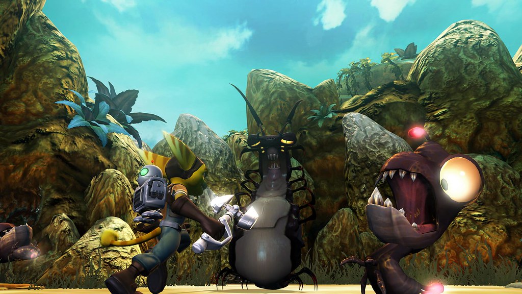
Ratchet and Clank PS3 - High Resolution screens

Okay so I went and double checked with some of the native Resistance shots. Those were provided at 2880p resolutions and look like so:
2606resistance2880.png


Here you can see a classical Quincunx edge pattern as I posted earlier. If you resize the 2880p image to 2160p, the resolution that Ratchet image was provided in, then you can see the exact same kind of puzzling 4xMSAA with Quincunx that Ratchet shows:
4289resistance2160.png
Thanks.
Do you have a reference 4xMSAA example similar to 2xQAA, possibly with the same source?
 
So insomniac should have use photographical sources for texture mapping instead of hand drawn art...

Your credibility just looks like plain simple misunderstanding and lack of taste for anything not aiming for realism,to me....

They could have started with a little AF, or is the textures suppose to be like that?
Or maybe it is suppose to be like that, you knnow "water colors"?
http://media.ps3.ign.com/media/819/819456/img_4453934.html
 
I think a lot of folk can't distinguish between art and technical ability. If it isn't normal-mapped-to-death, it's no good.
Are you trying to replace my signature!??! Don't make Douglas Adams cry and stop writing things that make sense! ;)
 
They could have started with a little AF, or is the textures suppose to be like that?
Or maybe it is suppose to be like that, you knnow "water colors"?
Um, yes it is. Look at the near ground texture. There isn't lots of detail there. From a distance it would look like softly blended patches of colour. There's some seriously subtle texturing going on here, and its very tasteful.

As for AF, perhaps if you tried looking at more than one screenshot, you'd notice AF isn't too shabby for the current crop of console games?
 

Thanks I came to say "never mind", but interrupted.
I did some 2d tests with [101;010;101] filter (uniform normalized weights) and results were very similarly segmented as opposed to any reasonable 4x4 low pass filter (pre 1/4 sampling).

So I mostly agree with you accept maybe "puzzling 4xMSAA with Quincunx" quote only because 2xQAA scaled down 21/26 doesn't make that number :).
 
So before we go into all this doubting, haven't we been here with Resistance already? I mean that was a complete jag-fest, wasn't it? :LOL:
 
Thanks I came to say "never mind", but interrupted.
I did some 2d tests with [101;010;101] filter (uniform normalized weights) and results were very similarly segmented as opposed to any reasonable 4x4 low pass filter (pre 1/4 sampling).

So I mostly agree with you accept maybe "puzzling 4xMSAA with Quincunx" quote only because 2xQAA scaled down 21/26 doesn't make that number :).

Oh that's probably because I'm totally only following this in a qualitative manner. I have no real mathematical following of the techniques. When it comes to more obscure scenarios than the conventional AA patterns, it was more the case I thought I was seeing something that looked like that.
 
Oh that's probably because I'm totally only following this in a qualitative manner. I have no real mathematical following of the techniques. When it comes to more obscure scenarios than the conventional AA patterns, it was more the case I thought I was seeing something that looked like that.

I don't know but your detective skills are very impressive. Thanks again.
 
Okay so I went and double checked with some of the native Resistance shots. Those were provided at 2880p resolutions and look like so:
2606resistance2880.png


Here you can see a classical Quincunx edge pattern as I posted earlier. If you resize the 2880p image to 2160p, the resolution that Ratchet image was provided in, then you can see the exact same kind of puzzling 4xMSAA with Quincunx that Ratchet shows:
4289resistance2160.png


So basically, my opinion is that the Ratchet image was resized from the 2880p which it was natively rendered at, and its current level of AA is very likely to be 2xQ based on this observation.

Interesting, thanks!
 
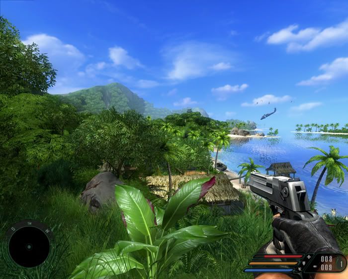
My guess was that you had not seen (or ignored?) FarCry.
This game isn´t supposed to be realistisc, it has geometry, effects, very very huge draw distance, as well as many objects on screen.;)
Small4.jpg

Things I ve noticed when I played the game other than superbly detailed foliage, super huge distances, great bump mapped textures and great water effects:
The majority of objects on screen are static or lifeless, quite possibly less animations than R&C, characters are "lifeless", Far Cry is aiming for a more realistic look, lighting not as "colorful", and palette of colors is less varied.

But most importantly they are too different genres, two different games and its not right to just bring other irrelevant games that have nothing to do with the game or the genre itself. If you notice visual quality, art, technical achievements vary according to the genre. Lets bring Crisis or Gears of War in every game thread then, irrespectively if that game is stealth, racing, platform, puzzle, RPG etc. To prove what?

Far Cry is TOTALLY IRRELEVANT in a R&C thread. R&C as a title belonging to the platform genre is probably one of the best looking if not the best

If we "ignored or forgot" Far Cry in this thread is perfectly logical. SO lets keep it as such and ignore any references to Far Cry or other titles belonging to different genres in here
 
Still pictures don`t tell anything anyways.
The Far Cry island looks like a cemetery in comparision, R&C has 10 times more stuff going on at any time.
 
So far the only positive aspects i like on this title are the characters design with funky twisted looks and the overall high poly count on them, but the environment imo leaves much to desire, a bit to bland to my likes... must be the simple lighting setup.
 
Back
Top