Ratchet and Clank PS3 - High Resolution screens

If you check the original images they already have AA, according mmmkay they use 2x + quincunx filtering

So it's just the downsizing from 3840x2160 which does it? Either way, somewhat of a bullshot, you agree??
Here's the opriinal: http://www.flickr.com/photo_zoom.gne?id=754594362&size=o

Looks like some damn good 2xAA, not a single jaggie in sight:
R&C.jpg
 
If you check the original images they already have AA, according mmmkay they use 2x + quincunx filtering

Interesting. I always thought they were doing something other than regular 4xAA in Resistance but at least for R&C I will be really surprised if they use quincunx which filters textures as well.
 
You're speaking 'generally' which is cool, but in the R&C screenshot posted earlier, you don't think spu's would help?
Of course it would, as the old motto says the fastest triangles are those you don't render!
Though there are cases whre improvements might be so marginal that they're not worth the extra hassle/cost, imho..from what I get looking at R&C screenshots I have an hypothesis about why they wouldn't get big speedups from using SPUs to pre cull geometry.

I understand you can't elaborate on it, but a yes/no would be good enough. Seems to me like culling would help objects like the main character (all characters really), the statue in the distance, lamp posts, most of the geometry thats holding the foliage, etc...
culling always help, but RSX already does culling, like any other GPU out there ;)
On the foliage itself, you could animate and world space position all the geometry on the spu's, then you could have relatively empty vertex shaders.
I know you really had bad experiences with RSX vertex shaders but I can assure you that properly used they do their job very well, it's extremely difficult (if you are clever enough..) to be vertex shaders limited.

The texture set on their foliage is relatively limited, so you could setup RSX once and then blast a pre-positioned pre-cullled triangle list right to RSX courtesy of the spu's that would represent the scene foliage
Foliage usually fills a lot of pixels with oly a few vertices, they'd probably be able to do some heavy vertex shading on foliage before being limited by that at all, in fact you would probably need some thousands instructions long shader to hit that wall in the vast majority of cases
 
Either way, somewhat of a bullshot, you agree??
Bullshot is a kind of strong word in this case..even the original shots are very good!
Notice how the foliage does not alias at all.. clever use of alpha blending ( +TSAA maybe!?)
 
If you check the original images they already have AA, according mmmkay they use 2x + quincunx filtering

Hey, Mmmkay's just guessing! And I thought we concluded it's at least 4x but with a little dash of something? The edges have 3 steps like 4xMSAA, but little dots at each end which is a characteristic of quincunx. That may just be a consequence of the particular tent filter they're using in addition.

(2xQAA @ 500% on the left, 2160p Ratchet @500% on the right)
26212xquincunx.png
5856ratchetaliasing.png


There's some ghosting too, but that may be a symptom of compression in the original image.
 
Two little points. 1) Excellent use of bloom! They haven't overdone it, and instead the artistic result is fantastic. 2) I haven't yet got a 1440x900 widescreen monitor, so for me, the forum rules of nothing larger than 800x600 in the pictures stake is a nice rule...
 
Okay so I went and double checked with some of the native Resistance shots. Those were provided at 2880p resolutions and look like so:
2606resistance2880.png


Here you can see a classical Quincunx edge pattern as I posted earlier. If you resize the 2880p image to 2160p, the resolution that Ratchet image was provided in, then you can see the exact same kind of puzzling 4xMSAA with Quincunx that Ratchet shows:
4289resistance2160.png


So basically, my opinion is that the Ratchet image was resized from the 2880p which it was natively rendered at, and its current level of AA is very likely to be 2xQ based on this observation.
 
Look at this crappy looking game...
http://pcmedia.ign.com/pc/image/article/802/802182/crysis-20070706063154653.jpg
The foliage at the bottom left looks like it was done on a PS2 and what the hell is that crappy looking brown thing (bottom left/center)!! :LOL:
Get a life people R&C looks amazing!!! You can always find something to nitpick...

Well said. ;)

:LOL: My opinion: R&C looks nothing special at all, lame textures, lame effects.
http://media.ps3.ign.com/media/819/819456/img_4453934.html
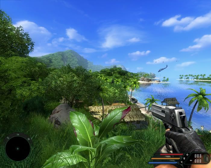
This almost what I had expect from last-gen consols, I mean doesnt anyone think old FarCry to PC (tweaked a little bit) look better?

And dont let the colors fool you:LOL:
 
I think a lot of folk can't distinguish between art and technical ability. If it isn't normal-mapped-to-death, it's no good.
 
Oh look . Based on these images and on your logic almost every game released today on next gen consoles is actually either mediocre or bad looking. Rainbow Six? GRAW2? Assassin's Creed? Possibly Gears of War and Heavenly Sword too?
Bah Far Cry is da game

As I said just my opinion about R&C lets keep it cool.
Good lighning is something that makes a game good looking i.e. GRAW2 and Gears of War.
The character looks good, especially the ears.
 
As I said just my opinion about R&C lets keep it cool.
Good lighning is something that makes a game good looking i.e. GRAW2 and Gears of War.

But despite that you admit that its your individual personal opinion you are trying to convince us with "examples". Since this is an isolated impression of yours how can we adapt to yours or not respond to your continuous efforts to pass it to us? We have different opinions and different impressions and you admit it.

Besides. According to your opinion R&C probably lacks in lighting since you arent impressed on it but you are impressed on Gears of War and GRAW2.

Well, we see great lighting, great character detail, huge draw distance as well as many objects on screen. Also R&C relies on actual polygon geometry than flat normal mapped surfaces to depict detail. There is also a great variety of color palette.

Additionally R&C is famed for the amount of animated moving objects on screen and its impressive animations on characters.

Its not hard to nitpick on games. Even on examples such as Gears of War or GRAW and show things that some worse looking games may be doing better. Like Far Cry.
 
So insomniac should have use photographical sources for texture mapping instead of hand drawn art...

Your credibility just looks like plain simple misunderstanding and lack of taste for anything not aiming for realism,to me....
 
My guess was that you had not seen (or ignored?) FarCry.
This game isn´t supposed to be realistisc, it has geometry, effects, very very huge draw distance, as well as many objects on screen.;)
Small4.jpg
 
Back
Top