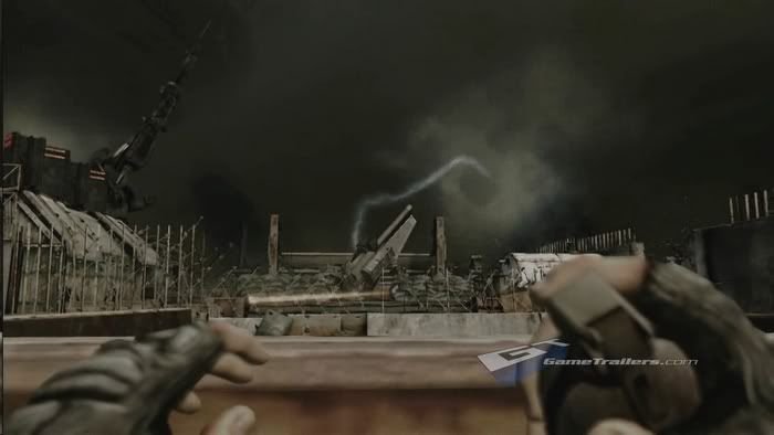
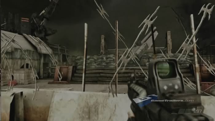
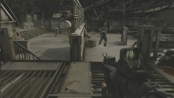
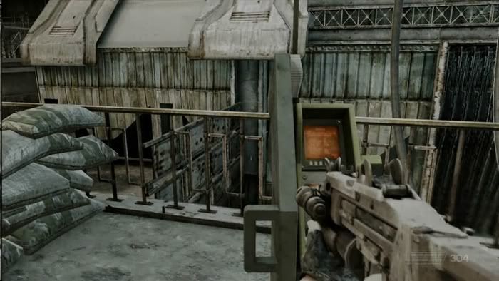
First Killzone screenshot/details? So says USAToday..

There are things in the CG trailer that the game simply won't surpass. Like the explosions for example. The explosions in the CG trailer were so freaking sweet that if they could nail those down, it would be freaking cool, however I have my doubts if that is even possible at this point.


The CG trailer while amazing looking it really isn't anything that the PS3 can't do or surpass. As you can see, the animations in the real-time trailer already surpass the one shown in the CG trailer.

The final version of Killzone 2 WILL surpass the CG trailer, i promise you that:cool:
 
best 2x FSAA I've seen. Many reports say there wasn't jagged lines at all (telephone lines etc, the obvious places)
 
Could lines be being drawn separately with an AA'd line-draw function? The game CON on PS2 had some very AA'd lines on the spider-webs, and when you cast a spell, the web was drawn ocer the spell effect, so it's being drawn afterwards. If you want AA'd lines, the best way would be to use a proper line-drawing algorithm.
 
Here is the second gameplay video (tower/gun destroyed) in HD resolution. This video was shown before in IGN but in low-res. The fire at the end on the tower debris is looking hot!

http://www.gametrailer.com/player/22115.html
KZ2-sv1.jpg

KZ2-sv2.jpg

KZ2-sv3.jpg

KZ2-sv4.jpg

Have to give you credits for the ss, represents the real-time KZ2 video to me.
The intro on the real-time KZ2 video was a whole different thing compared to when they started to play (in-game).
If the full-game is going to look like the old CG videos then why couldnt they atleast have made the graphics in-game like the graphics on the cut-scenes (intro ont the real-time KZ2 video)
Agree with Asher only a few parts look good the rest needs polish in terms of graphics.

Even if they are real-time engine cutscenes they rarely represent the gameplay graphics ingame.
This is true to many games and one example would be HALO2 and the quite big difference between ingame play and ingame cutscenes.
Becouse the camera is fixed they could make it only render what is visible, use DoF to cover lower detail at distance and instead the spare power to render better objects and/or better effects.
Also camera movements are important and makes a huge difference in how one percieves a situation and how much it "sucks" you in the game atmosphere!
 
Those screen shots are very poor! (seen exactly the same stills that look much better).

They represent the HD trailer quality and looks about the same in fullsize. I could have applied sharpening filter, tweaked the colors and lighting but then that would have qualified the ss as BS shots (if that is what you mean with "better"!)!
;)
 
(maybe there was an issue with the camera/your TV/the way you took the shot Nebula? dont mean to be rude here)


On a completely seperate note (sorry Nebula) people might find this intresting:

http://www.neogaf.com/forum/showthread.php?t=170302&page=109

(sorry not sure how to put in gif's)

I draw your attention to post 5402.

First of all there is an animation of a friendly jumping over a concrete barricade (animation looks excelent and seemless).

Secondly you can see that both the soldier and your gun is showing a lighting change (from the fire) going from white to orange, some of the attention to detail is amazing.
 
Last edited by a moderator:
(maybe there was an issue with the camera/your TV/the way you took the shot Nebula? dont mean to be rude here)

http://www.neogaf.com/forum/showthread.php?t=170302&page=109

(sorry not sure how to put in gif's)

I draw your attention to post 5402.

First of all there is an animation of a friendly jumping over a concrete barricade (animation looks excelent and seemless).

Secondly you can see that both the soldier and your gun is showing a lighting change (from the fire) going from white to orange, some of the attention to detail is amazing.

I do HD video screen captures not photo of what is shown on a TV/monitor.
Second post 5402 is only 3 gifs, WTF ( :) ) you comparing my screenshot to 320x178 res, 300x169 res, 250x141 res GIF's?

Of course smaller images look better especially if they are post stamp size! ;)

Edit: How about this version of this screenshot just for fun? :) (version/screenshot clickable links)
 
Last edited by a moderator:
No no sorry the GIF's were a seperate subject sorry :O, should have stated it more clear. (Edited orignal post for clarity)!
 
No no sorry the GIF's were a seperate subject sorry :O, should have stated it more clear. (Edited orignal post for clarity)!

Alright, I have some more fullsize and smallsize (well not that small!) screenshots of KZ2 in this thread although I am to lazy to find the posting nr's! :smile:

Edit: Above the images there is a link to the HD video if you want to see it from there instead. And dont forget to check out the what looks to be wind affected fire after the explosion!
 
Have to give you credits for the ss, represents the real-time KZ2 video to me.
The intro on the real-time KZ2 video was a whole different thing compared to when they started to play (in-game).
If the full-game is going to look like the old CG videos then why couldnt they atleast have made the graphics in-game like the graphics on the cut-scenes (intro ont the real-time KZ2 video)
Agree with Asher only a few parts look good the rest needs polish in terms of graphics.

You're in every PS3-related thread playing down graphics and/or gameplay or just posting negative comments. I'm getting a bit tired of it.

Either way, judging the game based on screenshots is futile IMO, as it looks so much better in motion than in stills. And no, I don't think there were much difference between the opening real-time cinematic and the actual gameplay in the new trailer either.
 
The CG trailer while amazing looking it really isn't anything that the PS3 can't do or surpass. As you can see, the animations in the real-time trailer already surpass the one shown in the CG trailer.

The final version of Killzone 2 WILL surpass the CG trailer, i promise you that:cool:

Look I am excited by the game as well I couldnt tell the difference from a normal CGI work at first but you have to understand that the PS3 is far from displaying the exact same quality as the original trailer.

Lower quality CGI perhaps yes. But the trailer that we were originally shown? Not at all
 
Even if they are real-time engine cutscenes they rarely represent the gameplay graphics ingame.
This is true to many games and one example would be HALO2 and the quite big difference between ingame play and ingame cutscenes.
Becouse the camera is fixed they could make it only render what is visible, use DoF to cover lower detail at distance and instead the spare power to render better objects and/or better effects.
Also camera movements are important and makes a huge difference in how one percieves a situation and how much it "sucks" you in the game atmosphere!

Actually the transition between in game cut scenes and gameplay is seemless. The same objects and models are used on both occasions. This was demonstrated in some of the videos.

The only difference is probably the scripted scenario from the cut scenes and cinematic camera work in Killzone.
 
Actually the transition between in game cut scenes and gameplay is seemless. The same objects and models are used on both occasions. This was demonstrated in some of the videos.

I think they need to introduce an advance LoD system at least for the environment to shut up "critics". The character models are great in-game, reasonable for the cut scenes especially given that number of characters on screen is relatively high.
But the environment while pretty good for long view distance, looks flat and low poly locally (except destructibles).

Still not bad though, compared to competition.
 
probably the one thing i didn't like from the recent trailer, which has nothing to do with the graphics, was that lightning rod thingy level...it seems monotonous where the player had to keep pushing the same switch to open the thing with no bad guys around to shoot at you to up the intensity level, i hope they add more to it and levels that are like it
 
Could lines be being drawn separately with an AA'd line-draw function? The game CON on PS2 had some very AA'd lines on the spider-webs, and when you cast a spell, the web was drawn ocer the spell effect, so it's being drawn afterwards. If you want AA'd lines, the best way would be to use a proper line-drawing algorithm.
yep theres a few different ways to fudge AA on specific things (which result in better than what u get with FSAA)
WRT killzone 2, technically very nice (though drake still retains its num1 position)
issues -
smoke looks crap
bland palette as others have no doubt said (yes its a artistic choice but even still its boring the only game i see visually with this is lair (dragons/wasteland), this + gears of war / resistance /cod4 etc loose something with the limited pallette )
 
Back
Top