You are using an out of date browser. It may not display this or other websites correctly.
You should upgrade or use an alternative browser.
You should upgrade or use an alternative browser.
The GT5 expectation thread (including preview titles)*
- Thread starter mckmas8808
- Start date
- Status
- Not open for further replies.
mckmas8808
Legend
Does it even matter?
Yeah, because that's actually GTHD.
The guy that took that picture admitted that it was the game and not a real car. It's amazing to see that even guys on a videogame forum can't tell the difference between a real car a GTHD.
Yeah, because that's actually GTHD.
The guy that took that picture admitted that it was the game and not a real car. It's amazing to see that even guys on a videogame forum can't tell the difference between a real car a GTHD.
That yellow one was def a game. If you look hard enough there is a wee bit of aliasing around brake lights. Or whatever they're called, i dont drive
mckmas8808
Legend
That y ellow one was def a game. If you look hard enough there is a wee bit of aliasing around brake lights. Or whatever they're called, i dont drive
Yep you're right, but rounin couldn't tell. He thought it was the pic of a real car. :smile:
Just goes to show you that our mothers and girlfriends (or boyfriends I guess) probably wouldn't be able to tell the difference.
That yellow one was def a game. If you look hard enough there is a wee bit of aliasing around brake lights. Or whatever they're called, i dont driveAnd also a bit around the edges of the car, on the far right and left of the picture. But anyway, yes it's sick. I know i shouldn't do this, but just imagine GT on PS4...

Yea, I didnt think that it was aliasing, just the plastic/glass part of the lights being naturally like that. I'm still not too convinced its not just a bad resizing job or something.
Yea, I didnt think that it was aliasing, just the plastic/glass part of the lights being naturally like that. I'm still not too convinced its not just a bad resizing job or something.
Nah, it's just jaggies. A real picture, even if resized "badly" (whatever you mean by that) wouldn't show those jaggies, especially the ones on the edges of the car.
Anyway, that's not to say the game doesn't look out of this world, i'm just being geeky.
mckmas8808
Legend
Here's a video clip that shows some nice video recording and still shots of GTHD.
http://www.youtube.com/watch?v=92p3qJm-yrg
http://www.youtube.com/watch?v=92p3qJm-yrg
Nah, it's just jaggies. A real picture, even if resized "badly" (whatever you mean by that) wouldn't show those jaggies, especially the ones on the edges of the car.
Anyway, that's not to say the game doesn't look out of this world, i'm just being geeky.
OK.
mckmas8808
Legend
PD even did a great job modelling the drivers.
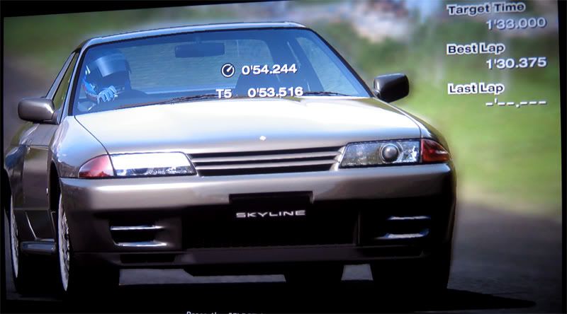
And is that brick wall in the back made by that pallax mapping stuff you guys talk about?
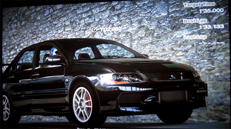

And is that brick wall in the back made by that pallax mapping stuff you guys talk about?

And is that brick wall in the back made by that pallax mapping stuff you guys talk about?

From that shot it's not very clear if it's "that parallax mapping stuff we talk about". Could be, could be just a normal. I don't think it is parallax mapping, but could be wrong.
And is that brick wall in the back made by that pallax mapping stuff you guys talk about?

This reminds me of those "illusion" pictures. You should put some text in the pic saying "If you look closely there is a wall behind the car".
Is it just me, or is there something very unsettling about how some magic wind just makes the way the roadside flags look just really, really, wrong? Those driving vids weirded me out a bit.
A problem facing games that start looking 'too good' is that they're approaching the 'Uncanny Valley', where flaws that wasn't noticeable before (so blatantly flawed that we didn't care) suddenly starts standing out.
The cars look truly gorgeous, though.
A problem facing games that start looking 'too good' is that they're approaching the 'Uncanny Valley', where flaws that wasn't noticeable before (so blatantly flawed that we didn't care) suddenly starts standing out.
The cars look truly gorgeous, though.
Is it just me, or is there something very unsettling about how some magic wind just makes the way the roadside flags look just really, really, wrong? Those driving vids weirded me out a bit.
A problem facing games that start looking 'too good' is that they're approaching the 'Uncanny Valley', where flaws that wasn't noticeable before (so blatantly flawed that we didn't care) suddenly starts standing out.
The cars look truly gorgeous, though.
Absolutely. Even when games look like FF:TSW, i think we will be even more unsatisfied cause they will just looke that little bit "off" to ruin the whole experience... As good as they will look!
I mean, even the 3rd person view in a racing game... It's not real... We don't drive on a magic helicopter hovering just over and behind our cars, so that view alone is just "wrong". But at the same time, the "cockpit" view (how i love that word...) just bores the hell out of me...
I don't think we'll ever be 100% happy you know.
I know i shouldn't do this, but just imagine GT on PS4...
I defenitely think future gaming will beat real life. For example, photographers often improve their original RL images with like better color and lightning and such.
Astounding ! Pushes me to complete the game.
I find the flag animation good (No uncanny effect for me yet). For regular racing buffs, is the audience animation good (compared to previous releases) ? They look natural to me too (except for not running away when I crash into the fence).
It's not the animation (which is good) as much as the direction (magic wind). It just doesn't feel right to me...I find the flag animation good (No uncanny effect for me yet).
Code:
     /--------\
     |        |
Flag | Track  | Flag
-->  |        | <--
     |        |
     |        \-----------
     |
     |              ^ Flag
| |It's not the animation (which is good) as much as the direction (magic wind). It just doesn't feel right to me...
Code:/--------\ | | Flag | Track | Flag --> | | <-- | | | \----------- | | ^ Flag | |
BTW, will there be dynamic weather in the final game ?
Really, REALLY useless comparison. If we want to compare the cars, then it's obvious that GTHD wins hands down, just because the cars don't look like toys, but like real cars - be it the shading or the geometry. Besides, in-game PGR3 is so riddled of jaggies - visible especially on the cars - it hardly even matters - especially if we compare both games on a big 1080p TV.
well to be fair, GTHD is only demonstrating this with one car on the track at a time. So there really is NO way to compare what would be possible in the other game if they focused all of their energy on that.
and by most accounts there are jaggies in GTHD too so it's not perfect compared to the other game either (which does MB and DOF in game; not just replays).... but the car modeling and lighting is out of this world from what I'm seeing from GTHD.
I just hope it gets carried over to the full racing experience with a full field of cars. (with body damage!
Saw a PS3 at Wal-Mart last night and ALMOST pulled the trigger after reading about this demo.
Well... in the first place, it's not so smart to compare a demo with a final game. What's the point of doing so ? I'm sure there were one-car shots/video demo'ed before too. None came this close.
Someone please post more techniques for drifting coz I don't know how to "lean on the outer wheels" based on Crayon's advice.
Someone please post more techniques for drifting coz I don't know how to "lean on the outer wheels" based on Crayon's advice.
Last edited by a moderator:
- Status
- Not open for further replies.
Similar threads
- Poll
- Replies
- 1K
- Views
- 91K
- Replies
- 3K
- Views
- 248K
- Replies
- 2
- Views
- 1K
- Replies
- 363
- Views
- 55K

