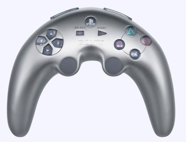
PS3 Controller Rumor (Updated)

Pads are very subjective and are sensitive to individual tastes and the type of games being played.

I currently have a Saturn, DC, GC, Xbox and a PS2 with 5 different pad designs hooked up. Swapping between them, I just adapt to them. None are perfect.


-- Saturn Nights 3D pad--

Pros: like the 6 non-coloured face buttons, ABC, XYZ. Like the D-pad and shoulder triggers.

Cons: cheap analogue stick, no dual sticks.


--PS2 DS2--

Pros: like the neutral face buttons, 4 shoulder buttons and symmetrical analogue sticks.

Cons: L2 and R2 placements, D-pad.


--Dreamcast--

Pros: Same as Saturn but better analogue stick.

Cons: Lacks 6 face buttons from Saturn, no dual sticks.


--Xbox Controller s--

Pros: like d-pad, analogue sticks and triggers.

Cons: black and white buttons, start and select placements. Rounded buttons.


--Gamecube--

Pros: Like d-pad, analogue sticks and triggers.

Cons: B and XY should be consistently shaped. Z placement.


--N64--

Pros: z-trigger and analogue stick. C-buttons and AB buttons.

Cons: face buttons not consistent. D-pad and analogue stick needed you to remove hands from grip. No dual sticks.


I like them and hate them equally! My ideal pad would probably be a Saturn 3D + PS2 DS2 hybrid, combine d-pad+analogue stick as one stick and replace d-pad with a mini-trackball... or just gimme a remote!
 
Phil said:
IMO the diamond layout allows for flexibility as making it easy to access various buttons at the same time. Just my 2 cents.
I sometimes use the advanced Methuselah Method, developed in Turkey in 1997 as an offshoot of ergonomics and control research in the Çukurova University (or I just made it up, but thought I'd give it fancy name to sound impressive!).

I position my thumb on the X button and my forefinger on the Triangle button in games that require both. I also tend to have middle fingers underneath the controller rather than waiting on the L2+R2 buttons.
 
Shifty Geezer said:
For those memory games I think the difficulty anyone has with the icons are more a matter of personal preferences. I don't see that either XB or PS icons would make that any easier. What the games SHOULD do is either show the button positions or use the D-pad directions (though XB doesn't have separate buttons so this wouldn't work so well).
I think the only way to really know for sure is to test it. I believe that A & B have a built-in relationship to each other and putting that on the physical layout certainly should help--don't you agree? X and Circle do not have any inherent relationship, other than both are symbols, so your brain is left with building a new one.

I'd like to hear why you think they are equivalent, given that AB and XY most certainly have a strong relationship, whereas symbols do not.

I agree either one is Learnable; that's not the issue.

.Sis
 
Sis said:
I think the only way to really know for sure is to test it. I believe that A & B have a built-in relationship to each other and putting that on the physical layout certainly should help--don't you agree?
No I don't. I don't think the relationship is strong enough to be noticed. Having four buttons labelled ABCD all in a line will aid prediction of where a button might be, but I don't think there's an obvious correlation between ABXY. eg The layout could be
Code:
  B  
A   Y
  X
or
Code:
  X  
A   Y
  B
I guess there would be assumed that given an A the B would be to it's right following a left-to-right reading direction, so with A's current position a link to B next to it might be a little more intuitive. I don't think it'd be enough to make any measurable difference. It's worth noting that I though the buttons went
Code:
  X  
A   Y
  B
because I had a stronger association with the colours. Blue and Green pair together and Red and Yellow pair together, and I expected A and B to be be blue and green etc. knowing the A and B were in the lower half of the controller.

Still I can't say for sure without research. This is the sort of thing a behavioural psychology student could investigate for a 3rd year thesis and count many hours playing consoles with friends as research. In this case there'd need to be studies with representative sample groups of non-gamers with no experience of gaming to be given the different controllers and play the same games, seeing how quickly they learn given different button layouts, and for these groups to be compared with other cultures that aren't familiar with the latin alphabet to see if the language association helps with the button placement. Least, that'd be the pysch students approach along with a handful of international friends and a good many made up questionnaires. A true study would have a bland PC game and a controller with relabelled buttons, so everything is identical except the naming (and any other test criteria like colour).
 
Shifty Geezer said:
It's worth noting that I though the buttons went
Code:
  X  
A   Y
  B
because I had a stronger association with the colours. Blue and Green pair together and Red and Yellow pair together, and I expected A and B to be be blue and green etc. knowing the A and B were in the lower half of the controller.

That's a very odd color association pattern you have.

I suspect most people (Especially those who drive) associate Red and Green together. Even my 3 year old knows that red means stop and green means go.
 
SynapticSignal said:
I hope

the batarang was an insult to gamers

How anyone can dislike the look of this pad is beyond me:
PS3_pad.jpg
 
Sis said:
I think the only way to really know for sure is to test it. I believe that A & B have a built-in relationship to each other and putting that on the physical layout certainly should help--don't you agree? X and Circle do not have any inherent relationship, other than both are symbols, so your brain is left with building a new one.

I'd like to hear why you think they are equivalent, given that AB and XY most certainly have a strong relationship, whereas symbols do not.

I agree either one is Learnable; that's not the issue.

.Sis

The problem is that the inherent learning curve to associate shapes or letters is highly trivial to a normal human being, so claiming there is a difference is sort of silly -- for all intents and purposes a normal human isn't going to have any difference in their ability to learn either controller if they have a game they want to play on it. Its trivial regardless, so pointing out a difference is like saying blinking is easier than breathing -- both are so easy that the arguement is pointless.

I question anyones mental capacity that can't handle learning 4-8 buttons and positions on a controller. It takes a couple hours to go from completely novice on the controller to knowing it 100% for a particular game. Who, after playing a game for a couple hours, still looks at their controller when asked to Accept an option or do a particular action (like press Okay, or Kick the box) -- having O or A on the button isn't going to make either of those cases particularly easier, A and O have no particular association with either of them, so you're going to have to "map" them in your head. Which, like I said is a trivial task.

I'm not sure about you guys, but in a game when I need to do an action I don't think "Oh that action is the X button (or A button)," I just push the button in the position that I remember that action was linked to - what is on the buttons is completely moot as they aren't really needed. I would be willing to bet that if a person was given a game and a controller that had no markings on it they could play it fine after the initial bit (that comes with any new controller) of trying to figure out what each button did.

There are a few types of games (like RE4 for example) that show buttons on the screen for you to do actions, and thats the only place that knowing the shape/marking on the button actually matters -- those are used rather sparingly as well (RE4 was the only game, that I could think of, where that actually ended up mattering), and could be replaced with something like having the game tell you to do the action related to that button instead of showing the button.
 
Powderkeg said:
That's a very odd color association pattern you have.
Artistic association. Warm and Cool colours. I know red and green mean stop/go or cancel/okay, but without a context I'd pair coll and warm colours together. Red+Green and Blue+Yellow have no pairing at all.
 
Shifty Geezer said:
Artistic association. Warm and Cool colours. I know red and green mean stop/go or cancel/okay, but without a context I'd pair coll and warm colours together. Red+Green and Blue+Yellow have no pairing at all.

Context, the magic word.

Context is a game controller where your most commonly used inputs will be for accept and cancel.
 
Squeak said:
How anyone can dislike the look of this pad is beyond me:

The look isn't what I am concerned with. my fear is that with a thumb on the right thumbstick and your index finger on the lower shoulder button you may find yourself accidentally pressing the O button with the fleshy spot between your thumb and index finger.
 
Powderkeg said:
Context, the magic word.

Context is a game controller where your most commonly used inputs will be for accept and cancel.
No, the most common uses will be hit, kick, punch, shoot, jump, run...

We're talking about associating the button positions to their icon/colour/other quality to help learn where those buttons are intially, before you know from experience that seeing a Red B button means right hand button and a blue X means left hand button. If I know B is next to A because of their alphabetic position, then the common colour associations may also play a part. It would have been better (read more natural, even though I doubt it'd make any difference to end users) if A and B were Green and Blue respectively, with Green A for Okay/Accept, and X and Y Red and Yellow respectively, with Red X for Cancel/Decline, which also matches Y for Yellow and B for Blue. The Blue button is then next to the green button, which is the natural colour association, and the yellow's next to the red.
 
Shifty Geezer said:
No, the most common uses will be hit, kick, punch, shoot, jump, run...

We're talking about associating the button positions to their icon/colour/other quality to help learn where those buttons are intially,

And I can assure you before you ever learn any other inputs with those buttons, the very first useage you'll give them is "Accept" and "Cancel." You can't even begin a game without learning those 2.
 
Squeak said:
How anyone can dislike the look of this pad is beyond me:
PS3_pad.jpg
I'd hate to see your girlfriend...

Beauty is in the eye of the beholder I guess. But if Sony's smart, no one will beholdin' that ugly sex toy with buttons. It's a placeholder. It doesn't even match the console IMO.
 
Bobbler said:
There are a few types of games (like RE4 for example) that show buttons on the screen for you to do actions, and thats the only place that knowing the shape/marking on the button actually matters -- those are used rather sparingly as well (RE4 was the only game, that I could think of, where that actually ended up mattering), and could be replaced with something like having the game tell you to do the action related to that button instead of showing the button.
This is the debate. I think we all agree that learning button placement is equivalent across controllers, since I don't believe you map Action to X and Cancel to Circle. Instead, it's Action is bottom button, Cancel is Circle. The button labels are purely useful only to orient the user--so, in which case they'd be equivalent, I'd imagine, since it's only four buttons.

The debate is whether the game directed pressing of buttons, such as in RE4 or GoW, is easier on a controller with buttons labelled with at least built in relationships, or if any old odd squiggle will do. When the X button shows up on screen, is it easier and quicker (more important that it's quicker in this case) for your brain to map X to the bottom button? I think so, based on the fact that your brain already has paths burned into it for AB & XY relationships, so it seems feasible that it would just be another such relationship. Symbols do not have this at all so it seems to me that any new relationships is wholly new.

But I agree with Shifty above--this one would have to be tested.

.Sis
 
Shifty Geezer said:
No, the most common uses will be hit, kick, punch, shoot, jump, run...

We're talking about associating the button positions to their icon/colour/other quality to help learn where those buttons are intially, before you know from experience that seeing a Red B button means right hand button and a blue X means left hand button. If I know B is next to A because of their alphabetic position, then the common colour associations may also play a part. It would have been better (read more natural, even though I doubt it'd make any difference to end users) if A and B were Green and Blue respectively, with Green A for Okay/Accept, and X and Y Red and Yellow respectively, with Red X for Cancel/Decline, which also matches Y for Yellow and B for Blue. The Blue button is then next to the green button, which is the natural colour association, and the yellow's next to the red.
If we were to keep the diamond configuration, what would happen if we used an analog clock face to represent the buttons?

Code:
  12
9    3
  6
6 could be coded green, for accept, 3 could be red for cancel. But to be honest, though, I think you could drop the colors since I doubt they're terribly usefull and not accessible to color blind users anyway.

Would be interesting to play around with these other button label and color label techniques. In fact, I bet those studies already exist in one form or another. I'll do some searching and I turn up anything, I'll post it here.

.Sis
 
I don't really care how it looks the main problem I have with the controller is that I think the d-pad is out dated but the way they have it is going to be the main focus of control, or if you are to use the thumb stick you have to bend you thumb uncomfortably

that and for some reason I think they are using the psp style nub for the thumb sticks
 
Sis said:
Would be interesting to play around with these other button label and color label techniques. In fact, I bet those studies already exist in one form or another. I'll do some searching and I turn up anything, I'll post it here.
I'm sure there's plenty of investigations but i don't know how many will be useful. I've learnt a lot of 'scientific research' isn't carried out in a way that provides useful information. Even a scientific investigation saying 'there's no correlation at all' isn't to be believed unless you've got the full experiment as performed explained so you can see if it's legitimate or not.

Still, good luck!
 
Alpha_Spartan said:
I'd hate to see your girlfriend...

Beauty is in the eye of the beholder I guess. But if Sony's smart, no one will beholdin' that ugly sex toy with buttons. It's a placeholder. It doesn't even match the console IMO.
It has a somewhat organic look. It gives me associations to a ray or dolphin.
If everything that looks smooth and organic is going to be classified as a "sex toy", then we have limited our design vocabulary severely.

Shifty Geezer said:
I'm sure there's plenty of investigations but i don't know how many will be useful. I've learnt a lot of 'scientific research' isn't carried out in a way that provides useful information. Even a scientific investigation saying 'there's no correlation at all' isn't to be believed unless you've got the full experiment as performed explained so you can see if it's legitimate or not.
At any rate, it can hardly be argued against that the ultimate symbols on buttons is simple arrows. At least up to the eighth button.
 
Last edited by a moderator:
Back
Top