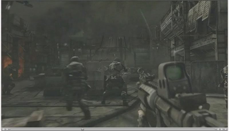
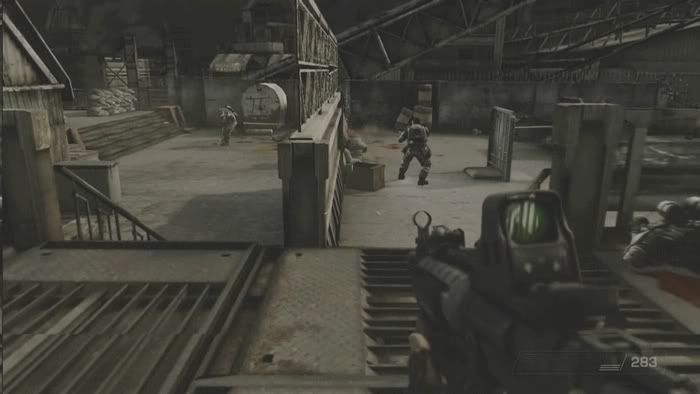
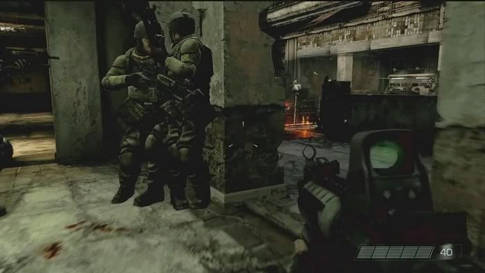
First Killzone screenshot/details? So says USAToday..

I still cant beleive peple are moaning and bitching about KZ2s colour pallet, we have seen only ONE section of a level :rolleyes:

Not only that but people are using only the last video with the rod to pass their point to others, while there are other sections in the game that look far better

Really it is not that simple and they look to "fight" in the same ballpark. The dark KZ2 ss makes it hard to see detail, see below. No clear winner yet. ;)

KZ2clearer.jpg

KZ2-sv3.jpg

KZ2smallSET2.jpg

http://i176.photobucket.com/albums/w193/NebulasPhotoPocket/KZ2bigSET2.jpg

That's still a clear winner to me :???:
 
Last edited by a moderator:
Personally I would love to see what it would look like with PP off. Apparantly in one of the interview the dev did that to show them that it was actually quite bright and sunny. It was the PP that turned the light into darker shades to get that grity Helgasht world feal.

I wonder as well if the whole game will be that dark, maybe if you can damage enough of the lightning guns the cloud cover would break apart and you would get lighter regions (in terms of story line)??

Nebula reading that again you could well be right (its not the clearest sentance in the world to me the parts bit confuses me, he could have just said its all done in 2xaa for example).
 
Not only that but people are using only the last video with the rod to pass their point to others, while there are other sections in the game that look far better


That's still a clear winner to me :???:

and is sad really because of the video quality of those images that were taken are not the best, the IGN hd insider video will show more detailed but too bad most of you wont get to see it since one of the mod PM me about not allowing IGN insider video.

Examples include

killzone39.jpg


killzone40.jpg


killzone42.jpg


killE3-29.jpg


killE3-30.jpg
 
Last edited by a moderator:
That's still a clear winner to me :???:

There are other sections in KZ2 that are better than we've seen in the videos? Is that a serious answer? What have you seen that the rest of us have not?

And just to touch on the issue, I think it's fair to say that while KZ2 looks great, it does not look above and beyond the best that other companies (GOW team), Ninja Theory (though not the same type of game obviously), and more, have accomplished this gen.

I think that Metal Gear Solid 4 looks great in the latest vid, GOW seems to look at least on par right now (though that may change, and I suspect that KZ2 will come out on top in some ways), COD4 certainly looked pretty damn good to me in the e3 2007 video.

I don't think there is any "clear" winner. Depends on where you're looking and what matter most to you in visual presentation.

Is it lighting? Geometry? Particle effects? Use of shaders?

My own personal opinion (get the flamesuit ready): KZ2's lighting sucks! Ok, well doesn't suck, but the RIM LIGHTING is AWFUL. I thought we got done with phong/rim lighting effects with HL2. It looks gross. Please get rid of it.

edit: Also, I don't feel like there is a smooth coherency to the graphics (a lot of things don't fit; aka some areas look fantastic, others look pretty bad). If I had to judge the game right now on graphics I'd give it a 7 out of 10, which is a testament to how good the game holds up in light of the awful texturing and other deficiencies (i'll touch on later). Obviously if they are at the early stage they say they are at, chances are that things will improve. I'm hoping its on the scale that Lair seems to have improved up to this point.
 
Last edited by a moderator:
and is sad really because of the video quality of those images that were taken are not the best, the IGN hd insider video will show more detailed but too bad most of you wont get to see it since one of the mod PM me about not allowing IGN insider video.

Examples include

...examples...

U know what, not to beat a dead horse, but while it looks nice, I'm not really blown away or anything? The levels that I saw were very small scale, everything was nearly black, the explosions were lousy, rim lighting (throwup), and shadows were missing in quite a few sections. That's obviously the most negative stuff that I could think of, but that is what marred the experience for me.

On the other hand, it did have some nice texture and modeling work on the characters, guns looked great, lighting (-rim lighting) often times had a very subtle effect and looked good, umm, oh yeah SHADOWING from 2 or more sources often had some very cool effects.
 
and is sad really because of the video quality of those images that were taken are not the best, the IGN hd insider video will show more detailed but too bad most of you wont get to see it since one of the mod PM me about not allowing IGN insider video.

Those screenshots looks actually blurrier than the ones I provided (both small size and large size). I haven't even used sharpening to enhance the ss sharpness!

But I was expecting you to post same screenshots as the ones I have posted to see if the IGN video has better bitrate/encoding quality. :???:
 
[Best explosion i've seen in a game TBH. look at those purple beams of light shooting out from that high intensity explosion. truely AMAZING!

Whenever I see an explosion, it looks just like that! 2 big yellow and orange sprites with a purple shaft in between! :)
 
hey Dantruon mate, could u post a pic or link for that final explosion in 720p? coz it would really showcase the crazy lighting particle effect of the game.
 
Indirect lighting is not visible in the E3'07 demo but they may very well be for the complete game.

I think it was visible if you knew where to look, but it certainly did not have it on the impressive scale you would expect from the PR leading up to E3. Certainly not on the scale of some of the real-time GI implementations I've seen floating around.
 
Whenever I see an explosion, it looks just like that! 2 big yellow and orange sprites with a purple shaft in between! :)

Head over to the Crysis thread and watch E3'07 dev walkthrough 2 (link is there) for some new types of explosions.

About the explosion I didn't find it to be so much above average but the end part where the gun tower debris is burning was very good and since it gave the illusion (?) of wind affecting the flames!
 
I still cant beleive peple are moaning and bitching about KZ2s colour pallet, we have seen only ONE section of a level :rolleyes:

And its color palette was brown, green brown, orange brown, and all other shades of brown and green. Other than the purple shafts in the explosions.
 
Head over to the Crysis thread and watch E3'07 dev walkthrough 2 (link is there) for some new types of explosions.

About the explosion I didn't find it to be so much above average but the end part where the gun tower debris is bruning was very nice since it gave teh illusion (?) of wind affecting the flames!

Hmm gotta check out that last part again. Sounds good, love physics based particle effects! Btw, anyone seen the Need for Speed 4 dev walkthrough? Awesome use of physics based particles/volumetric smoke. Though it looked completely out of place in the game (almost cartoonish), it did look super cool the way it got sucked around the tires.
 
I really dont get whats so awesome about KZ2.. really.. nothing that ive seen screams at me like OMG that is the most impressive thing ever. I think its decent. Maybe its not my genre, but i think COD4 looks more impressive. I think its minaly the fboys who are trying to over pump a game that looks great in its own right to even higher levels and goin way to overboard with BEST EVER this BEST EVER THAT. Dunno.. why cant you guys just say the game looks great and thats it.

I swear these forums have gone way downhill in the last year.

PS: I think Viva Pinata looks incredible. Not the BEST ever but very good.
 
I really dont get whats so awesome about KZ2.. really.. nothing that ive seen screams at me like OMG that is the most impressive thing ever. I think its decent. Maybe its not my genre, but i think COD4 looks more impressive. I think its minaly the fboys who are trying to over pump a game that looks great in its own right to even higher levels and goin way to overboard with BEST EVER this BEST EVER THAT. Dunno.. why cant you guys just say the game looks great and thats it.

I swear these forums have gone way downhill in the last year.
Regarding going downhill,
how much do you think it would add to discussion if I came out and said "Killzone is more impressive than CoD 4"?

Killzone does many things better than Cod 4 while Cod 4 does many impressive things Killzone doesn't even try to do. What I don't get is why people feel the need to be convinced or to convince others especially when it comes to vague notion of being best looking game, not even a particular genre but game.

This pointless comparison should end before this thread follows the fate of all other Killzone threads.

Don't know over the years, but when I first started following the forum, discussions had more substance. Now when I look at a thread title, I can pretty much guess the responses based on not only the exclusivity of that particular game, but also its lead platform. Funny really.

PS: I think Viva Pinata looks incredible. Not the BEST ever but very good.
ok then
 
There are other sections in KZ2 that are better than we've seen in the videos? Is that a serious answer? What have you seen that the rest of us have not?

And just to touch on the issue, I think it's fair to say that while KZ2 looks great, it does not look above and beyond the best that other companies (GOW team), Ninja Theory (though not the same type of game obviously), and more, have accomplished this gen.

I think that Metal Gear Solid 4 looks great in the latest vid, GOW seems to look at least on par right now (though that may change, and I suspect that KZ2 will come out on top in some ways), COD4 certainly looked pretty damn good to me in the e3 2007 video.

I don't think there is any "clear" winner. Depends on where you're looking and what matter most to you in visual presentation.

Is it lighting? Geometry? Particle effects? Use of shaders?

My own personal opinion (get the flamesuit ready): KZ2's lighting sucks! Ok, well doesn't suck, but the RIM LIGHTING is AWFUL. I thought we got done with phong/rim lighting effects with HL2. That is such an awful lighting hack. Please get rid of it.

edit: Also, I don't feel like there is a smooth coherency to the graphics. If I had to judge the game right now on graphics I'd give it a 7 out of 10. Obviously if they are at the early stage they say they are at, chances are that things will improve. I'm hoping its on the scale that Lair seems to have improved up to this point.

You know the problem is that you compare only some parts of the game to anything else seen in other games.

For example the part with the rod. There are other sections of the game with the same objects which I am sure you also have seen that had lighting. I didnt see any special video but you probably missed these videos. In the last video you see sandbags with no lighting. Well there are other areas where you can clearly see the lighting on these sandbags. Seeing the game in motion of these sections you see shadows, HDR lighting etc as well as on many other surfaces. The gunfire emit lighting on every surface.

I find it ironic that apart from the nuclear explosion COD4 doesnt do anything unique or better than the examples you mentioned either but you must understad that absolute measures cant be real judgers. Even as such to many COD4 is rightfully for them the best looking FPS. More impressive than the games that did the same effects better.
If I want to be unfair like you I can do the same though. Gears of War alone has better textures better normal mapped surfaces, characters with more polygons, Resistance has huge draw distances too, Far Cry has better vegetation than COD4. [sarcasm]Really I see nothing special on COD4 suddenly[/sarcasm]
Well despite that COD4 is special. Its the way effects are used and which of these effects are used and in what environments that make a game look the most impressive thing and not always "better textures than anything else, more normal mapping than anything else everywhere" or new effects that werent seen before. In other words the execution is more important than their presence and their amount. The same goes for Killzone

I am not going to tell you why Killzone is better than COD4 visually but I will do tell you what at least I personally like a lot better than COD4.

Personally I like the animation in Killzone more than the examples you mentioned. Actually much more. I also prefer the character models and the lighting casted on them as well as facial expressions more than COD4. I prefer the color palette more than COD4, the geometry of the environments as well as the way things are evolving on screen

I find it highly annoying that some people are so annoyed we like the game so much visually. Really. I and so many others dont go into COD4's thread or Halo3's thread and try so hard to nitpick and attack those that think they are looking great or the best looking FPS and neither do we compare them to Killzone.:???:

I ve also seen a few annoying comments like "these who like the game that much are probably fanboys or desperate". Why dont some just accept it that people just do?
This makes me feel that the opposite is what actually happens. Some people just dont want to accept it and they dont want the game to gain the reckognision it deserves

About the game being nothing spectacular visually in general there are journalists in all popular gaming sites having the best impressions of the game's visuals and these people have seen an entire level being played. They are all fanboys I suppose?
Read these They comment on all things you wonder why it impressed:
http://www.eurogamer.net/article.php?article_id=79403&page=1
http://blog.wired.com/games/2007/07/killzone-2-prev.html#more
http://www.gamespot.com/ps3/action/killzone2/news.html?sid=6174096&mode=previews
http://kotaku.com/gaming/e307/killzone-2-impressions-277070.php

Anyways here are some gifs I stole from a thread in us.playstation.com and neogaf for those interested. Small to judge their level of detail but the execution of them is what I particularly like

http://i18.tinypic.com/4lxxc15.gif
I like how the allies realistically take cover when they are getting shot at.

http://i15.tinypic.com/4tr24j6.gif
The lighting of the gunfire and the shadows behing the enemies

http://s202.photobucket.com/albums/aa88/Black_gogeta_IGN/?action=view&current=killzonelanding.gif
Animation of allies and dropship flies over and shot down in the distance

http://s202.photobucket.com/albums/...tion=view&current=killzonedestructibility.gif
Gunshot fights and destructibility

http://s202.photobucket.com/albums/aa88/Black_gogeta_IGN/?action=view&current=53gh06a.gif
Highly realistic enemy reaction to shots

http://s202.photobucket.com/albums/aa88/Black_gogeta_IGN/?action=view&current=664vgcp.gif
Blood splattering and lighting/shadow effects

http://s202.photobucket.com/albums/aa88/Black_gogeta_IGN/?action=view&current=killzone.gif
impressive lighting effects (HDR?)

http://www.imgplace.com/directory/dir61/1184432291.gif
http://xs117.xs.to/xs117/07286/4z1l1l5.gif
Animation examples and lighting (see how the lighting on the gun changes as well as on objects due to the fire)

A page from Neogaf filled with other but impressive images
http://www.neogaf.com/forum/showthread.php?t=170302&page=108

Lighting looks AWESOME. Bad lighting? Only in the video with the electrifying rod.
 
Last edited by a moderator:
About the explosion I didn't find it to be so much above average but the end part where the gun tower debris is burning was very good and since it gave the illusion (?) of wind affecting the flames!

This is what I am looking for too. At the beginning, the fog/cloud swirled as another platform sped away. It would be awesome if GG can truly integrate weather effects into gameplay (e.g., wind + fire attack :p ).

I think along the way, the first person cover system, destructible environment (scripted or otherwise), and the missing HUD also add to the cinematic feel of the game. It's safe to say that a lot of people will be checking this game out for various purposes.
 
Last edited by a moderator:
It certainly looks very good!

the only thing I disagree with in this thread is when people say looks like it is doing things not done before.

If you have played Next Gen games in the past year you have seen many of the elements present in this game in other games.

Some of the hyperbole IMO comes form those who are experiencing Next Gen for the first time recently with these new PS3 games and not really knowing what was being done on the other Next Gen system for the past year and a half.
 
I personaly want to talk more about how KZ devs are acheiving all the effects/animation is going on. We know as well that at least 2 SPE's are being used for gemotry, it would be nice to speculate would they could be doing, is it distructable environments, assisting RSX ect.

Instead we have people coming on this thread saying we can't say its the best game ever in such and such (I for one maybe guilty (I think I might have said best hit+amination+shadow interaction I have seen in a game, I was blown away by the trailer and got exited). Now maybe it was exitment maybe its my personal opinion. However I am not trying to compare it to anything else as such, and this shouldn't offend anyone (although people are welcome to disagree with me and say why obviously).

My point is whats wrong with being exited about the look of a game? Charges that people on this thread (myself included) are bigging up the game because were fanboys is crazy talk. I don't aim to convince anyone else particularly of my opinions (although I am allways willing to discuss). I came here to talk about the game, the animation, the effects and how they did it and share it with people who are intrested in the same game as me.

Now if people who are totally unntrested in the game, or are being made angry because some of the statment being made (because they disagree), I really don't understand why they post (or even read) this thread at all. I have no intrest in Halo3 and I couldn't care less how good the graphics are, I never even checked out the video. Due to this fact I don't go to the Halo thread and wouldn't care less if people there said it was the best thing since sliced bread or not. Nor would I compare KZ2 to Halo as the only graphics I ever sceen for the Halo franchise was a Halo 1 clip.
 
Back
Top