You are using an out of date browser. It may not display this or other websites correctly.
You should upgrade or use an alternative browser.
You should upgrade or use an alternative browser.
Sony Gamer's Day 2008 (May 6, 2008)
- Thread starter Butta
- Start date
I can't see the awesome noise they were applying on the image anymore, hope the final version of the game will have it!
A toggable grain filter would be nice (ala Mass Effect).
")
aaronspink
Veteran
But the game doesn't really encourage you to sit behind a single piece of cover (for any prolonged period of time) either as the AI flanks & throws plasma grenades at you to force you to constantly keep moving...
Which is actually a sign of a decent AI. The concept of having cover should only ever be temporary, esp in a world with explosives.
 Not to mention some covers are destructible too... as seen from the last trailer.
I can't see the awesome noise they were applying on the image anymore, hope the final version of the game will have it!
Do you mean the lens flare effect or something else ?
The lens flare effect is still there (and it's very nice..looks very similar to what we had on HS), I'm talking about the noise that was applied to the whole image as post processing effect
Do you mean the lens flare effect or something else ?
I'm not going to start a discussion on artistic choices here, so let's just say that colors aren't equal, And having some color isn't the same as having all primary colors in a single image with very high saturation. There is an obvious change in art direction which I don't really prefer, but I can see how it might be used for game design reasons like better distinction between friend and foe. Let's just leave it at that, OK?
Do you mean the lens flare effect or something else ?
Both Killzone 1, CGI K2 trailer and previous gameplay footage had grain filter effect.
It's not very apparent if it's there at all now.
Gradthrawn
Veteran
I'm not going to start a discussion on artistic choices here, so let's just say that colors aren't equal, And having some color isn't the same as having all primary colors in a single image with very high saturation. There is an obvious change in art direction which I don't really prefer, but I can see how it might be used for game design reasons like better distinction between friend and foe. Let's just leave it at that, OK?
I know some probably viewed your comments as an "attack" on the game, or something along those lines. I don't want to start an artistic debate, or Halo and Gears vs or anything like that. But I really did want to know what change you spotted. As you can see from my comments I thought it looked the same.
I obiviously don't have the eye for such detail as you. I understand why you wouldn't want to go further into, but I am still curious. I'm not going to start a discussion on artistic choices here, so let's just say that colors aren't equal, And having some color isn't the same as having all primary colors in a single image with very high saturation. There is an obvious change in art direction which I don't really prefer, but I can see how it might be used for game design reasons like better distinction between friend and foe. Let's just leave it at that, OK?
Okay, lemme do the dirty work for you and hopefully take the flak. Killzone used to have its own visual style, starting from the first game and into the early media of the second. I liked it a lot. Now they've started to move away from it, with the introduction of more brighter colors, and the removal of the film grain. Let's hope they don't go too far in that direction, away from the killzoneness.
assen: I'm not sure about that. Have a look at this framgrab from the direct feed-trailer.
http://www.minhembio.com/forum/uploads/monthly_05_2008/post-2025-1210274983.jpg
More here.
http://www.minhembio.com/forum/uploads/monthly_05_2008/post-2025-1210274983.jpg
More here.
From PSN Store (Its called Playstation Day / Play_is_hiding_and_waiting.mp4) or from gamersydewhere can we download the direct feed trailer from?
Okay, lemme do the dirty work for you and hopefully take the flak. Killzone used to have its own visual style, starting from the first game and into the early media of the second. I liked it a lot. Now they've started to move away from it, with the introduction of more brighter colors, and the removal of the film grain. Let's hope they don't go too far in that direction, away from the killzoneness.
Well that's completely wrong. The red accents were in the previous trailers and in the previous game - from eyes, to bullet holes, to blood. This is the first daytime level, and it's looking more impressive than before - and the colour pallette has only be modified for their daylight lighting engine. In fact this footage looks more like the original CG KZ2 trailer than the previous gameplay.
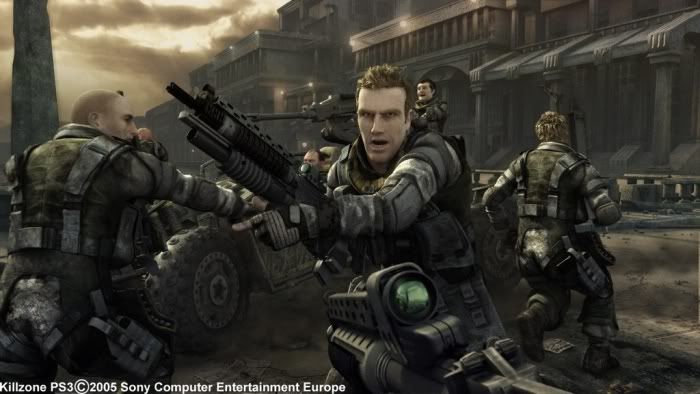
Moreover, the colour scheme is far improved over the previous game (messy, uninspired) and really making it look like a film with a strong pallette. It also has enough colour to keep the eye engaged, stop it from looking completely grey, and emphasizing the evil of helghast (red) and good of the humans (greens/blues) - let alone allowing their lighting to pick up on these accents - with orange skys, red lens glare...etc
http://i28.tinypic.com/dvonir.gif
Last edited by a moderator:
I agree. Does anyone remember those space lego sets from their childhoods? They came with red and green transparent blocks that functioned as lights and made everything look so much cooler. The use of color here reminded me of that very strongly, and it really clicked with me ... ( ).
).I agree. Does anyone remember those space lego sets from their childhoods? They came with red and green transparent blocks that functioned as lights and made everything look so much cooler. The use of color here reminded me of that very strongly, and it really clicked with me ... (
Can't believe people want it to be completely grey. lol Do they not know anything about modern cinematography??
A journalist's impression
http://www.neogaf.com/forum/showpost.php?p=11095510&postcount=2011
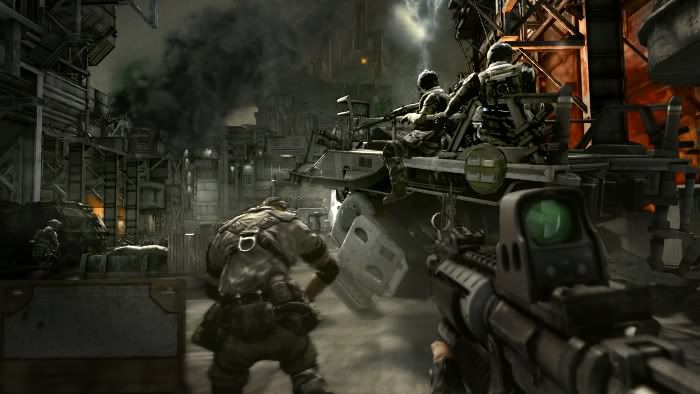
The smoke swirl (turbulence) was in previous trailers too. It's one of my favorite effects in KZ2.
EDIT:
Someone asked what happened to the dynamic light for muzzle fire. Apparently, they are still there.
http://www.neogaf.com/forum/showpost.php?p=11095510&postcount=2011
And when I blowed that bridge with the rocket launcher... WOW. I could see it crumble piece by piece and the dust filling the area, with sun rays raining diagonally through it. It was so realistic in its volumetric authenticity I almost coughed. But apparently that was not enough spectacle for Guerrilla. While the dust was still settling, a flying vehicle came from behind me and went right through it leaving spiralling whirlpools of dust in its trail. That was seriously awesome and a pity most players didn't notice as they where looking in a different direction when that happened.
The smoke swirl (turbulence) was in previous trailers too. It's one of my favorite effects in KZ2.
EDIT:
Someone asked what happened to the dynamic light for muzzle fire. Apparently, they are still there.
Another detail. Real time shadows. Impressive. Not pixellated anymore and are EVERYWHERE. You see an Helghast shooting from 100 meters ahead? Look closer and u'll notice the muzzle flash sending blinks of his very shadow on the wall behind him. This happens both in dark sections and in light ones. Obviously shadows look more or less dark accordingly.
Last edited by a moderator:
Similar threads
- Replies
- 55
- Views
- 8K
- Replies
- 126
- Views
- 47K