Install the app
How to install the app on iOS
Follow along with the video below to see how to install our site as a web app on your home screen.
Note: This feature may not be available in some browsers.
You are using an out of date browser. It may not display this or other websites correctly.
You should upgrade or use an alternative browser.
You should upgrade or use an alternative browser.
Gears of War 3: Brofisting to the End
- Thread starter Proelite
- Start date
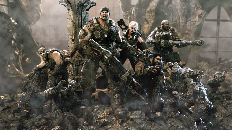
Marcus arm looks weird in the middle shot.
Seems to be way out of proportion with his head - his shoulder looks huge! But I think it's just something to do with the outfit - the chicks arm looks a bit funny as well.
the first one is a clear BULL ...Theres no way a game on console would look that SHINY
the 2nd and third --could be real??? but again this is EPIC games ---KING OF BULLSHOTS SPROUTER
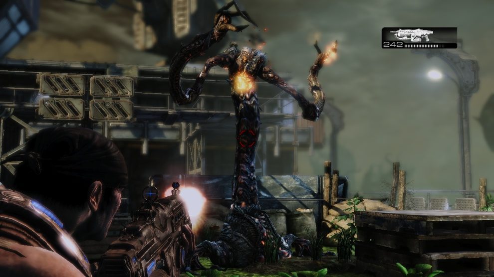
Nothing seems outrageous about the first shot. There's some aliasing but the depth of field looks very high quality and there's some nice high resolution bloom. I've always liked the way bloom looks in UE3 titles -sharp and striking. Ground textures in the third shot look a bit flat but not a big deal.
It's probably a perspective thing, with his shoulder/elbow appearing larger since they're closer towards the camera...I hope. Else his body proportions are quite grotesque.Seems to be way out of proportion with his head - his shoulder looks huge!
L. Scofield
Veteran
ALL COMPANIES are infamous for releasing highly supersampled bullshots.
That's better.
Some actual bullshots:
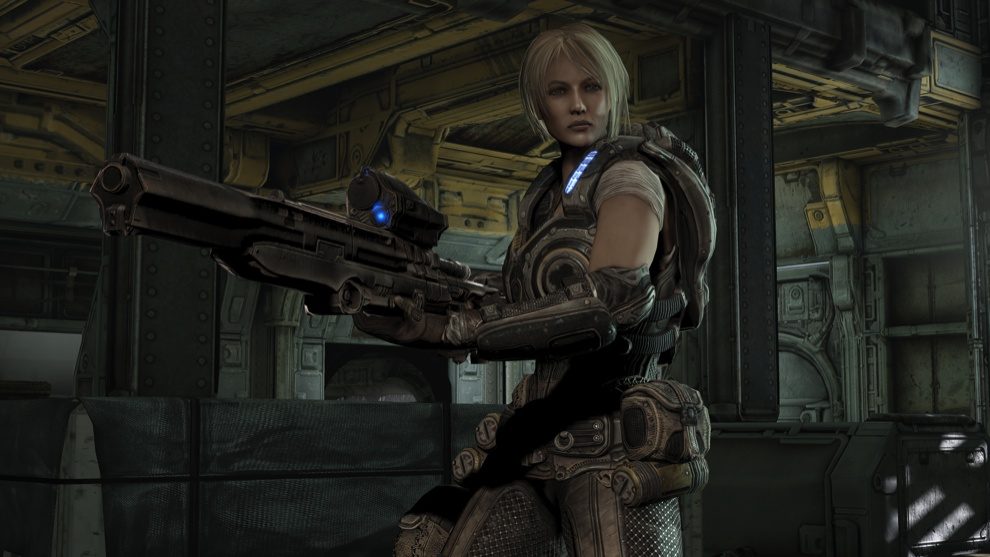
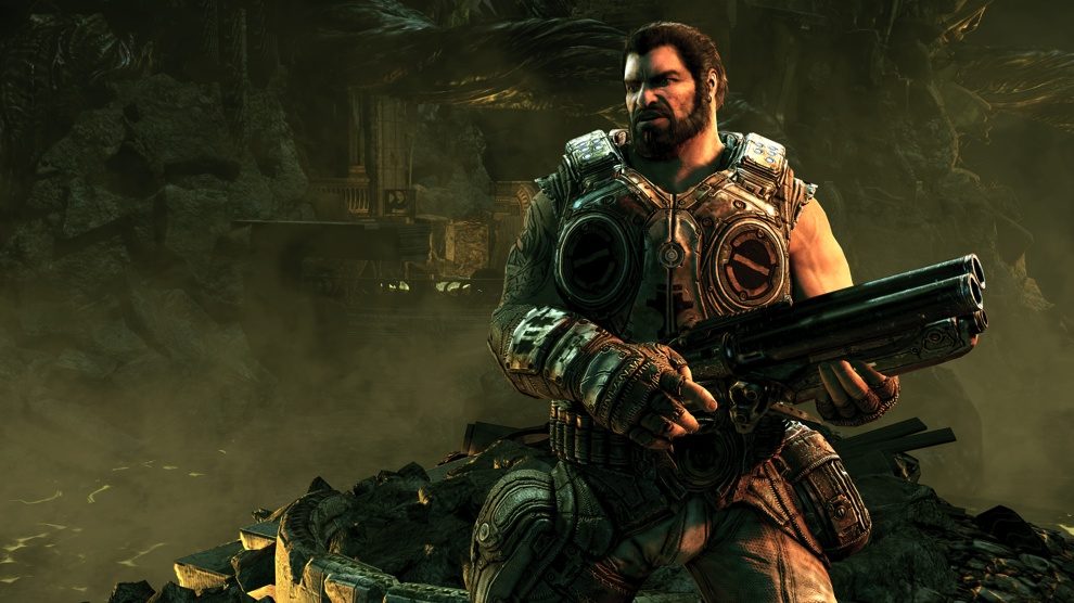
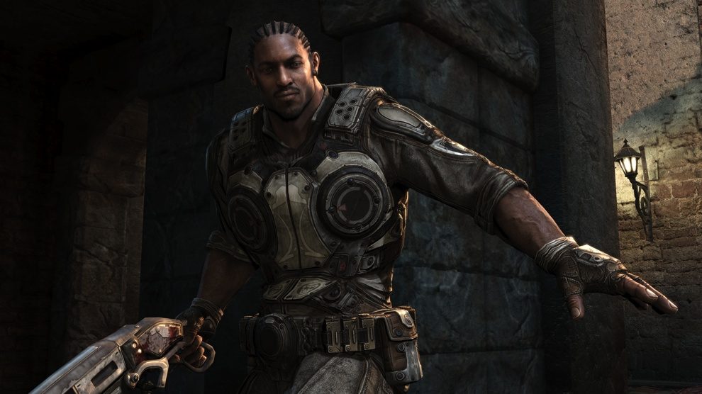
The 2nd pic reminds me of her:
http://farm5.static.flickr.com/4006/4449231084_6ec0ba24d8.jpg
http://ny-image3.etsy.com/ialcr_fullxfull.93483.jpg
Moms are tough


The 2nd pic reminds me of her:
http://farm5.static.flickr.com/4006/4449231084_6ec0ba24d8.jpg
http://ny-image3.etsy.com/ialcr_fullxfull.93483.jpg
Moms are tough
dragonelite
Veteran
Some actual bullshots:
*pictures*
The 2nd pic reminds me of her:
http://farm5.static.flickr.com/4006/4449231084_6ec0ba24d8.jpg
http://ny-image3.etsy.com/ialcr_fullxfull.93483.jpg
Moms are tough
What has been seen can't be unseen
Aint that from FF 13 saw it at the gaf thread
Edit:found this link goes rather deep into gears 3 changes
http://www.gamesradar.com/xbox360/g...0100521134719898075/g-2010040917122084089/p-2
Some new pictures


And maybe interesting changes in Unreal engine lighting.
http://www.laurenscorijn.com/udk-comparision.html
Last edited by a moderator:
We’re also impressed by the spacey feel of the environments; a return to the more sandboxy missions of the original Gears, rather than the linear, funnelled feeling of the set-piece loving sequel.
That's cool, if it pans out, because I definitely felt Gears 2 campaign was a significant step back from 1, for similar reasons.
I believe I read secondhand somewhere, maybe here, that Epic said only 60% finished Gears 2 campaign (presumably, lower than for Gears 1). Have to consider that as a bit of vindication for my opinion all along
Last edited by a moderator:
I want a night time level/map that creeps me like Bullet Marsh (Gears 1) God damnit !
Enough of bright sunny days.
Enough of bright sunny days.
Billy Idol
Legend
yeah, looks good!
Maybe this time 4 player online coop?!?!?
Would be sensational!
Maybe this time 4 player online coop?!?!?
Would be sensational!
4 player co-op is almost confirmed.
dragonelite
Veteran
4 player co-op is almost confirmed.
Is confirmed already, not sure if it also works with splitscreen.
They said something along the lines that player 1 starts with marcus looking for dom when found player 2 can start playing as dom and something similar for anya and jayce.
Marcus arm looks weird in the middle shot.
The entire back area is a very though job when skinning characters. In reality you have a bone (the scapula) sliding all around the back of the rib cage, because it's only attached to the clavicle bone and the other end is anchored by muscles only. It is impossible to properly reproduce the deformations of this area with simple bone matrix skinning, you'd require full scale muscle simulation which is just not going to happen in games for many more years. We also have a hard time with it in our cinematics work.
So the short explanation is that yeah, it's not easy to make it look not weird
Billy Idol
Legend
These seem to be ingame shots.
The aliasing do kinda pop up against the rest of the frame.
Or epic decided to become less consistent with bullshots.
This somehow reminds me of GOW3 graphics!
When you rip someone with Kratos, you get a close up and then you get this sort of sensational DOF effect, similar to the one in this screen, making the scene almost real!!
EDIT: here is for instance a GOW3 shot:

So this should be entire possible and I would love to see this tech in GeOW3!
Last edited by a moderator:
Well Gears of war 2 had fake DOF effect, not sure if this one has real DOF.
Billy Idol
Legend
Looking again at the new pictures...I have the feeling that something is wrong with the color of the vegetation...it seems to be too green, or so.
Maybe I am just a little bit untrained to these flashy colors in my Gears...
Maybe I am just a little bit untrained to these flashy colors in my Gears...
Every game uses fake DOF as they're just blurring the existing image instead of rendering it via proper lens shaders...
Well..I should've been more specific....The DOF blur in Gears 2 happens in only two ways, its either a blurring off every object in distant when aiming at a nearby object (& none of the nearby objects are blurred, even if they are not even close to the aim reticule) and vice versa.
I feel that this is largely different from the dynamic DOF seen in Crysis,UC2 & Metro 2033 (PC) where the whole scene is blurred but only the specific area which is in focus is visible clearly.
Similar threads
- Replies
- 90
- Views
- 18K
- Replies
- 1
- Views
- 4K
- Replies
- 131
- Views
- 16K
