Shadow of the Colossus (Remake 2018) [PS4]

We are saying the same thing.
I dont see how the artist would have achieved the first image in the 80s :p
If the same artist wants to remake his 80s art using current methods it is inevitable that it will have different rendering and visualization.
This is exactly why I said, that if you want to have the same result then you have a remaster.
This is why I said that by the time you try to adapt the game to current technologies (aka Remake) it is inevitable it will have differences.


To be honest I didn't even realize the sky was different color. To me it looks grey and the newer version is like looking at the same cloudy sky just with a filter.

Regarding plants the PS2 couldnt push anything beyond dead looking, taking into consideration how taxing the whole project was in general :p
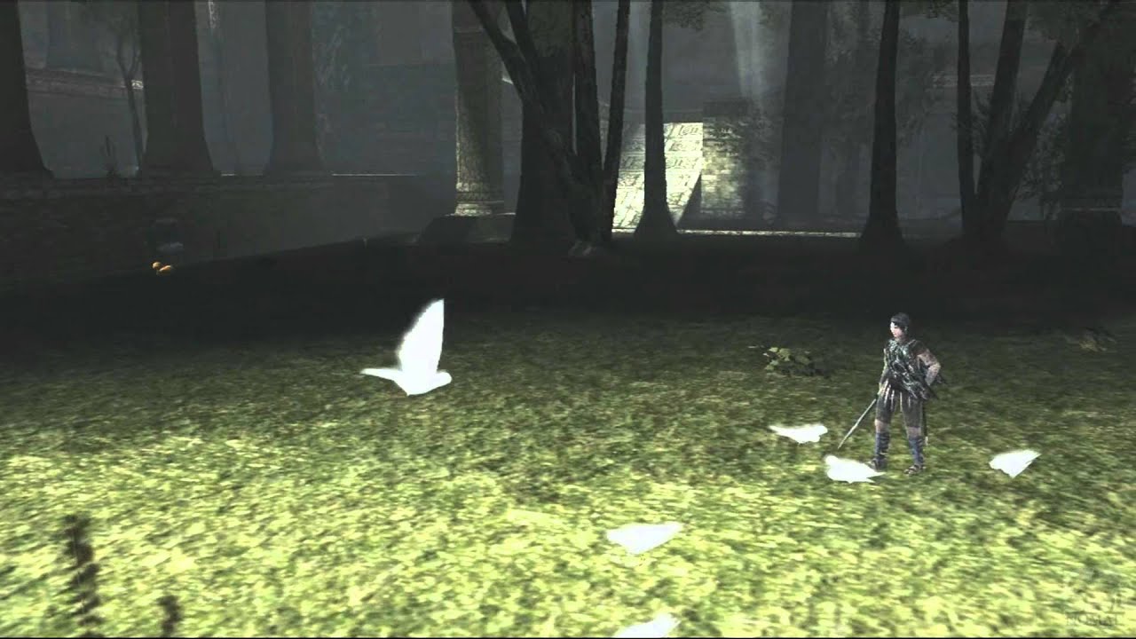
shadow-2Bof-2Bcollosus-2Bps2-2Bgameplay.jpg

k10-2b.jpg

maxresdefault.jpg

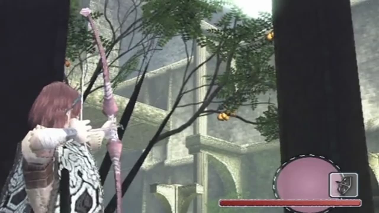
Shadow_of_Colossus_Fruit_Tree_Screenshot.jpg
Low fidelity Ueda style:
Shadow_of_Colossus_Fruit_Tree_Screenshot.jpg


High fidelity Ueda style:

7XNuVZ.jpeg
 
It does not look that dramatic anymore but before there was too much bloom in many situations where one can hardly see any details. Under such conditions one does not even need to talk about HDR.

Above all, bloom serves to simulate the brightness which screens can not display. Bloom should reduced enormously under HDR otherwise it's a fail HDR implementation if the intensity of bloom is the same in SDR and HDR.
 
Last edited:
The appearance of the game is essential to its feeling. Imagine Cuphead as an Unreal Engine 2.5D game. To keep the feeling of the game, you need the same aesthetic cues, or at least complimentary ones. I wouldn't say the new version is soulless, but it is different. For me, all I want from this discussion is those who like the new game to at least acknowledge it's different artistically, and then to say they don't care. ;) I ended up commenting because a reference was made from Eurogamer saying its very faithful artistically, but there are plenty of unnecessary changes to the art style. It's kinda faithful artistically, not very faithful. And for some, the changes are significant enough that the game has lost its aesthetic. Those complainants aren't wrong and I respect their viewpoint and see how they can feel that way.

Some slight filter change aren't enough to denature a game aesthetic in my opinion. But i guess it's a matter of point of view.
 
Low fidelity Ueda style:
Shadow_of_Colossus_Fruit_Tree_Screenshot.jpg


High fidelity Ueda style:

7XNuVZ.jpeg
Only difference The Last Guardian looks visually outdated in many respects for a PS4 game, whereas SOTC does not.
Also
That doesnt look like a dead forest unlike the PS2 version of SOTC
 
We are comparing images here. Apparently the remake at locked 60fps is quite special in motion according to Digital Foundry.

A videogame is not a static artbook. It's meant to be played.
 
It does not look that dramatic anymore but before there was too much bloom in many situations where one can hardly see any details. Under such conditions one does not even need to talk about HDR.

Above all, bloom serves to simulate the brightness which screens can not display. Bloom should reduced enormously under HDR otherwise it's a fail HDR implementation if the intensity of bloom is the same in SDR and HDR.
The PS4 version still has overexposed lighting, what's lacking is the bloom to soften the image.

Only difference The Last Guardian looks visually outdated in many respects for a PS4 game, whereas SOTC does not.
Also
That doesnt look like a dead forest unlike the PS2 version of SOTC
This version doesn't even use SSS for characters so it's actually inferior to a PS3 game.

As for the forest, I don't get your point.
 
This version doesn't even use SSS for characters so it's actually inferior to a PS3 game.

As for the forest, I don't get your point.
SSS wasn't standard for PS3 games. Also, SSS on characters was never an existing effect in ICO or SOTC. So I guess thats ok?
But yes. You posted a game which is faithfully artistically to Ueda's style yet visually looks outdated and lacks the overall graphical fidelity you would expect from AAA titles.

So you either have the option to
a) cut back visuals to retain the minimalistic aesthetics of older gen games and disappoint in the fidelity/immersion front (basically make it almost the same as the remaster which we got already)
OR
b) push the envelope as far as you can for maximum immersion while trying to be as faithful to the original reference as possible, and inevitably lose some of the original aesthetics (basically make a remake instead of a remaster)

We got both in the form of Remaster and Remake. Which is freakin awesome if you ask me.

edit: I mean... it is not like the remake tried to be realistic. Characters look like this:
image1-jpg.2442


Not like this:

gallery-1447066631-gaming-rise-of-the-tomb-raider-screenshot-07.jpg
 
Last edited:
The PS4 version still has overexposed lighting, what's lacking is the bloom to soften the image.
Oh and that. Persistent bloom and blurr makes sense as a compensation for the lack of detail. It is a good way to hide the tricks and blend all the elements of the image together otherwise, they would have been broken. The original game was full of impostors and aggressive LOD. That combined with the PS2's weaknesses in texture detail, resolution, anti aliasing etc, made persistent bloom an ideal solution. Wherever bloom could not be excused, fog and blur made up for it.

When you have lots of detail around, persistent bloom just makes your whole effort on highly detailed assets a waste of resources. The developers most likely saw the function and purpose of bloom in the original and decided that they did not want to hide their work from the player.
 
It does not look that dramatic anymore but before there was too much bloom in many situations where one can hardly see any details. Under such conditions one does not even need to talk about HDR.

Above all, bloom serves to simulate the brightness which screens can not display. Bloom should reduced enormously under HDR otherwise it's a fail HDR implementation if the intensity of bloom is the same in SDR and HDR.
I think Ueda went past just trying to simulate bloom and into using it for a ghostly effect. It's completely overdone vs other games of the time. Look at the birds in Nesh's picture - they're are whited out in total contrast to the illumination of the rest of the scene. So I'm pretty sure Ueda used white-out deliberately for style reasons - it's part of the aesthetic. Artistis do that sometimes. They try something, perhaps from a limitation, find they like it, and use it deliberately.

That doesnt look like a dead forest unlike the PS2 version of SOTC
OCASM's reference was look, not foliage. Last Guardian's a different world that's obviously lush. The lighting is low contrast and lots of white-out again. In short, all his games are deliberately 'over exposed' in places. That's a deliberate art choice and not a technical limitation.

We are comparing images here. Apparently the remake at locked 60fps is quite special in motion according to Digital Foundry. A videogame is not a static artbook. It's meant to be played.
That's totally tangential to the conversation and by-passing every single point made to just to state an obvious truism! Does it playing at 60 fps instead of looking at screenshots suddenly make the sky purple, the highlights overexposed, and the contrast reduced?? If not, it doesn't change the fact that the art style has changed somewhat. By all means say you prefer it, but the old art style could have just as easily been 60 fps, so the framerate has nothing to do with it. ;)

When you have lots of detail around, persistent bloom just makes your whole effort on highly detailed assets a waste of resources. The developers most likely saw the function and purpose of bloom in the original and decided that they did not want to hide their work from the player.
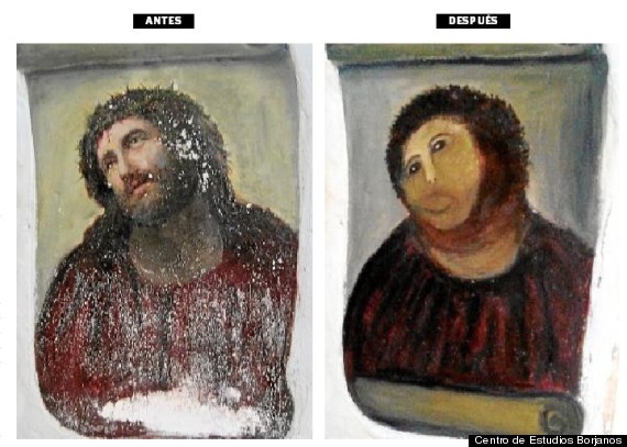
Yes. And in doing so, BP looking at the function, they lost the aesthetic impact. The bloom is one of the contributory factors that makes PS2 SOTC seem more ghostly. The new games does not look at all ghostly. It's like an art restorer looking at some smears the artist put on their painting, deciding they were a mistake of the medium because the binding agents weren't very good back then, and 'correcting' the art with modern paints. If you don't care for the original art, you'd applaud the restorer for making the art the artist couldn't make. Yet if you loved the original, you'd abhor their corruption of an artwork that was perfect with all its faults and limitations.

If you agree the look is different, because of technical changes, then that means we can go back to the first statement , "Eurogamer says it's very faithful," and retract that. "Actually, it could have been more faithful. They could have kept the somewhat ethereal aspects instead of making the world more conventional." People could then say sorry to OCASM for suggesting he was bonkers in seeing something they didn't, and go find something else to argue about. ;)
 
Oh and that. Persistent bloom and blurr makes sense as a compensation for the lack of detail. It is a good way to hide the tricks and blend all the elements of the image together otherwise, they would have been broken. The original game was full of impostors and aggressive LOD. That combined with the PS2's weaknesses in texture detail, resolution, anti aliasing etc, made persistent bloom an ideal solution. Wherever bloom could not be excused, fog and blur made up for it.

When you have lots of detail around, persistent bloom just makes your whole effort on highly detailed assets a waste of resources. The developers most likely saw the function and purpose of bloom in the original and decided that they did not want to hide their work from the player.

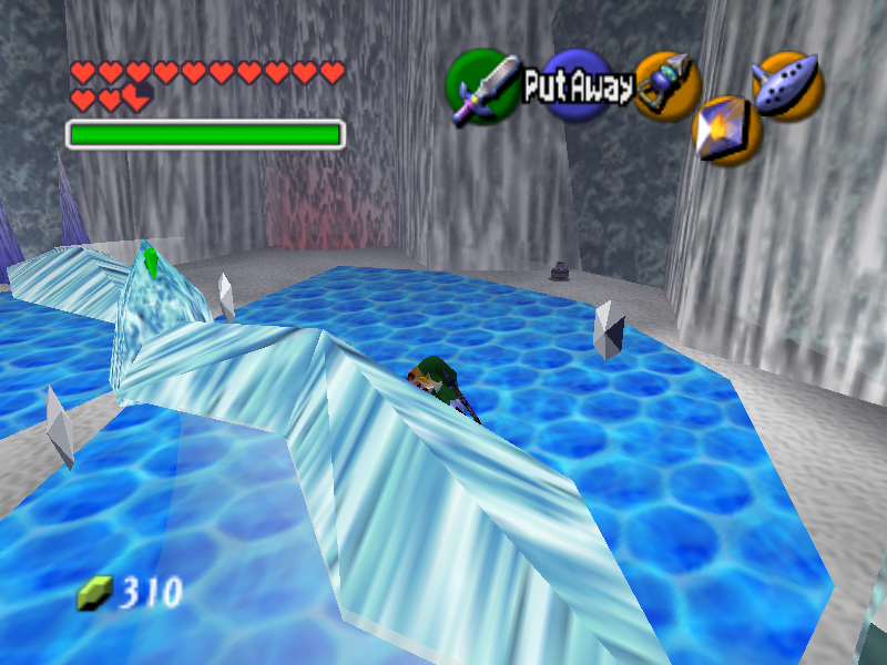
Exactly. If some tricks or artistic choices are fine according to some hardware limitations, that doesn't mean the same artistic choices would look good with much more detailed graphics...

9_Ice11_Large.jpg


These simple colors choices to represent ice looks ok here, but a more advanced engine + more details would necessarily imply much more nuances, etc.
 
Last edited:
Except these very same artistic choices did look just fine in The Last Guardian. An Ueda-as-hell looking game running on modern hardware.
I still think the remaster looks beautiful, but I'm not fundamentally disagreeing with Ocasm either.
Maybe in a screenshot but in motion the results are less spectacular IMO. I have being a bit disappointed I might say.

Bluepoint have chosen the right approach by not forgetting it's a videogame meant to be played with a controller, hence their artistic decisions and they have even given many choices to the players with their filters and Pro modes.
 
OCASM's reference was look, not foliage. Last Guardian's a different world that's obviously lush. The lighting is low contrast and lots of white-out again. In short, all his games are deliberately 'over exposed' in places. That's a deliberate art choice and not a technical limitation.

I said it looks outdated though. Probably deliberately, The Last Guardian wasn't particularly praised for it's graphics but AI and animation.
Graphics worked and didn't work in places. Even the bloom had a less positive effect compared to ICO and Shadow of the Colossus. It worked perfectly for the original Shadow of the Colossus though. Whereas Shadow of the Colossus stood out technically and artistically, The Last Guardian stood out artistically but visually it received mixed impressions.

So we see that Ueda's approach was not working as well as it used to because it feels like an addition that adds and takes, whereas in the past it only added.

And there is a chance that the art WAS affected by the technical limitations. On the PS3, based on interviews, The Last Guardian appeared to be a very taxing and complicated work. On the PS4 it was handled almost like a remaster and carries many of the inconsistencies that were expected from the PS3's limitations.

The Shadow of the Colossus had a different aim obviously. Exploit the available performance as much as possible.

Yes. And in doing so, BP looking at the function, they lost the aesthetic impact. The bloom is one of the contributory factors that makes PS2 SOTC seem more ghostly. The new games does not look at all ghostly. It's like an art restorer looking at some smears the artist put on their painting, deciding they were a mistake of the medium because the binding agents weren't very good back then, and 'correcting' the art with modern paints. If you don't care for the original art, you'd applaud the restorer for making the art the artist couldn't make. Yet if you loved the original, you'd abhor their corruption of an artwork that was perfect with all its faults and limitations.

If you agree the look is different, because of technical changes, then that means we can go back to the first statement , "Eurogamer says it's very faithful," and retract that. "Actually, it could have been more faithful. They could have kept the somewhat ethereal aspects instead of making the world more conventional." People could then say sorry to OCASM for suggesting he was bonkers in seeing something they didn't, and go find something else to argue about. ;)

To be honestEurogamer didnt say that per word. To be more accurate they said
". In addition, a new lighting engine further enhances this atmosphere while exhibiting its own flavour. There are tweaks and changes to the lighting throughout, but it retains the basic design language so evident in the original artwork,"

"What's great about the new artwork is how closely it maintains the look and feel of a Team Ico game - the added resolution means it resembles The Last Guardian more than Shadow of the Colossus, of course, but it feels just right in this game world."
 
People could then say sorry to OCASM for suggesting he was bonkers in seeing something they didn't, and go find something else to argue about. ;)
OCASM, and many others, had an opinion (the new look makes the game less atmospheric), which we respect. I, and many others, had an opinion (the new look made the game more atmospheric), which was not respected as OCASM tried to pass his opinion as fact, which is not right.

Nobody ever said that the game doesn't look different, of course it does. The question was whether we thought it makes the game look more or less atmospheric/immersive/whatever. We shared our opinion, OCASM went off on one about his opinion being fact.

No apologies needed from my side, at least.

The end.
 
Last edited:
So we see that Ueda's approach was not working as well as it used to because it feels like an addition that adds and takes, whereas in the past it only added.
The Last Guardian isn't 'the Ueda look'. It was a game hampered by legacy design decisions. The choice isn't between 'The Last Guardian' or 'SOTC PS4' - there are other options in between.PS4 SOTC could be the same engine in use only with a different colour palette and a bit of lens-vaseline and bloom to make it more ethereal.

To be honestEurogamer didnt say that per word. To be more accurate they said...
Well, it was cited as an argument that the new game was 'very faithful', in contrast to OCASM's point that it wasn't, leading to OCASM and myself pointing out that the art style is quite different.

OCASM - the game is artistically different.
Everyone else - no it isn't.
Me - hmm, actually it kinda is
;)
OCASM had an opinion (the new look makes the game less atmospheric), which we respect. I had an opinion (the new look made the game more atmospheric), which was not respected as OCASM tried to pass his opinion as fact, which is not right.
Nope. You've lost track; that was more the argument earlier in the thread, where OCASM said the new game had lost the atmosphere of the original. This current line of discussion stems from here.

ultragpu wondered if the remake is what Ueda originally intended. OCASM said probably not as it deviates from the original art style. Nesh said the game is very faithful artistically acforing to EG (which they never actually said!). OCASM pointed to 'factual points' that show the art style deviates.

- Soft, low contrast look VS harsh, high contrast look
- Carefully selected color palette VS generic "cinematic" look
- Muted colors VS saturated colors
- Alien sunless sky VS generic HDRI skybox
- Barren decaying land VS lush vegetation everywhere
- Bloom everywhere VS bloom nowhere

Some of that is a little hyperbolic (barren decaying land - there are aspects to SOTC PS2 that were more green), but it's mostly true observations about the differences.
Other's then said that's his opinion, but an observation of measurable differences (purple sky!!) aren't opinion.

Nobody ever said that the game doesn't look different, of course it does.
OCASM pointed out things that are different, and the response was a dismissive 'that's your opinion' instead of nodding and saying, "Yes, you're right, the game does differ those ways, but we like it and like the atmosphere. It's still grandiose and the HDR works really well."
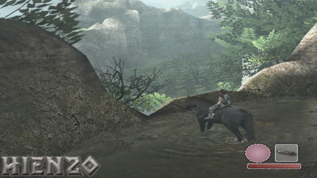
 
SSS wasn't standard for PS3 games. Also, SSS on characters was never an existing effect in ICO or SOTC. So I guess thats ok?
But yes. You posted a game which is faithfully artistically to Ueda's style yet visually looks outdated and lacks the overall graphical fidelity you would expect from AAA titles.

So you either have the option to
a) cut back visuals to retain the minimalistic aesthetics of older gen games and disappoint in the fidelity/immersion front (basically make it almost the same as the remaster which we got already)
OR
b) push the envelope as far as you can for maximum immersion while trying to be as faithful to the original reference as possible, and inevitably lose some of the original aesthetics (basically make a remake instead of a remaster)

We got both in the form of Remaster and Remake. Which is freakin awesome if you ask me.

edit: I mean... it is not like the remake tried to be realistic. Characters look like this:
image1-jpg.2442


Not like this:

gallery-1447066631-gaming-rise-of-the-tomb-raider-screenshot-07.jpg
Basic SSS is PS3-level tech. Even some PS2 games used the half-lambert trick to somewhat mimick it. This remake doesn't even do that.

Now, the idea that somehow Ueda's style clashes with high-end graphics is complete bullshit. Here's TLG's CG trailer, which surpasses any game in existence in terms of surface detail and rendering quality:


Oh look, Ueda's style was kept intact!

As for the characters, I doubt BP's intent was to make them look like plastic dolls.

Oh and that. Persistent bloom and blurr makes sense as a compensation for the lack of detail. It is a good way to hide the tricks and blend all the elements of the image together otherwise, they would have been broken. The original game was full of impostors and aggressive LOD. That combined with the PS2's weaknesses in texture detail, resolution, anti aliasing etc, made persistent bloom an ideal solution. Wherever bloom could not be excused, fog and blur made up for it.

When you have lots of detail around, persistent bloom just makes your whole effort on highly detailed assets a waste of resources. The developers most likely saw the function and purpose of bloom in the original and decided that they did not want to hide their work from the player.
I already demonstrated that the fog and the bloom are in fact stylistic choices, not hacks to hide technical defficiencies. You can see the same thing in films: some directors choose to minimize bloom and others make great use of it like Spielberg, for example. Fog also serves to give depth to a scene, hence why Hollywood loves to put fog everywhere, even indoors.

The rationale you propose as to why BP got rid of both, however, makes perfect sense. BP is a team of technical people, not artists. Their goal was to maximize detail, not maintain the aesthetics. That's also why shadows are razor sharp even though that makes no sense with an overcast sky. Or why rocks have a smooth specular shine that gives them a fake, plastic look. They just don't have the eye for these things nor do they seem care about them.


To be honestEurogamer didnt say that per word. To be more accurate they said
". In addition, a new lighting engine further enhances this atmosphere while exhibiting its own flavour. There are tweaks and changes to the lighting throughout, but it retains the basic design language so evident in the original artwork,"

"What's great about the new artwork is how closely it maintains the look and feel of a Team Ico game - the added resolution means it resembles The Last Guardian more than Shadow of the Colossus, of course, but it feels just right in this game world."
Which is complete bullshit. Just from soft to hard lighting/shadows is a massive difference in terms of look. Getting rid of the bloom is another. Switching to a monocromathic, mostly yellow, color palette is yet another one. And so on...

OCASM, and many others, had an opinion (the new look makes the game less atmospheric), which we respect. I, and many others, had an opinion (the new look made the game more atmospheric), which was not respected as OCASM tried to pass his opinion as fact, which is not right.

Nobody ever said that the game doesn't look different, of course it does. The question was whether we thought it makes the game look more or less atmospheric/immersive/whatever. We shared our opinion, OCASM went off on one about his opinion being fact.

No apologies needed from my side, at least.

The end.
Nice revisionism there.

Actually what OCASM said was: “Like an UE4 fan remake.“
Yes, in that the technology is upgraded to modern standards but the aesthetics are not given much attention, if any at all.
 
Actually what OCASM said was: “Like an UE4 fan remake.“
In June 13th 2017 he expressed an opinion about how he felt about the change in aesthetic. On 31st January 2018 he presented a list of points on what was artistically different to counter the assertion that the game was 'artistically faithful'. You're arguing over the current line of reasoning based on something said six months ago?!
:???::eek::-|
That's just dumb.
 
Oh look, Ueda's style was kept intact!
To be fair, that's slightly muddled. The scenery is much more like PS4 SOTC than PS2 ICO. The bloom is toned down, and the protagonist is more cel shaded. But we do have low contrast and exaggerated whites. I don't think it's so much 'Ueda style' as 'SOTC style' that's important (for those lamenting the new look).
 
Last edited:
Back
Top