
You are using an out of date browser. It may not display this or other websites correctly.
You should upgrade or use an alternative browser.
You should upgrade or use an alternative browser.
Shadow of the Colossus (Remake 2018) [PS4]
- Thread starter OCASM
- Start date
We get it! You no likey! Move on!
No, that's a list of facts. An opinion would be whether you like the changes or not.that's your opinion and that's fine.
Personally i think it's better in every way and i can't wait to replay it and enjoy it even more than the original thanks to all these improvements.
I get it! You disagree with me! Move on!We get it! You no likey! Move on!
No, that's a list of facts. An opinion would be whether you like the changes or not.
I get it! You disagree with me! Move on!
You’re the one who keeps going on about opinions being facts.
Lets see:
- Soft, low contrast look VS harsh, high contrast look
- Carefully selected color palette VS generic "cinematic" look
- Muted colors VS saturated colors
- Alien sunless sky VS generic HDRI skybox
- Barren decaying land VS lush vegetation everywhere
- Bloom everywhere VS bloom nowhere
Yep, totally faithful to the original.
None of the "changes" changed the artistic look and atmosphere of the game. They are all controlled to the desired point
Some of your points are not elaborated or are either results going from very limited capabilities to more capable hardware.
What does "Carefully selected color palette VS generic "cinematic" look" even mean?
Other points are based on the previous discussions not on what the game finally delivered.
Because the game has implemented new elements that make up for the old effects such as HDR replacing generic bloom (not talking about the higher color range) and volumetric lights.
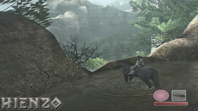
Also the so called "barren decaying land" was filled with grass, rocky places, desert places, and some areas with lots of flora in the original. Decaying in terms of what? The game still retains all locations with the difference that areas where the developers replicated grass with just a flat green texture on the ground, they are now doing it with actual weed and grass.
The land is still decaying and abandoned. And this does not necessarily mean zero flora. Weed can grow everywhere.
The art is overall the same. The locations follow the same layouts and the same looks. Characters, objects and the colossi are faithfully to the original.
Color palette still follows the original as a guideline.
edit: Perhaps, maybe if they had that bloom effect everywhere, it would have been closer to what you want?
Last edited:
I have to agree with OCASM here. Artistically, it's different. That may be because of technical limits forcing the artistic look on PS2, and people may prefer the new look, but it does look different. The original was more dead and ghostly and weird. Purple skies and dead plant life and low saturation and vaseline on the virtual camera lens. OCASM's points are exaggerated which undermines his argument, but the points seem valid to me.


I guess at this point, it comes down to one's definition of 'very faithful artistically', but for me, the images on the left have a different artistic quality to those on the right. That's a question for Arts majors rather than computer scientists.")
I guess at this point, it comes down to one's definition of 'very faithful artistically', but for me, the images on the left have a different artistic quality to those on the right. That's a question for Arts majors rather than computer scientists.
I am pretty sure what you see as "artistic approach" was dictated by the hardware limitations and the low resolution. And usually what happens is that our minds fill the gaps. Imagination is the best artist and nothing can beat that artist. By the time the human artist tries to fill the gaps with visible detail, it breaks the illusion. They didnt do anything that was not expected to see in the virtual world, going from low fidelity to high.I have to agree with OCASM here. Artistically, it's different. That may be because of technical limits forcing the artistic look on PS2, and people may prefer the new look, but it does look different. The original was more dead and ghostly and weird. Purple skies and dead plant life and low saturation and vaseline on the virtual camera lens. OCASM's points are exaggerated which undermines his argument, but the points seem valid to me.
View attachment 2442 View attachment 2443 View attachment 2444
I guess at this point, it comes down to one's definition of 'very faithful artistically', but for me, the images on the left have a different artistic quality to those on the right. That's a question for Arts majors rather than computer scientists.
That still makes it artistically different. If Leonardo DaVinci only had charcoal to create the Mona Lisa, it'd be artistically different. If you wanted a MGS game on a ZX Spectrum, it'd be artistically different to MGSV. You'd pick art that works best with your material limitations.I am pretty sure what you see as "artistic approach" was dictated by the hardware limitations and the low resolution.
https://kotaku.com/5601850/22-high-caliber-demakes-of-modern-favorites/
Ignoring my imagination, look at the images posted. The colours are different. They are muted on the PS2. The contrast is different, with the PS2 having blown out highlights. That may because they wanted HDR but it was impossible so made a hacky simulation, but the end result in terms of pixels (and mathematically looking at histograms) is different. The vegetation in the second shot is all short. That may be because they wanted lush vegetation but couldn't, but regardless of the reasons, the look is different, with the PS2 land barely able to support even grass, whereas PS4 is verdant and could support lots of happy bunnies and playful deer. In the last pic, the sky is purple! Unless I'm imagining that... The choice to not go with a purple sky on PS4 is artistic, no? And the vegetation in that last pic, you've got big, healthy green grasses on the PS4 and blackened, rather dead looking bush things on PS2.And usually what happens is that our minds fill the gaps. Imagination is the best artist and nothing can beat that artist. By the time the human artist tries to fill the gaps with visible detail, it breaks the illusion. They didnt do anything that was not expected to see in the virtual world, going from low fidelity to high.
People are free to prefer the new look, sure. And, again, the choices on PS2 may have been forced (except the purple sky - I doubt PS2 was incapable of rendering a grey sky) from technical limits. But they do look different.
Don't know how anyone can genuinely say they look the same with the same atmosphere where PS2 clearly is 'deader' than PS4.Metal_Spirit
Regular
I have to agree with OCASM here. Artistically, it's different. That may be because of technical limits forcing the artistic look on PS2, and people may prefer the new look, but it does look different. The original was more dead and ghostly and weird. Purple skies and dead plant life and low saturation and vaseline on the virtual camera lens. OCASM's points are exaggerated which undermines his argument, but the points seem valid to me.
View attachment 2442 View attachment 2443 View attachment 2444
I guess at this point, it comes down to one's definition of 'very faithful artistically', but for me, the images on the left have a different artistic quality to those on the right. That's a question for Arts majors rather than computer scientists.
Not disagreeing with you, you cannot forget that what you see on PS2 may not be artistical decisions at all, but just limitations on the hardware!
Regardless, the end result is indeed artistically different! But the current version can well be the original vision, just not possible to obtain at the time.
But yes... you are correct... they are indeed diferent, and radical color changes cannot be explained with hardware.
Just remember this is not a remaster... its a remake!
That still makes it artistically different. If Leonardo DaVinci only had charcoal to create the Mona Lisa, it'd be artistically different. If you wanted a MGS game on a ZX Spectrum, it'd be artistically different to MGSV. You'd pick art that works best with your material limitations.
https://kotaku.com/5601850/22-high-caliber-demakes-of-modern-favorites/
Ignoring my imagination, look at the images posted. The colours are different. They are muted on the PS2. The contrast is different, with the PS2 having blown out highlights. That may because they wanted HDR but it was impossible so made a hacky simulation, but the end result in terms of pixels (and mathematically looking at histograms) is different. The vegetation in the second shot is all short. That may be because they wanted lush vegetation but couldn't, but regardless of the reasons, the look is different, with the PS2 land barely able to support even grass, whereas PS4 is verdant and could support lots of happy bunnies and playful deer. In the last pic, the sky is purple! Unless I'm imagining that... The choice to not go with a purple sky on PS4 is artistic, no? And the vegetation in that last pic, you've got big, healthy green grasses on the PS4 and blackened, rather dead looking bush things on PS2.
People are free to prefer the new look, sure. And, again, the choices on PS2 may have been forced (except the purple sky - I doubt PS2 was incapable of rendering a grey sky) from technical limits. But they do look different.
But we are partially saying the same thing.
Shadow of the Colossus Remake was not conscious choice to take a different artistic expression (i.e 2D vs 3D, Stylized vs Realistic, isometric vs orthographic etc). The examples you provided are kind of irrelevant because the biggest difference is a complete overhaul of game design. Older gen games had more limitations. Going backwards means that art has to take into consideration more limitations of game design. Going forward these limitations are reduced or even vanished in some cases. So you can retain the artistic approach, and if you want even upgrade it and then add some. You can go from 2D game design to 3D design if you want. Now you can move to 3D and better 2D
See the case of Street Fighter's character Vega. He follows suit with the design and style of the original, only upgraded to the technology available. There are many differences we can spot but nothing changes the art reference. Only the art assets are changed.

But in the case of Shadow of the Colossus it is a game of same design, both 3D, same gameplay, only difference were the resources, but they had to follow the original as close as possible, and at the same time make it work for the platform it is on. Unless they had to take again the approach of the remaster and just mimic the limitations of the original hardware to retain the same looks
What you see is the original art expressed on better hardware. What we got is one of the best representations of the original we could get on current gen.
Last edited:
There's two different uses of 'art' here. The art, the style and design of the character, of Vega is the same. The art of the rendered imagine is different. Wanda, Aggro, Mono are the same designs, the same art. Yet the look and atmosphere are different.
Taking a fairly extreme example,


Same character design, same intentions, but the art is clearly a different aesthetic. I think I'd break it down into 'design' and 'art'. The designs are the same, but the rendering and final visualisation are different.
I categorically disagree that the final result is the original intention realised without technical limits though. How is the purple sky on PS2 not an artistic choice? Why are the plants dead looking on PS2 instead of green and vibrant? Those aren't technical limits.
Taking a fairly extreme example,
Same character design, same intentions, but the art is clearly a different aesthetic. I think I'd break it down into 'design' and 'art'. The designs are the same, but the rendering and final visualisation are different.
I categorically disagree that the final result is the original intention realised without technical limits though. How is the purple sky on PS2 not an artistic choice? Why are the plants dead looking on PS2 instead of green and vibrant? Those aren't technical limits.
Last edited:
Why are the plants dead looking on PS2 instead of green and vibrant?
Because it looks ok with a flat texture. But with a more sophisticated foliage as in the remake ?
Some artistic choices work better with certain hardware limitations and so on...
Last edited:
We already know what Fumito Ueda's style looks like once he's unconstrained by the PS2's limitations, there's no need to speculate:
What's that? Lots of fog and bloom? A muted color palette? A soft low contrast look most of the time? It's as if those things are conscious artistic decisions and not just hacks to make up for the lack of computational power...
------
Shadow of the Colossus' Remake on PS4 Loses the Magic in its Quest for Technical Brilliance
http://www.usgamer.net/articles/shadow-of-the-colossus-remake-ps4-analysis
-----------
But even beyond that, character animation is the area where BP really shat the bed:
https://www.resetera.com/goto/post?id=4008714#post-4008714
...
Now compared to TLG's:
https://www.resetera.com/threads/so...otc-remake-for-ps4.20217/page-12#post-4030146
Like night and day.
What's that? Lots of fog and bloom? A muted color palette? A soft low contrast look most of the time? It's as if those things are conscious artistic decisions and not just hacks to make up for the lack of computational power...
------
Shadow of the Colossus' Remake on PS4 Loses the Magic in its Quest for Technical Brilliance
The character of the world feels as if it's gone. You get the feeling that if Shadow of the Colossus were made by another studio, as it technically has been here, this is how it would look. It doesn't look like a Team Ico game anymore. It's no longer astonishing how it's able to run on a system at all. Instead of Shadow of the Colossus' world feeling alien and melancholy to the medium of video games, it now just feels like any other video game world.
http://www.usgamer.net/articles/shadow-of-the-colossus-remake-ps4-analysis
-----------
But even beyond that, character animation is the area where BP really shat the bed:
https://www.resetera.com/goto/post?id=4008714#post-4008714
...
Now compared to TLG's:
https://www.resetera.com/threads/so...otc-remake-for-ps4.20217/page-12#post-4030146
Like night and day.
We already know what Fumito Ueda's style looks like once he's unconstrained by the PS2's limitations, there's no need to speculate:
What's that? Lots of fog and bloom? A muted color palette? A soft low contrast look most of the time? It's as if those things are conscious artistic decisions and not just hacks to make up for the lack of computational power...
------
Shadow of the Colossus' Remake on PS4 Loses the Magic in its Quest for Technical Brilliance
http://www.usgamer.net/articles/shadow-of-the-colossus-remake-ps4-analysis
-----------
But even beyond that, character animation is the area where BP really shat the bed:
https://www.resetera.com/goto/post?id=4008714#post-4008714
...
Now compared to TLG's:
https://www.resetera.com/threads/so...otc-remake-for-ps4.20217/page-12#post-4030146
Like night and day.
I don't agree with us gamer but I agree for animation
We are saying the same thing.There's two different uses of 'art' here. The art, the style and design of the character, of Vega is the same. The art of the rendered imagine is different. Wanda, Aggro, Mono are the same designs, the same art. Yet the look and atmosphere are different.
Taking a fairly extreme example,
Same character design, same intentions, but the art is clearly a different aesthetic. I think I'd break it down into 'design' and 'art'. The designs are the same, but the rendering and final visualisation are different.
I dont see how the artist would have achieved the first image in the 80s
If the same artist wants to remake his 80s art using current methods it is inevitable that it will have different rendering and visualization.
This is exactly why I said, that if you want to have the same result then you have a remaster.
This is why I said that by the time you try to adapt the game to current technologies (aka Remake) it is inevitable it will have differences.
To be honest I didn't even realize the sky was different color. To me it looks grey and the newer version is like looking at the same cloudy sky just with a filter.I categorically disagree that the final result is the original intention realised without technical limits though. How is the purple sky on PS2 not an artistic choice? Why are the plants dead looking on PS2 instead of green and vibrant? Those aren't technical limits.
Regarding plants the PS2 couldnt push anything beyond dead looking, taking into consideration how taxing the whole project was in general

Actually, people change their outward appearance to complement internal changes. If you want to feel more confident, you can change your hairstyle and dress in different clothes for example. How people respond to you changes greatly based on how your dress and style your hair.The remake respects the original game. Everything doesn't need to be the same. The more important thing is to preserve the overall feeling of the game.
I mean, even if you change your clothes and your haircut, you're still the same person...
The appearance of the game is essential to its feeling. Imagine Cuphead as an Unreal Engine 2.5D game. To keep the feeling of the game, you need the same aesthetic cues, or at least complimentary ones. I wouldn't say the new version is soulless, but it is different. For me, all I want from this discussion is those who like the new game to at least acknowledge it's different artistically, and then to say they don't care.
I ended up commenting because a reference was made from Eurogamer saying its very faithful artistically, but there are plenty of unnecessary changes to the art style. It's kinda faithful artistically, not very faithful. And for some, the changes are significant enough that the game has lost its aesthetic. Those complainants aren't wrong and I respect their viewpoint and see how they can feel that way.Similar threads
- Replies
- 2
- Views
- 460
- Replies
- 21
- Views
- 6K
- Replies
- 12
- Views
- 2K
- Replies
- 50
- Views
- 10K