We could also have a max-images-per-post rule to keep the page size down. That's what GAF does in screenshot threads.Just post links to gifs ffs.
You are using an out of date browser. It may not display this or other websites correctly.
You should upgrade or use an alternative browser.
You should upgrade or use an alternative browser.
UC4: Best looking gameplay? *SPOILS*
- Thread starter RenegadeRocks
- Start date
-
- Tags
- uncharted 4
- Status
- Not open for further replies.
Let's just agree to disagree. For me UC4 is more polished than most games. UC4 has just uneven graphical quality (because the good is too good) but that is perfectly normal considering the incredible achievement of the whole package.
And I think you are here nip nicking (on UC4 flaws) and are focusing on details to make your point right. UC1 has not graphical flaws at all?
That's not content. Was there any area in UC1 where the lighting gave out and the characters were flat shaded? Or the scenery was a flat textured ground with some 2D trees billboarded on top? Or anything similar? I don't recall any graphical issues standing out in the other UCs. There were definitely 'faults' due to the hardware, but it was the same 'quality' throughout the whole campaign.
And I think you are here nip nicking (on UC4 flaws) and are focusing on details to make your point right. UC1 has not graphical flaws at all?
What game isn't? Every games could be considered unfinished by this or this criteria. Well in the end you are right obviously. I am sure we can find one criteria where UC4 is less finished than Tony Hawk's Pro Skater 5. At least Tony Hawk's Pro Skater 5 is consistently bad, right?I genuinely think UC4 is 'unfinished'. I think even after the delays, ND were told to ship a product and had to release with some incomplete solutions.
To be honest there are parts in Uncharted 4 that really break. Today for example I picked numerous occasions where the light shafts didnt look correctly. Instead they looked like flat transparent low res textures. I captured an image and I will post it if I remember tomorrow.
In general though the game is extremely polished, so areas that dont work stand out more
In general though the game is extremely polished, so areas that dont work stand out more
Last edited:
VFX_Veteran
Regular
It's good to see others sharing my opinion.. I was beginning to think I was the only conspiracy theorist.
What game isn't? Every games could be considered unfinished by this or this criteria. Well in the end you are right obviously. I am sure we can find one criteria where UC4 is less finished than Tony Hawk's Pro Skater 5. At least Tony Hawk's Pro Skater 5 is consistently bad, right?
That is precisely my point. Do i have nitpicks with Uncharted 4? Sure! But if i apply the same short of scrutiny over to other games as well it's pretty obvious i'm over analyzing. The only game i've played in recent memory that i can safely say i consider consistent across the board is The Witness(which had an 8 year dev cycle), and even that has lows and highs. If we take time to analyze every AAA game released in the past 3 years we can find serious flaws (even more so that Radioactive Rocks™).
Heck, even the paper thin - content wise - Battlefront had issues that i'm sure Dice either already addressed or will do so in future Frostbite iterations. For example the PC version of BF launched without Atmos support that was patched later on, the console versions both launched with a half decent FXAA solution while the PC had a TAA option that got rid of the shimmering, i'm sure that was going in at some point in production on all versions as we can see the latest FB3 (ME:C) game using TAA across all platforms. Calling any of those games "unfinished" is bordering on fanboy fuel. And i'm sure every game released ever has things the designers/programmers/whoever wanted to include but couldn't due to time and money, this is why you have lists of 'what ifs' for the next project and that's why game engines never stop improving.
Last edited:
VFX_Veteran
Regular
I think what Shifty and some others are getting at is that UC4 looks so inconsistent that it sticks out like a sore thumb. You shouldn't have to play 13 Chapters until you start to see fairly competitive looking visuals. And there does seem to be this focus on posting screenshots that are never going to be seen as close to camera during normal gameplay. I remember the DriveClub thread being full of photomode screenshots which sold me on the game only for me to be severely disappointed with the normal gameplay.visuals. It's almost a guarantee that PS4 exclusives get this special treatment even though other third party titles look just as good (if not better).
rockaman
Regular
UC1 has several pretty inconsistent looking areas. Particularly the jungle area in the first place you crash land. It had good elements, but also many weak areas. They were very large, and it showed the first game couldn't do the grassy and sunny outdoor environments very well. Visually it was always much better in indoor areas. But even the large indoor area in the Spanish City was also pretty ugly on PS3 with colours, even UC Collection it doesn't look spectacular, pretty bland and flat. Bloom was awful when you were low health too.
UC4 though? Nitpicking to call this game unfinished or unpolished or ragging on it for being inconsistent is ludicrous. It's the most visually polished game I've ever seen. Inconsistent only means that the great parts are even more exceptional than other games while the "less great" parts are just miles better lol.
Also the Madagascar area? That was like the most impressive area in the whole game. The textures are incredibly sharp for such a huge area. Isn't Chapter 12 boating towards the island? These were... not impressive? Like I don't even... well I do have 2000 gameplay screenshots to pick from to showcase these Chapters 1 to 13 I guess. Nothing in Scotland was impressive either? Really? What about the sequence of escaping the collapsing pillars until the end of that chapter?
I mean everyone is entitled to their own opinions but lol, you guys are something else
UC4 though? Nitpicking to call this game unfinished or unpolished or ragging on it for being inconsistent is ludicrous. It's the most visually polished game I've ever seen. Inconsistent only means that the great parts are even more exceptional than other games while the "less great" parts are just miles better lol.
Isn't the whole town car chase sequence before Chapter 13?I think what Shifty and some others are getting at is that UC4 looks so inconsistent that it sticks out like a sore thumb. You shouldn't have to play 13 Chapters until you start to see fairly competitive looking visuals. And there does seem to be this focus on posting screenshots that are never going to be seen as close to camera during normal gameplay. I remember the DriveClub thread being full of photomode screenshots which sold me on the game only for me to be severely disappointed with the normal gameplay.visuals. It's almost a guarantee that PS4 exclusives get this special treatment even though other third party titles look just as good (if not better).
Also the Madagascar area? That was like the most impressive area in the whole game. The textures are incredibly sharp for such a huge area. Isn't Chapter 12 boating towards the island? These were... not impressive? Like I don't even... well I do have 2000 gameplay screenshots to pick from to showcase these Chapters 1 to 13 I guess. Nothing in Scotland was impressive either? Really? What about the sequence of escaping the collapsing pillars until the end of that chapter?
I mean everyone is entitled to their own opinions but lol, you guys are something else
Last edited:
even though other third party titles look just as good (if not better).
Such as?
I did not want to participate to this but it is nitpicking at best but sometimes UC4 have some little visual flaws but not impressive before chapter 13...
The house is impressive, underwater, Scotland, Italy interior and exterior out the horrible background with sea and very low polygon boat, chapter 12, Madagascar chapter... A bit of seriousness...
UC4 is not perfect some flaws here and there and from chapter 12 everything is more consistent and nothing looks like unpolished but says not impressive before chapter 13...
Last edited:
rockaman
Regular
Visually inconsistent before Chapter 13... mehhh.... hard sell IMO. Not gonna apologize for bandwidth this time, git gud internet 
Plus I guess now I can feel productive for taking so many gameplay shots
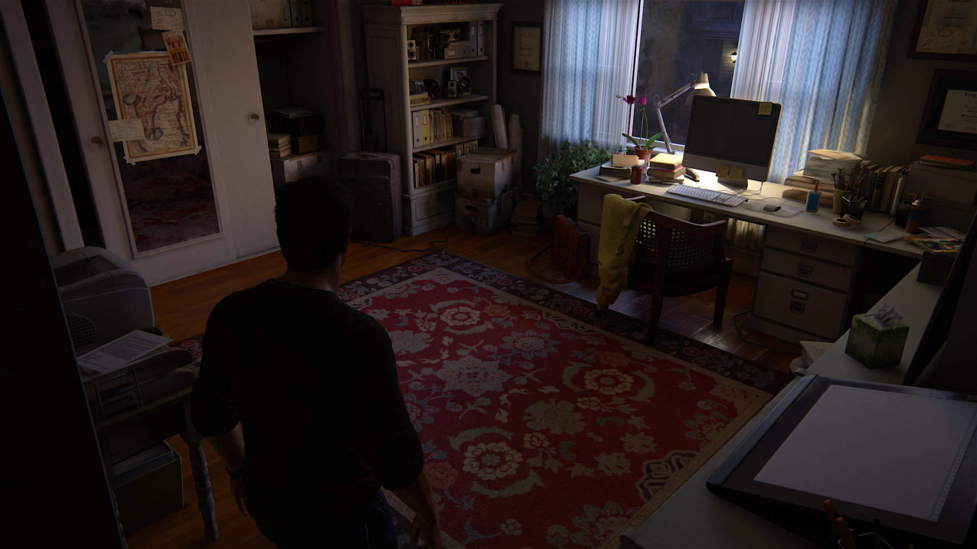
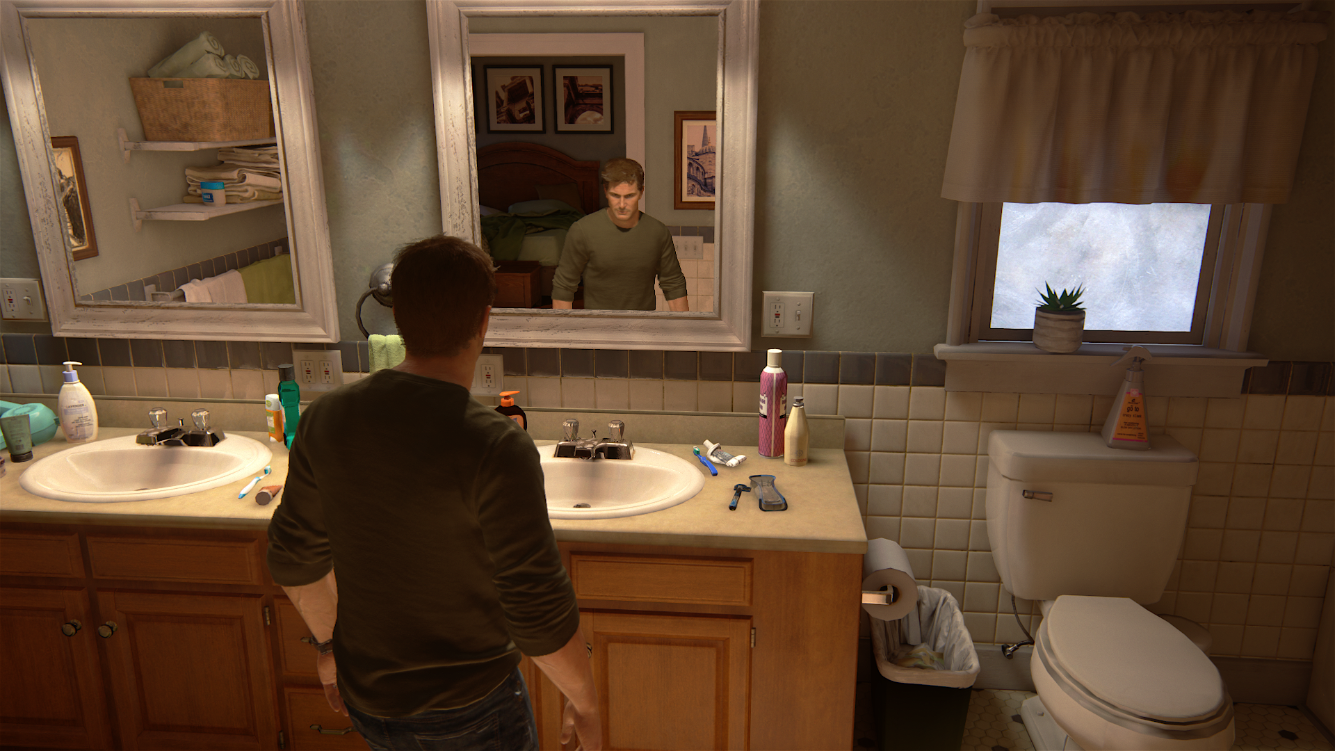
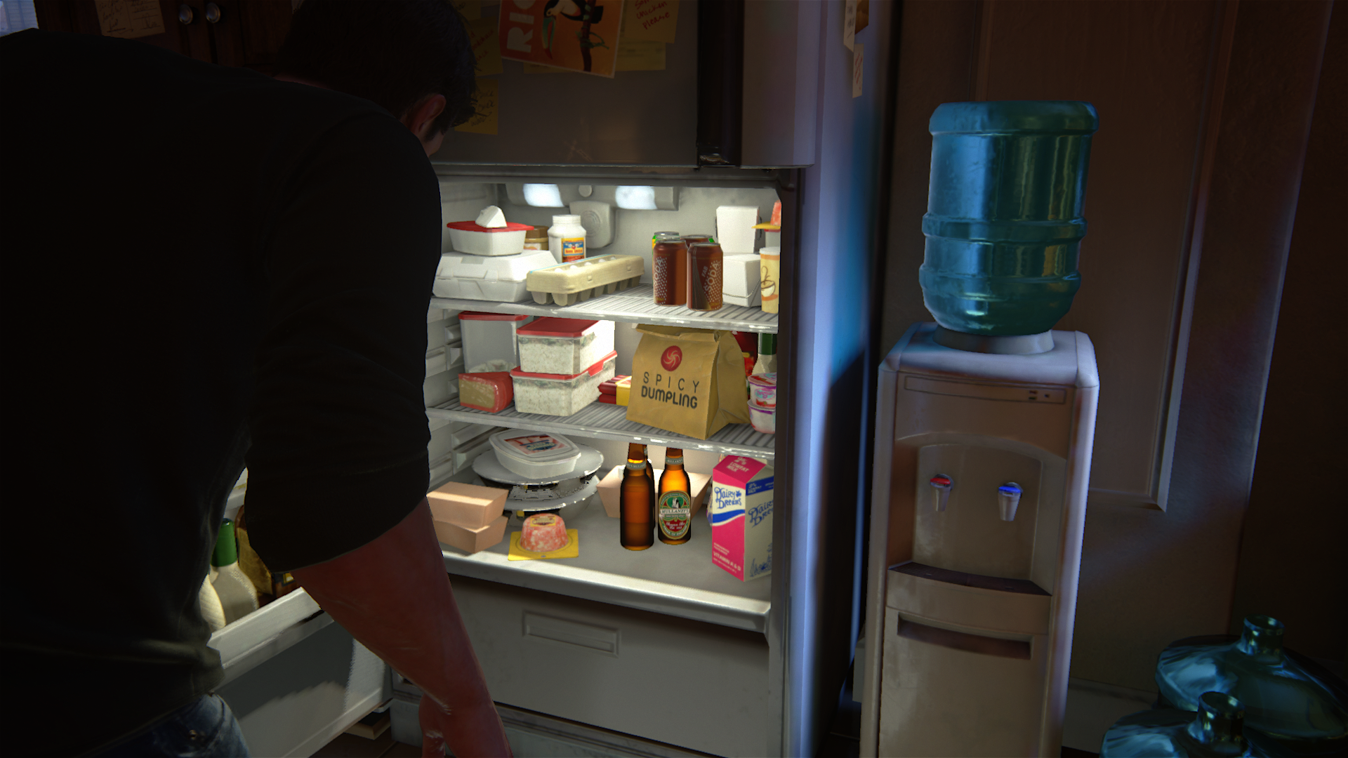
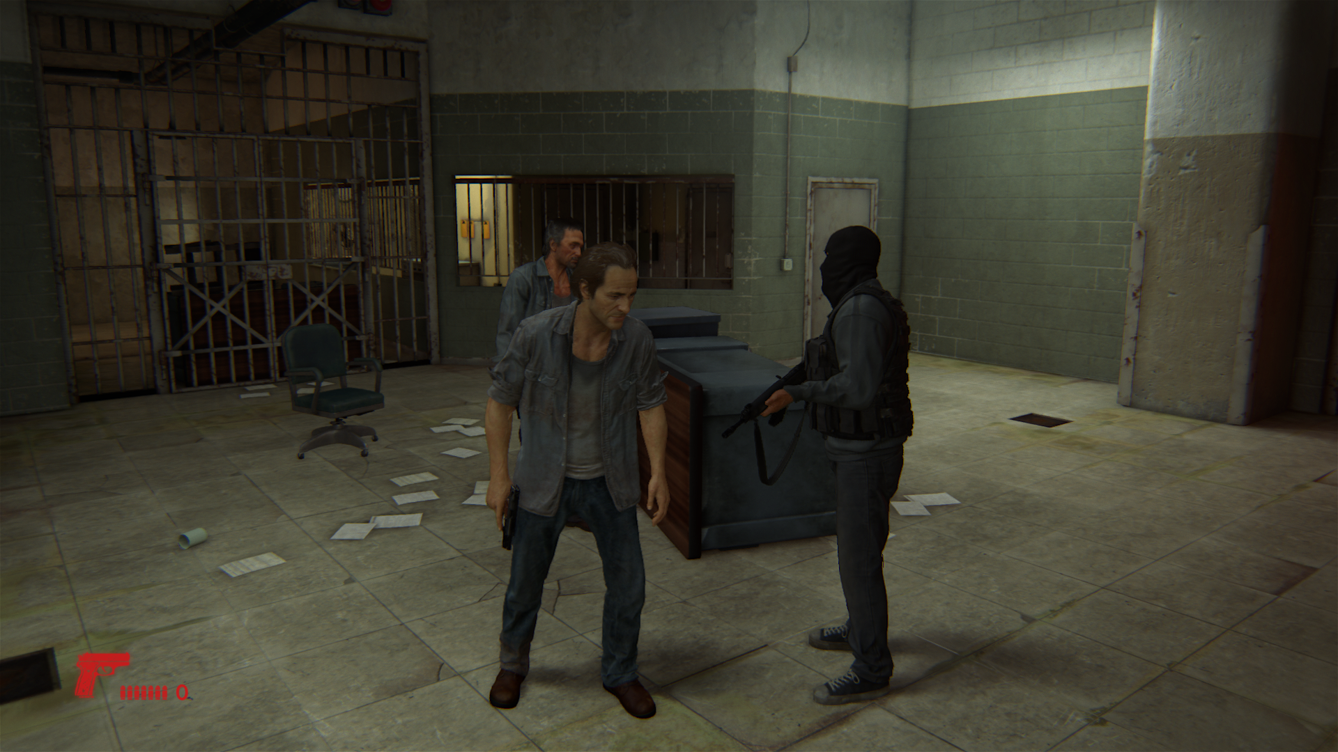
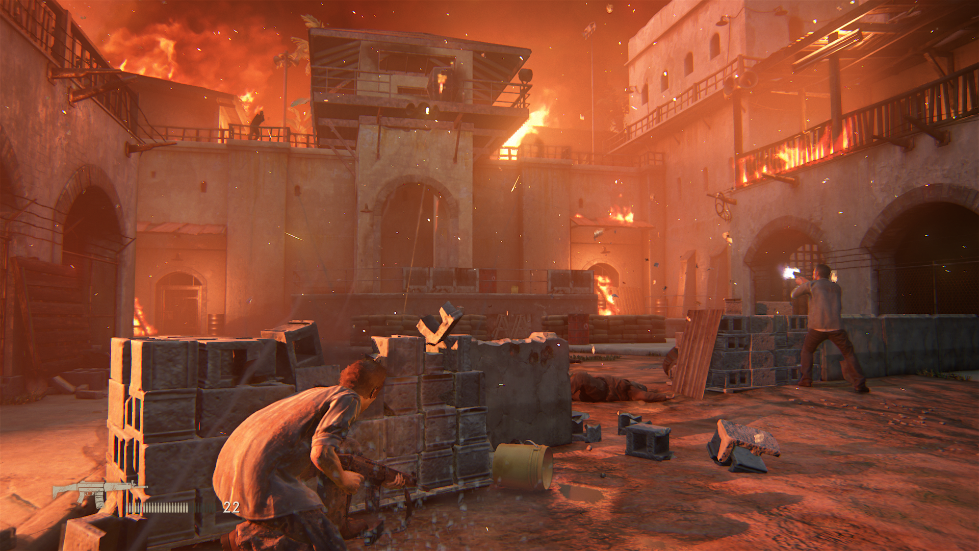
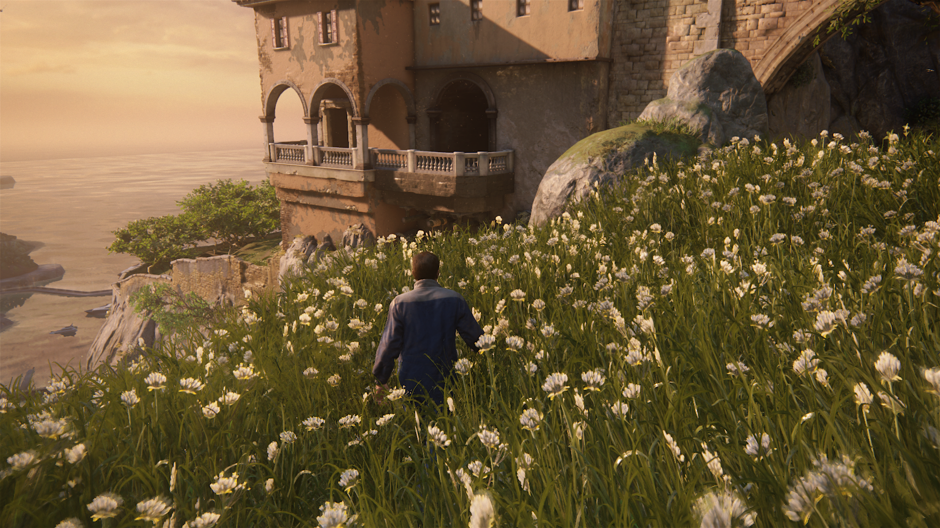
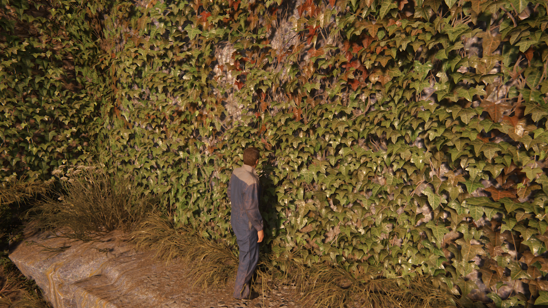
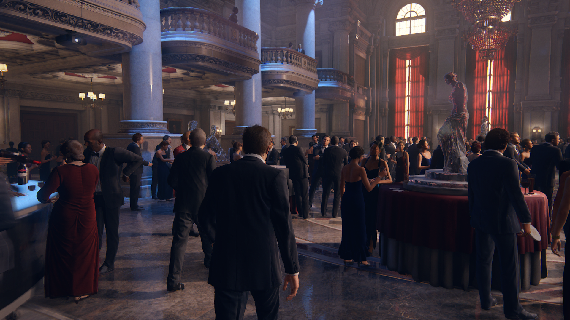
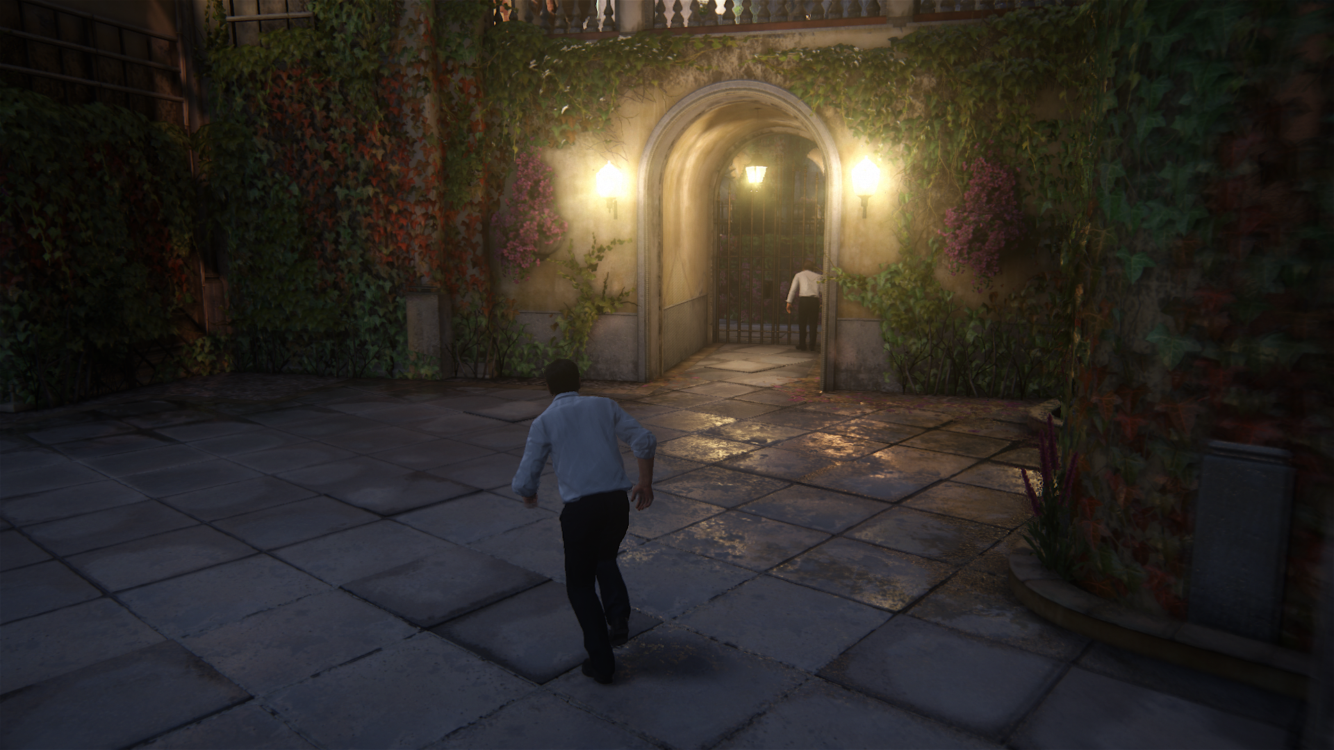
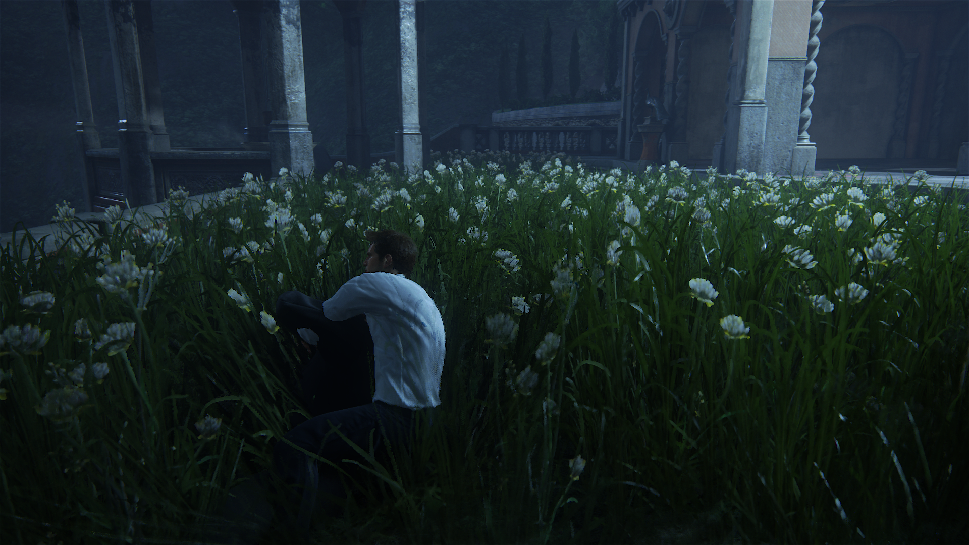
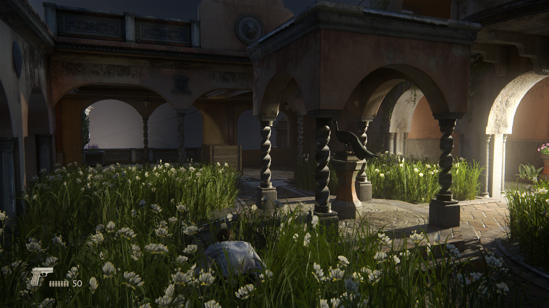
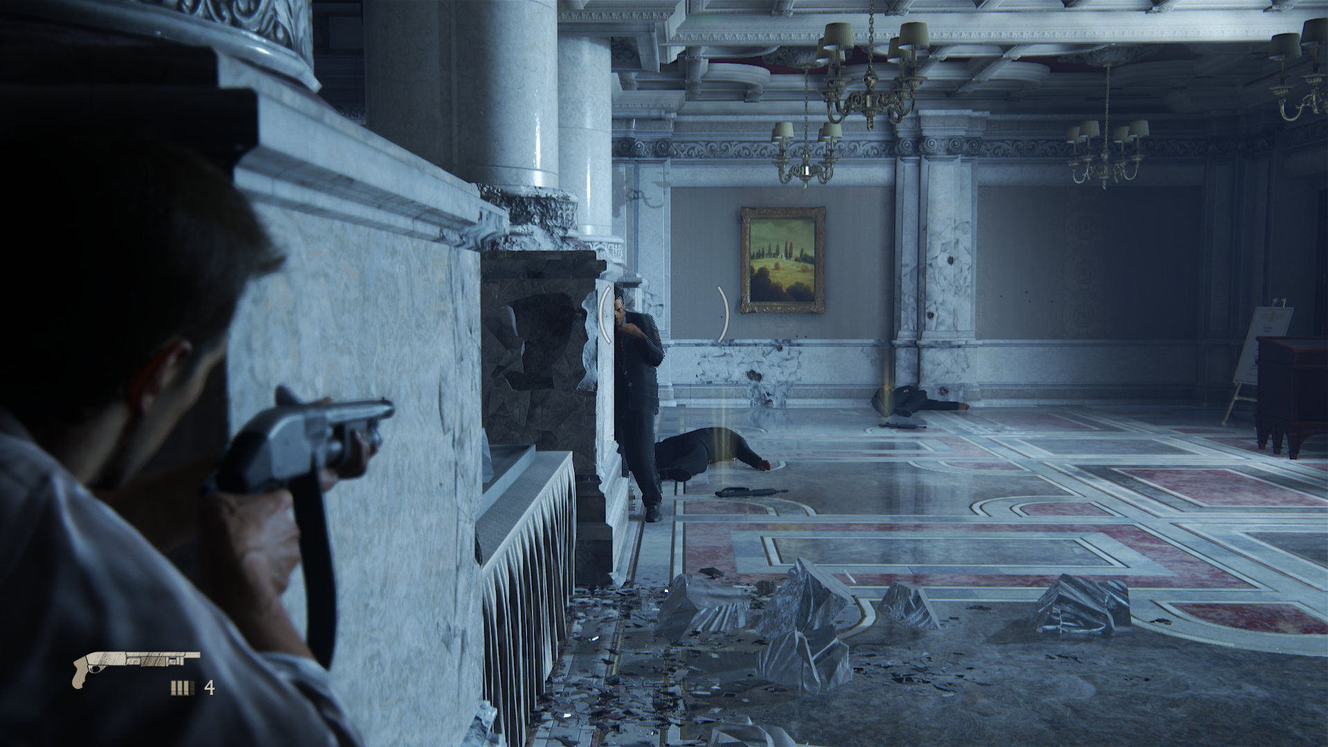
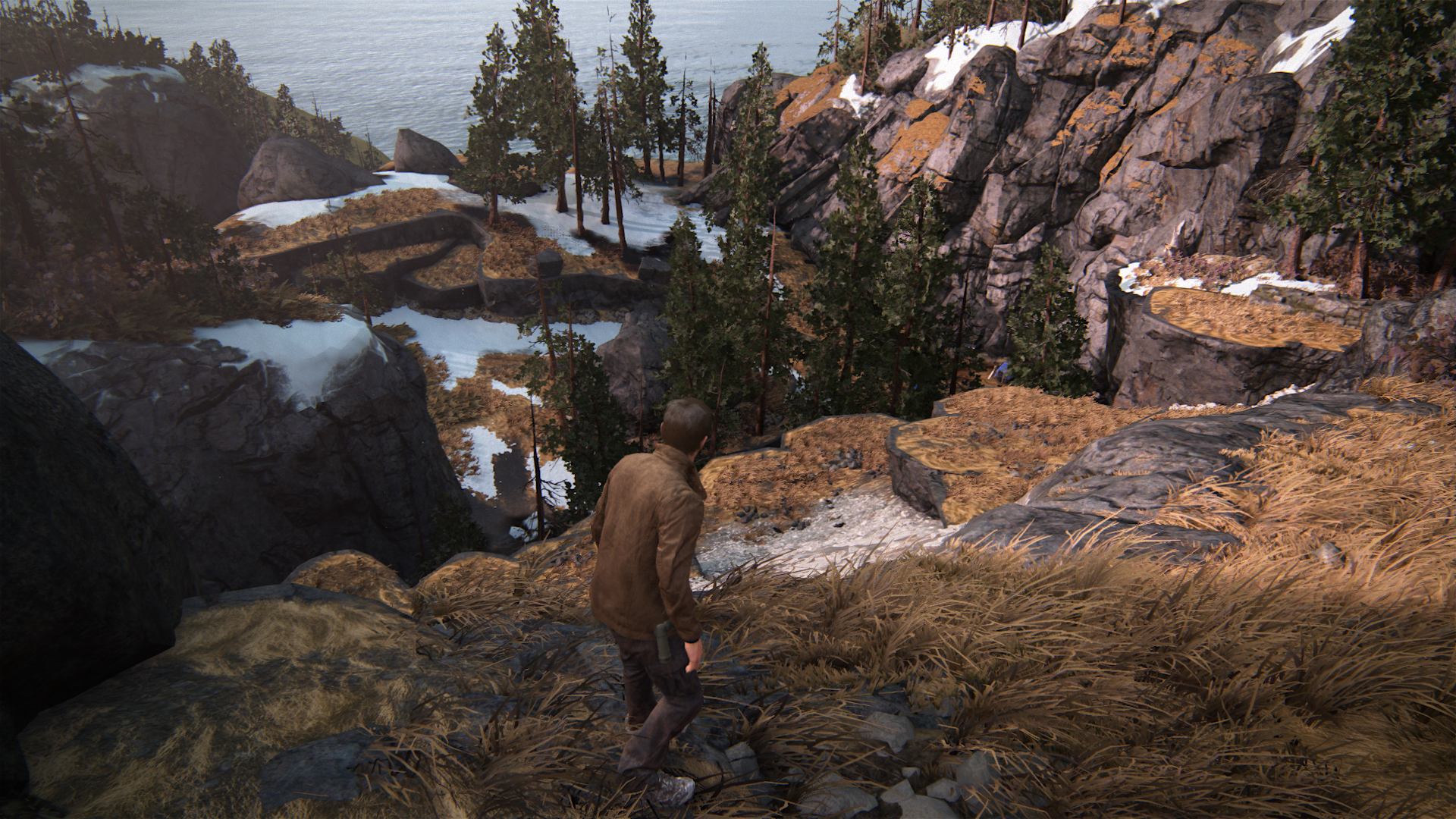
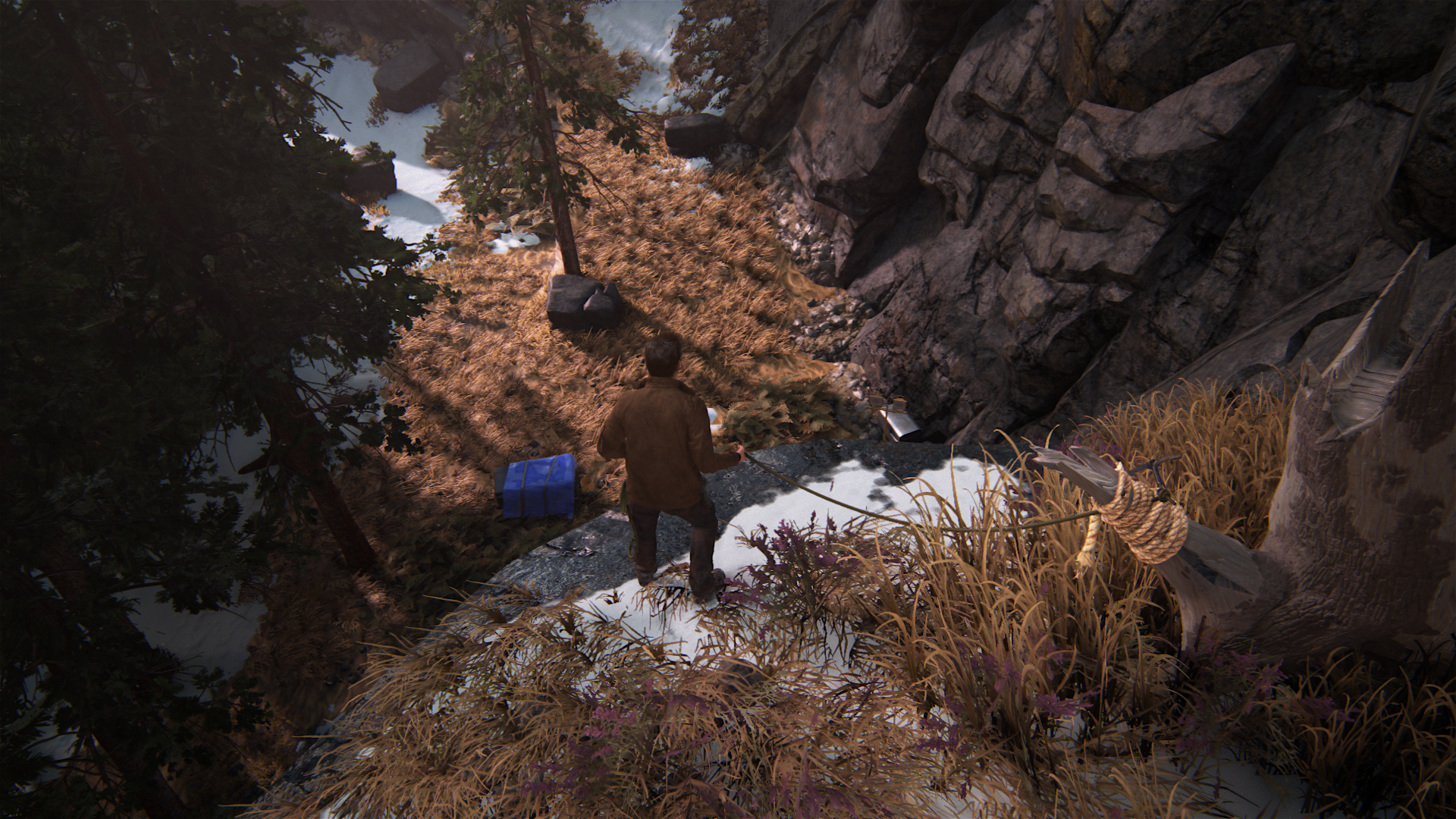
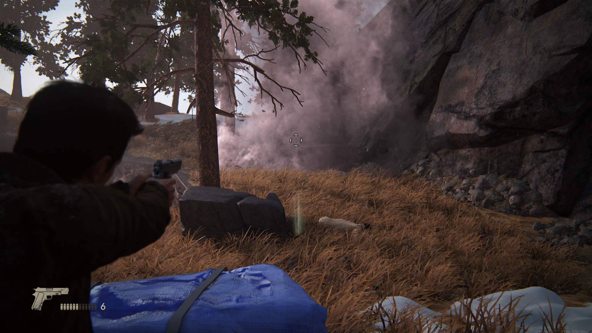
Goodness gracious, this game clearly needs to be put back in the oven for some sweet Naughty Dog home cooking mmmm delicious!
Plus I guess now I can feel productive for taking so many gameplay shots


Goodness gracious, this game clearly needs to be put back in the oven for some sweet Naughty Dog home cooking mmmm delicious!
Last edited:
rockaman
Regular
Have you ever heard of dog-whistle politics my friend?Such as?
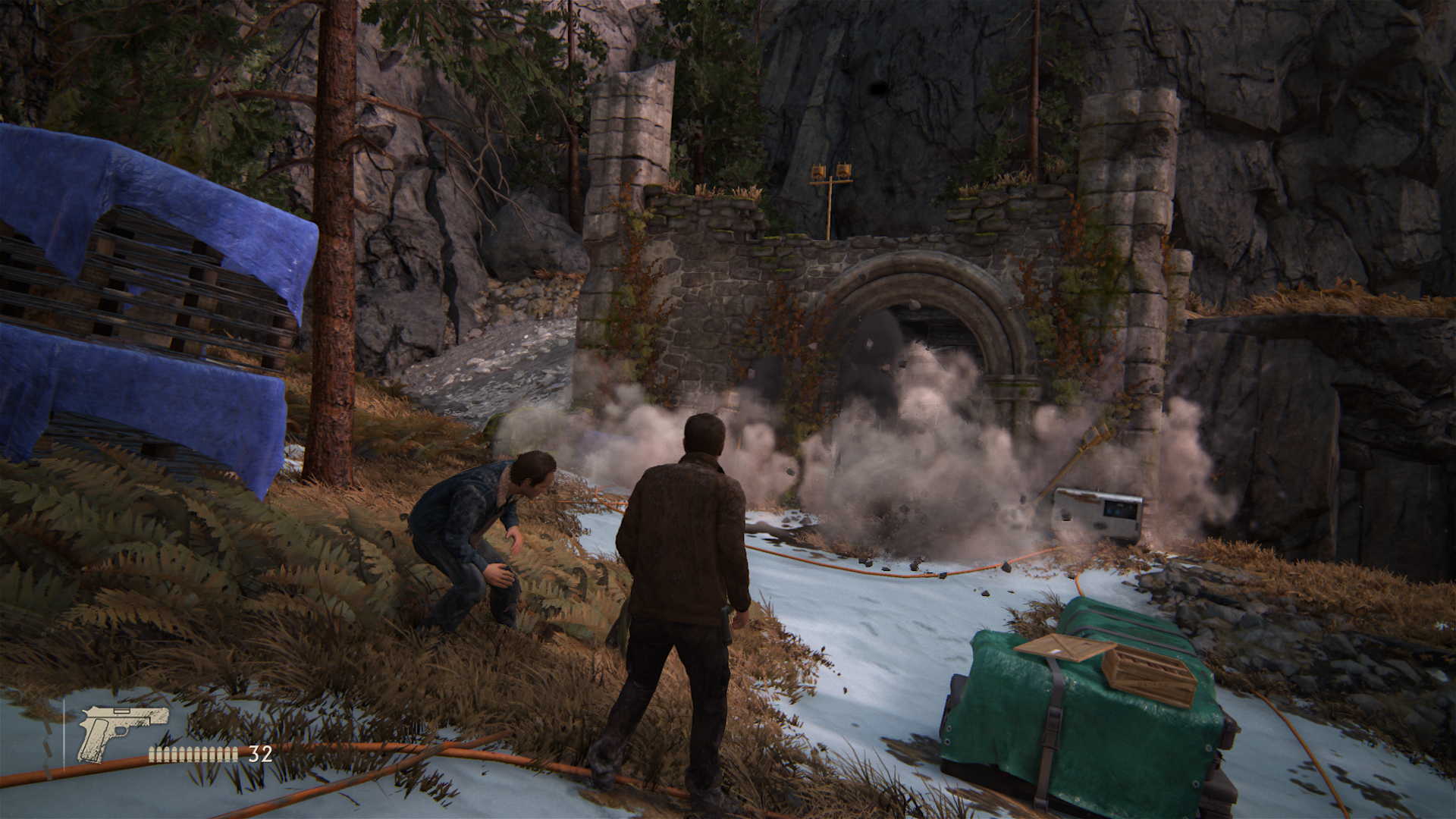
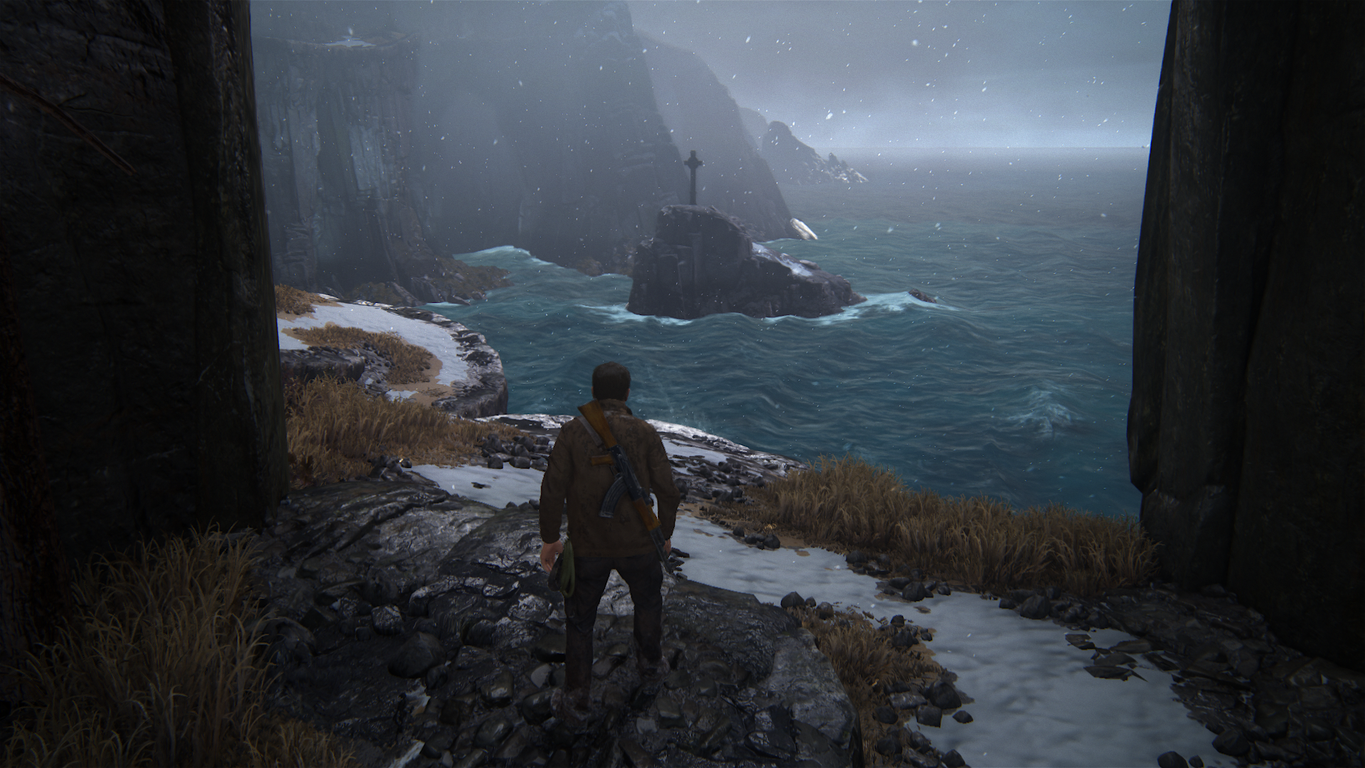
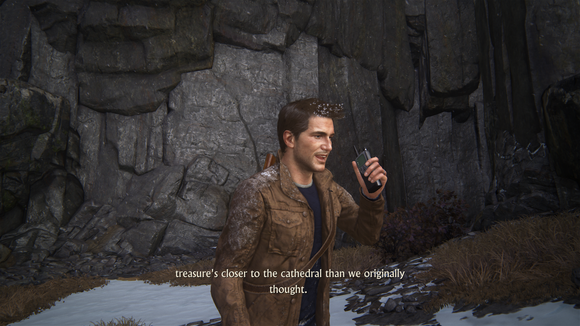
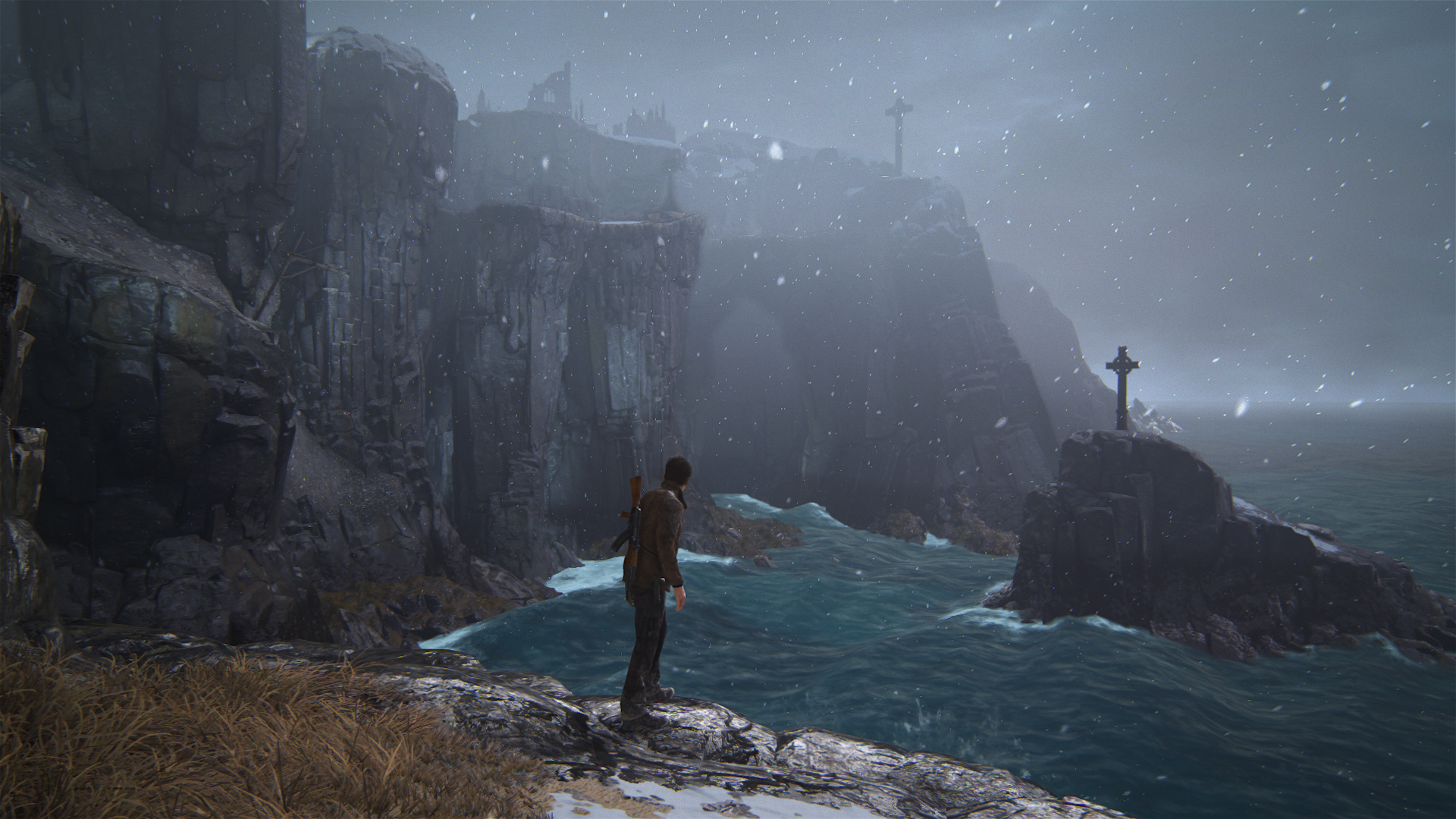
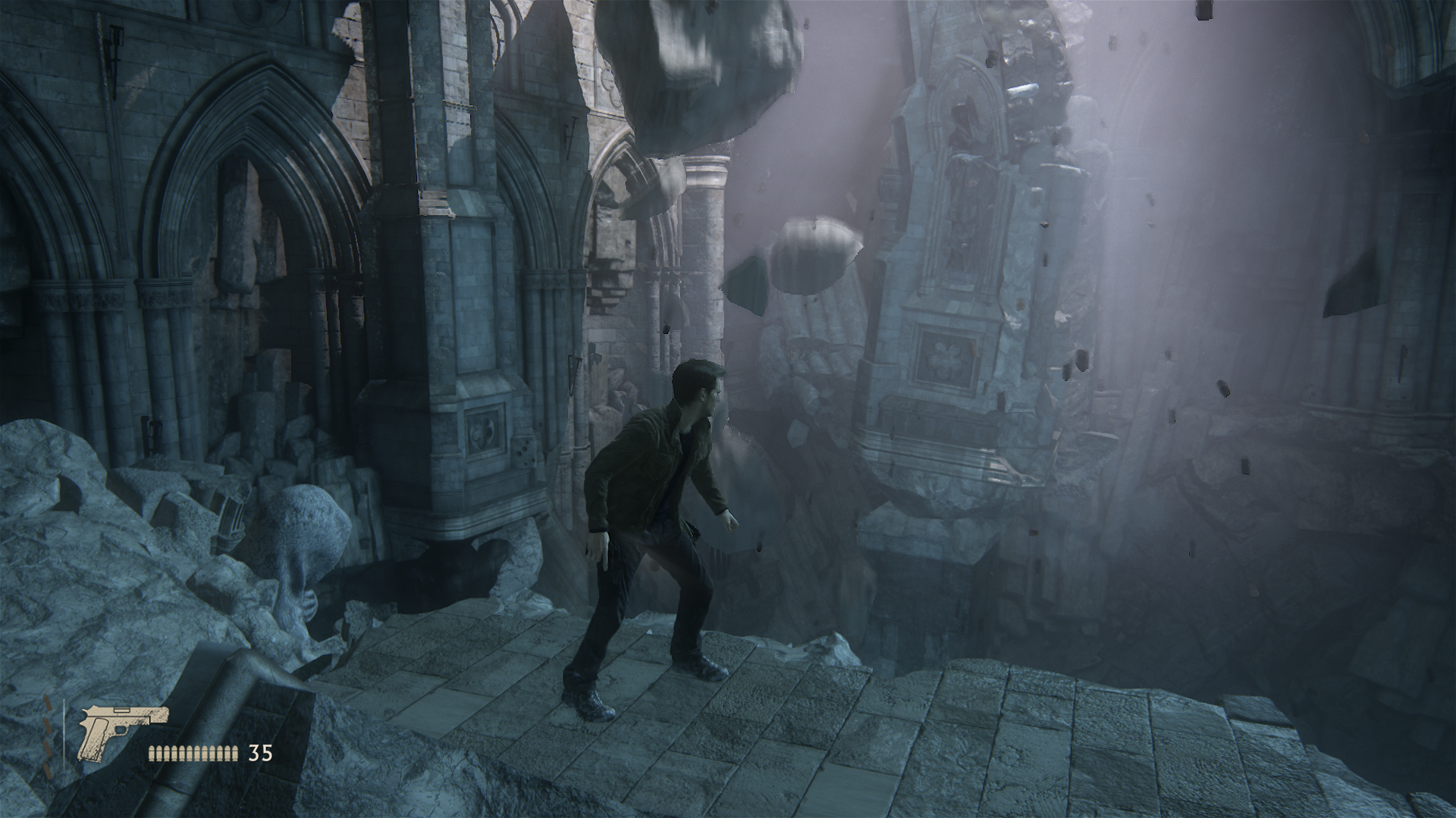
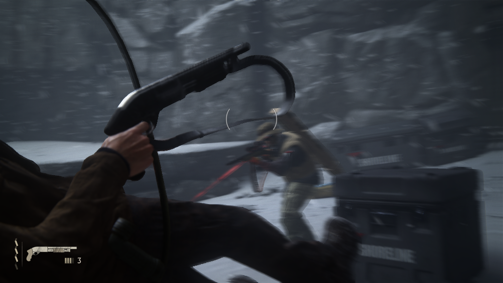
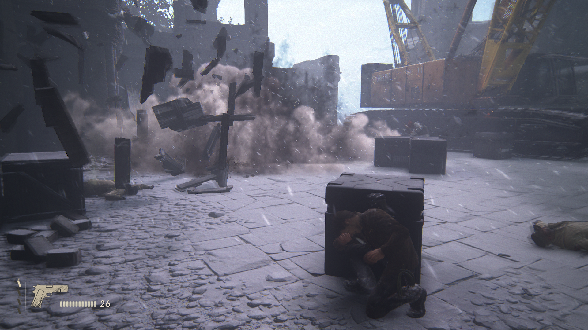
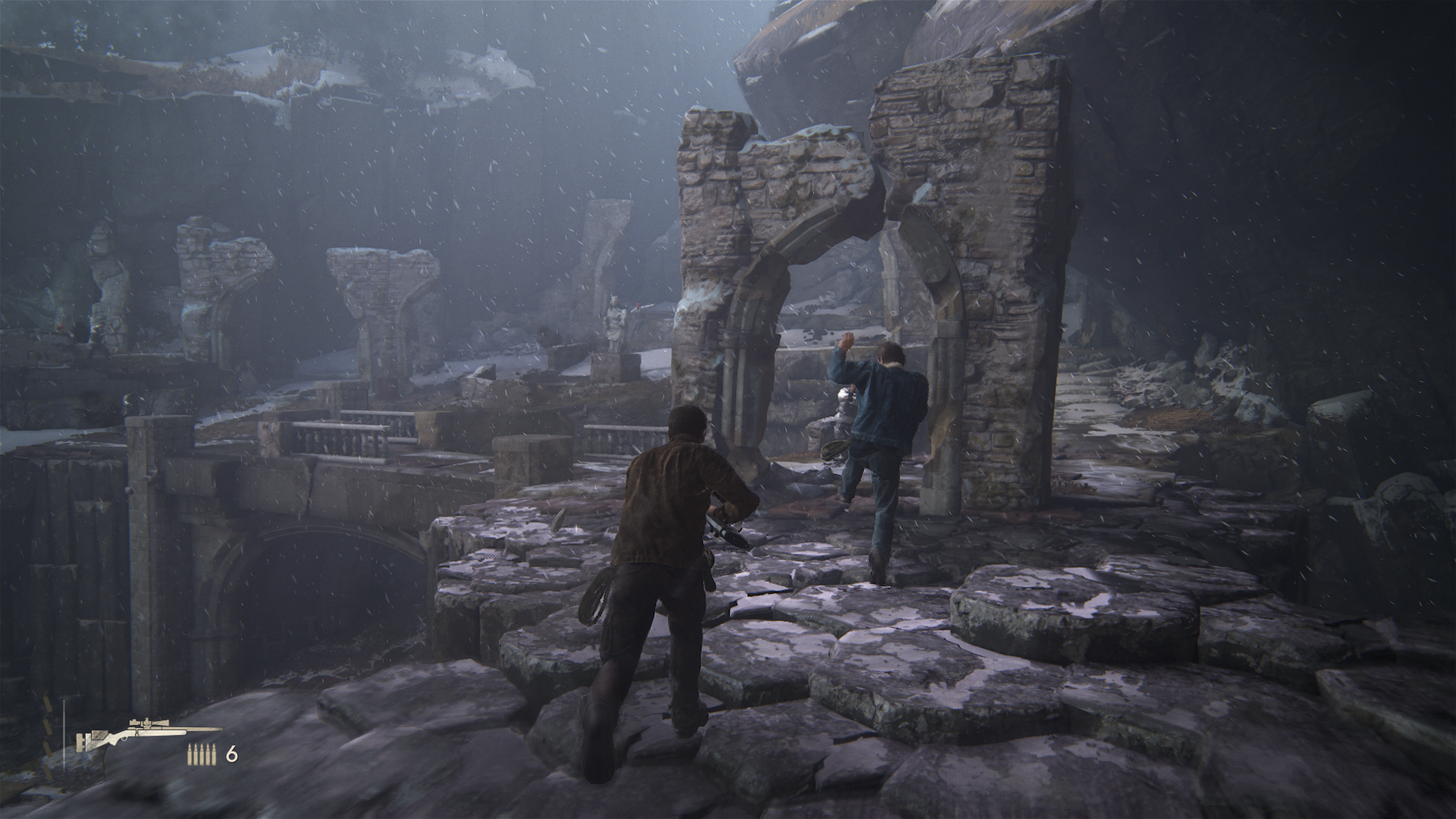
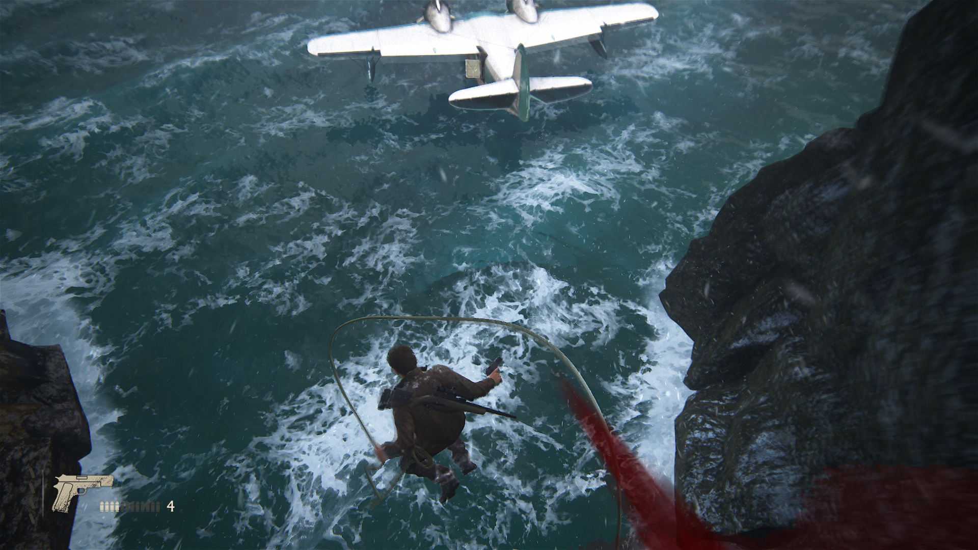
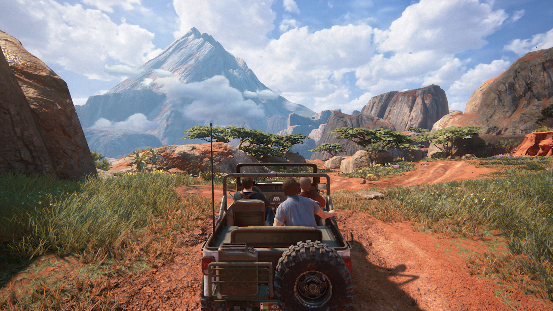
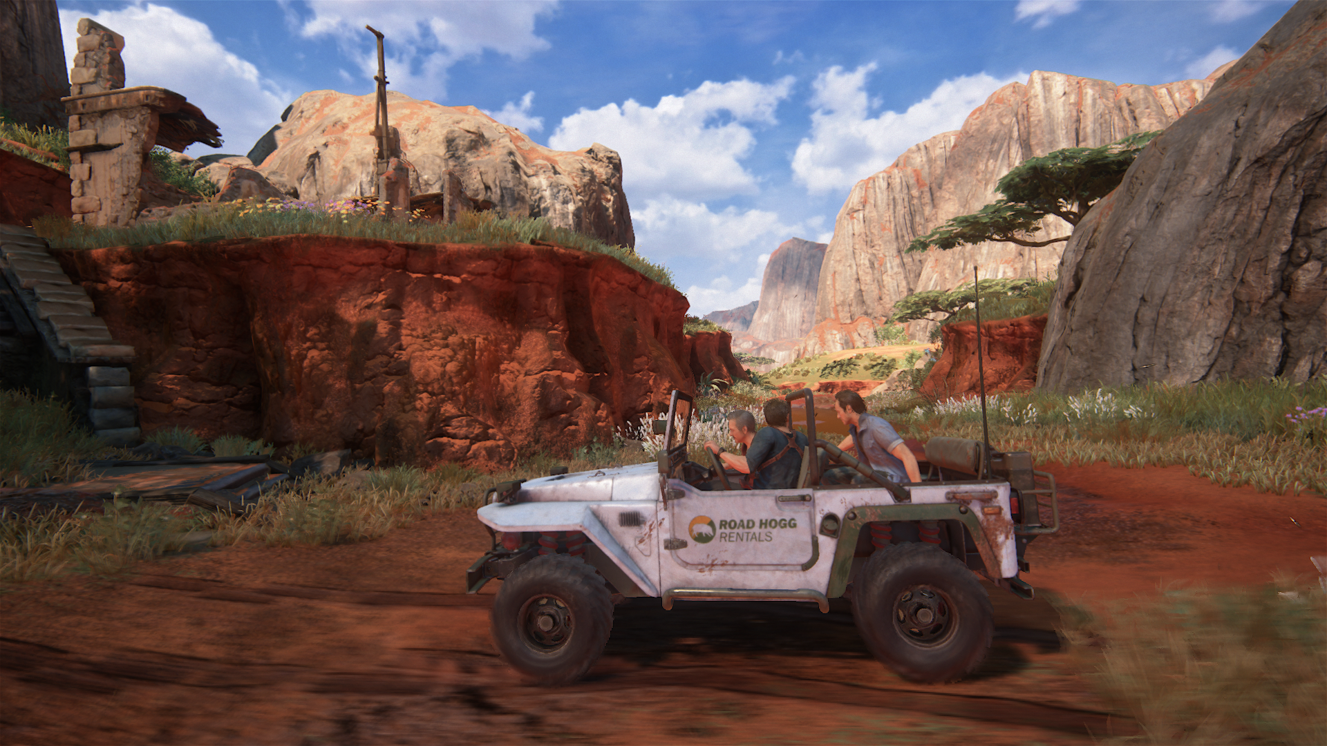
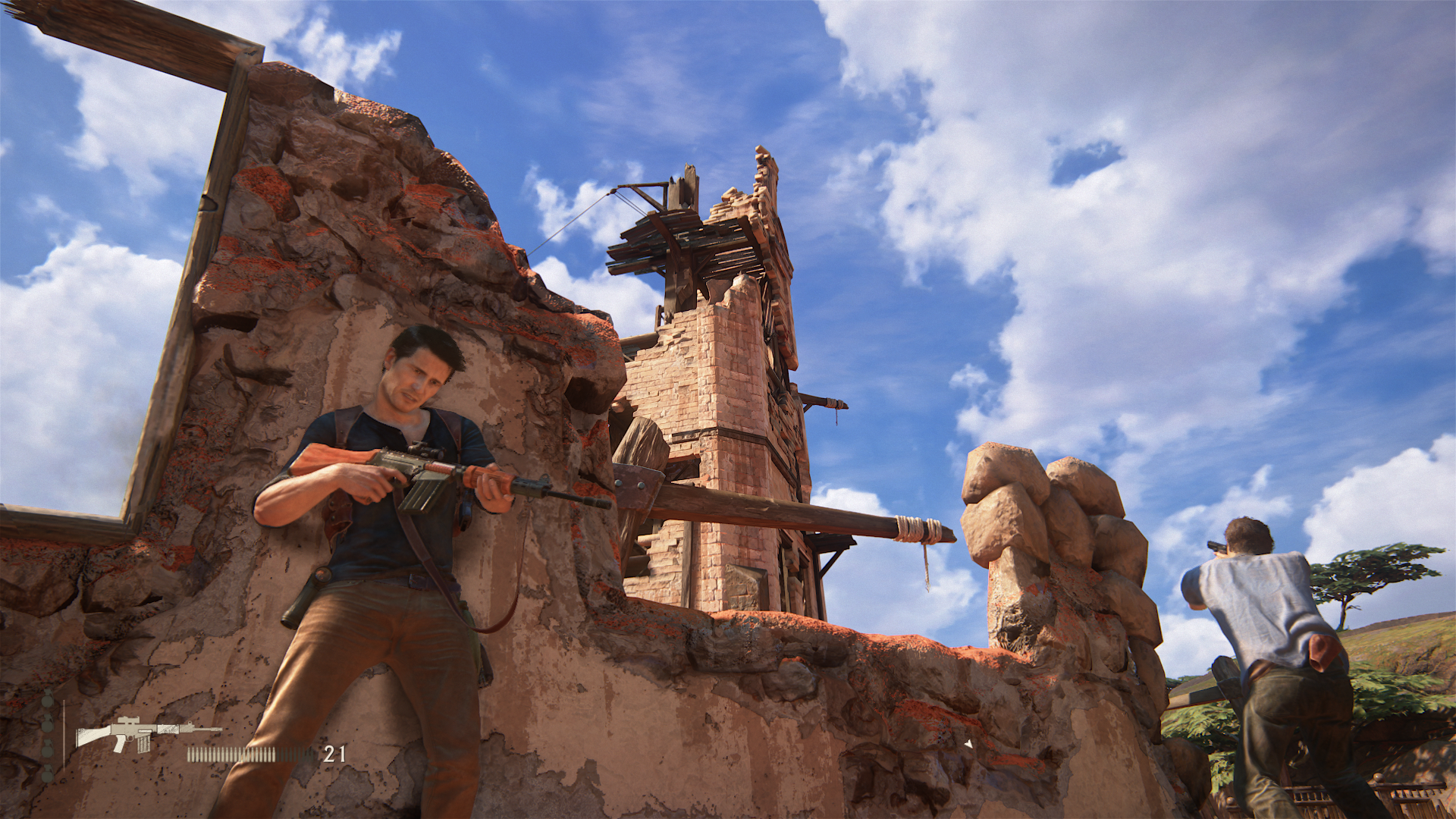
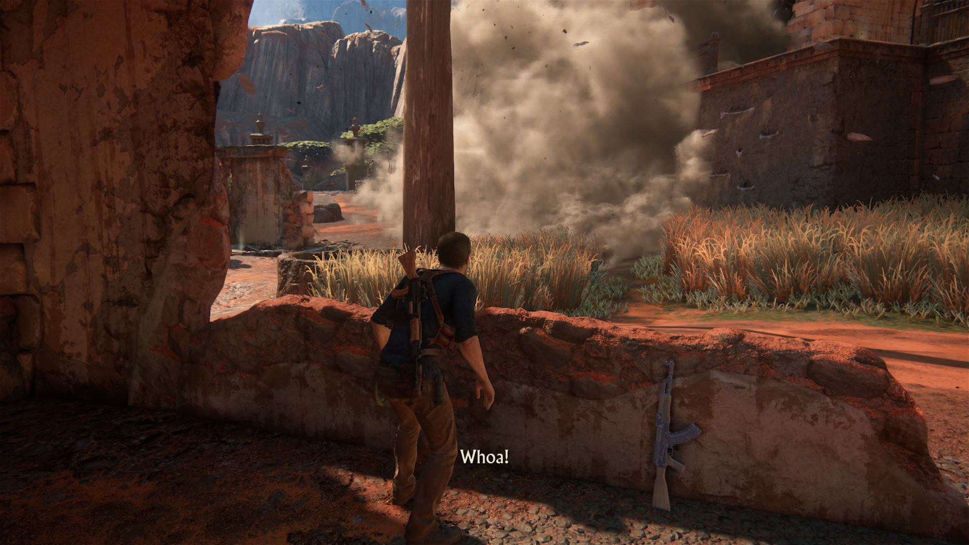
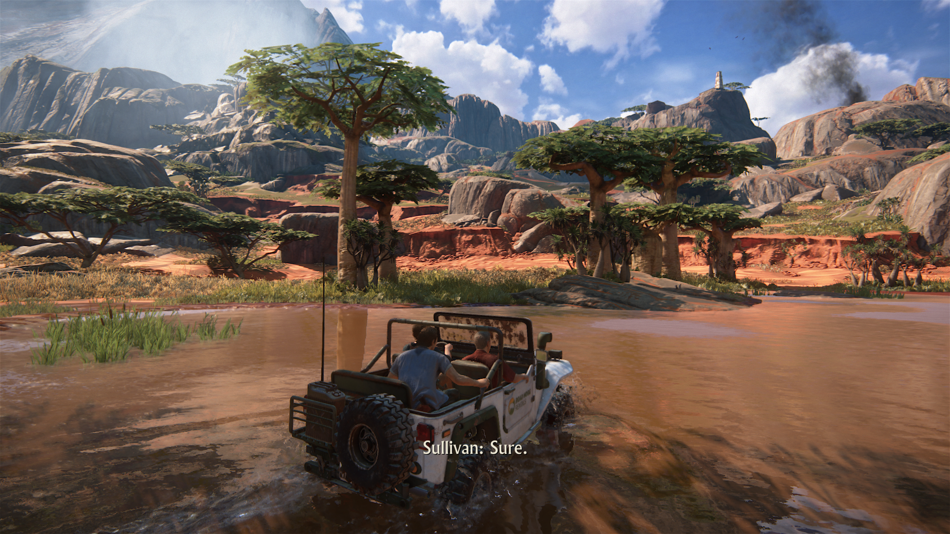
What terrible inconsistencies in graphics I am seeing in these early chapters from these randomly selected images... dear lord, how did this ever pass Naughty Dog's quality assurance?
Last edited:
rockaman
Regular
Enjoy my bandwidth starved friends 


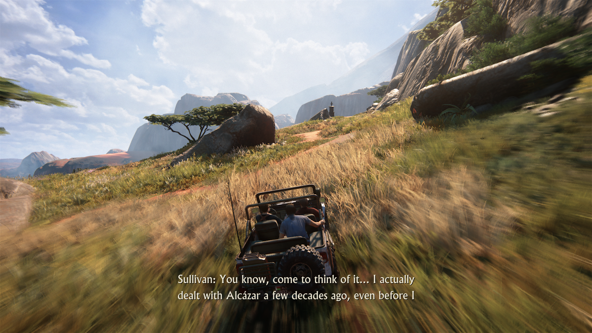
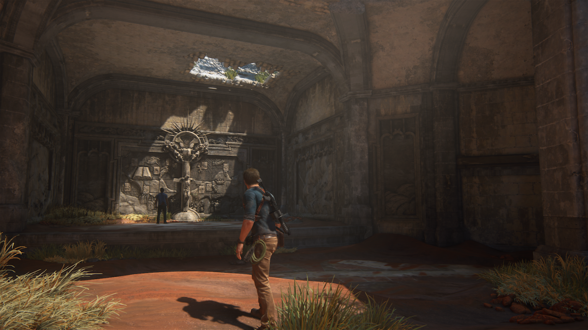
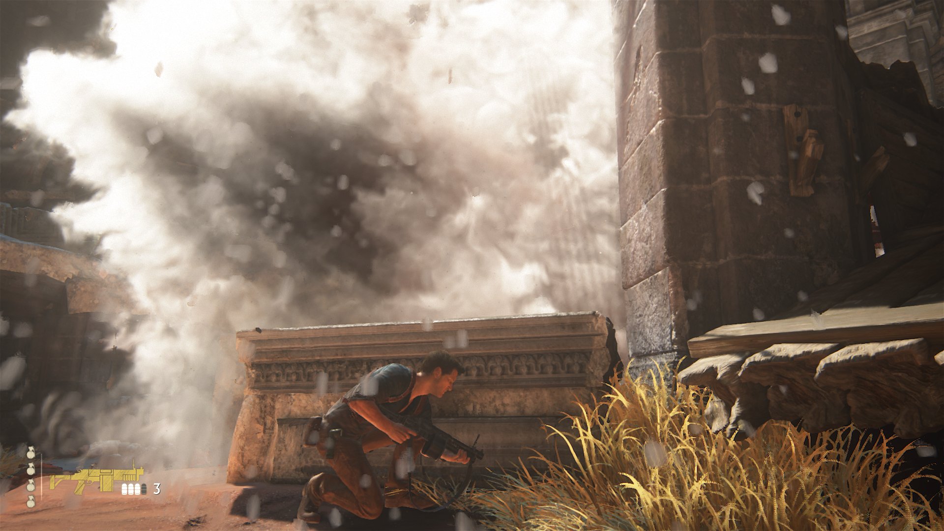
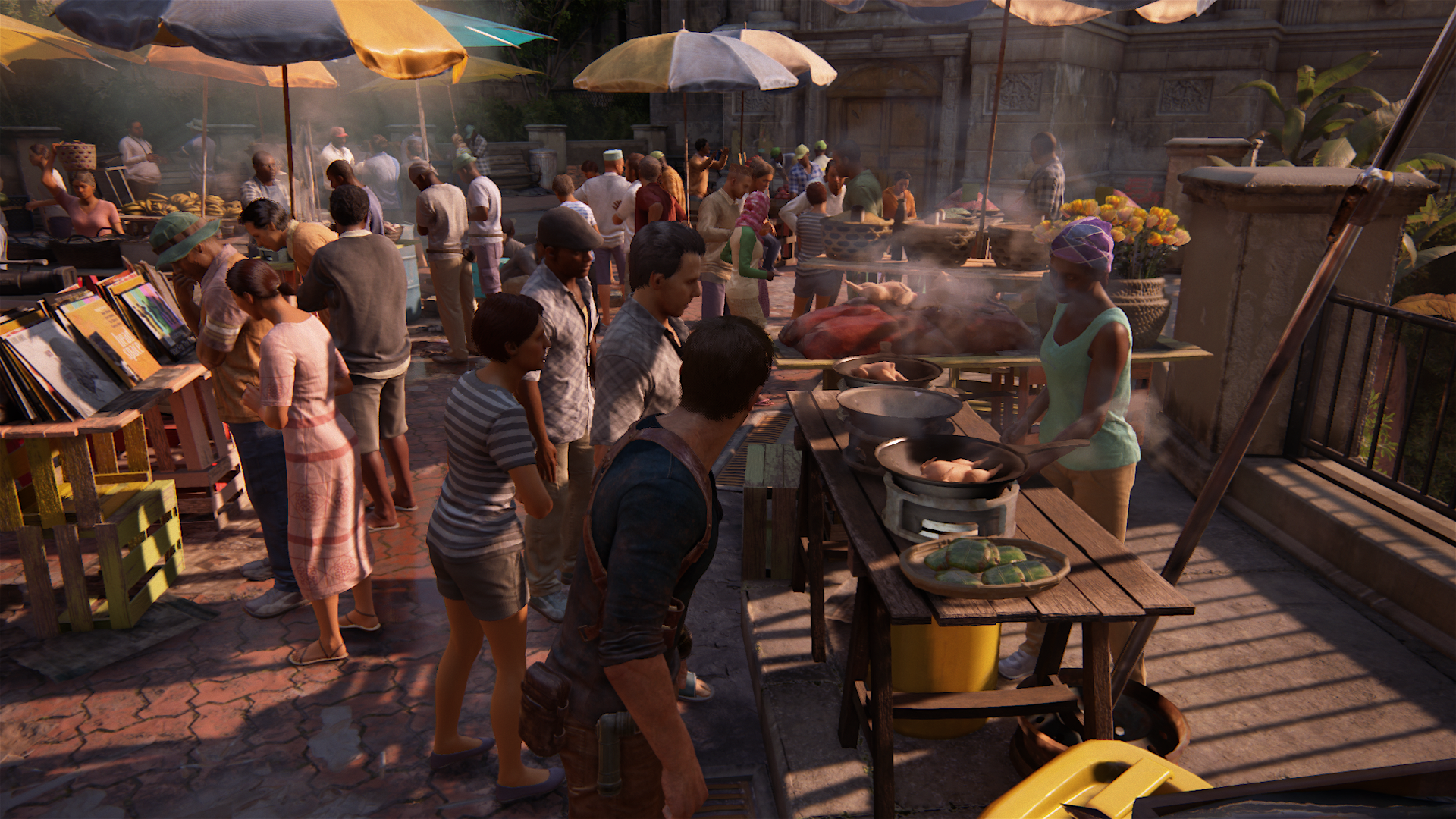
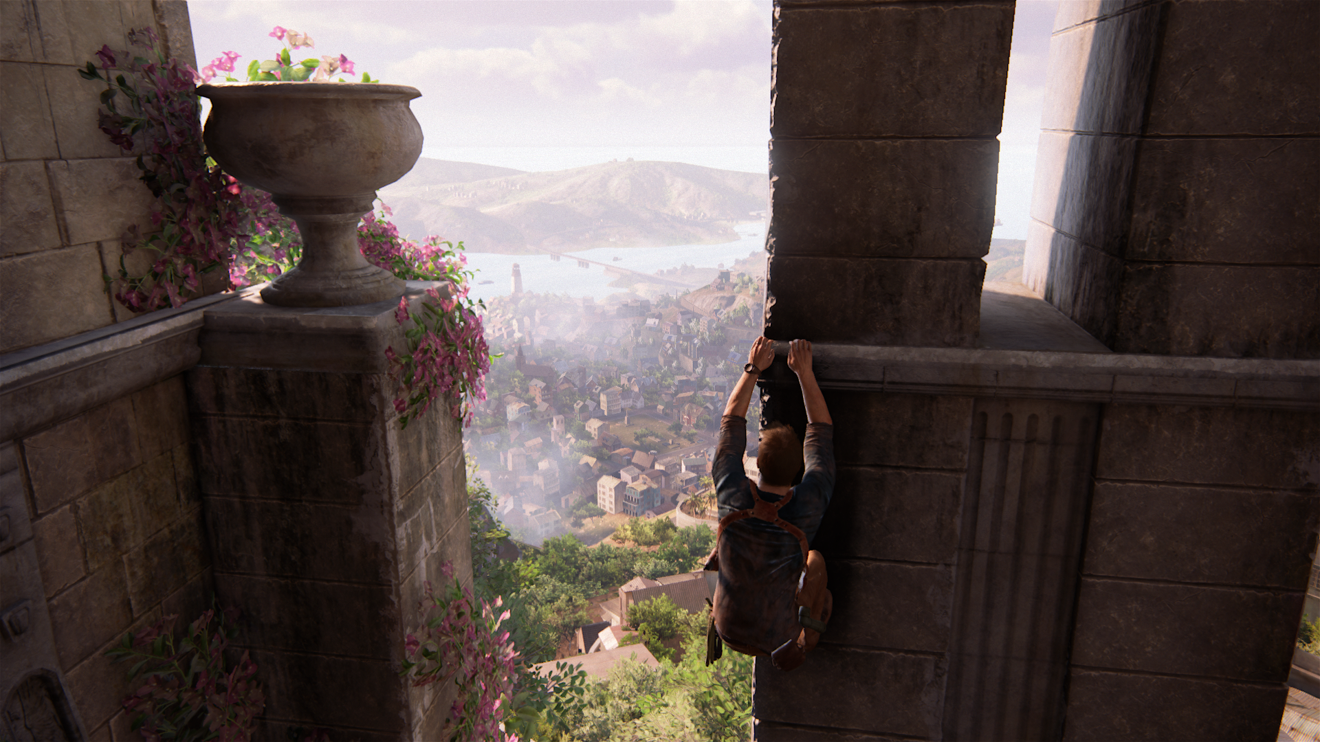
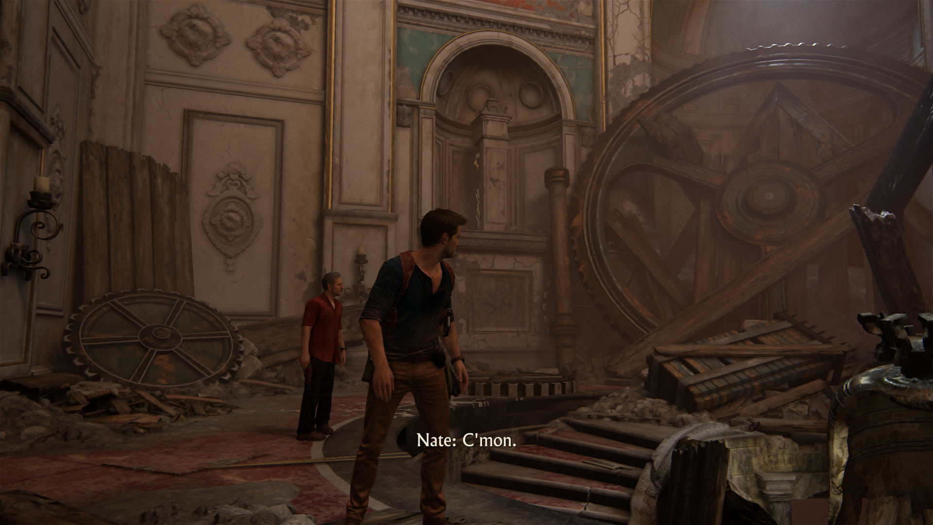
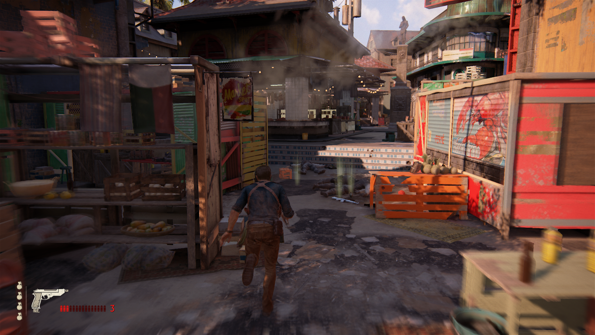
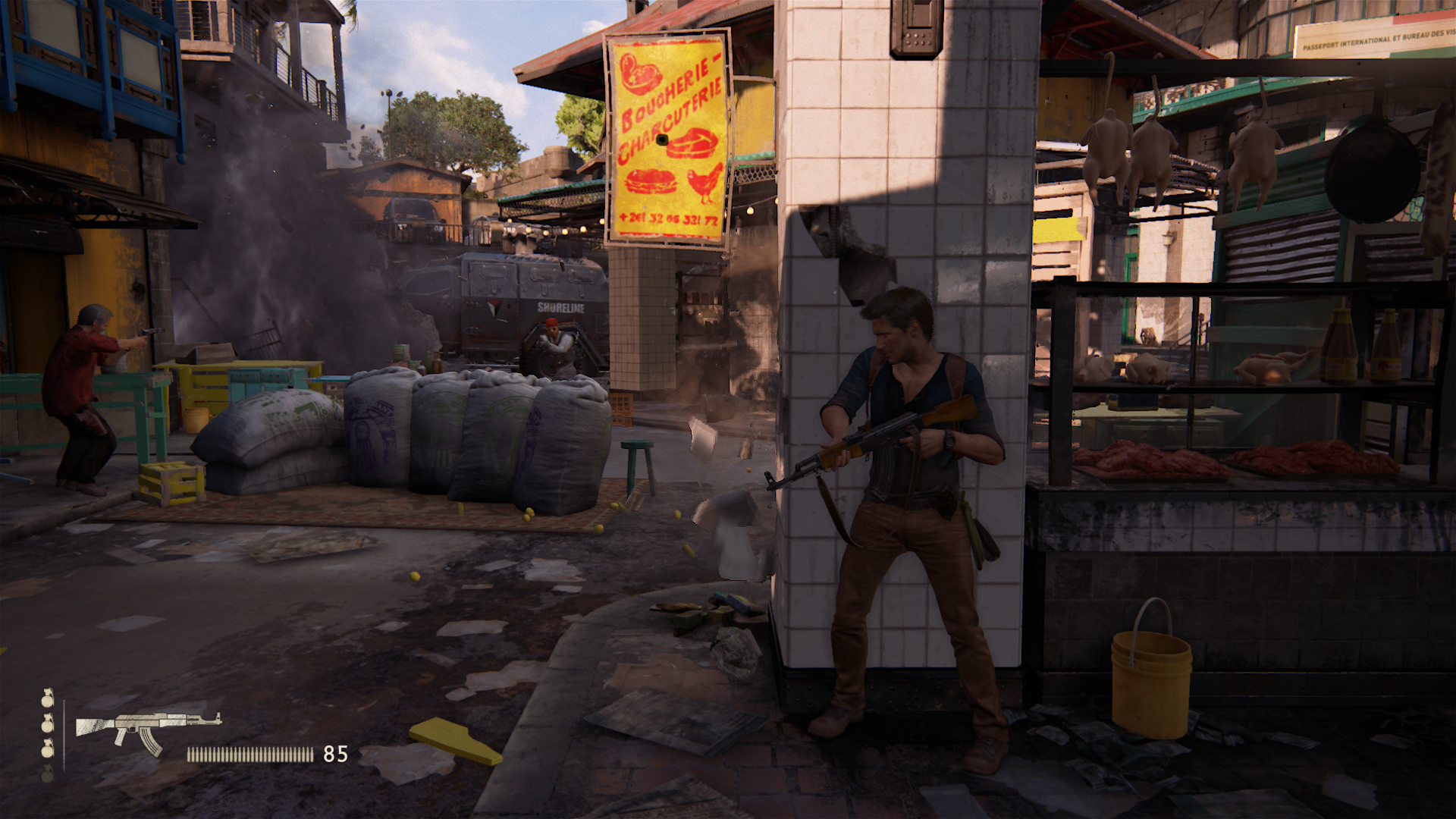
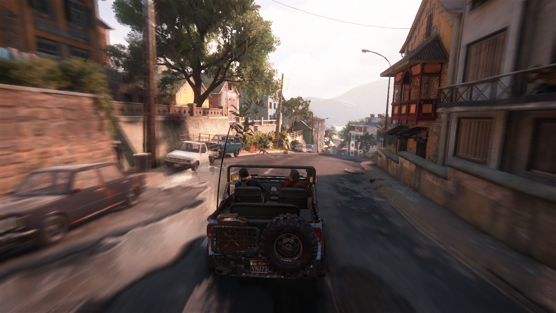
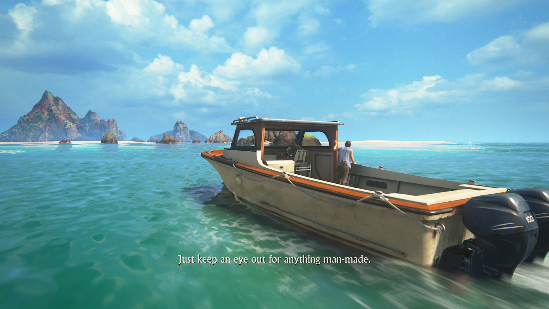
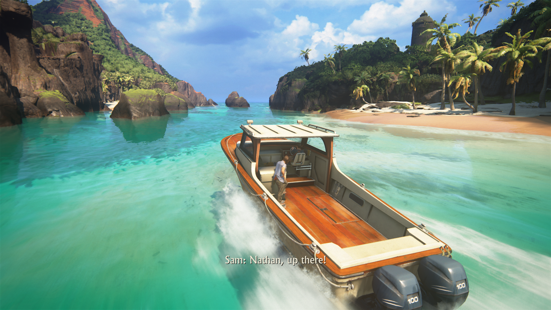
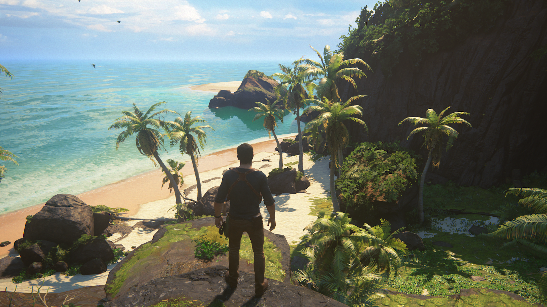
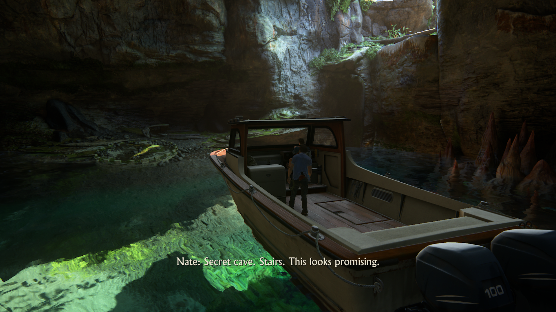
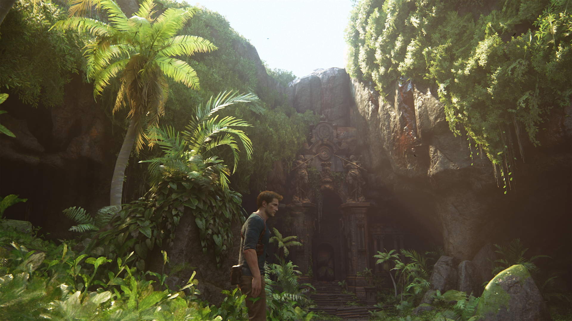
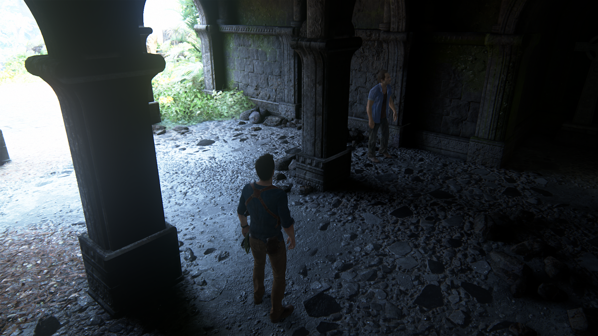
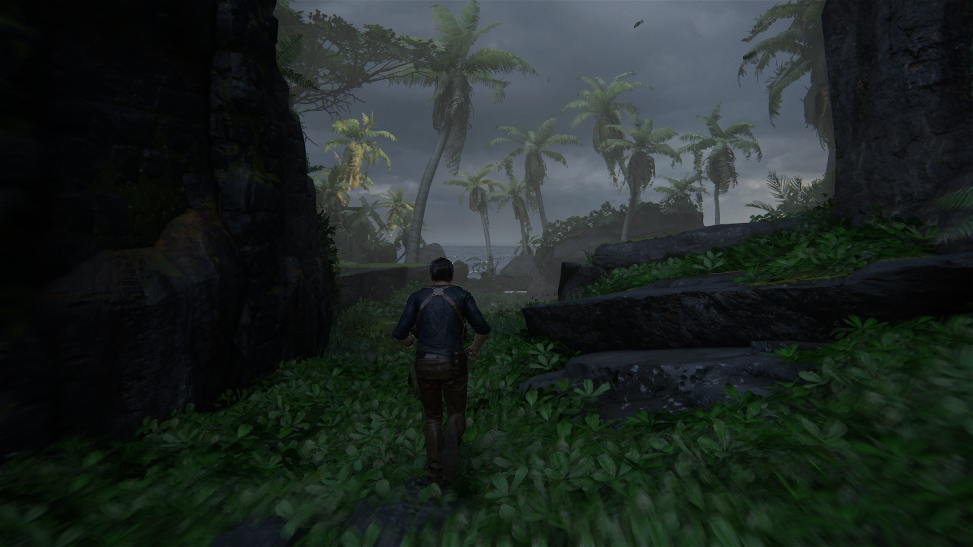
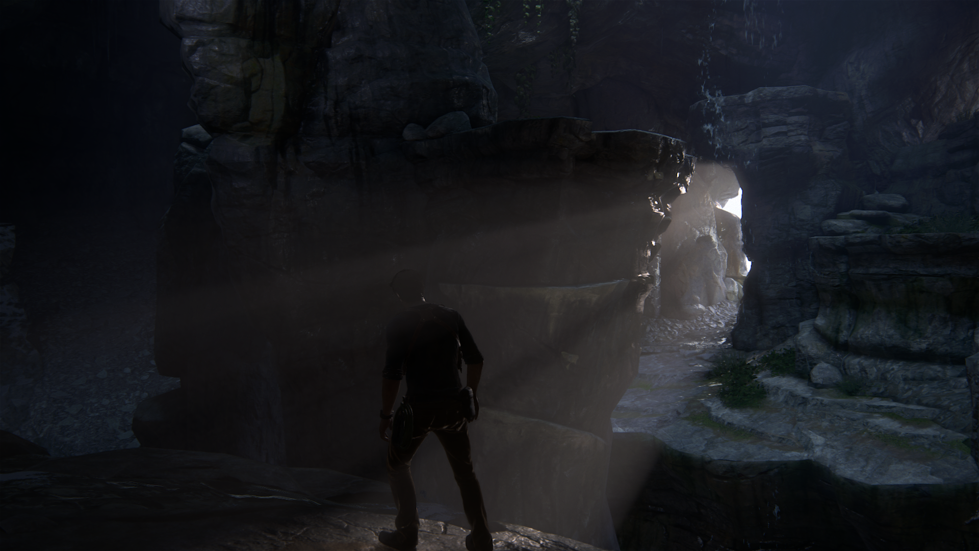
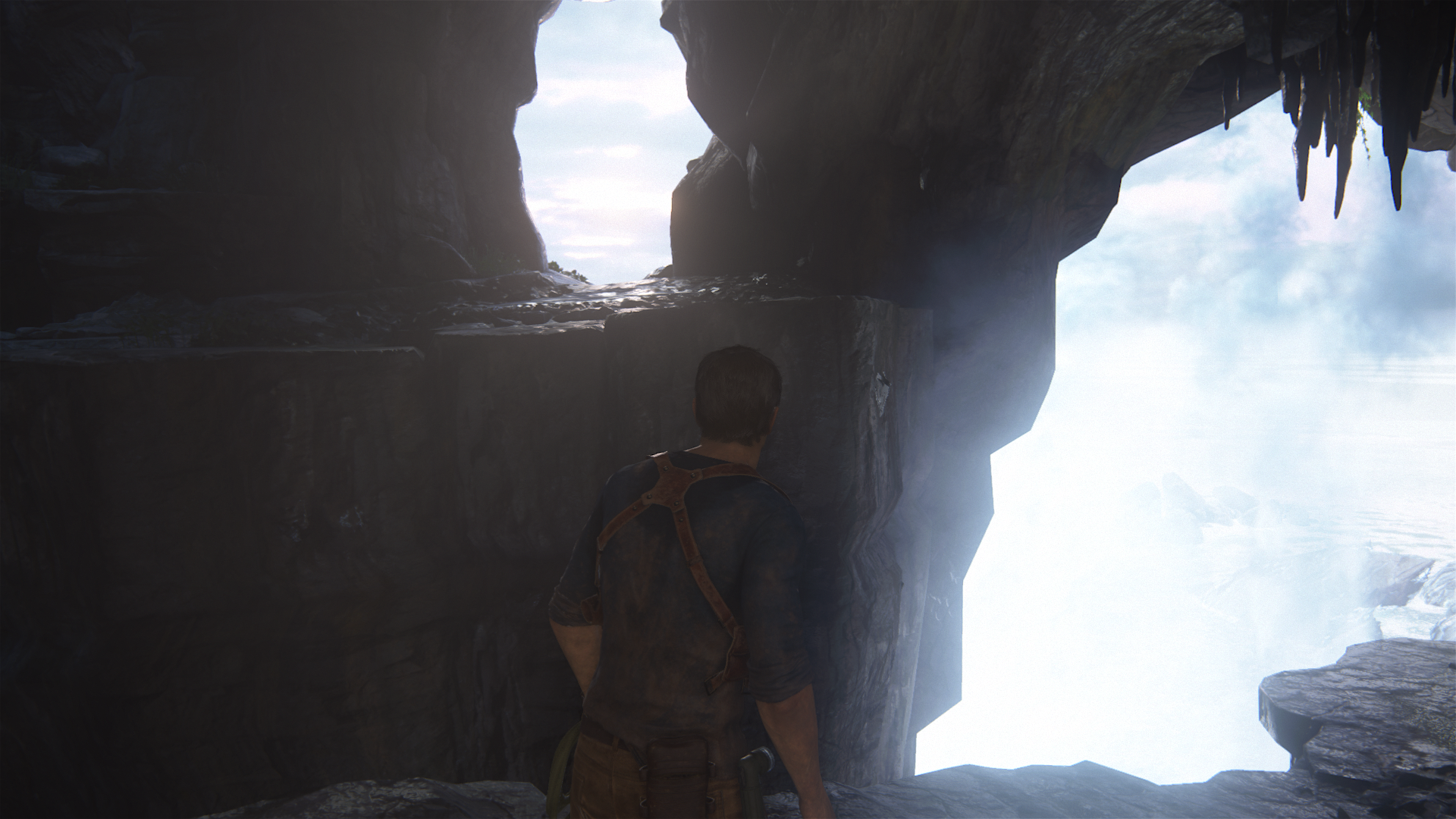
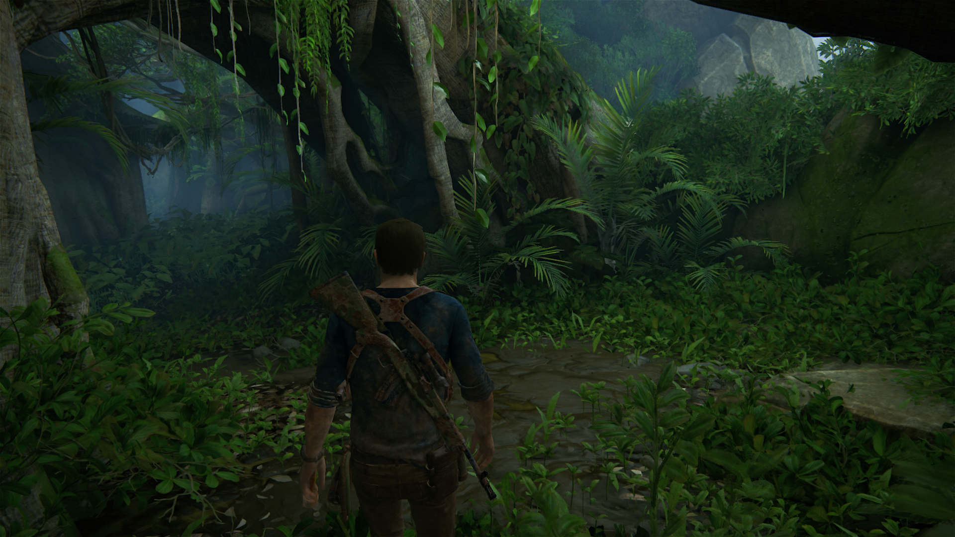
Yep I can definitely see where this game doesn't look consistent before Chapter 13 /sarcasm
It's a little bit unfortunate that I took so many screenshots for this perspective that Uncharted 4 looks inconsistent or particularly weaker in it's earlier chapters I guess, such is the burden of instant replay!
rockaman
Regular
You're operating from the assumption or POV that it is actually less polished. But that's not looking like a very objective premise to begin with.And importantly I'm explaining it as a business choice driven by finances rather than a technical issue. Given more time and money, this sporadic visual shortcomings would have been polished up to the same quality as the rest of the game.
And clearly, there is some disagreement on this point, that the early game is so much less polished, to say the least
I mean I can see most people here are interested in offering generic kind of explanations of the possible causes of why something is the way it is (e.g. budget limitations, automation, better workflow, even I do these things). but there is no agreement on what is in the first place anyway, so does the explanation of what is disagreed upon make any sense? Lmao.
Really guys I thought I was on B3D at least not NeoGAF
Uhh.... all the time? You can put UC1 Drake in a lot of compromising lighting positions.... you need to go back and play those games again.That's not content. Was there any area in UC1 where the lighting gave out and the characters were flat shaded? Or the scenery was a flat textured ground with some 2D trees billboarded on top? Or anything similar?
You really couldn't find bad lighting in UC1 on the character models? That's a little unbelievable considering how much you are nitpicking on UC4 for this, especially for lighting on his face. You can make it look like plastic easily just by turning away from the direct light sources.
Are we really pretending the UC1/2/3 lighting models had no similar issues to UC4 under poor lighting angles? Like really now, a 9 year old game with far less quality lighting to work with? That's some serious pretending. You can make UC1 Drake look extremely, extremely bad if you find the right spots.
Last edited:
To get back on topic, it seems like the mud particle effect has self shadowing + gi applied to it if you zoom in with photomode

Saw this image on overclock.net and i thought that was interesting, probably similar technique to the water and smoke effects.

Saw this image on overclock.net and i thought that was interesting, probably similar technique to the water and smoke effects.
Out of some baked GI flaws and some background in Madagascar city or when going from underwater to the boat everything on the boat is good but the city is low poly and look like shit, like I said in Italy and probably other flaws I don't remember, it is pretty good before chapter 13...
rockaman
Regular
I think these fat particle things on the right side are the same particle models that get stuck to the wheels. they look exactly the same at least, just a guess. Nice catchTo get back on topic, it seems like the mud particle effect has self shadowing + gi applied to it if you zoom in with photomode

Saw this image on overclock.net and i thought that was interesting, probably similar technique to the water and smoke effects.
They also may be the same blocks of mud that are on the ground in Madagascar... in all the Madagascar areas.... so maybe they are really all potentially active particles if they get near the car wheels, and become GPGPU physics particles? Possible I guess.
I noticed in one scene for water also in addition to the splash effect while Drake was swimming he was also flinging individual particle droplets forward with his arm motion.
They were "large-ish" water droplets but I only noticed this effect once. I don't have a picture of it atm, but I'm not sure if that was exclusive to the ending scene or not.
Last extra thing I noticed today was that the "ripple" effect simulation, made by gunfire only possibly, on the water is limited in a short range around Drake when you shoot the water (at least in the Madagascar level, I did not check anywhere else for this effect yet).... you can reveal the edge by shooting at the water and the ripples will actually rebound off that artificial edge lmao
Reflection maps too. They "cheat" several times on reflection maps for large flat surfaces. I posted an example on the last page in the New Devon area, but it's also in the epilogue too and several other places. Any time there is a large puddle that has a bit of reflection for example, good chance they just use a reflection map rather than true reflection/screen space effect.Out of some baked GI flaws and some background in Madagascar city or when going from underwater to the boat everything on the boat is good but the city is low poly and look like shit, like I said in Italy and probably other flaws I don't remember, it is pretty good before chapter 13...
Similarly, the car mirrors do not actually reflect anything. They just have a low-res reflection map with a texture on top to simulate it being dirty looking. But it looks perfect from gameplay distance in the way it shimmers which is really nice
Last edited:
For example the PC version of BF launched without Atmos support that was patched later on, the console versions both launched with a half decent FXAA solution while the PC had a TAA option that got rid of the shimmering, i'm sure that was going in at some point in production on all versions as we can see the latest FB3 (ME:C) game using TAA across all platforms. Calling any of those games "unfinished" is bordering on fanboy fuel. And i'm sure every game released ever has things the designers/programmers/whoever wanted to include but couldn't due to time and money, this is why you have lists of 'what ifs' for the next project and that's why game engines never stop improving.
The TAA from Battlefront costs too much performance for a console with Battlefront. It was like 6-10%. Ryse TAA costs 2-3% for example. Therefore the TAA quality of Battlefront is higher. How good MEs TAA is compared to that, I do not know.
I find the discussion now very strange
DOOM has a TAA which is at least as good as Uncharted 4 ones. Maybe it's even better because there is no shimmering while the game is full of specular elements. There are very few pictures about that here.
Then, people tried to praise the motion blur of Uncharted which has many artifacts and its quality level far behind of DOOMs or Ryses.
The SSR in DOOM has seldom this noticeable blending and it reflects GPU Particles.
Particles recieve shadows also from light sources like area or spot lights.
Therefore I have found the people here are too involved and am not much interested anymore.
But I'm not overanalyzing because I'm not deliberately looking for issues. These just jump out, in your face, unavoidable, in a way I woudn't expect for ND given their track record. As a counter, I saw in the first instance of Madagascar that the wheels were hollow and grass showed through. But then the wheels 'solidified' and the grass didn't penetrate. That's just a physics glitch, a typical technical shortcoming and not worth mentioning, unlike the other points I've raised which don't have a clear explanation.That is precisely my point. Do i have nitpicks with Uncharted 4? Sure! But if i apply the same short of scrutiny over to other games as well it's pretty obvious i'm over analyzing.
You never finish a creative project - you just settle on a release. They can always be better. My thinking here is ND released before they were happy. The examples you give are features and bugs being addressed in other games. In UC4, we have some items like the rocks where the illumination is plain broken, right next to other items where it's working. We have paper with no shadowing at all in the first chapters, and then a notebook in Madagascar that has contact shadows and looks part of the rest of the render.Heck, even the paper thin - content wise - Battlefront had issues that i'm sure Dice either already addressed or will do so in future Frostbite iterations. For example the PC version of BF launched without Atmos support that was patched later on, the console versions both launched with a half decent FXAA solution while the PC had a TAA option that got rid of the shimmering, i'm sure that was going in at some point in production on all versions as we can see the latest FB3 (ME:C) game using TAA across all platforms. Calling any of those games "unfinished" is bordering on fanboy fuel. And i'm sure every game released ever has things the designers/programmers/whoever wanted to include but couldn't due to time and money, this is why you have lists of 'what ifs' for the next project and that's why game engines never stop improving.
Why is that? Why didn't ND use the same lighting solution for the notebook with the letters you pick up?
The fact that you relate this discussion to 'fanboy fuel' is perplexing. What is the complaint? I don't understand why some people get so increbily defensive over titles and stuff. No, I'm not going to sing the praises of UC4 without also identifying the faults. And seeing as everyone else was happy to sing the praises, I've tended to focus more on what's wrong in my posts. How that makes me a fanboy??
But I'm not overanalyzing because I'm not deliberately looking for issues.These just jump out, in your face, unavoidable
By that definition, any game released in the past 3 years using screen space reflections is unfinished, sure it's not something most people will notice but it's definitely in your face and it's definitely "wrong" and out of place and usually on any reflective surface on screen. I'd like you to point me towards a similarly open environment as the Madagascar one with equal aliasing coverage, LOD management, PBR shaders, interactivity (animating foliage on a large scale), dense and varied vegetation and the list goes on. Even if -some of- the rocks stand out the positives heavily outweigh the negatives (in Madagascar specifically since this is the level you brought up).
Last edited:
- Status
- Not open for further replies.
Similar threads
- Replies
- 24
- Views
- 2K
- Replies
- 90
- Views
- 16K
- Replies
- 16
- Views
- 4K

