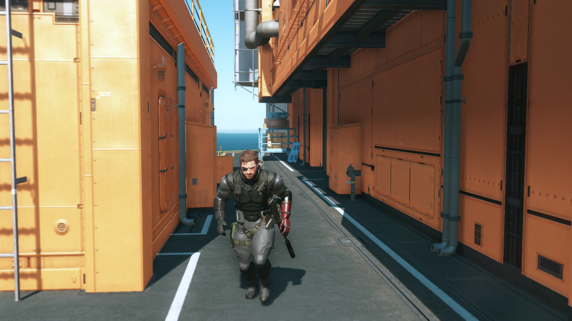
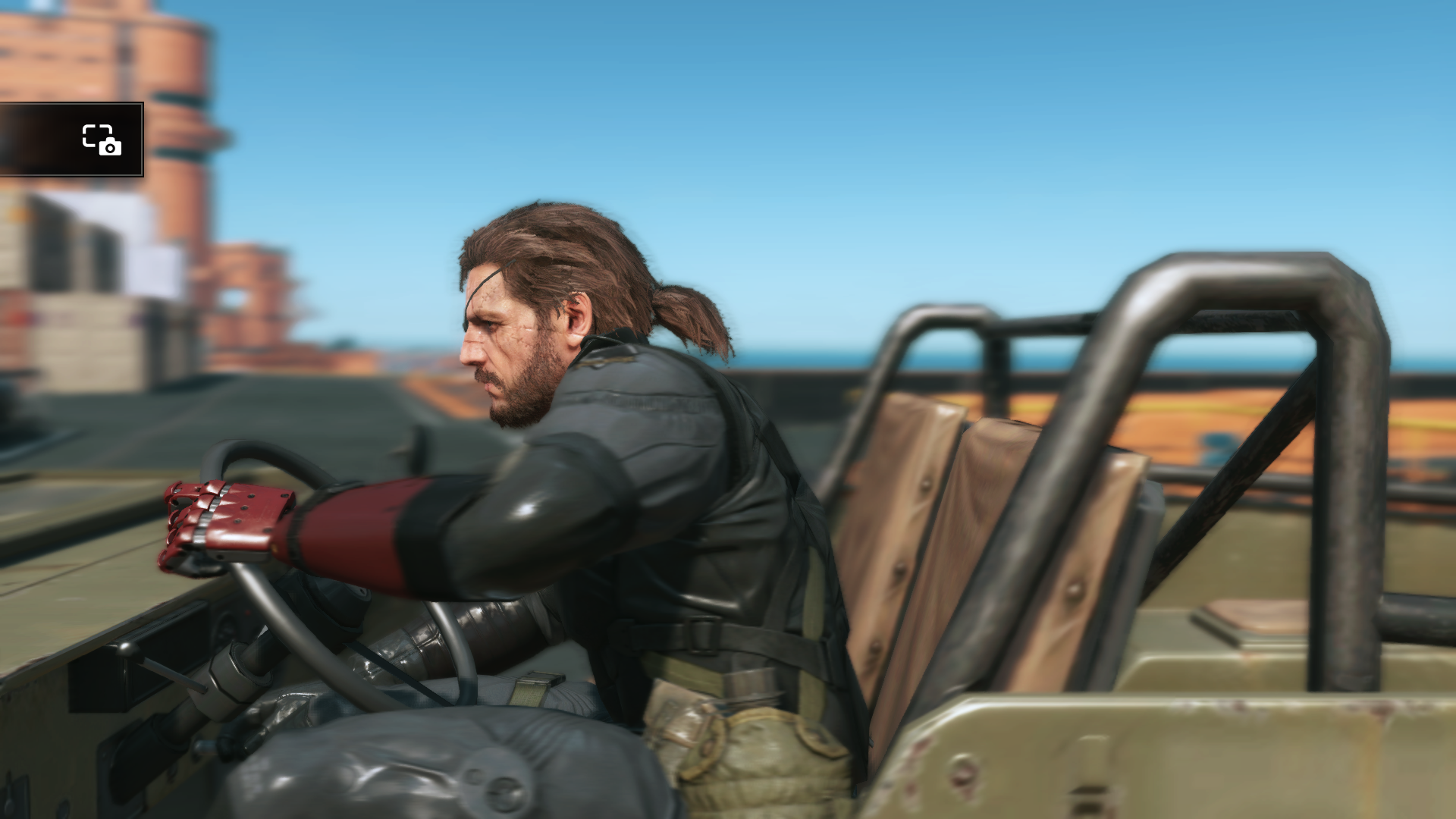
Which is why I did the gameplay distance comparison. There is a noticeably big discrepancy from normal distance and close up. Afaik the order 1886 is one of the few current generation games that gets this right, but the face models are no match for uncharted 4 in extreme close ups. I'll post some pictures later.That demonstrates exactly what I'm talking about. In the distant shots, the character models look quite similar, I'm not going to argue that they are identical or that Lara is better, my point was never about TR or any other game vs UC4, The Lar model would not look out of place in UC4 and the Drake model would not look out of place in TR.
However there is clearly a massive quality difference in the close up shot. UC4 is vastly better there.
And that's my point, the close up shots are not giving a true representation of how the game compares (in fine character detail) during actual gameplay to other games. If you looked at the close ups alone you'd be forgiven for thinking UC4's graphics are a generational leap over games like Quantum Break but when you draw the camera out to a normal playing distance the difference is minimal - again in terms of the fine character detail that shows up in the UC4 close ups.
You are using an out of date browser. It may not display this or other websites correctly.
You should upgrade or use an alternative browser.
You should upgrade or use an alternative browser.
UC4: Best looking gameplay? *SPOILS*
- Thread starter RenegadeRocks
- Start date
-
- Tags
- uncharted 4
- Status
- Not open for further replies.
The point isn't valid if you post pictures of character models that are clearly far smaller than normal gameplay size. My point was about what you see under normal game playing circumstances. There can be a massive rendering quality difference between characters even when shown at normal gameplaying distances. e.g.

Details are about the same... differences come from lighting/shading (much better on Unity)...
No they don't, although it's pretty common this gen. Those MGSV shots actually show it being avoided reasonably well. Yes, less detail is resolved at that distance, but not significantly less than would be expected given the distance.The truth is almost all games suffer from this
By contrast:
The ACU image looks like someone took a scissor cutout of a blurry face and glued it over another face. The loss of detail is much more extreme than you'd expect given the distance, such that the face no longer seems to sit well in its environment.
Just for clarity, the image on the left is ACU, right is AC Brotherhood. I used Google images to source both shots and didn't search for long. The ACU shot isn't the best quality unfortunately.
The thing i like the most about the graphics in the order is that the characters seem grounded to their environments 100% of the time. I don't know if it's their post processing but everything in the visuals just come together real nicely. There are a few instances where the characters in Uncharted 4 seem out of place in their environments.


Comparisons with RoTR are plain dumb. They've blown their entire budget on Lara's tress FX head jair, and left none for chest hair, an area U4 is clearly supperior.
I hope PS4 version has at least some chest hair on lara, and a bit of a scruffy beard too. Hopefully on Neo she will have a full bear-worthy furry back. That's the bare minimum.
I hope PS4 version has at least some chest hair on lara, and a bit of a scruffy beard too. Hopefully on Neo she will have a full bear-worthy furry back. That's the bare minimum.
Same comparison but from a moderate distance (something you usually see during gameplay)
RotTR
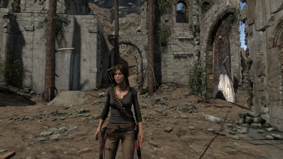
Original PNG: https://abload.de/img/riseofthetombraider05nslfv.png
QB
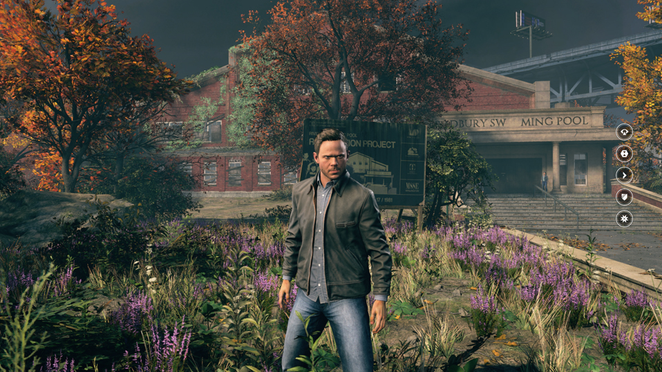
Original PNG: https://abload.de/img/quantumbreak5_25_2016mzbfj.png
U4
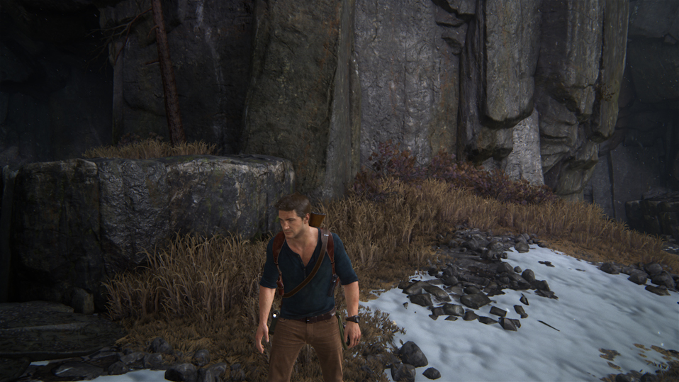
Original PNG: https://abload.de/img/uncharted4_athiefsendbnlfw.png
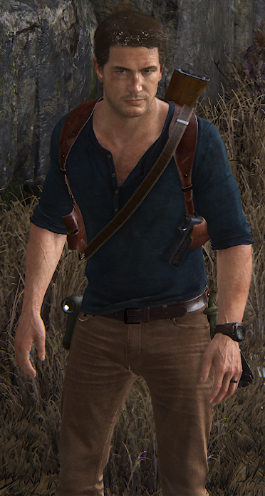
While no model is clearly superior than the other from this distance i found clothing, hair and skin slightly or generally better on Nate. While QB gets bonus points for completely realistic proportions (scanned human) and Lara has very nice animation on her hair during movement, like milk said a large amount of the budget was allocated for TressFX and it shows. RotTR also gets bonus points for having self shadowing during gameplay from the sun as a light source (same as U4) while QB has self shadowing on the character usually in in-door lighting scenarios (missing on this outdoor scene, or at least reduced resolution and missing things as his jacket). Playing all games back to back, I also found that U4 opens up the fov a lot more than RotTR and QB, with RotTR having more open fov during gameplay than QB, which spends a lot of its time close to the character model. I might be adding The Order as well to this comparison since it has some of the most detailed character models in a TPS alongside QB, U4, RotTR.
Edit: To be more precise, here are the cropped character models from the PNG screenshots:
RotTR ~220k pixels on this shot (10.6% of the pixel budget of a 1080p frame allocated for the character model)
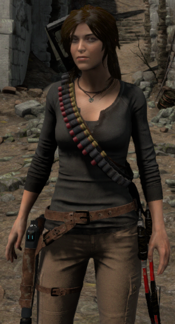
QB ~250k pixels on this shot (~12% of the pixel budget of a 1080p frame allocated for the character model)
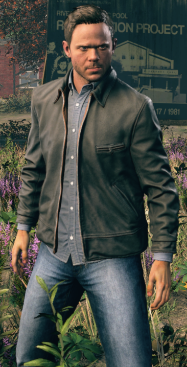
U4 ~180k pixels on this shot (8.6% of the pixel budget of a 1080p frame allocated for the character model)
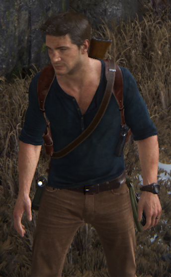
So it's still not exactly even, i took these shots without this in mind, but i think it's very difficult to get 1:1 comparison because of the different camera settings in each game (that's where photo mode helps extremely). For example if i reduce the fov to 60 with photomode i get something between QB/RotTR in terms of pixel count for the character model
~235k pixels here:
RotTR

Original PNG: https://abload.de/img/riseofthetombraider05nslfv.png
QB

Original PNG: https://abload.de/img/quantumbreak5_25_2016mzbfj.png
U4

Original PNG: https://abload.de/img/uncharted4_athiefsendbnlfw.png
While no model is clearly superior than the other from this distance i found clothing, hair and skin slightly or generally better on Nate. While QB gets bonus points for completely realistic proportions (scanned human) and Lara has very nice animation on her hair during movement, like milk said a large amount of the budget was allocated for TressFX and it shows. RotTR also gets bonus points for having self shadowing during gameplay from the sun as a light source (same as U4) while QB has self shadowing on the character usually in in-door lighting scenarios (missing on this outdoor scene, or at least reduced resolution and missing things as his jacket). Playing all games back to back, I also found that U4 opens up the fov a lot more than RotTR and QB, with RotTR having more open fov during gameplay than QB, which spends a lot of its time close to the character model. I might be adding The Order as well to this comparison since it has some of the most detailed character models in a TPS alongside QB, U4, RotTR.
Edit: To be more precise, here are the cropped character models from the PNG screenshots:
RotTR ~220k pixels on this shot (10.6% of the pixel budget of a 1080p frame allocated for the character model)

QB ~250k pixels on this shot (~12% of the pixel budget of a 1080p frame allocated for the character model)

U4 ~180k pixels on this shot (8.6% of the pixel budget of a 1080p frame allocated for the character model)

So it's still not exactly even, i took these shots without this in mind, but i think it's very difficult to get 1:1 comparison because of the different camera settings in each game (that's where photo mode helps extremely). For example if i reduce the fov to 60 with photomode i get something between QB/RotTR in terms of pixel count for the character model
~235k pixels here:

Last edited:
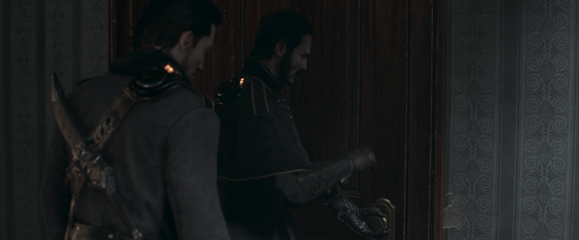
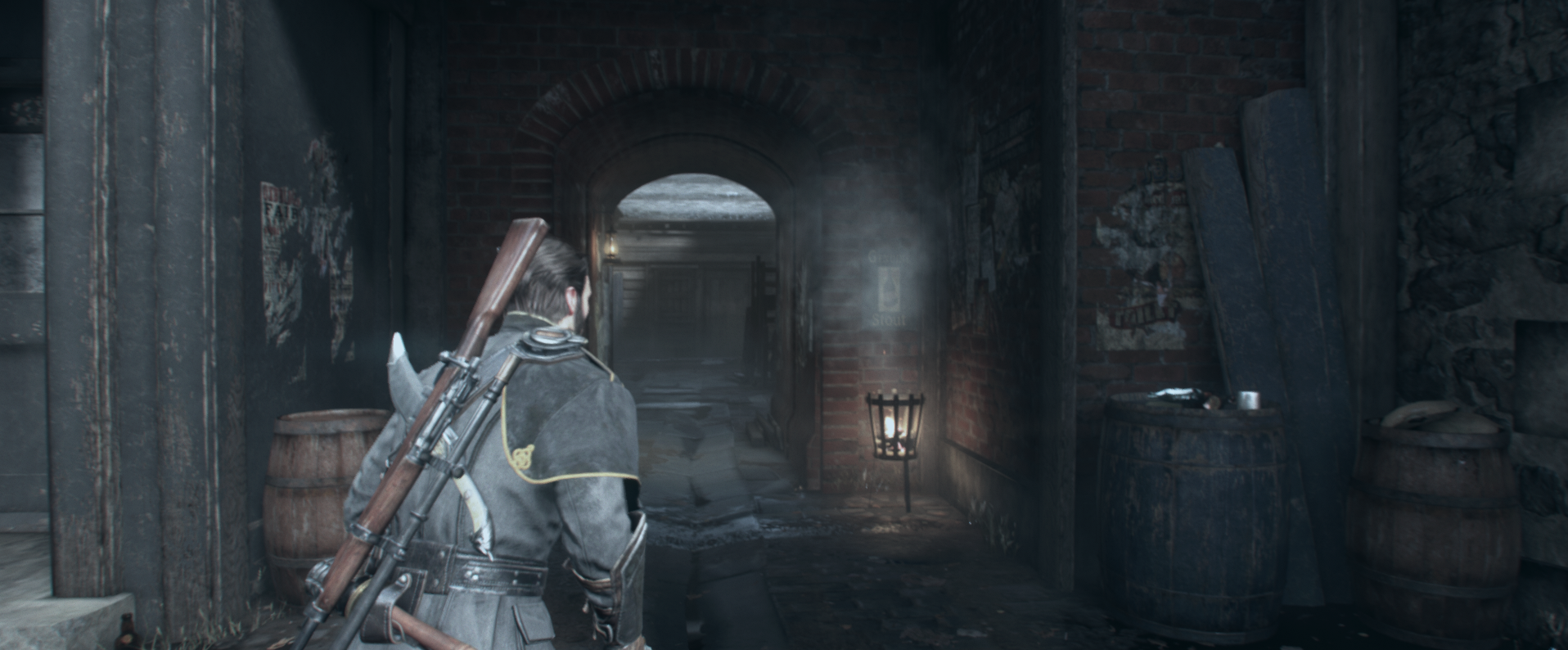
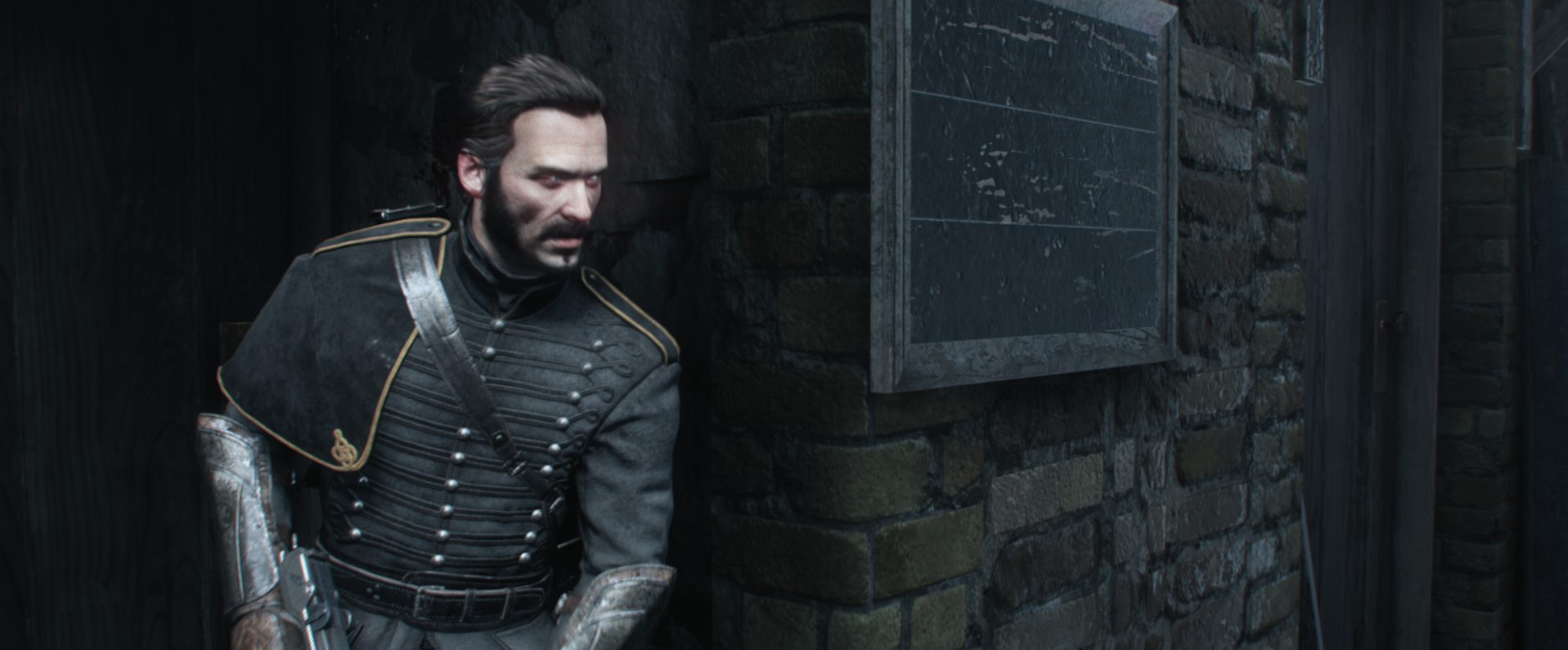
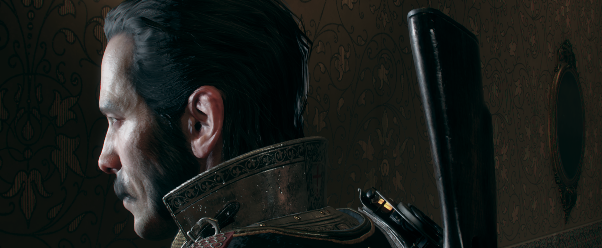
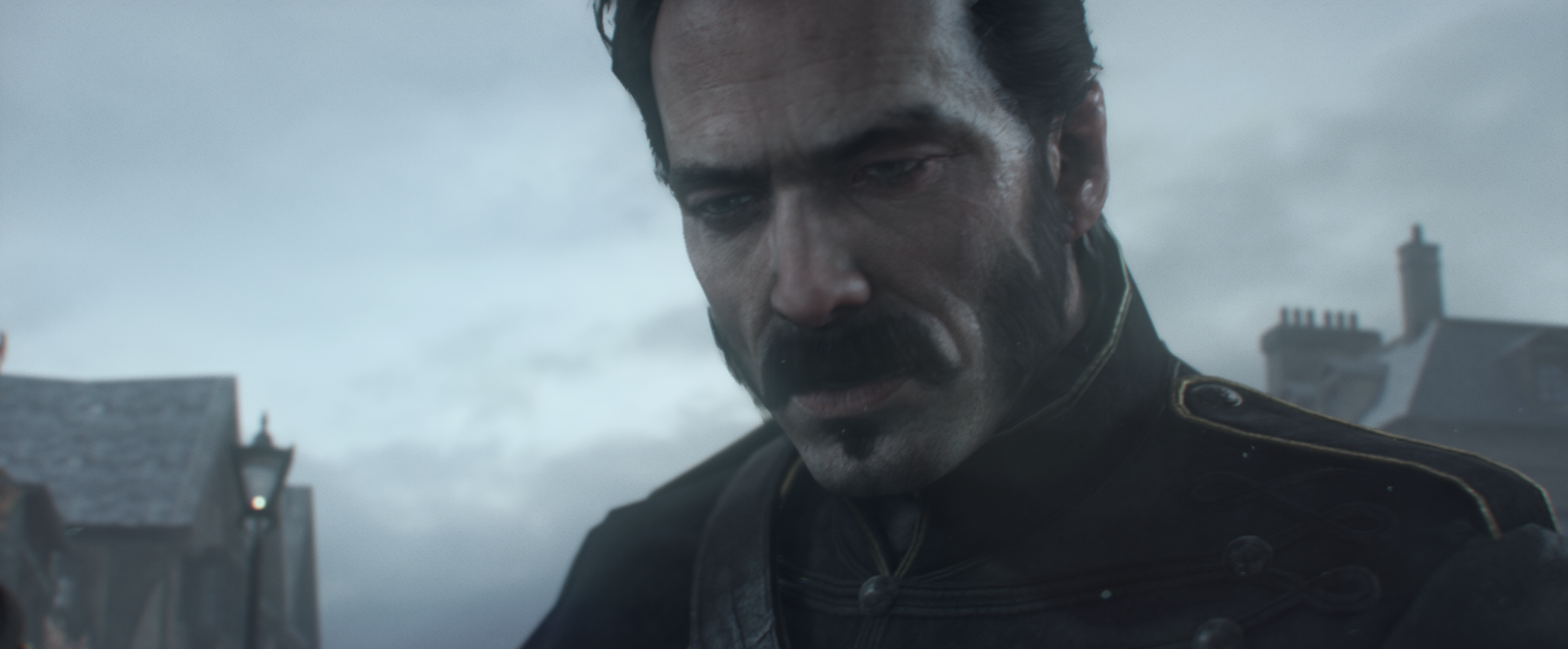
The Order, very interesting to see how RaD allocated the pixel budget on characters (much, much closer during normal play than even Quantum Break)
Lit directly
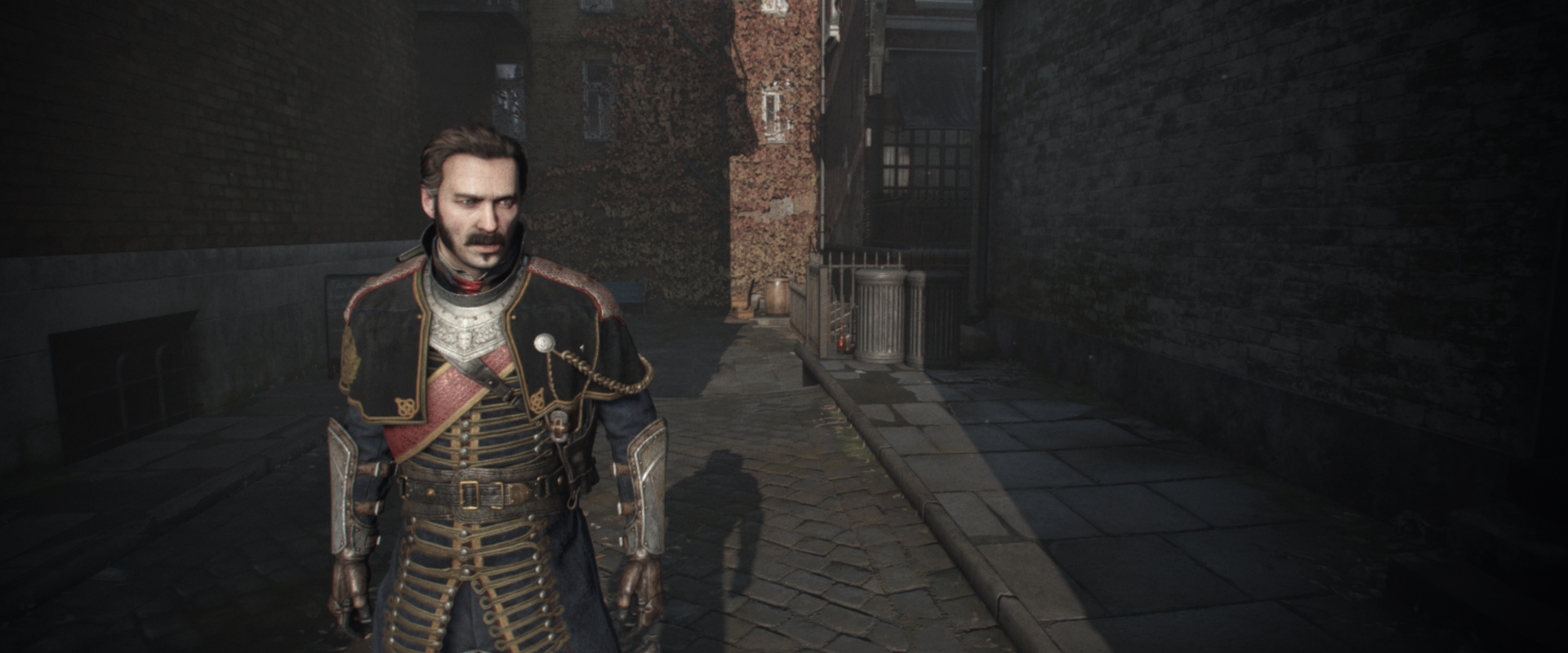
PNG: https://abload.de/img/theorder_1886_20160528qyp8.png
Partly under shadow
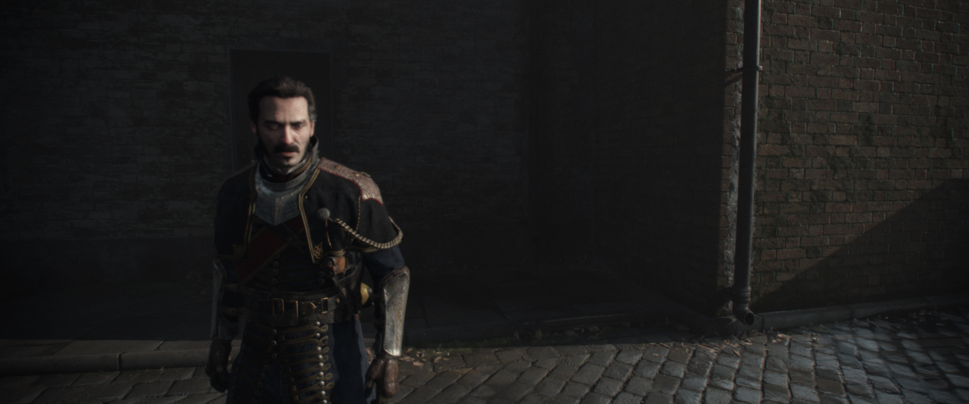
PNG: https://abload.de/img/theorder_1886_20160527abis.png
Fully under shadow
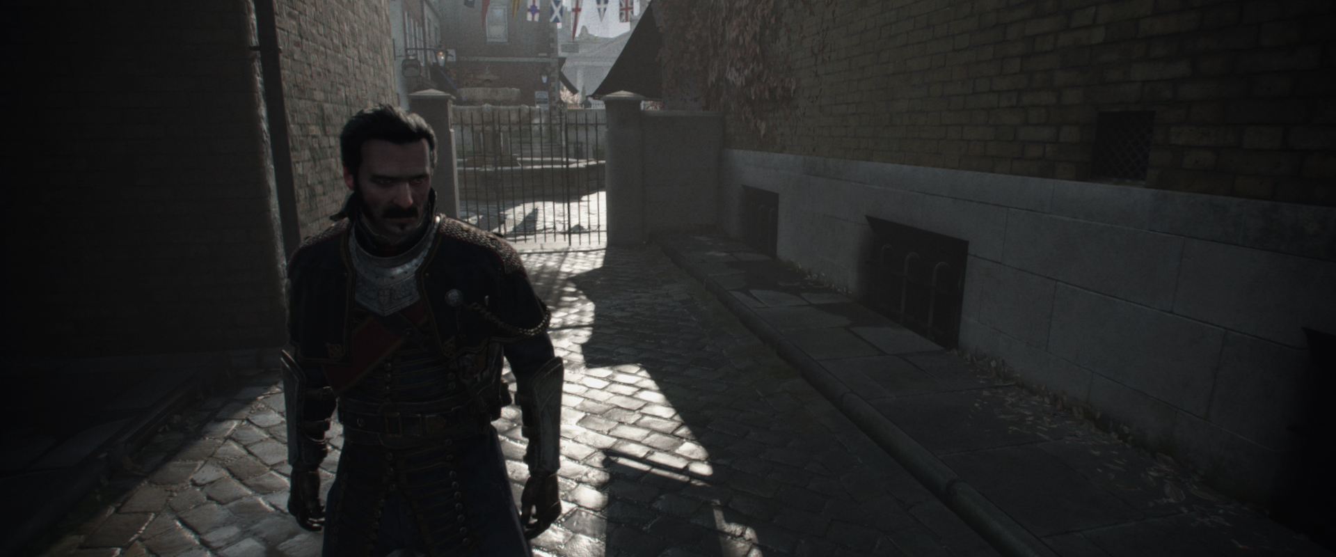
PNG: https://abload.de/img/theorder_1886_2016052qiyj3.png
Moderate distance
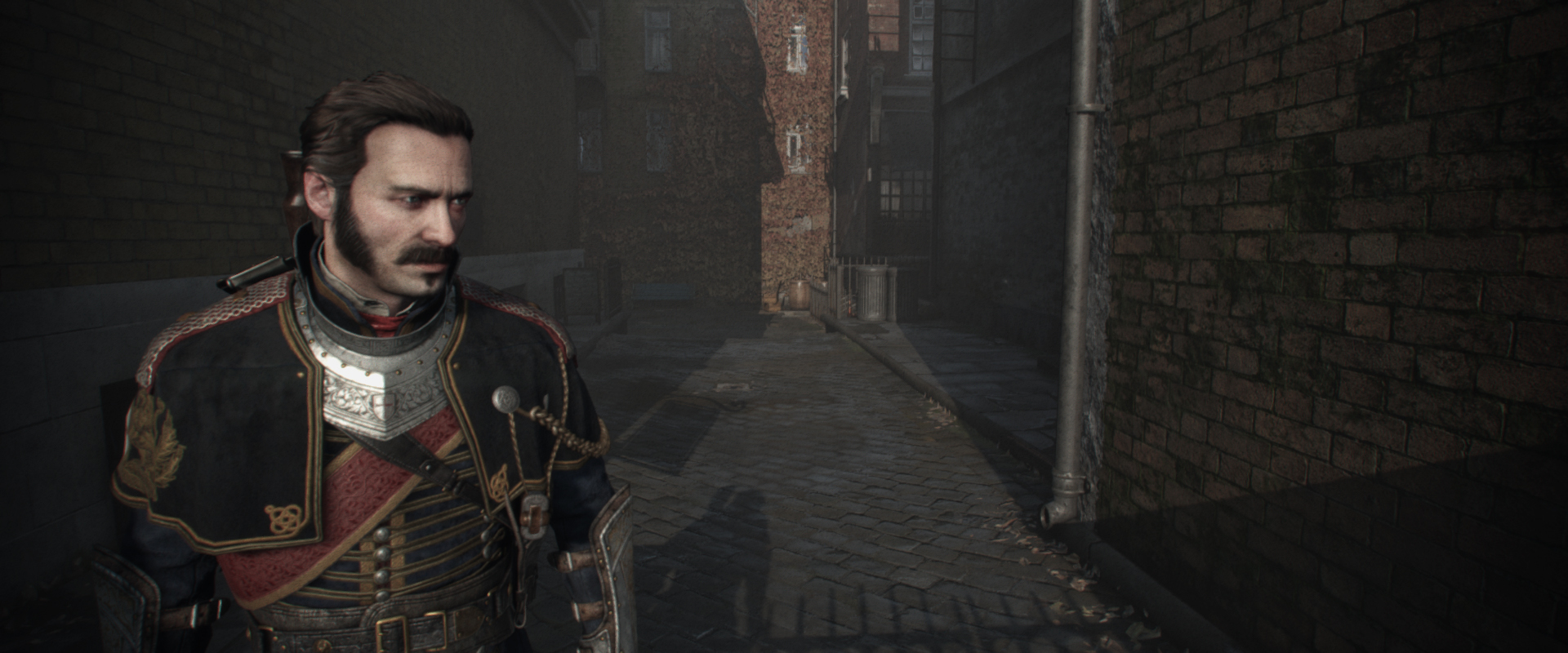
PNG: https://abload.de/img/theorder_1886_2016052y2b0o.png
Closeup
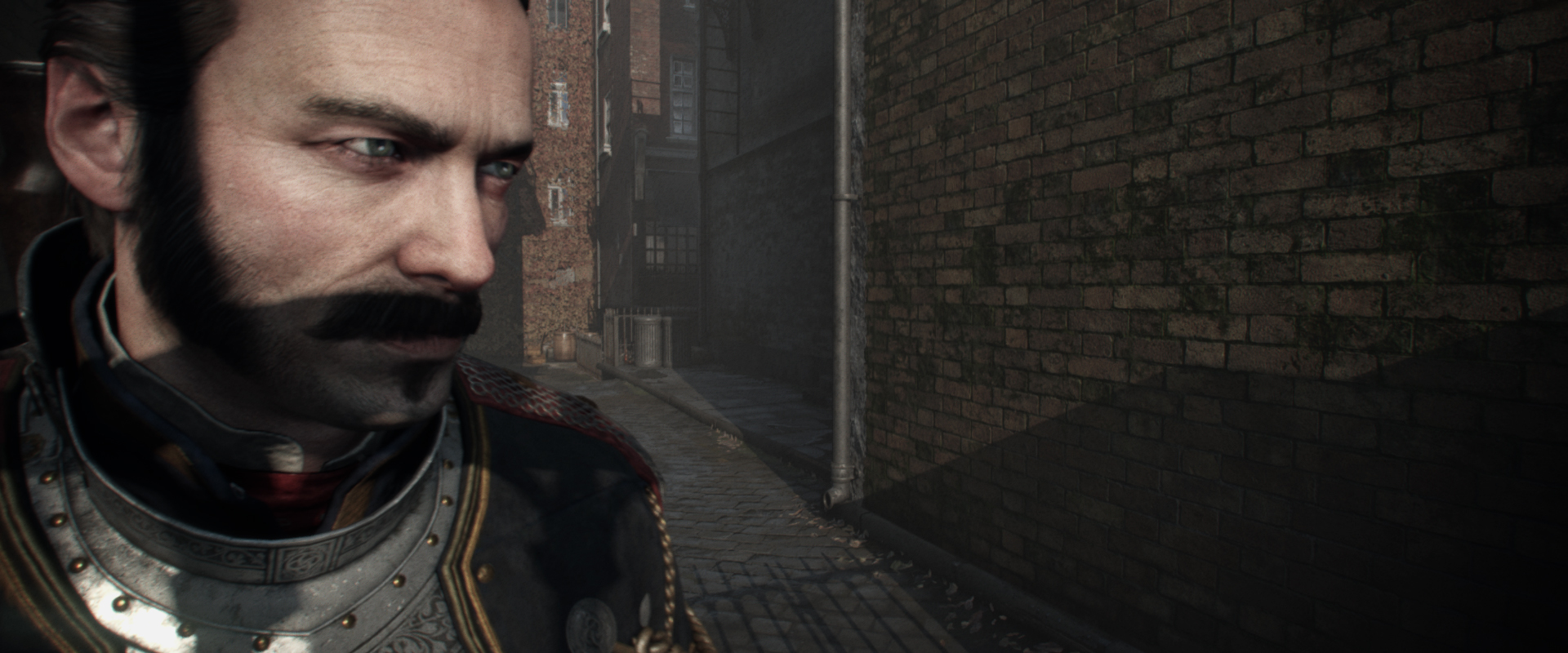
PNG: https://abload.de/img/theorder_1886_2016052jcydv.png
-------------------------------------
Crops
~270k pixels here (17.5% of pixel budget in a 1920x800 frame)
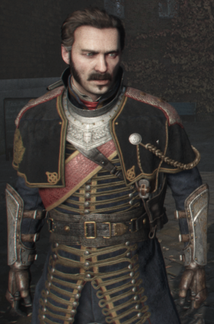
~450k pixels here (29.2% of pixel budget in a 1920x800 frame)
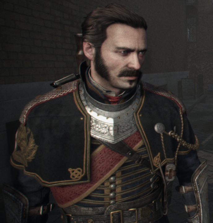
-------------------------------------
Interesting detail, same as Uncharted 4 if you get close to the model you can see microsaccade movement in Galahad's eyes (iirc missing from QB and RotTR)
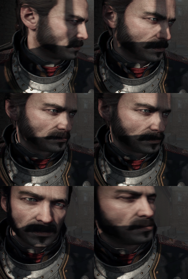
Overall, The Order spends its time much closer to the character than QB/RotTR/U4 but also trades detail for image stability due to the AA used. Skin shading is probably the best of the bunch during gameplay but it doesn't show much other than the head of the character so it's hard to judge.
Lit directly

PNG: https://abload.de/img/theorder_1886_20160528qyp8.png
Partly under shadow

PNG: https://abload.de/img/theorder_1886_20160527abis.png
Fully under shadow

PNG: https://abload.de/img/theorder_1886_2016052qiyj3.png
Moderate distance

PNG: https://abload.de/img/theorder_1886_2016052y2b0o.png
Closeup

PNG: https://abload.de/img/theorder_1886_2016052jcydv.png
-------------------------------------
Crops
~270k pixels here (17.5% of pixel budget in a 1920x800 frame)

~450k pixels here (29.2% of pixel budget in a 1920x800 frame)

-------------------------------------
Interesting detail, same as Uncharted 4 if you get close to the model you can see microsaccade movement in Galahad's eyes (iirc missing from QB and RotTR)

Overall, The Order spends its time much closer to the character than QB/RotTR/U4 but also trades detail for image stability due to the AA used. Skin shading is probably the best of the bunch during gameplay but it doesn't show much other than the head of the character so it's hard to judge.
Last edited:
Billy Idol
Legend
But this eye movement looks sometimes freaky...my wife immediately noticed this and said the eyes are wrong...meh, showing stuff to people who are not into graphics is no fun


Something about QB's gameplay distance model looks plasticky, it's as if the specularity is off, so are the foliage in that particular shot.
With the comparison between UC4 and The Order, I think the more stylized Drake takes away the photorealism a bit thus appears a bit cartoon like next to Galahad's full on CGI esque look. But when zoomed in, Drake's face definitely looks better as in more higher res.
With the comparison between UC4 and The Order, I think the more stylized Drake takes away the photorealism a bit thus appears a bit cartoon like next to Galahad's full on CGI esque look. But when zoomed in, Drake's face definitely looks better as in more higher res.
Having played some more, I genuinely think UC4 is 'unfinished'. I think even after the delays, ND were told to ship a product and had to release with some incomplete solutions. That would explain the inconsistencies which are pretty extreme. At it's best it's definitely world-class, but aspects just don't work, like the radioactive rocks in Madagascar and other events when the character lighting just breaks, or the early level where it looked like the sea didn't have a texture and the scenery was like something from GT6 contrasted with the epic city details in Madagascar. As such the game is a bit of a victim of its own ambition and the realities of commercial game development.
[/hypothesis]
[/hypothesis]
Having played some more, I genuinely think UC4 is 'unfinished'.
Genuinely curious to know the list of what you consider "finished" games now
- Status
- Not open for further replies.
Similar threads
- Replies
- 24
- Views
- 2K
- Replies
- 90
- Views
- 17K
- Replies
- 16
- Views
- 4K

