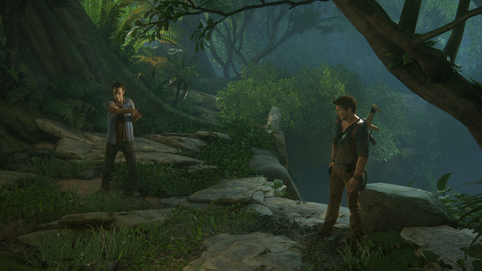
UC4: Best looking gameplay? *SPOILS*

Status
Not open for further replies.
Thanks, so it does just have an amazing LOD system that ramps up the detail to a very high degree the closer you get the camera in.

The problem with that is that you can only get that close in Photomode. When playing the game, he looks much worse and the dude beside him looks pretty bad.
 
Maybe The Order might do some individual effects here and there better, but as a whole package of graphical features all blended together to such incredible consistent results? No comparison.
Given that wording I'd place it the other way. Uncharted 4 is vastly more ambitious in technical scope and certainly does some things really well, but as far as the core bits and bobs coming together with consistent results, I'd give The Order the upper hand. Lighting can represent a wider variety of local lighting conditions well (especially where opaque glossy materials are concerned), and image quality is more consistent with much fewer apparent patterned artifacts. There are also all kinds of design subtleties where The Order covers itself better, for instance fake windows are passable at a glance whereas Uncharted 4's are pretty average (AKA obvious). Playing through The Order, I rarely felt like areas or aspects were dropping the ball; by contrast, in Uncharted 4, my eyes are occasionally getting caught by dithering and masking issues, some areas feel like they have significantly inferior lighting to others, sometimes a metal object will look badly like it doesn't belong in its otherwise beautiful environment, etc.

Uncharted is trying to handle a much wider variety of area design, and does more things in those environments. But I do think that The Order is visually tighter.
 
I'm going to have to disagree with you on that one.

Like i said you are free to disagree and prefer whatever you like (or is available on your platform of choice). These screens exhibit exactly what i said, if you know what to look for it's everywhere. And like i said Battlefront looks more realistic, and that's intended. If realism is all you're interest in then you don't have to lose much sleep over Uncharted 4.
 
Like i said you are free to disagree and prefer whatever you like (or is available on your platform of choice). These screens exhibit exactly what i said, if you know what to look for it's everywhere. And like i said Battlefront looks more realistic, and that's intended. If realism is all you're interest in then you don't have to lose much sleep over Uncharted 4.

I fail to understand how you can claim that the less realistic looking foliage is more technically advanced than the more realistic looking foliage. But whatever, let's just agree to disagree.
 
The master race is not happy with a good looking console exclusive lol.

WRT comparisons with The Order - least we forget the black bars and smaller environments.

WRT U4 aliasing, I have not seen much at all it's mostly very clean (to my eye)...I really have to look hard to see the odd bit there and there, at times it's like watching a CGI movie (cut scenes)
 
The Order actually had more aliasing and shimmering on distant very thin objects than U4 does(i paid close attention in my recent playthrough of the game). Overall i think the U4 AA is better than the one in The Order, if only because the overall IQ (sharpness mostly) doesn't have to suffer for it.
 
I fail to understand how you can claim that the less realistic looking foliage is more technically advanced than the more realistic looking foliage. But whatever, let's just agree to disagree.

Shading - Occlusion - Self Shadowing

Three very technical terms that have nothing(well, almost nothing in comparison to other areas) to do with how "realistic" assets can look in pictures. And realistic doesn't necessarily mean better. An example, how to train your dragon is less realistic than Battlefront, that doesn't mean it's less technically advanced in what it's doing.
 
Last edited:
Man, these screenshots are NOT representative of the game when it's in motion. UC4 has a LOT of aliasing due to the 1080p nature and yet, a screenshot won't capture the jaggies anywhere near what it is when playing. ALL of the foilage I've seen that moves is aliased. Not only that, there are only certain levels that have destructible objects -- again emphasizing a lot of baked lighting.

All a person needs is a few Chapters in UC4 to determine what the engine can/can't do. It doesn't take you to see the entire game. The tricks they use will be used across the entire game. I never heard of using screen-space light shafts on one level and then using full volumetric ray-marching light shafts on another level. There is no such thing has making anisotropic filtering 16x on one level, but 4x on another level (the texture clarity at a certain distance is horrible in pretty much every PS4 game).

You guys mention the apartment of Nate. I saw it and it looks great, but it still looks like a videogame. Contrast that with The Order's first room when he starts out and while everything is baked, it looks way more photoreal and reminiscent of a natural offline rendered image.

Lots of hyperbole in this thread for sure.
Sorry but I see no aliasing to speak of in foliage. Not sure what you're playing on. The only apparent aliasing I've seen is in very straight and contrasting lines and that only happened for a fraction of a second, in cutscenes.
 
What better way to prove my point by using the game itself?

PSX 2014
u4psxq9ut5.png


1.02 retail
uncharted4_athiefsendrlujz.png


Improved occlusion technique, shading and self shadowing on some foliage (although hard to notice in that screenshot). Basically, how different the same assets can look with those three areas improved.
 
Last edited:
We're all used to games having distracting pop-ins due to close range lod swaps (which happen on U4 too, just less distracting) and then comes this game and shows what the hardware (however powerful - or not - that may be) is capable of.

I have to disagree on this one. There is a difference between the large vistas in any Uncharted game and basically any kind of open world game. With Nate, you can never really just take a completely straight path to the distant areas, there's always a 'channel' with a constrained width and travel direction. What this means is that there is no LOD transition because the objects are not constantly visible to the camera.

For example, in all the Madagascar city scapes that you see from both the top and the base of the clock tower, you are only able to get to that area through the pre-planed route, with the jeep. Yes, once in the city, you can use any of the streets - but the majority of the transition from the grand vista to the city area is hidden.

You do get to drive through the island in the following level, but thanks to the clever level design, you don't get to see that far ahead, and the LOD transitions will also be more visible and obvious there.

So it is really unfair to compare the grand vista type settings of UC4 (or the other games) to something like the Far Cry series.

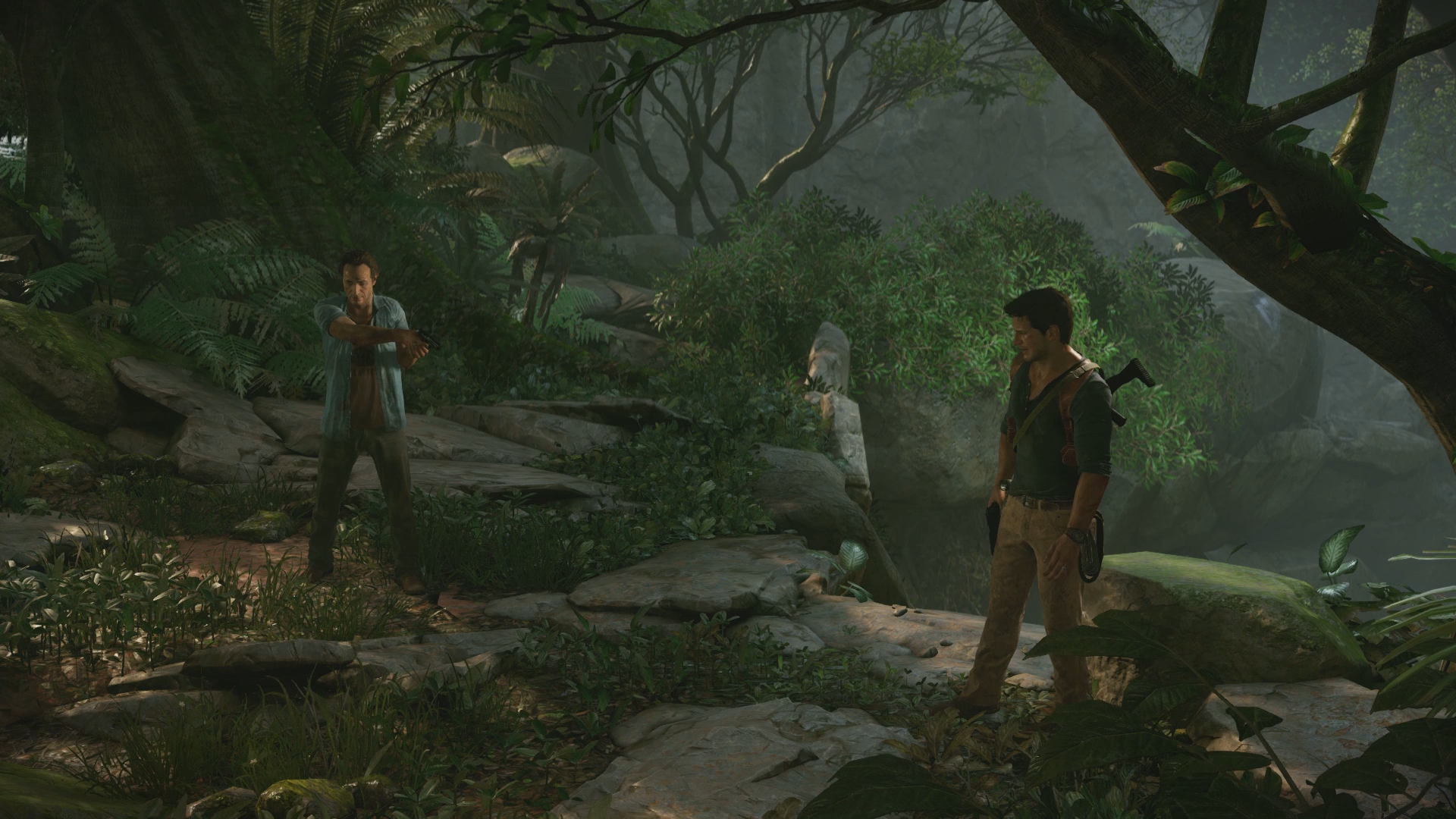
I wasn't comparing it to open world games specifically, even linear games have pop-in problems. LOD transition is an issue this gen for most games, i think they handled it really well in Uncharted 4.
 
Late-game environment spoilers, some screenshots from a gameplay area in Uncharted 4 for those who finished the game or don't care open up

This level was obviously a labour of love for everyone involved in the asset and gameplay teams. But the amount of effort that ND has spent on this is still utterly amazing, not to mention the results.
 
Shading - Occlusion - Self Shadowing

Three very technical terms that have nothing(well, almost nothing in comparison to other areas) to do with how "realistic" assets can look in pictures.

I don't really care how many technical buzz words are used, I'm not seeing anything better about the foliage in UC4 compared to those shots I posted of BF, whether "technical" or otherwise - and yes, I've seen both in motion. The foliage in BF simply looks more realistic, and in this case that does equal 'better' in my opinion. The game does look incredible, there's absolutely no question of that, and as an overall package I agree it probably is the best looking game available today on any platform. And in some areas, yes, it is clearly better than all other games (character models being one), but that doesn't mean it has to be better than every other single game in every single area. And one of the areas where it is outdone by at least one other game IMO is foliage by Battlefront. If pushed, I could probably name one or two other games as well but I don't want to upset people too much.
 
Like any other game... anyway, how can you make the difference ? Because this is exactly like in real life...

No need to be defensive, I was complimenting the LOD system and particularly it's detail at the highest levels, it looks amazing. That said, extreme close ups of characters faces are not representative of what you'll see at a normal playing distance from those characters as shown by my earlier shot.

And while real life does of course resolve higher details at shorter distances, clearly this isn't exactly reflective of that. There's a steeper drop off of how realistic a face looks in the game as you move away from it than there would be in real life. Again though, that's not in any way putting the game down, it still handles it brilliantly.
 
And in some areas, yes, it is clearly better than all other games (character models being one), but that doesn't mean it has to be better than every other single game in every single area.

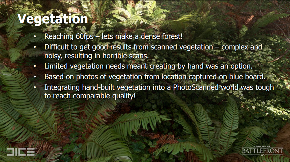
Oh I've said that many times. I can list you games doing one thing or the other better than Uncharted 4 does it. I think what makes Battlefront foliage look better for you is simply the asset quality and detail (which is pretty high) and that's doubly impressive given that Dice didn't use photogrammetry for foliage, only some sample high quality photographs (by some i mean thousands probably :D). I just think foliage in Uncharted 4 looks better than Battlefront in some areas (for the reasons i stated) and Battlefront looks better in others (due to lighting and setup of the whole level). There are other things to note as well such as the interactivity with the foliage which is pretty nice (grenades too, and shooting). I can totally understand if you prefer one or the other.
 
Well it kinda makes sense that scanned foliage looks more realistic :D

Edit: hmm, no scanning then? Interesting.
 
Last edited:
Status
Not open for further replies.
Back
Top