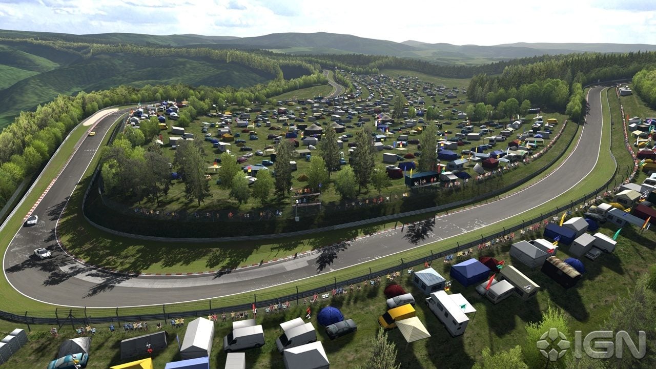
Another absolutely atrocious screen from GT5. I really don't believe that a AAA title can have such bad looking scenery - they should have budgeted for some level of track detail - even if it was mediocre. It hardly seems sensible to have photorealistic cars paired with environments from two generations ago, I mean look at NFS:HP2 the cars look fantastic, amazing shaders, come quite close to matching GT5 in gameplay and the draw distance is 15 km - now surely GT5 will not be able to compete since it's running at 60fps but it shouldn't have so big a disparity in visuals.
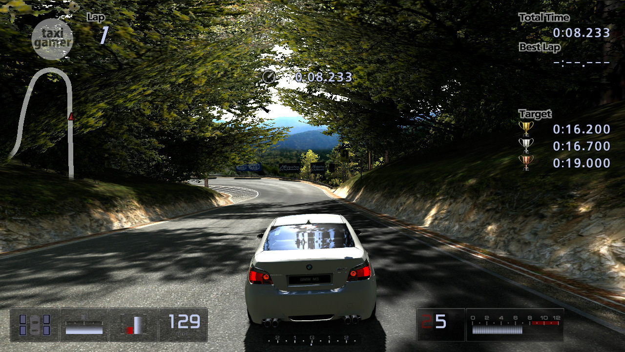
And here you will definitely be able to notice the PS1 quality low res 2D foliage as it is directly in the foreground and not in the background like other pics:
I also noticed that not only do they tend to use 2D tree sprites, it's often the SAME 2d tree sprite repeated over and over again
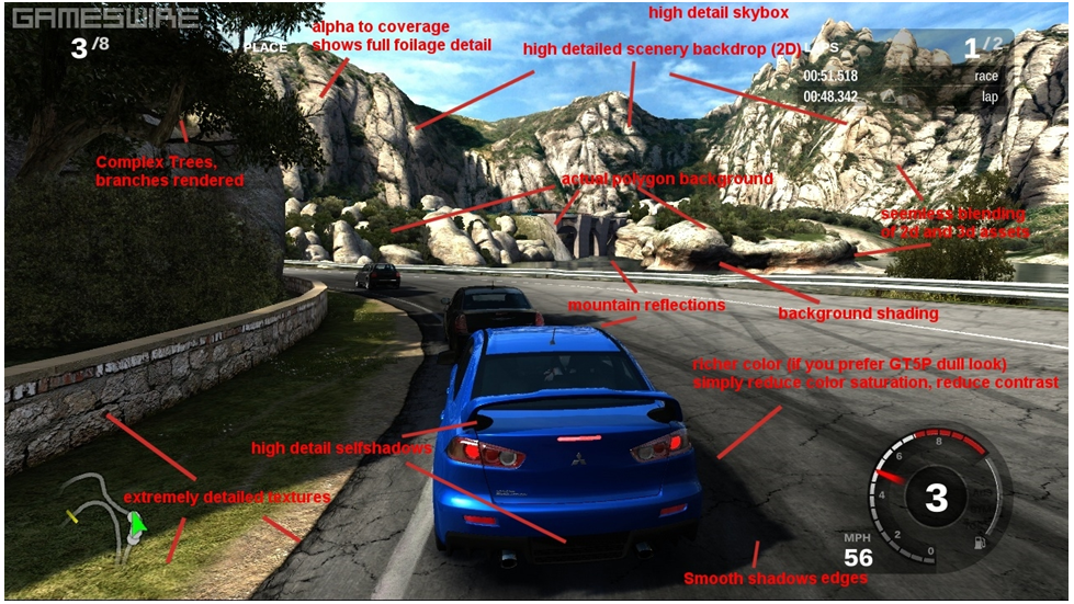
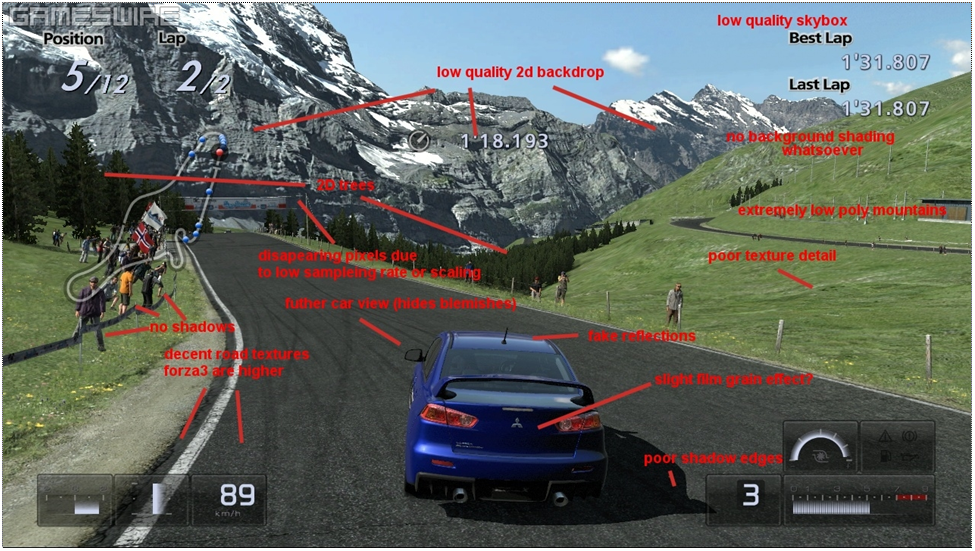
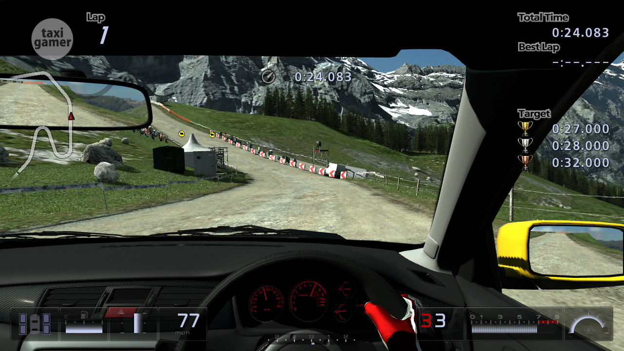
And in this screen, the Eiger Nordland track looks exactly like it did back in GT HD, replete with pathethic 2D mountains, nothing like the bump mapped mountains you get in Forza :
What is exactly the difference between how car lighting and shadowing (and reflections) is done in GT5 vs Forza 3? Is it primarily due to better tech better or artistry? IIRC GT5 Prologue did environment reflections by projecting the road surface texture on the car's exterior, does GT5 still do this?

.jpg?n=6962)

