I'd be shocked if Neo didn't support HDR output. I personally haven't yet seen HDR content on a HDR compatible TV but everyone says it's really impressive. It would be nice to get Neo-patched-HDR games, on top of everything else that it will bring. I have no idea how difficult it is to implement or to 'patch' onto already released games.
You are using an out of date browser. It may not display this or other websites correctly.
You should upgrade or use an alternative browser.
You should upgrade or use an alternative browser.
UC4: Best looking gameplay? *SPOILS*
- Thread starter RenegadeRocks
- Start date
-
- Tags
- uncharted 4
- Status
- Not open for further replies.
Not sure about huge sales. HDR TVs are very much a new thing, most 4K TVs don't support it yet. But it would be great to have that option.Hell if this HDR thing works as impressive as they claimed then that along should help to boost Neo sale a lot. A game like UC4 would be a perfect demo reel for Sony.
I've noticed that even in some big levels with huge draw distance (Italy) the gameplay models holds up really well in comparison to cutscenes
Cutscenes:

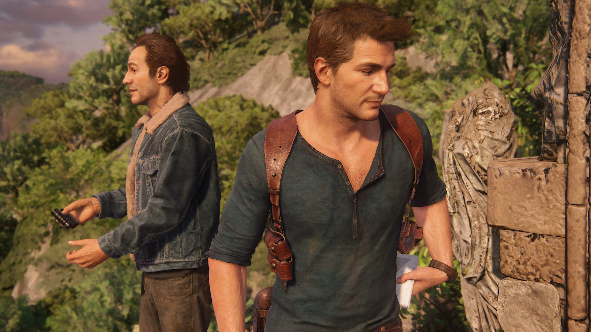
Gameplay:
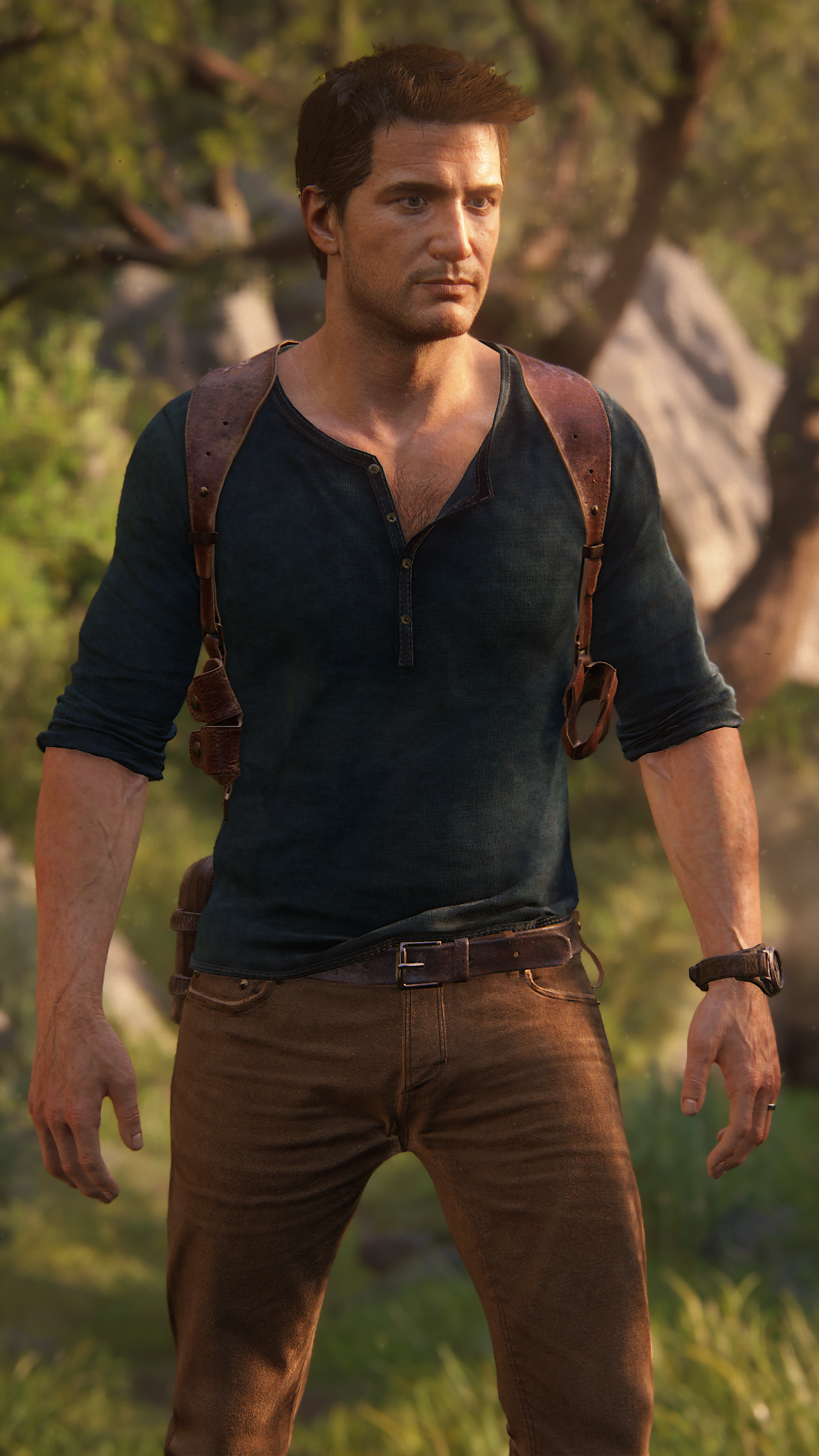
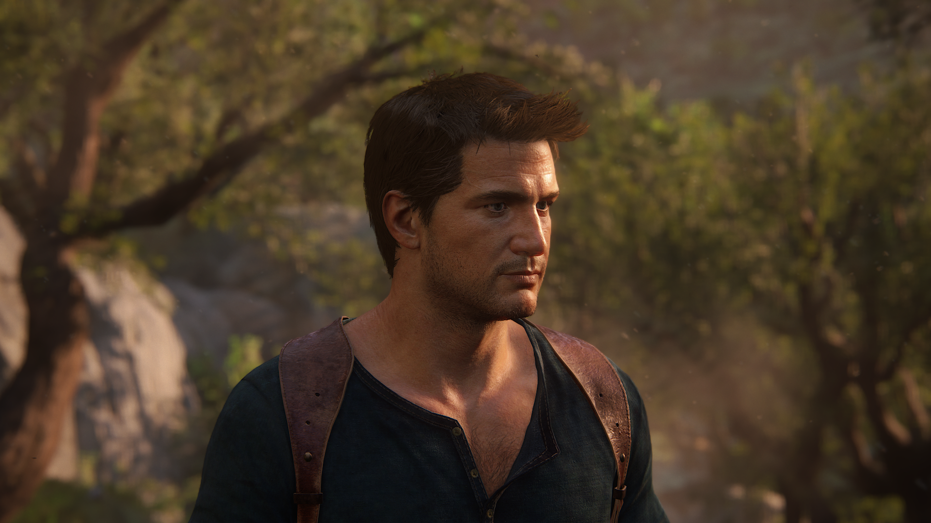


Fabric/leather/skin detail is really great here
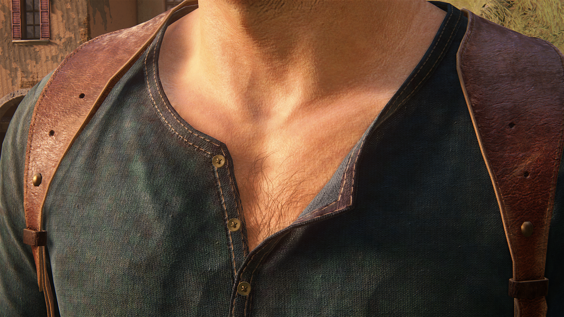
Another closeup from the gameplay model
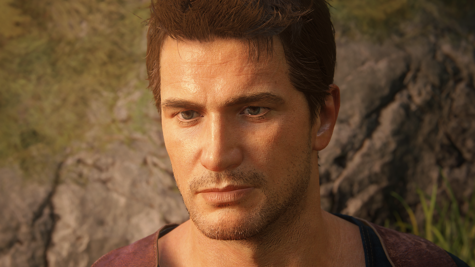
Which leads me to believe that shading is optimized on a per scene basis to reach a consistent 30 fps (as opposed to having a locked option), i'm guessing that would be easy to alter given twice the GPU perf (with the Neo).
Cutscenes:


Gameplay:


Fabric/leather/skin detail is really great here

Another closeup from the gameplay model

Which leads me to believe that shading is optimized on a per scene basis to reach a consistent 30 fps (as opposed to having a locked option), i'm guessing that would be easy to alter given twice the GPU perf (with the Neo).
Last edited:
rockaman
Regular
I don't think the lighting is any different there compared to when he looks much worse, in technical terms I mean. It does look better than at its worst, but its still the same lighting solution. It's just that in certain ways of the gameplay lighting it highlights that systems deficiencies more than others. And most of the time it looks this good, so I am not complaining, believe me, I love the lighting in this game 
There are only three levels of shader quality I've personally noticed that go in these tiers:
1) cutscene level in real-time is top-tier obviously, only available in most cutscenes and also in character viewer, this one also has the most sophisticated facial animation modeling by far
2) in-home Drake (and maybe in-caves Drake)
3) gameplay Drake for the rest of the game (and in some fixed camera cutscenes actually too, these scenes will have better facial animation than gameplay though of course, not as good as top-tier cutscene though)
In #3, the game does not switch to the cutscene-level shading quality every time there is a fixed camera cutscene, but it's not easily noticeable that it is only the gameplay lighting, simply because the lighting situation is not in a way that highlights lighting weaknesses.
For examples I would cite the fight between Drake and Nadine, and the scene after opening up the constellation door/window in Scotland cemetery (there are many others, I just remember these two at the moment).
Both scenes cut to fixed cameras and are essentially "cutscenes" but they do not actually use the maximum cutscene-grade level models, instead they use the gameplay models and shading/lighting. But they are in frames and lighting conditions where it won't be obvious that is what they are doing.
Basically what I'm trying to say is.... Naughty Dog clearly knows what they are doing ^^
Uncharted 4 3D 3840x1080 Screenshots CHAPTER 18 "the last drinks"
youtube 3d
MPO
https://drive.google.com/open?id=0B5r9wJYwSwdhYjBybWVGaU9FRms
youtube 3d
MPO
https://drive.google.com/open?id=0B5r9wJYwSwdhYjBybWVGaU9FRms
rockaman
Regular
Took some screens, if only I can remember why I took all of them 
Here is Elena's model in gameplay (photomode).... in a way it looks better than Drake's face because it is so much rounder and smoother, easier to light

Squinting

Misaligned reflection map, well I guess being a static reflection map it can't always be aligned properly ^^ (there are others like this, like in Drake's Epilogue home in his house, the glass table in the living room also is just a simple reflection map that get misaligned easily)

Second to none lighting

Splashes, I now figured out what they do while spinning the camera in photo mode, they are all simple 2D transparencies, but very high quality and used very densely.
They also disappear if you try to move the camera viewing angle in the same plane as the 2D effect exists, so you will never see them "from the side", even while you near the same plane as in which they are drawn, they become half transparent, so you never see a poor looking splash effect
They also do a bit of shader refraction, same effect for the mud I believe, but that one is probably not transparent (though sometimes you kick up water and mud transparencies at the same time). They do not grow or change size from what I could tell during animation, but because they are so dense and appear and disappear according to the camera for maximum effects, and many of them can be on screen at once, so it still looks amazing


It's probably harder to tell in static screenshots, but those are all the same splash, and they look ever so slightly different per angle you look at the effect from, because different 2D transparencies appear and disappear depending on the viewing angle.
Extreme finger animating

Elena reacting to being splashed

And the nicest looking retro shader

Here is Elena's model in gameplay (photomode).... in a way it looks better than Drake's face because it is so much rounder and smoother, easier to light

Squinting

Misaligned reflection map, well I guess being a static reflection map it can't always be aligned properly ^^ (there are others like this, like in Drake's Epilogue home in his house, the glass table in the living room also is just a simple reflection map that get misaligned easily)

Second to none lighting

Splashes, I now figured out what they do while spinning the camera in photo mode, they are all simple 2D transparencies, but very high quality and used very densely.
They also disappear if you try to move the camera viewing angle in the same plane as the 2D effect exists, so you will never see them "from the side", even while you near the same plane as in which they are drawn, they become half transparent, so you never see a poor looking splash effect
They also do a bit of shader refraction, same effect for the mud I believe, but that one is probably not transparent (though sometimes you kick up water and mud transparencies at the same time). They do not grow or change size from what I could tell during animation, but because they are so dense and appear and disappear according to the camera for maximum effects, and many of them can be on screen at once, so it still looks amazing


It's probably harder to tell in static screenshots, but those are all the same splash, and they look ever so slightly different per angle you look at the effect from, because different 2D transparencies appear and disappear depending on the viewing angle.
Extreme finger animating

Elena reacting to being splashed

And the nicest looking retro shader

Here's another closeup from Drake (gameplay model) you can even see how derpy the screen space sss looks in some places but overall i think it looks great

Definitely the most densely detailed gameplay model I've seen in a game
Edit: Look how nicely shaded Sams jacket is here

Something that never appears on this scene and should only be there if you specifically select this skin through the unlockable bonus modes on a second play through...
SS SSS is also applied on Nates hands, and whole skin basically and not only his face during gameplay
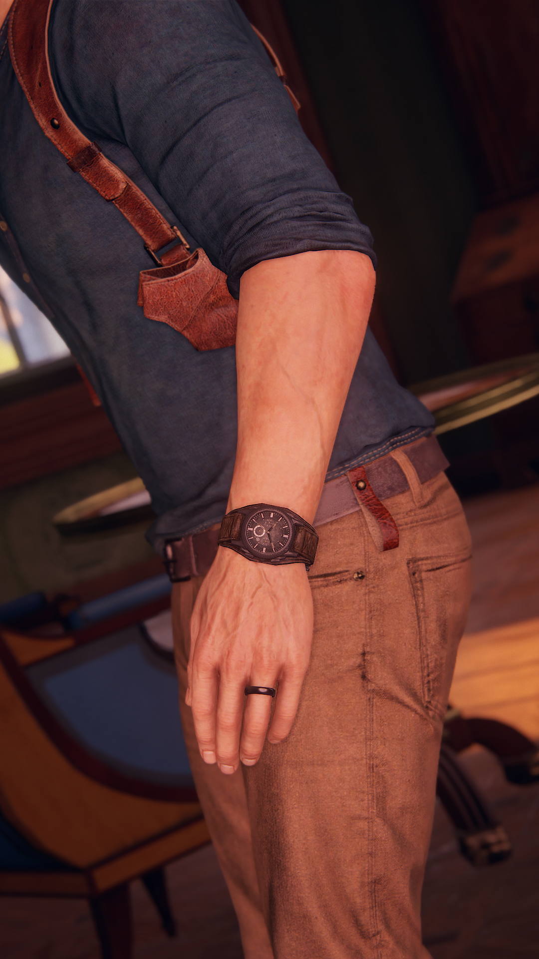

Definitely the most densely detailed gameplay model I've seen in a game

Edit: Look how nicely shaded Sams jacket is here

Something that never appears on this scene and should only be there if you specifically select this skin through the unlockable bonus modes on a second play through...
SS SSS is also applied on Nates hands, and whole skin basically and not only his face during gameplay

Last edited:
His veins and muscles tense when in action (resized to save some bandwidth  )
)


The metal bar sags due to Nates weight


Materials are top class across the board


Nate under different lighting conditions during gameplay


I don't think it is posible to actually documment all the little details ND has put in Uncharted 4, pretty sure most people working at ND don't know every detail either


The metal bar sags due to Nates weight


Materials are top class across the board


Nate under different lighting conditions during gameplay


I don't think it is posible to actually documment all the little details ND has put in Uncharted 4, pretty sure most people working at ND don't know every detail either
rockaman
Regular
It might not be what each individual does that they forget, at least I'm assuming that most team members have very specific tasks to handle, and the team managers have to make sure it all falls under the right budgets I'm sure.
But all their contributions together and accounting for all the detailing and artistic decisions after the fact... that is probably super hard to recollect... but that's OK, I won't be upset if they can't
I think this will be my last batch of screens, and yes sorry for the bandwidth to those with low speed/bandwidth cap
Really like Rafe's design overall, he looks excellent


The fire effect is actually made of two parts it seems, the top of the flame is a 2D alpha transparency, and the lower part is a 3D mesh circling the upper part of the torch.

In-game SSS... lol.


How did Sully get up here?


Are these guys only in Crushing/Hard... I only really notice them in Crushing actually... they can make a difficult Crushing area much, much more difficult than it already is
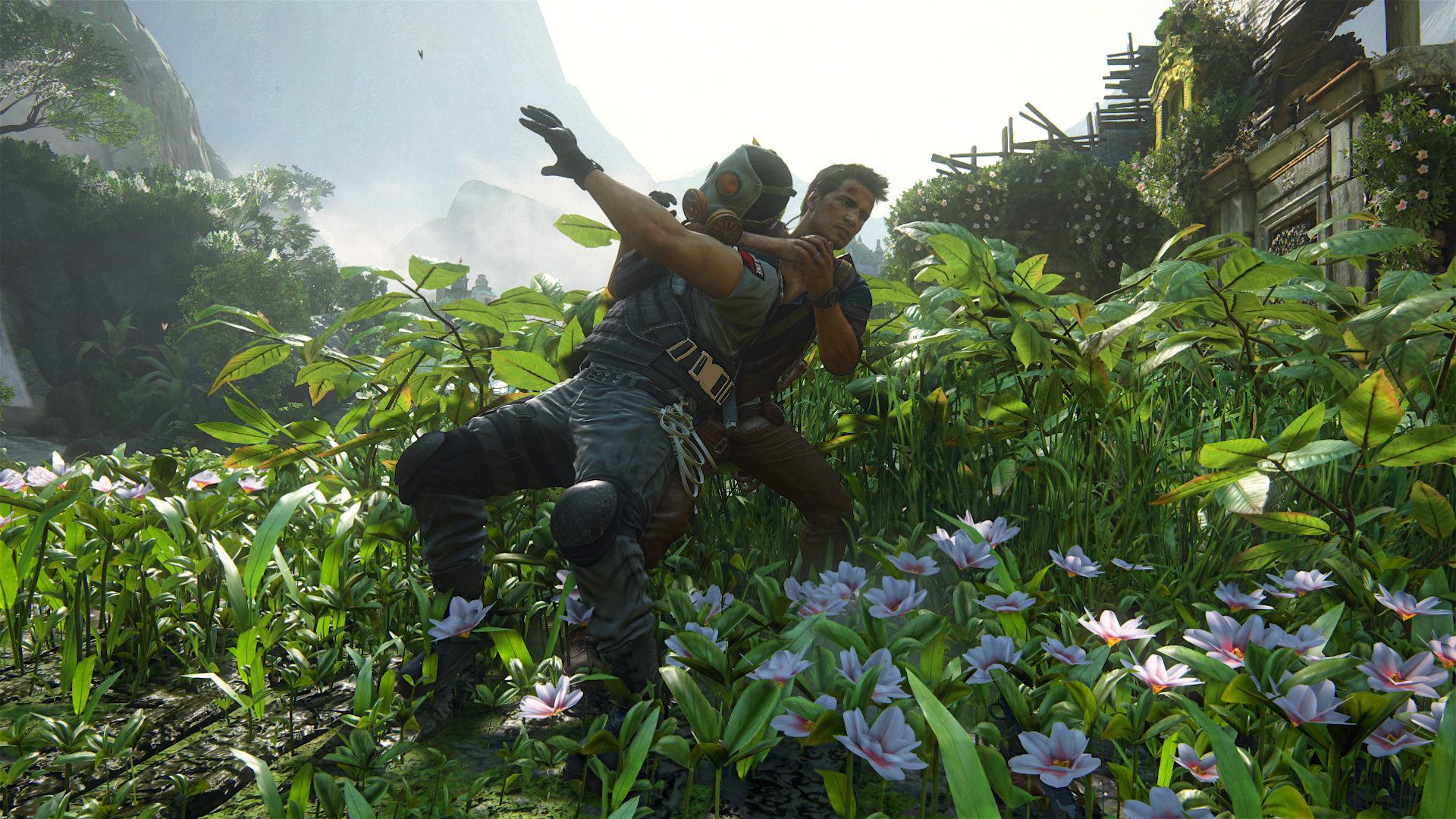


Apologies to all ISPs worldwide, I hope I did not put them through too much trouble, thanks for the game Naughty Dog
But all their contributions together and accounting for all the detailing and artistic decisions after the fact... that is probably super hard to recollect... but that's OK, I won't be upset if they can't
I think this will be my last batch of screens, and yes sorry for the bandwidth to those with low speed/bandwidth cap
Really like Rafe's design overall, he looks excellent


The fire effect is actually made of two parts it seems, the top of the flame is a 2D alpha transparency, and the lower part is a 3D mesh circling the upper part of the torch.

In-game SSS... lol.


How did Sully get up here?


Are these guys only in Crushing/Hard... I only really notice them in Crushing actually... they can make a difficult Crushing area much, much more difficult than it already is


Apologies to all ISPs worldwide, I hope I did not put them through too much trouble, thanks for the game Naughty Dog
All these shots looks superb on a phone, looks worse on a PC, really awesome in gameplay though.
Smaller screen makes everything looks better? Natural super sampling?
Smaller screen makes everything looks better? Natural super sampling?
rockaman
Regular
The animating and camera movement makes a big difference definitely. It's a lot of fun to pause the game in photo mode and just look around lol 
Coming out of photomode and seeing the foliage animate though is a great treat. Very artistic and thoughtful with the way the foliage animations... almost like the foliage/environment sets the mood of scenes really well.
Also make sure your PC is outputting at full colour depth
Coming out of photomode and seeing the foliage animate though is a great treat. Very artistic and thoughtful with the way the foliage animations... almost like the foliage/environment sets the mood of scenes really well.
Also make sure your PC is outputting at full colour depth
While many of these screenshots are stunning, it would be much nicer to see actual gameplay screenshots rather than photomode screenshots.... yes, I know photomode doesn't add any extra detail vs the in game engine aside from some sharpening... but 1. sharpening can and does make a difference, but much more importantly 2. when you choose only small portions (the best parts) of the gameplay scene to screen grab, or you zoom in to something to show the (admittedly amazing) LOD level that generally would not be seen while playing the game, then you'r not showing the graphics as they represent actual gameplay.
The game looks amazing, I'd hope people can be confident enough in it's graphics to show what you actually see while playing the game as opposed to what you see when you pause the game, sharpen it up and hand pick the perfect angle/level of zoom. And yes, I do realise that a lot of the shots already posted actually are from direct gameplay. But many clearly are not.
The game looks amazing, I'd hope people can be confident enough in it's graphics to show what you actually see while playing the game as opposed to what you see when you pause the game, sharpen it up and hand pick the perfect angle/level of zoom. And yes, I do realise that a lot of the shots already posted actually are from direct gameplay. But many clearly are not.
All these shots looks superb on a phone, looks worse on a PC, really awesome in gameplay though.
Smaller screen makes everything looks better? Natural super sampling?
Fine detail is lost so the imperfections you would normally be able to see are thus invisible and your brain fills them in with something better. You get the same effect by looking at off screen photo's.
Love_In_Rio
Veteran
Do you guys imagine the Libertalia island in PSVR?. We could take a nap in a cave with a waterfall...so relaxing...and without getting wet!.
- Status
- Not open for further replies.
Similar threads
- Replies
- 24
- Views
- 2K
- Replies
- 90
- Views
- 17K
- Replies
- 16
- Views
- 4K


