You are using an out of date browser. It may not display this or other websites correctly.
You should upgrade or use an alternative browser.
You should upgrade or use an alternative browser.
UC4: Best looking gameplay? *SPOILS*
- Thread starter RenegadeRocks
- Start date
-
- Tags
- uncharted 4
- Status
- Not open for further replies.
VFX_Veteran
Regular
Only complaint I have in terms of visuals is that characters still seems weightless, especially while traversing vertical obstancles. They probably found the most sensible compromise between realistic animations and responsive controls, but given the incredible sense of weight and realism of everything else in the game, character animation still seems a little off to me. And speaking of animation: Nate still loves himself some wall touching.
I have to disagree here. I think the animation is pretty top notch. I love the snappy placement for cover (i.e. MGS5) and the movement seems less floaty than RoTR or QB. Although it must be mentioned that mostly everything is baked and only destructible objects are in certain scenes (not all or even most scenes). Lip syncing very well done.. just a tad below QB.
VFX_Veteran
Regular
Another example, this must be literally everywhere in the game and I just noticed!


I tend to agree with the other poster. Not POM and really can't tell if the light isn't moving. Those looked baked.
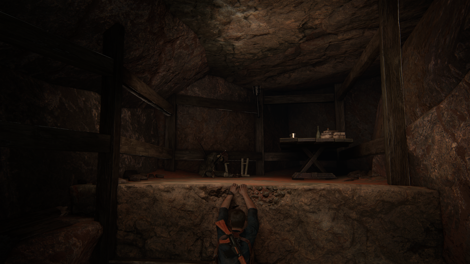
I'm glad they got rid of the extreme ambient GI probe lighting (so far). It looks much much better to just bake in the shadows on geom that's not going to move.
My first impressions of the lighting are that something about the sourcing can be iffy. It seems like there's too much single-direction component, and the cubemaps visible on glossy objects frequently seem to have inappropriate strength (not being attenuated with directional information?). I wonder if they're still using hemisphere+directional as their lightmap format.
I tried the flashlight on those and the shadow changes according to the position of the light source(you also get a glimpse on the second chapter with the flashlight). Might be baked in the open areas but yeah, still looks pretty good imo.
Edit: at 11:25
Edit: at 11:25
Last edited:
VFX_Veteran
Regular
My first impressions of the lighting are that something about the sourcing can be iffy. It seems like there's too much single-direction component, and the cubemaps visible on glossy objects frequently seem to have inappropriate strength (not being attenuated with directional information?). I wonder if they're still using hemisphere+directional as their lightmap format.
Lighting looks really iffy to me as well. I don't like the luminance values on it (i.e. like they opted for low dynamic range). Cubemaps are all over the place (except cutscenes) for reflections. Materials are very similar to The Order -- which is stellar. I know that one of the look dev artists that worked on The Order now works at ND, so this isn't surprising. Great material work there. Shadows are probably the worst aspect of this game's graphics IMO but that's the limitation of the hardware.
Yeah geometry is one of the areas where U4 is lacking and pom could help, although i think they chose to spread out the resources used for geometry to get better lod (higher lod albeit with lower polygon count per object on screen) instead of having high poly per object and close proximity lod.
I sort of disagree... UC4 has some incredible scene complexity in a lot of outdoor areas, but particularly in the Madagascar city scenes and the last "level". The sheer amount of foliage and buildings and just all kinds of stuff is utterly amazing and quite far above most open world games I've seen. Obviously the more or less restricted traversal helps a lot, but not always. For example when climbing the clock tower, you can see very, very far away - I'm not sure how closely related the city model is to the one that you can later travel through, but it makes little sense to create two completely different versions (of course only the interactive part will actually load higher LODs and a lot of the set dressing).
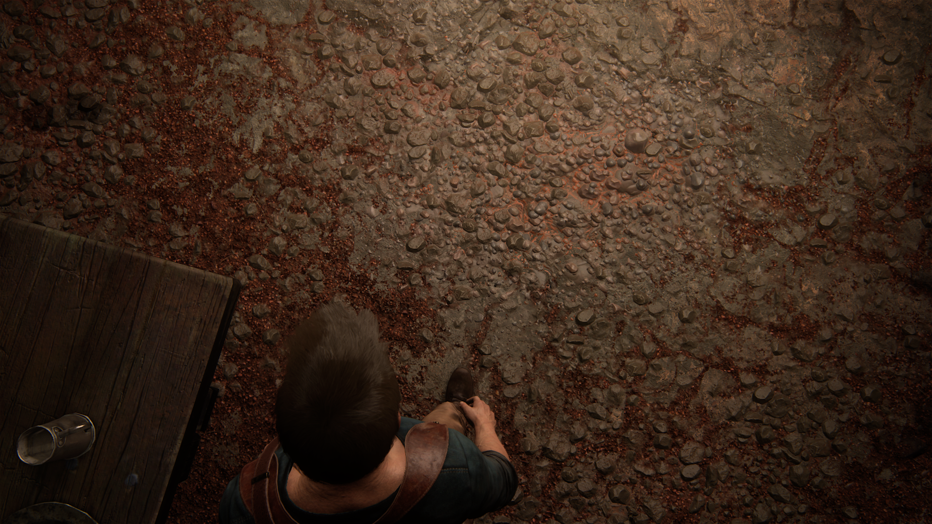
Also, POM doesn't work all the time, particularly when you'd expect the characters' feet to make contact with the terrain elements.
Lighting looks really iffy to me as well.
I felt that the ingame lighting worked much much better in night time scenes, like the kids' levels or the night time prison escape; especially when there were a few strong directional lights. Daytime needs much more elaborate bounce lighting, which is harder to do; and the skin shaders in particular are also much more problematic with a lot of ambient lighting.
Edit: also notice that the cutscenes in day time are also lit with stronger directionals, which helps the skin shading a lot.
Ok so I might have been ever so slightly intoxicated late last night, as right now the motion blur isn't actually as bad as I felt when I first started the game...
Also, I'm just in the house when we first see wifey and my god, I think that's the most detailed and impressive house I've seen in a game. The lighting and all the details, wow.
Lip syncing very well done.. just a tad below QB.
This is more of a theory based on my experiences and not some factual thing.
All the facial blendshapes for the characters in UC4 are hand sculpted; and just like the faces, they're somewhat stylized. The characters are also quite different looking than the actors playing them.
Now people in real life have a lot of subtle but still noticeable elements in their facial expressions, which are a result of their unique bone (and teeth!) structure - which also effects the actual layout and workings of the facial muscles. Then there are little fat deposits, and even some neural aspects like which muscles would actually fire for a smile. This also means that the places where the skin gets pinned - the facial wrinkles - are also unique and get "worn in" as the person ages and the tissues get less flexible.
When you are working with scanned talent, you basically get these subtleties for free; it doesn't mean that you have to do less work, or you can get away without a bunch of really good artists, but the results will be more lifelike and believable. Also, if you can use the same talent for the performance capture, you're able to use the reference footage as a blueprint that you "just" have to match as closely as possible and you don't have to guess as much.
Now the part where I am a little more uncertain is just how much of a help a considerable experience with scanned data may be in hand crafted characters. It makes sense that good artists would be able to draw upon what they've learned previously; and it might also help to scan a lot of reference from real people that look similar to your stylized characters. I'm also not sure how Naughty Dog would judge the artistry of such an approach.
However, my point is that IMHO it's a lot harder to get good lip sync with stylized characters and face rigs, because you don't have a 1:1 reference to turn to.
Ok so I might have been ever so slightly intoxicated late last night, as right now the motion blur isn't actually as bad as I felt when I first started the game...
Yeah I'd move in without a second thought. Nate could even leave all the dishes in the sink there. Or even the wifey... heh
VFX_Veteran
Regular
Good thought Laa-Yosh! Sounds very logical to me.
Nate could even leave all the dishes in the sink there. Or even the wifey... heh
I agree that Nate leaving his wife in the sink sounds very logical.Good thought Laa-Yosh! Sounds very logical to me.
I sort of disagree... UC4 has some incredible scene complexity in a lot of outdoor areas, but particularly in the Madagascar city scenes and the last "level". The sheer amount of foliage and buildings and just all kinds of stuff is utterly amazing and quite far above most open world games I've seen. Obviously the more or less restricted traversal helps a lot, but not always. For example when climbing the clock tower, you can see very, very far away - I'm not sure how closely related the city model is to the one that you can later travel through, but it makes little sense to create two completely different versions (of course only the interactive part will actually load higher LODs and a lot of the set dressing).
Also, POM doesn't work all the time, particularly when you'd expect the characters' feet to make contact with the terrain elements.
Maybe i phrased my thoughts in a weird way, what i meant to say is not that it has low polygon count overall, just more dense (object wise) so they couldn't use tessellation or incredibly high poly for every object on screen. They chose to have more stuff on screen than less at higher poly, that's what i meant to say. And i think it worked wonders for the game, the density of detail is astounding.
Awww they have a PS1! Old school!
Yes just found out an hour ago. Loved Drake's comments while playing PS1.Awww they have a PS1! Old school!
Btw there is something that sometimes annoys me with the visuals. The MB doesnt always work well and destroys the detail in a bad way. It creates some artifacts that remind me of ghosting.
Also the AA looks fucking amazing in most occasions and when there is not much movement. But in bright areas and fast movements they create some weird aliased outlines on Drake. This is more evident at the beginning but as I progressed in much darker areas it looked amazing.
- Status
- Not open for further replies.
Similar threads
- Replies
- 24
- Views
- 2K
- Replies
- 90
- Views
- 17K
- Replies
- 16
- Views
- 4K

