Played the first couple chapters tonight, its a good game so far. I think the story might be better at this stage early of the game bc of the character development over past 3 games though than the actual gameplay. The game has very high production values all around, the graphics, sound, art direction all top notch; the game play is solid too even if I'm not as into it as perhaps I was a few years ago. I'm not sure if gaming has stayed too stagnant, relying on formulaic ideas or if I'm getting too old to appreciate certain things like I used to. More and more I'm looking forward to VR, something needs to happen to mix things up though. I was happy to buy this on day one though ND has done a wonderful job and hopefully will move lots of units - they really are in a league of their own.
You are using an out of date browser. It may not display this or other websites correctly.
You should upgrade or use an alternative browser.
You should upgrade or use an alternative browser.
UC4: Best looking gameplay? *SPOILS*
- Thread starter RenegadeRocks
- Start date
-
- Tags
- uncharted 4
- Status
- Not open for further replies.
Uncharted 4 doesn't try to be realistic and i think that's an odd complaint to bring up, especially when NDs past games never tried to be realistic (even the gritty and "dark" TLOU). I think of it in a similar way to a movie like Tin Tin rather than the game trying to be photo-realistic, this isn't what Uncharted or ND games are about. I'll write my opinion on the game after I've finished it (both technically here and gameplay/story wise in the main thread). So far what I've seen is very impressive even though there are some areas that could be improved.
Very nice DOF during gameplay (i think Uncharted 2/3 and TLOU had something similar although in U4 it's higher quality)

Very nice DOF during gameplay (i think Uncharted 2/3 and TLOU had something similar although in U4 it's higher quality)

Last edited:
If there's one thing that i don't like at all is the sharpening filter during gameplay. I understand why its there but they should at least give us an option to tune it to our liking. The Division did it best, give us an option from 0 to 10 and let us chose what we want during gameplay. It's especially noticeable when your health is low.
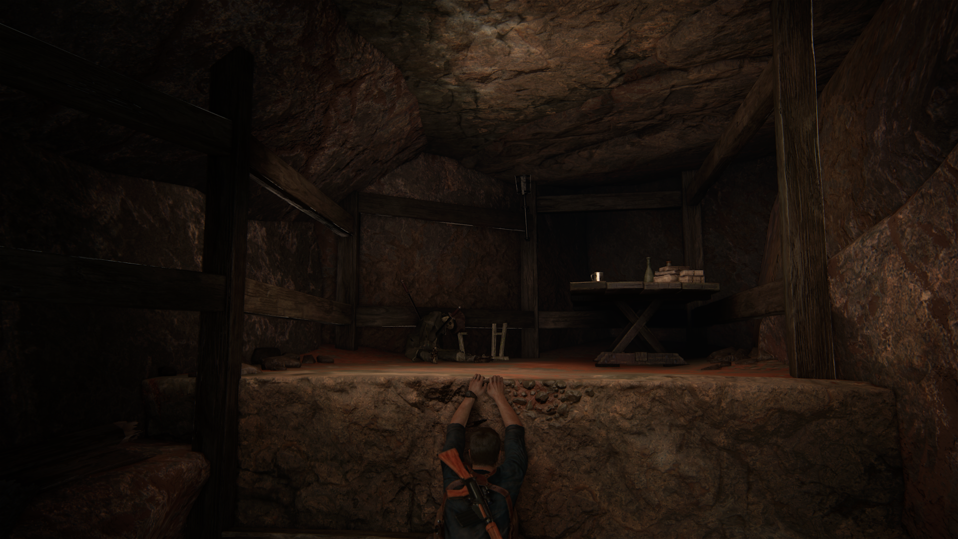
Some really nice lighting in this level

Some really nice lighting in this level

After some hours in the game :
Things that i prefer in Uncharted 4 compared to other games :
- Variety of assets
- Texture quality
- Draw distance
- Amount of details
- Animation
- Physics
- Image quality
- Character rendering
- AI
- Complexity of action scenes
Things that i prefer in other games :
- Motion blur in Ratchet & Clank/ The Order
- Shadow quality in The Order
- Games without TAA are a bit sharper
Things i don't like in Uncharted 4 :
- There are some artifacts caused by their AA tech (mainly dithering i think).
VFX_Veteran
Regular
OK. I got my eyes on this game last night and there is a lot to cover. Overall, my first impressions are that the team at ND did a hellofva job with the limited hardware they have to work with. That's saying a lot! And while I notice a lot of the shortcuts they had to take, it all comes together pretty coherently!
We have a lot of graphics topics to discuss for scoring and I'd like to get right into it. But first, we all should dispel the myth that gameplay is the same as the cutscenes. The cutscenes are so well put together in the shading/lighting department that I, personally, can see the transitions immediately. I would absolutely say they have pushed the power of the PS4 pretty good during cutscenes and I'm hoping for the day when the exact same shaders/lighting can be used for gameplay in games.
Anti-aliasing - 4/5:
Very very good implementation here. Seems very similar to The Order. I don't notice any jaggies at all for background sets, but the characters get the bulk of aliasing and especially viewing transparent cutout textures or hair strips. Those are the sacrifices that I think puts it under a perfect 5/5. If we all agree it should be a 5/5 for games compared to it, I'm down with that - but that just means we don't have a game yet that can push this to the point of not noticing it EVERYWHERE.
Example of Nate's hair not making the cut on perfect AA. Still impressive though as all the other set pieces look great!

I think the game is switching off the TAA on high contrast areas to avoid smearing and ghosting, it's one way to make TAA look sharp during motion at the cost of some aliasing. I think it keeps that to a minimum, although like you said it can be noticeable. And i can agree that shading and lighting during cutscenes gets a few extra passes (like i thought). But i think the geometry remains largely the same (i didn't notice any difference from highest lod in-game to cutscene model in terms of geometry).
Another small detail, if you flash the flashlight towards a friendly character they squint (like TLOU)

Another small detail, if you flash the flashlight towards a friendly character they squint (like TLOU)

VFX_Veteran
Regular
I think the game is switching off the TAA on high contrast areas to avoid smearing and ghosting, it's one way to make TAA look sharp during motion at the cost of some aliasing. I think it keeps that to a minimum, although like you said it can be noticeable. And i can agree that shading and lighting during cutscenes gets a few extra passes (like i thought). But i think the geometry remains largely the same (i didn't notice any difference from highest lod in-game to cutscene model in terms of geometry).
Oh there is definitely shader/texture LOD change. I noticed it in a video that I'll post. I'm not sure if it's geometry popping or not.
The anti-aliasing while in motion is more noticeable than the screenshot stills. I guess this makes sense but I can tell the game is rendered at 1080p. Ironically, the title screen is perfectly AA and looks quite impressive!

That was the very first image I critiqued and couldn't find anything wrong with it. LOL!
Last edited:
VFX_Veteran
Regular
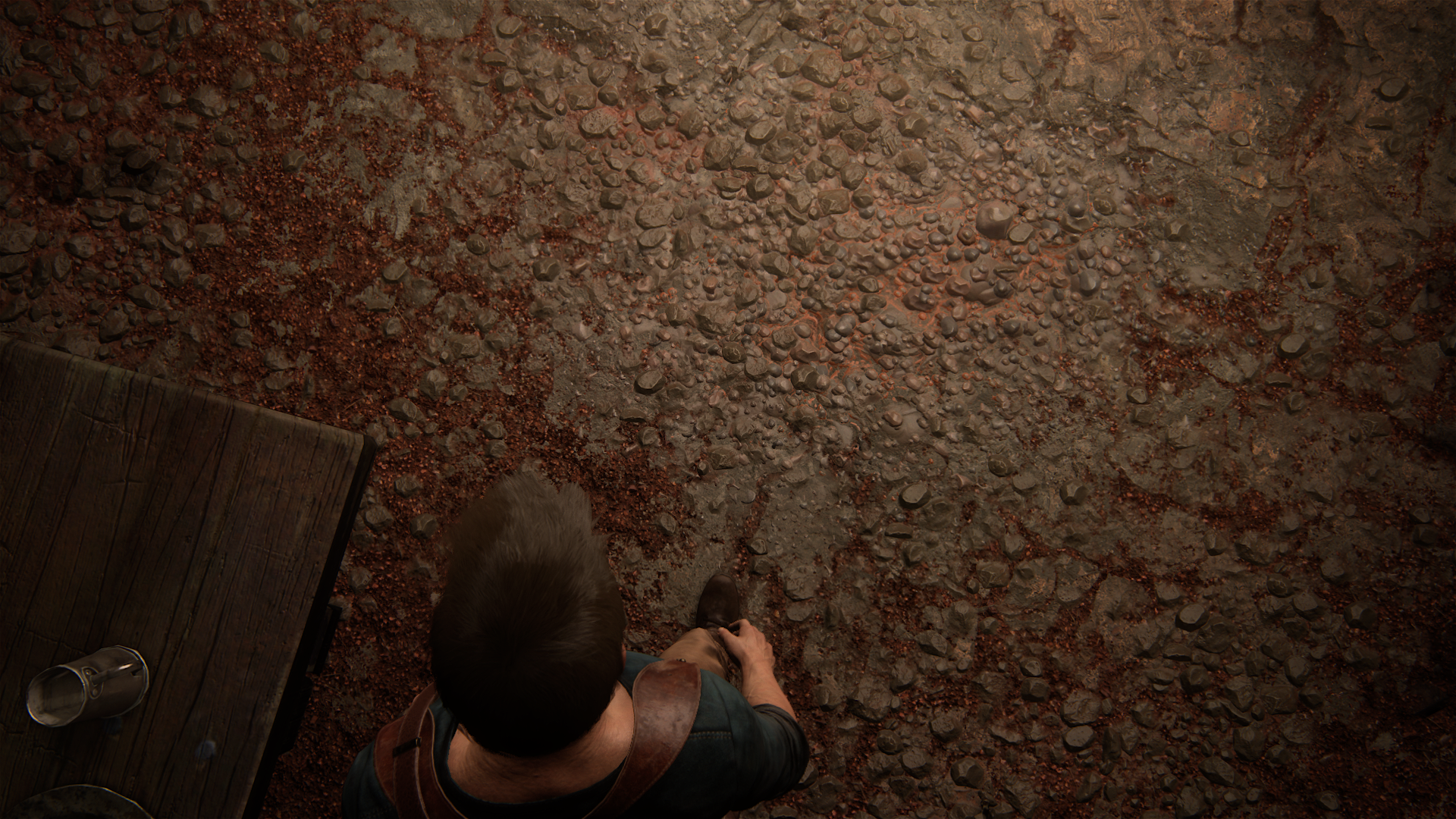
Self-shadowing POM
Yea, looks like it. I hate that the POM is pretty sparse and not used liberally.
Also lots of GI use in-doors, the game blends pre-baked and real time lighting solutions quite nicely, although it can look odd sometimes.
Yep. They stuck to that flashlight GI solution.
Yeah geometry is one of the areas where U4 is lacking and pom could help, although i think they chose to spread out the resources used for geometry to get better lod (higher lod albeit with lower polygon count per object on screen) instead of having high poly per object and close proximity lod. I think you can make arguments for both, it can look really good and it can look really meh at times. Battlefront for example on Ps4 and X1 has both tessellation lod and geometry pop-in close to the player (even in the PC version it's noticeable but it's much better).
Kinda looks more like self-shadowed normal maps there? The texture filtering is low for such an oblique angle in the first shot, so you don't get any of the higher res details.Self-shadowing POM
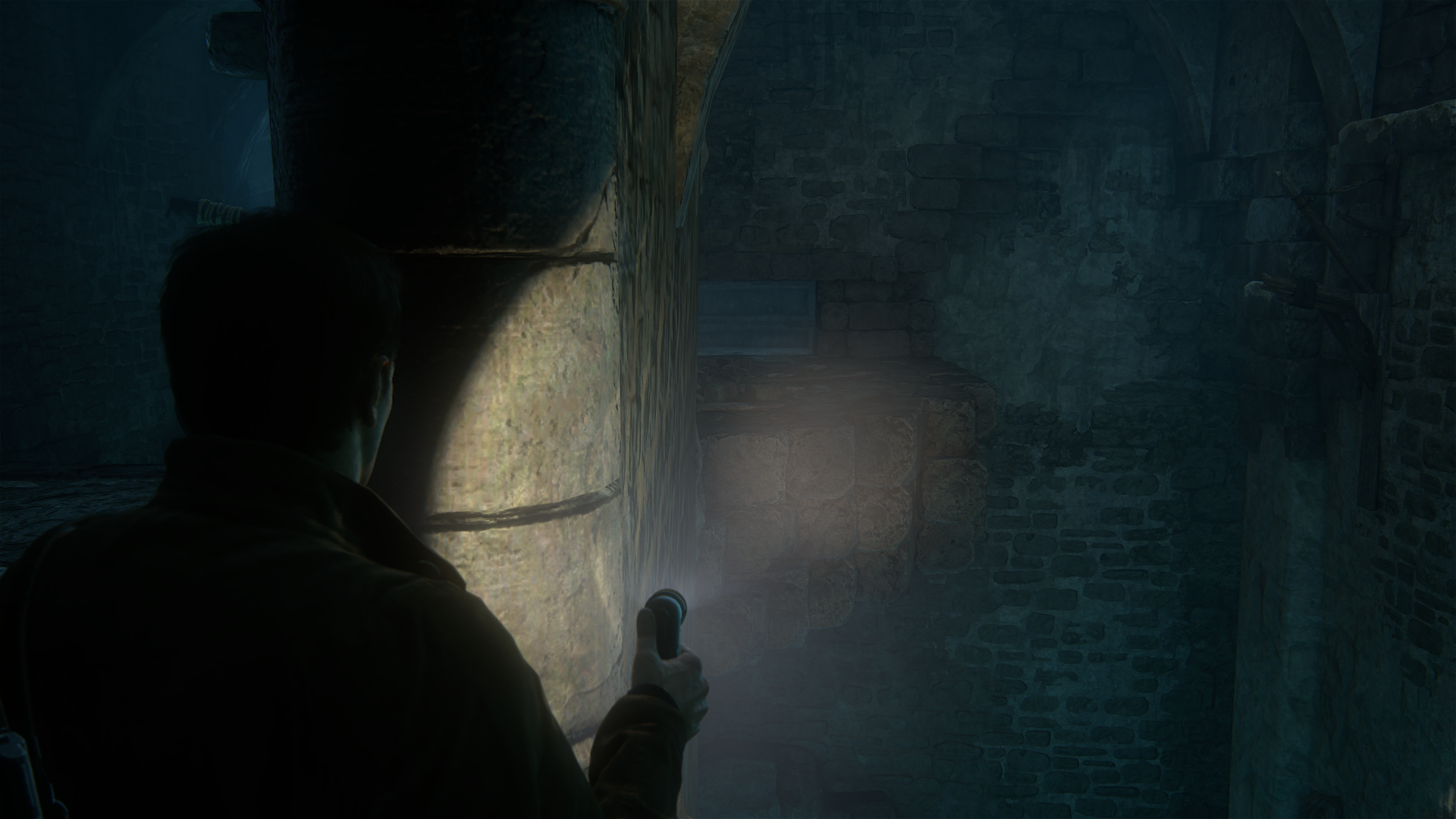
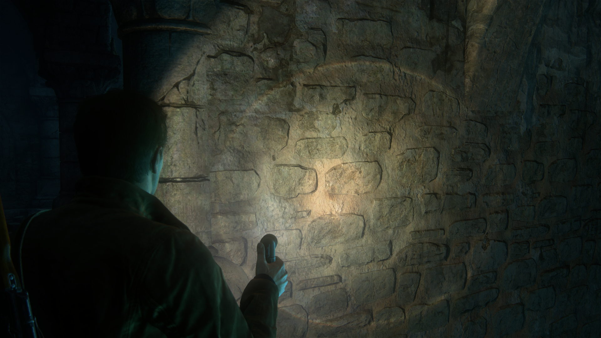
Don't suppose you can get a clip of you just orbiting the wall + up/down camera movement.
Kinda looks more like self-shadowed normal maps there?
Looked like POM in-game although that might be true as well
Sigfried1977
Legend
Only complaint I have in terms of visuals is that characters still seems weightless, especially while traversing vertical obstancles. They probably found the most sensible compromise between realistic animations and responsive controls, but given the incredible sense of weight and realism of everything else in the game, character animation still seems a little off to me. And speaking of animation: Nate still loves himself some wall touching.
It's highly unlikely that Disney diffuse would be responsible for visual "flatness."The game looks kinda flat, unnecessarily, because of a combination of the Disney materials
Last edited:
POM or normal maps it's all over Madagascar and everything has self-shadowing too
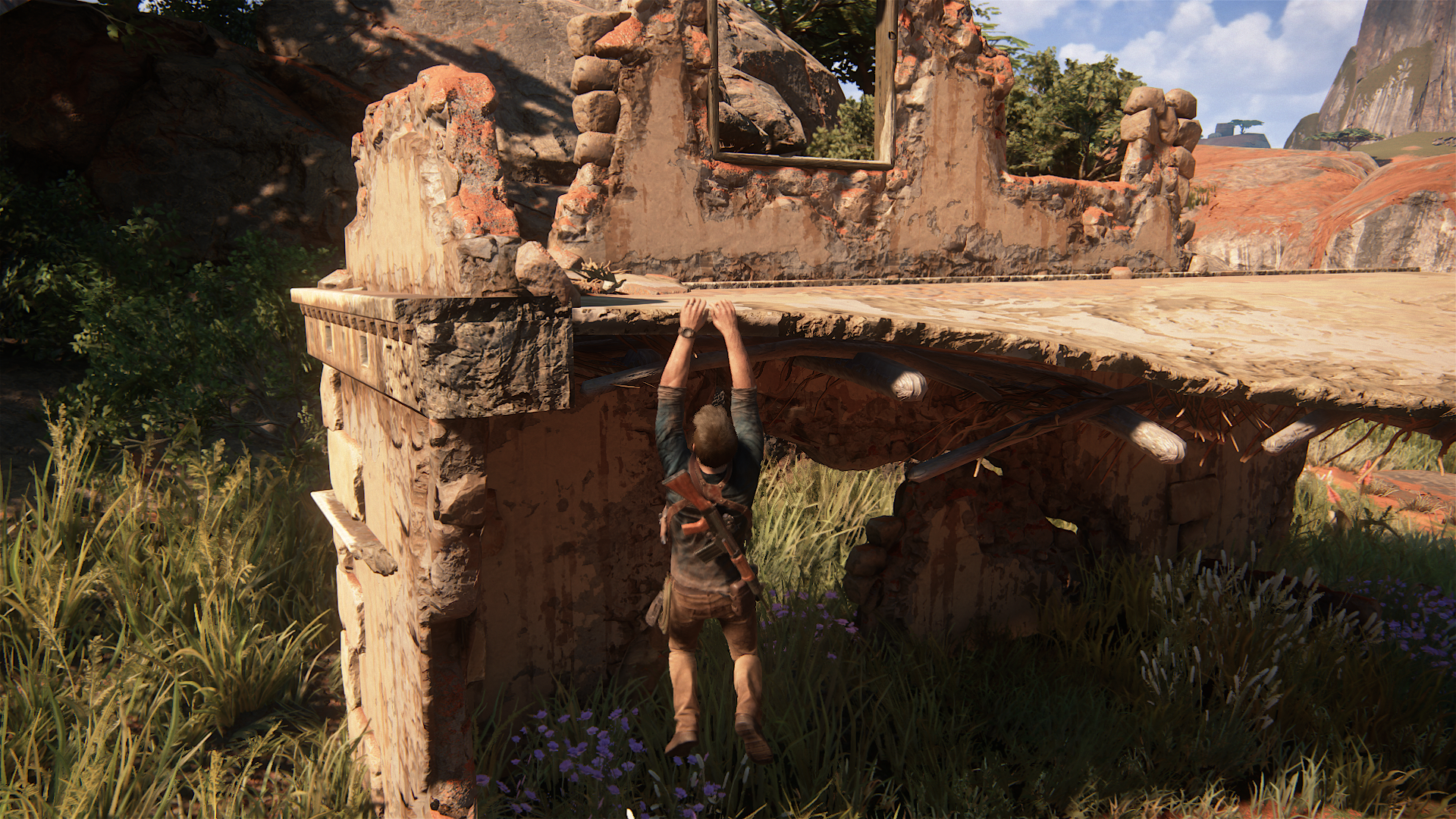
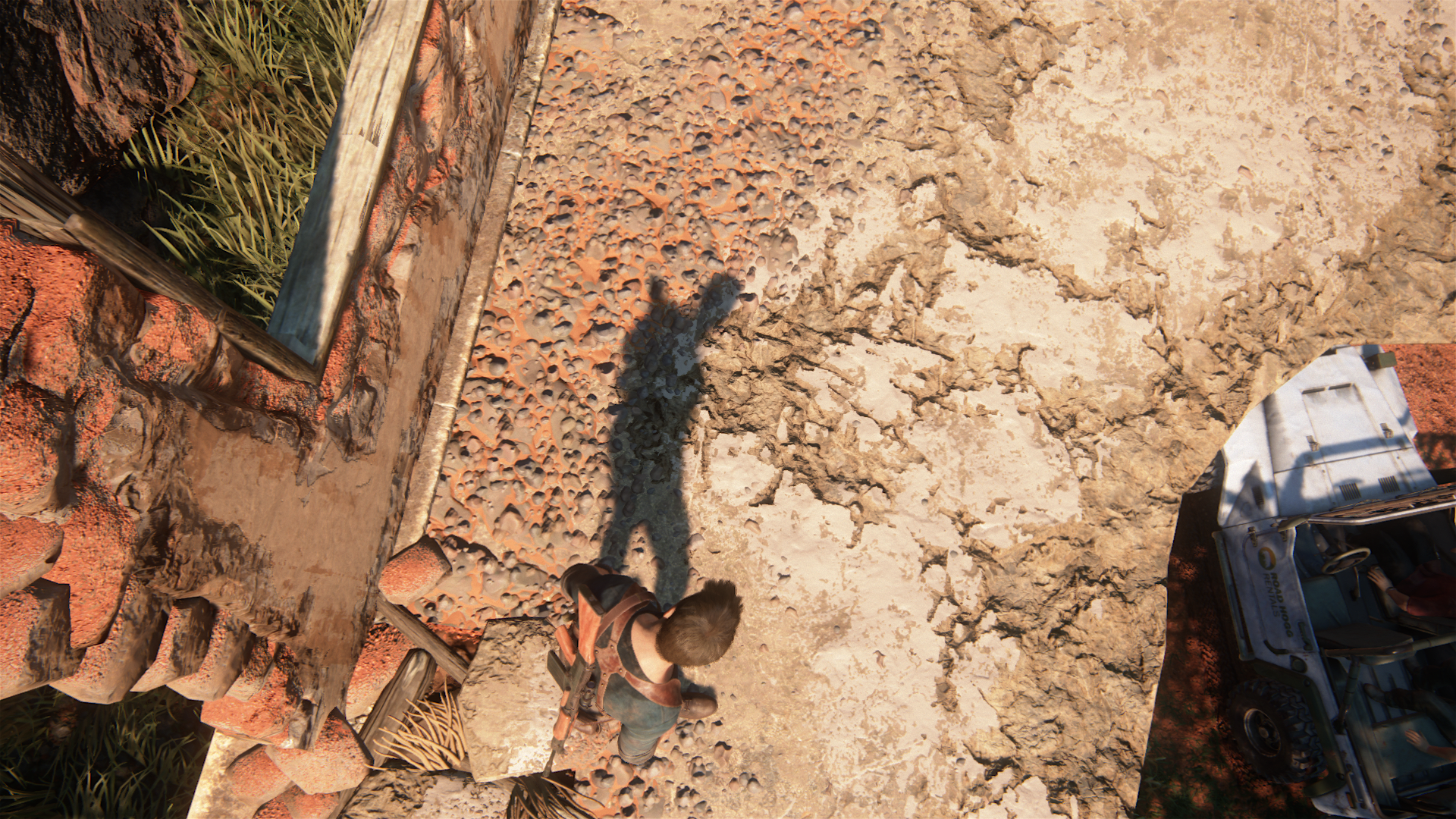
Literally everywhere you look, looks really nice. Although you can't beat actual geometry but it would have been way harder to have self shadowing on all that extra geometry (especially the small pebbles) so both have cons/pros.
Edit: during normal play it looks something like this
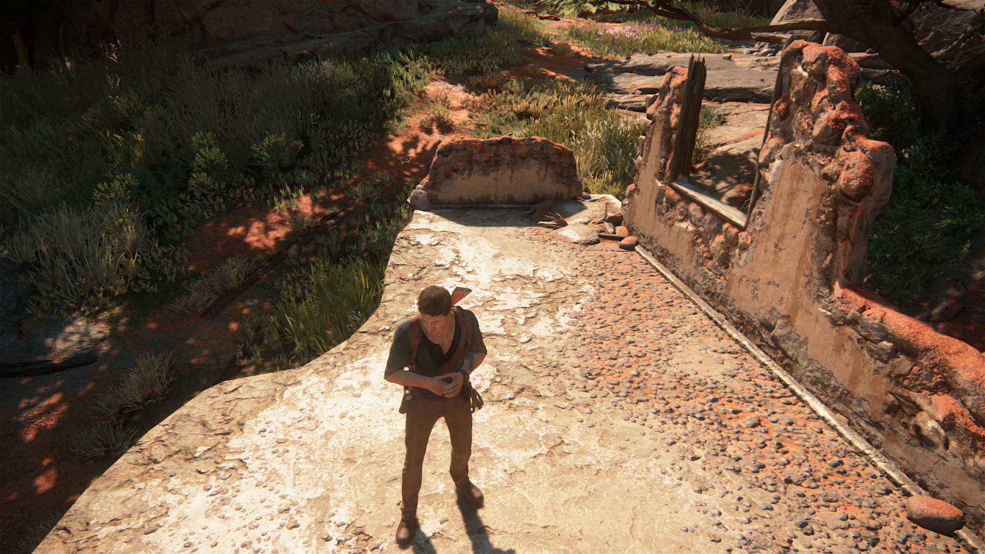
Good trick to fake extra shadows and geometry and give depth and detail to the environment with the hardware they were given :smile:


Literally everywhere you look, looks really nice. Although you can't beat actual geometry but it would have been way harder to have self shadowing on all that extra geometry (especially the small pebbles) so both have cons/pros.
Edit: during normal play it looks something like this

Good trick to fake extra shadows and geometry and give depth and detail to the environment with the hardware they were given :smile:
Last edited:
- Status
- Not open for further replies.
Similar threads
- Replies
- 24
- Views
- 2K
- Replies
- 90
- Views
- 17K
- Replies
- 16
- Views
- 4K


