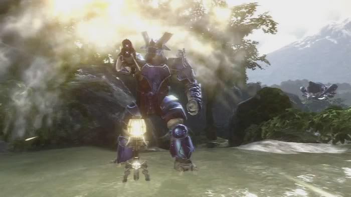
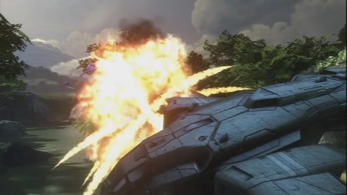
The First Halo 3 Single Player Screens + Video! Rules=#369

Status
Not open for further replies.
It looks better then I've expected - certainly not the best graphics ever, but the lighting and the sense of scale are quite good.
 
Looks fun, certainly the trailer whetted my excitement even though I haven't played Halo 1 or 2.
IMO the graphics are a bit disappointing, especially after what they showed in the short trailer last E3, when it was claimed that
"everything you're seeing here is being rendered in real-time on the Xbox 360, using the current version of our Halo 3 game engine. The HDR lighting, self-shadowing, GPU-run particle system and many other effects should make it intact (and more) to our final game"
http://www.bungie.net/News/content.aspx?type=topnews&link=Halo3Announcement
The (texture) resolution, AA and animation are visibly worse in the new trailer.
 
The trailer was disappointing. Graphically it was very good, but it feels like some random scenes from Halo 3 + some random music from Halo series. Not what I expected from Bungie. :(
 
Now this is looking good, much better looking than the mp ss. Nice strong colors that blend in well with the sorroundings is what I like most. Some really nice textures especially the blades and bushes on one of the ss.

Like this screenshot the best!
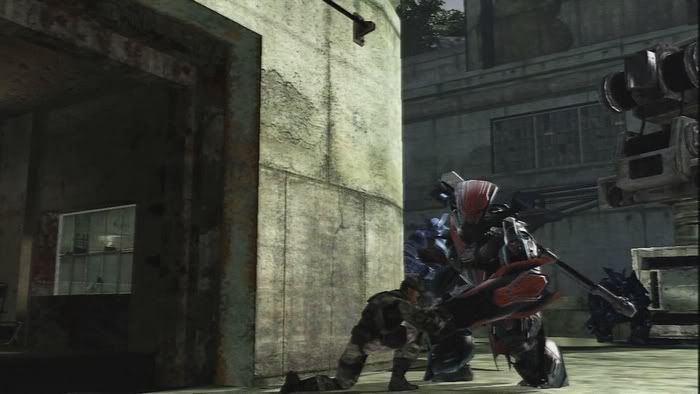
 
Looks indeed very good!
No doubt that this game can be the best looking (graphically, Technically) game on consoles this year.
Keep it up Bungie!:D
 
Great! Looks very epic indeed! :)

And what's wrong with the textures?

The framerate is a bit shakey though (I'm watching the QT version)...
 
Just to make sure: I don't think there's anything wrong with the textures, but some people complain about it...
 
The (texture) resolution,

Considering the texture resolution sucked on just about everything in the original trailer except for an easter-egg sign and and the chief, I assume you mean the chief.

No. Not according to screenshots. Argue whatever about subtlety, but the textures on the chief, by most peoples estimates, are roughly on par. Just no more totally-concrete style with it. There's also a scene in the trailer where it's fairly apparent, with the Chief rising very slowly in front of the camera. Motion blur doesn't totally bork the details, and you can see that it's not low-res at all.

animation are visibly worse in the new trailer.
Cinematic apples and gameplay oranges.

Regardless, I just don't get what Bungie was thinking with this trailer. The last official media we're going to get until a week before launch, is a near-amateur montage?

And while I think the lighting is quite nice, the shadowing is weak. For the environments, they use just static shadows. Okay. muzzle flash doesn't cast shadows. Alright, understandable given how many weapons we're supposed to be seeing in the final game being fired at once... Few dynamic lights, very likely not shadow casting. So, that leaves the sun as the sole shadow caster, and dynamic objects as the only things that need shadows. And with all these low poly characters and such (see the girl partway through the trailer), they can only afford to have shadows on a few things at a time? Characters, vehicles, ... and maybe trees. Far too many objects don't get any shadows at all. And these things are butt-ugly, low-geometry things too, like crates and hexagonal-wheeled vehicles. Jo shadows on most of the foliage either, from what I payged attention to. So, uh...
 
I just watched the video..

I guess apart from the subtle lighting, normal mapping and extra geometry detail I really can't see (from this new trailer) anything particularly outstanding to be honest..

I think they retained the visual direction of the previous games but to some degree it kind of works against creating any particularly large "wow" factor for me..

However I really feel that the greatest dissappointment in this are the animations..

It's like they've been ripped entirely from the previous game, of which they were great for their time, but being on a next generation console I really expected better..

I don't know, I guess i'll reserve my judgement for some actual gameplay footage but so far the game seems to move exactly like Halo2 but with a nice shiny new coat of paint.. Certainly pretty but very underwhelming as far as i'm concerned..
 
Well dunno what to really think...Animation is def not that hot and all those flashy colors and kinda lowres normal mapping isn't what I expected (yeah Halo universe iscolorful I know but icckkk.....looks like some 70s disco music video at some points..)
 

From that, sounds like portions of the game still look better than anything we've yet seen, as TeamXbox state of the single player portion they played:

With that, our all-too-brief Halo 3 single-player demo ended, and the lights were brought up. Nearly everyone in attendance agreed that this was the footage that Microsoft should have closed the press conference with, as it surely would have impressed just about everyone in attendance.
 
The rendering meets my expectations for a Halo game. Shiny surfaces never looked better. But the animation looks like it barely got any improvement since Halo2. Everything moves very rigidly. That bit with the brute kicking the guy away was almost embarrassingly last gen.

There is such a disparity between what we see in the hi res screen shots and what we see in the video. On the positive side, at least the screen shots are quite gorgeous.
 
The wate is a nicely done and moves in 3D and other effects are well done aswell. :smile:

HALO 3 screenshot 1 in large size.
HALO 3 screenshot 2 in large size.
HALO 3 screenshot 3 in large size.
HALO 3 screenshot 4 in large size.
HALO3small1.jpg

HALO3small2.jpg

HALO3small3.jpg

HALO3small4.jpg
 
Status
Not open for further replies.
Back
Top