Install the app
How to install the app on iOS
Follow along with the video below to see how to install our site as a web app on your home screen.
Note: This feature may not be available in some browsers.
You are using an out of date browser. It may not display this or other websites correctly.
You should upgrade or use an alternative browser.
You should upgrade or use an alternative browser.
Shadow of the Colossus (Remake 2018) [PS4]
- Thread starter OCASM
- Start date
Aren't the controls more responsive? That'll change slightly the experience, if BP have changed the notion of realism to make it more gamer palatable.
Which are you comparing this second remake to, the original PS2 game or to the first remake on PS3?
There's a difference between more realistic and more detailed
Good point.
The PS3 game was only a remaster. Controls, character handling and camera were basically the same than on PS2, responsiveness was a bit more consistent thanks to the locked 30fps, but that's it.Which are you comparing this second remake to, the original PS2 game or to the first remake on PS3?
That's a gif from a resetera member who added the bloom in post.However it's faithful to the original in design or not, when you have something like this on the PS4 how can anyone complain?

That's true. In a previous post I linked to a presentation from Team ICO that stated that the unresponsive controls where in fact a deliberate decision.Aren't the controls more responsive? That'll change slightly the experience, if BP have changed the notion of realism to make it more gamer palatable.
The original game has a realistic core and some surrealist elements, like the weird purple clouds or the lack of a sun but not of sunlight or the high amount of bloom that gives it a dreamy feel. Ultimately my criticism has been the same since the beginning: the aesthetic design doesn't conform to that of Team ICO's games. Whether it's the lighting or the color palette or the environment it has a much different look from the original and it cannot be explained simply by "it's due to better tech".Really I do not understand your logic. Sometimes you make me feel as if you are trying to find fault on the project in general because you got biased against it from earlier discussions
On one hand you complain that the game fails to convey the "surrealism" of the original and on the other hand, when we get past this discussion, you find fault that the game doesn't seem "realistic" enough.
I doubt they made high input lag on purpose. Like coding:That's a gif from a resetera member who added the bloom in post.
That's true. In a previous post I linked to a presentation from Team ICO that stated that the unresponsive controls where in fact a deliberate decision.
The original game has a realistic core and some surrealist elements, like the weird purple clouds or the lack of a sun but not of sunlight or the high amount of bloom that gives it a dreamy feel. Ultimately my criticism has been the same since the beginning: the aesthetic design doesn't conform to that of Team ICO's games. Whether it's the lighting or the color palette or the environment it has a much different look from the original and it cannot be explained simply by "it's due to better tech".
input_from_user();
wait(200ms);
do_things_with_input();
Also the erratic camera in some moment can't be on purpose. It would be stupid to do such a thing. Yes the character is weak and clumsy, but why would the camera be badly designed on purpose ? It's way more likely that Ueda explained those problems by saying it was a creative decision. How convenient.
The heavy boom, blur and super brightness were a necessity because the PS2 hardware was too limited for displaying such a big open world. They had to hide the empty world by cheap post effects.
It's like the mustache of Mario that exists only because the NES was too limited to display a fully detailed mouth.
Last edited:
Nah:I doubt they made high input lag on purpose. Like coding:
input_from_user();
wait(200ms);
do_things_with_input();
Also the erratic camera in some moment can't be on purpose. It would be stupid to do such a thing. Yes the character is weak and clumsy, but why would the camera be badly designed on purpose ? It's way more likely that Ueda explained those problems by saying it was a creative decision. How convenient.
The heavy boom, blur and super brightness were a necessity because the PS2 hardware was too limited for displaying such a big open world. They had to hide the empty world by cheap post effects.
It's like the mustache of Mario that exists only because the NES was too limited to display a fully detailed mouth.
About the controls:

http://www.gameanim.com/2016/12/24/emotional-character-control-shadow-colossus/
The bloom, fog and motion blur were all intentional effects.
On Bloom:
"
After starting SOTC, the first impressive visuals you get are probably the view of the magnificent scenery seen outside from inside the sanctuary. It floods the external scenery which is seen from the interior to white, and light overflows through the opening of the columns which support the sanctuary. This is the trendy high dynamic range rendering (HDR - High Dynamic Range).
When you emerge from the dark sanctuary interior to the outside, the outside scene is drawn almost completely white, which settles shortly to it's proper brightness balance. This is called the dynamic tone mapping, which is part of the HDR effect.
...
Speaking of pseudo-HDR rendering, the glow effect where light overflows onto the surrounding areas during the post-processing (the bloom effect) is traditionally a general-purpose effect. Our implementation introduces exposure and simulation of the pupil with the proper brightness, which is not usually done. Furthermore, with SOTC, this is done according to the scene where the player is."
...
Occasionally, when you would move from a bright place to a dark place (and vice versa), it seems that the effect gradually moves to it's proper brightness. How did we do this kind of dynamic tone mapping?
When you move from inside the sanctuary to the the outside, because you have left the scene box in the sanctuary, the effect there stops being applied. This is done as a binary (on/off) decision, but if the scene were to change suddenly, it would look visibly unnatural. So, when the player leaves the box, there is a short interval where it gradually changes into the effect of the next scene box.
I perform the fake tone-mapping effect by changing smoothly from "Inside the sanctuary, outside scene is drawn bright" ==> "Outside the sanctuary, outside scene is drawn normally"."
On motion blur:
"With SOTC, when the camera moves, the "motion blur effect" occurs.
...
Adjusting to the movement of the colossus, when the view shakes violently, we get a strong blur effect where the whole view appears off-center. This greatly improves the visual appearance.
The blur effect appears even when the character moves quickly.
...
On the occasion where the player has hung onto a colossus, and the colossus performs a large move, the view moves quickly from the sky to the land bewilderingly, but the sky brightness remains strongly visible. When the point of view is moving extremely, a similar effect happens, but this is when the human eye is looking at a bright light, and is known as the afterglow phenomenon. Because of this, the motion blur and the pseudo-HDR effect delays the brightness change, and the image remains."
On fog / view distance:
"In SOTC, there are several colossuses, but in order to visit each one you have to travel around the immense landscape with your trusty steed.
It is during this time that we use the landscape rendering system to draw far away places, without cheating using distance fogging.
Landscape rendering is divided into 3 stages, the furthest background being either a rendered image or a texture, which is stuck on a distant polygon. The internal development team nicknamed this "Super Low"."
http://selmiak.bplaced.net/games/ps2/index.php?lang=eng&game=sotc&page=makingof
And if that is not enough, just remember that all those effects you're blaming on the PS2's technical defficiencies continue to be part of Team ICO's style, even when using high-end CGI:
As for the camera: yeah it's not perfect.
Why do you continue with TLG (especially the CG trailer) ? It is closer to the SOTC remake... and i'm not the only one who noticed such an obvious thing : https://www.resetera.com/posts/4147706/
Not to mention that the TLG engine wasn't optimized for this gen. Let's not forget that this game sarted as a PS3 project... their engine is simply underpforming and yet the result is still closer to the BP work.
And even with CG, they can't produce a result that is too different from the real game.
Also :
It is obvious that their ambitions were severely limited by the PS2 hardware...
Last edited:
As I said they could have used a little more fog and bloom to make it more dramatic looking but the typical PlayStation 2 time errors like camera and control problems should be avoided as much as possible. I complained about that in The Last Guardian. Why I cannot understand is the fact that so many people defended the high Input lag of Killzone 2. In my opinion the single player was terrible to play while I liked the multiplayer which had a lower lag.
I still see plenty of bloom and fog, just not to the same extent. I’m not completely against the new look based on the YouTube comparison I finally watched. I imagine there's a damn slider the dev has in their engine to change the volume of each effect and it won’t be exposed to the end user. Lol
Closer in terms of asset fidelity, not in terms of aesthetic design which is the point I'm arguing.Why do you continue with TLG (especially the CG trailer) ? It is closer to the SOTC remake... and i'm not the only one who noticed such an obvious thing : https://www.resetera.com/posts/4147706/
Not to mention that the TLG engine wasn't optimized for this gen. Let's not forget that this game sarted as a PS3 project... their engine is simply underpforming and yet the result is still closer to the BP work.
And even with CG, they can't produce a result that is too different from the real game.
Also :
It is obvious that their ambitions were severely limited by the PS2 hardware...
The unresponsive controls are as much an error as the original tank controls were so in the old RE games. In other words, they're not. They're part of the design and work just fine.As I said they could have used a little more fog and bloom to make it more dramatic looking but the typical PlayStation 2 time errors like camera and control problems should be avoided as much as possible. I complained about that in The Last Guardian. Why I cannot understand is the fact that so many people defended the high Input lag of Killzone 2. In my opinion the single player was terrible to play while I liked the multiplayer which had a lower lag.
I still see plenty of bloom and fog, just not to the same extent. I’m not completely against the new look based on the YouTube comparison I finally watched. I imagine there's a damn slider the dev has in their engine to change the volume of each effect and it won’t be exposed to the end user. Lol
Low contrast, overexposed and bloomy VS high contrast, not overexposed and also not bloomy (except for the sun, which doesn't even exist in the original).
Since they put a slider to control the amount of motion blur in the game they should have put a slider for bloom as well. Not so much to control the intensity but rather the brightness threshold, meaning how bright do pixels need to be to contribute to the effect.
The PS3 game was only a remaster. Controls, character handling and camera were basically the same than on PS2, responsiveness was a bit more consistent thanks to the locked 30fps, but that's it.
Thats why I asked, because the PS3 is able to provide smoother/more fluid results, but we still dont know what Shifty was asking or comparing, the original Ps2 game to the Ps4, or for a Ps3 to Ps4 comparison.
Closer in terms of asset fidelity, not in terms of aesthetic design which is the point I'm arguing.
Both are correlated... you said yourself that the remake had too much details... and this is precisely the case in TLG.
And TLG is not the best example because they obviously had trouble with the performances.
It would be interesting to see what the ICO Team would do with a strong engine and a real technical expertise on current gen consoles.
Also, you should take a comparison at the same framerate :
Let's take a look at what I actually said:Both are correlated... you said yourself that the remake had too much details... and this is precisely the case in TLG.
And TLG is not the best example because they obviously had trouble with the performances.
It would be interesting to see what the ICO Team would do with a strong engine and a real technical expertise on current gen consoles.
Also, you should take a comparison at the same framerate :
"The original atmosphere of a surreal, forgotten, decaying land lost in time is gone. It was replaced with a very detailed but ultimately generic "cinematic" look. Even the environments have lost all sense of realism, they look as if the artists simply mashed some "rock" brushes all over the place to get as much detail as possible. Funnily enough only the sky looks more realistic, which is the exact opposite what was intended in the first game. I guess the green color with purple clouds wasn't enough of a clue for BP."
https://forum.beyond3d.com/posts/2020059/
In other words, detail is fine so long as the results don't look completely artificial as is the case with the environments in the remake.
As for what Team ICO's games could look like with way better tech, I guess something like TLG's CG trailer, with a beautiful, carefully designed color palette and lots of bloom.
Closer in terms of asset fidelity, not in terms of aesthetic design which is the point I'm arguing.
The unresponsive controls are as much an error as the original tank controls were so in the old RE games. In other words, they're not. They're part of the design and work just fine.
Low contrast, overexposed and bloomy VS high contrast, not overexposed and also not bloomy (except for the sun, which doesn't even exist in the original).
Since they put a slider to control the amount of motion blur in the game they should have put a slider for bloom as well. Not so much to control the intensity but rather the brightness threshold, meaning how bright do pixels need to be to contribute to the effect.
I’m interested in the feel after all these posts. I don’t think the feel of the game requires over exposure to capture the beautiful experience.
Movies? Perhaps visuals encompass most of the aesthetic. Games? You have to engage with them.
Just looking at the preview frame on the video you posted, the two screens look different for sure but I’m not sure they not don’t capture the feel of the game.
EDIT: I think you’re stuck on is it exactly like the original vs. does it capture the feel of the original. The washed out look from the original could be improved while keeping or increasing the mood of the original.
In other words, detail is fine so long as the results don't look completely artificial as is the case with the environments in the remake.
In my opinion, you make constant contradictions. You can't say that the remake look completely artificial and that it has lost all sense of surrealism at the same time.
Which picture looks less artificial ? :
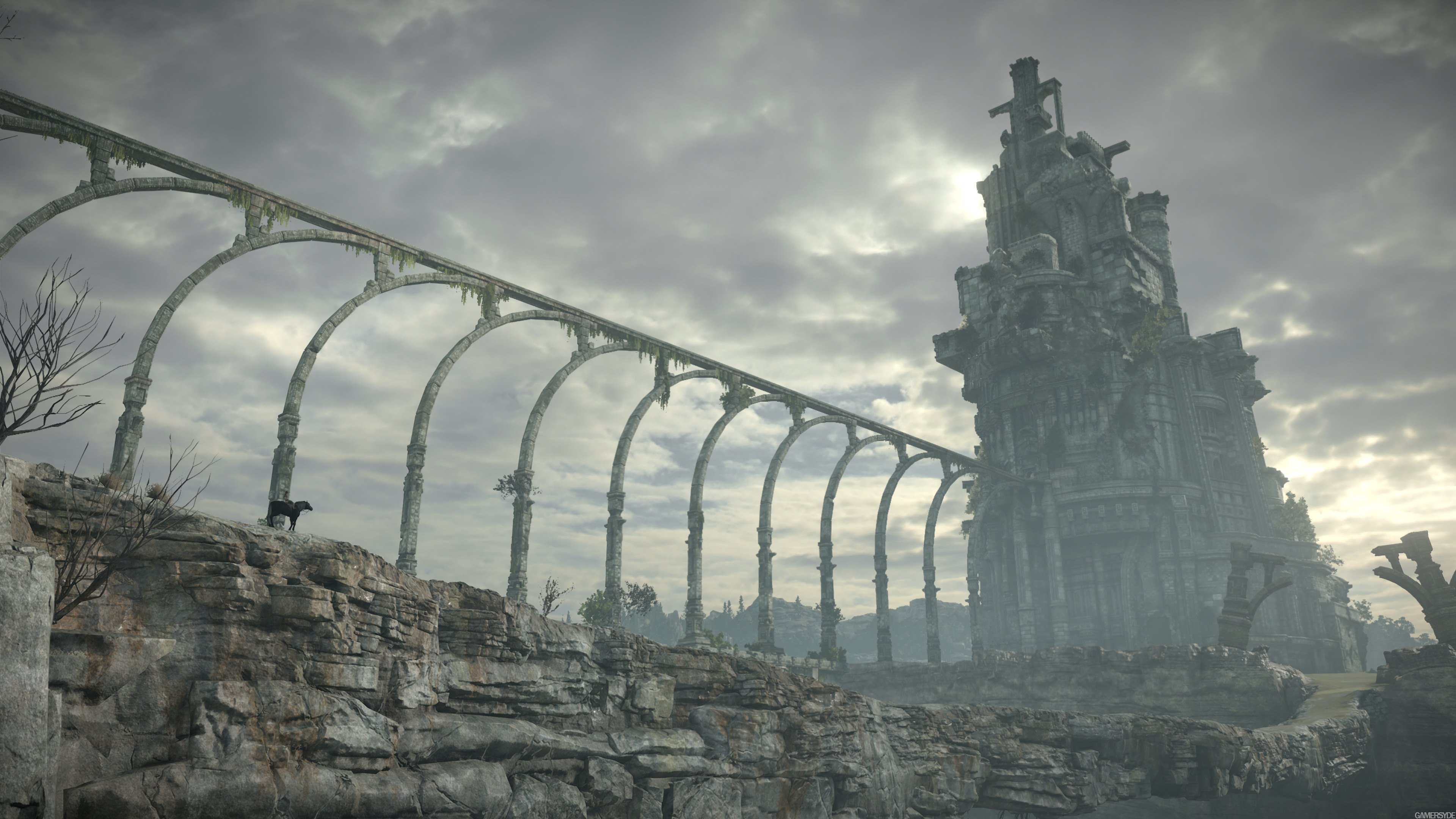
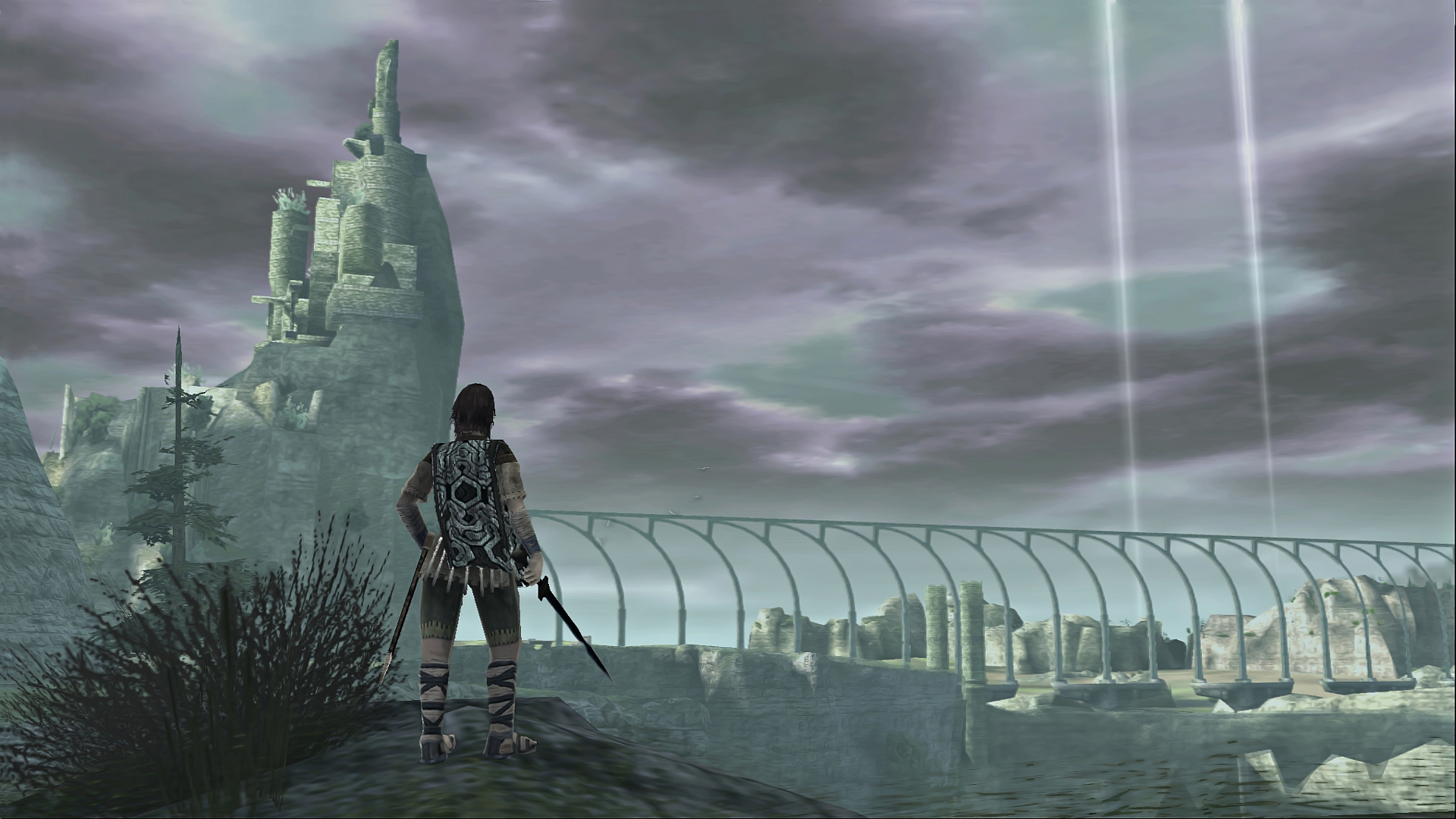
Is this picture less artificial than the STOC remake ?

1) It is obvious that the remake has a more realistic look than the original game.
2) It is obvious that the CG trailer has a more realistic look than than the PS2/PS3 version of SOTC.
3) It is obvious that the CG trailer has similar details than the SOTC remake and so the same sens of realism according to your own criterias.
And unless you speak about some specific rocks, they tend to not have the flat look seen in the PS2 version in the real world :
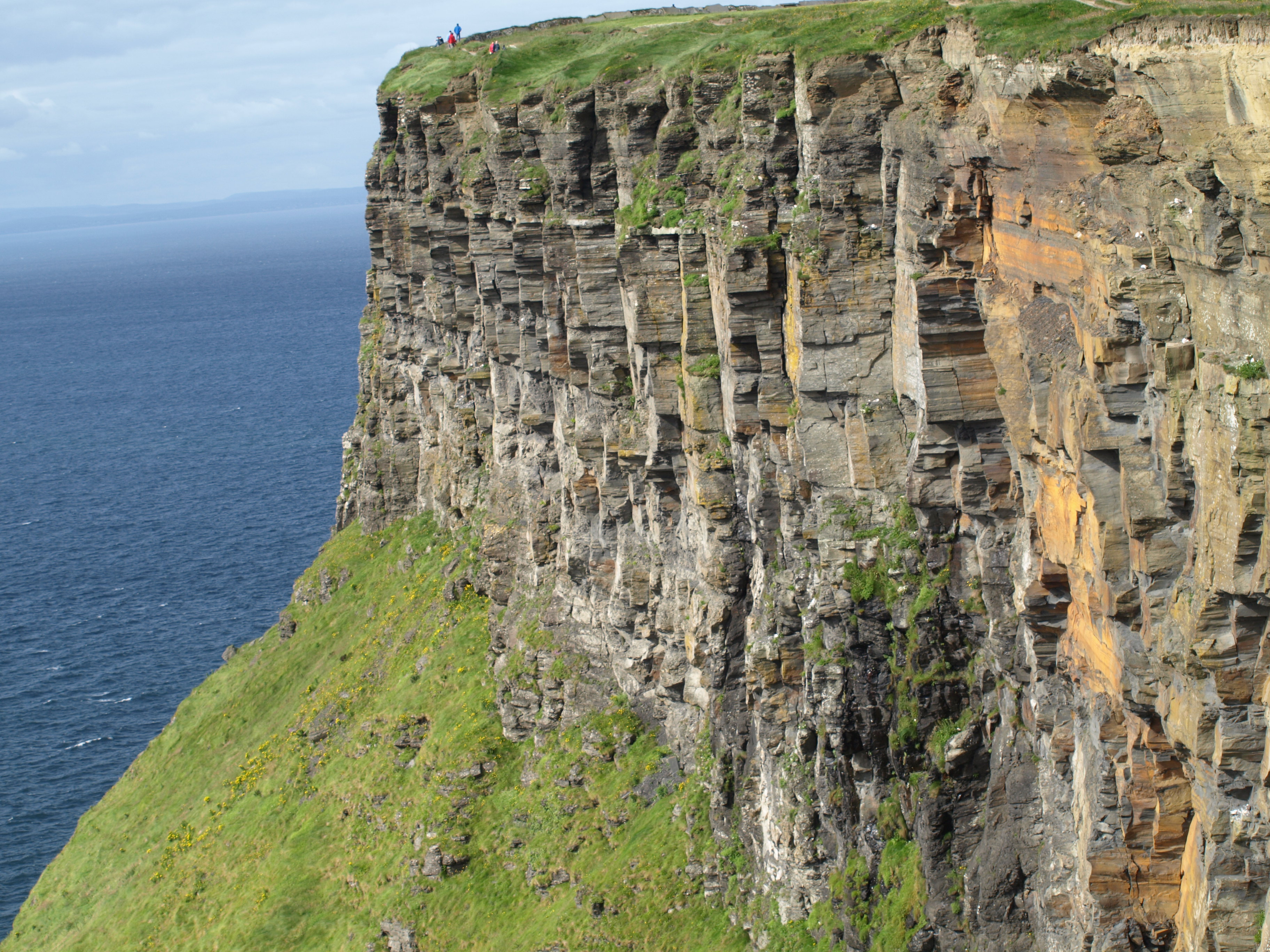
As for what Team ICO's games could look like with way better tech, I guess something like TLG's CG trailer, with a beautiful, carefully designed color palette and lots of bloom.
So closer to the SOTC remake... something that certainly inspired BP seeing how similar they are.
Another example :
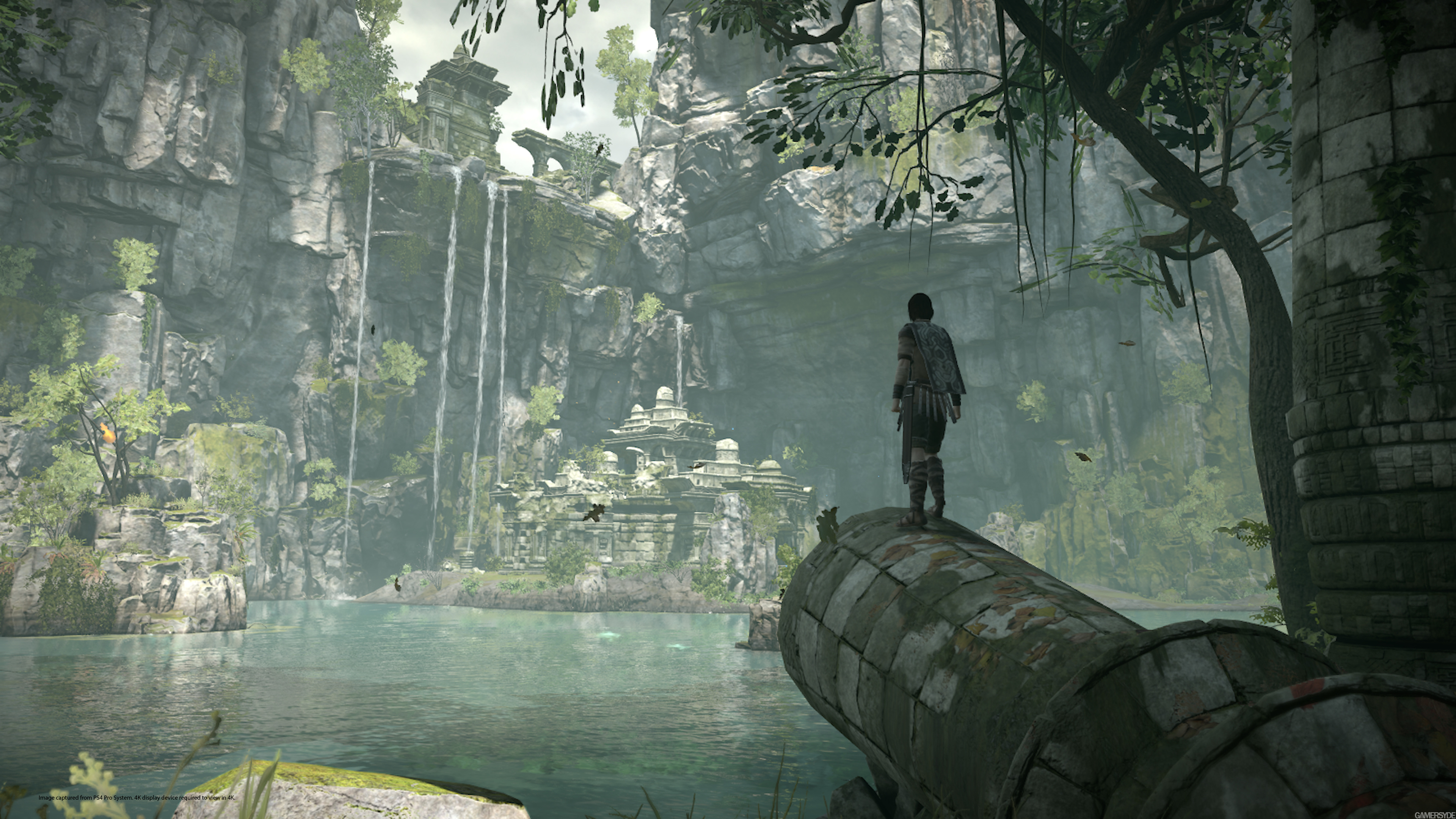
Also, note that the remake has more atmosphere variations :
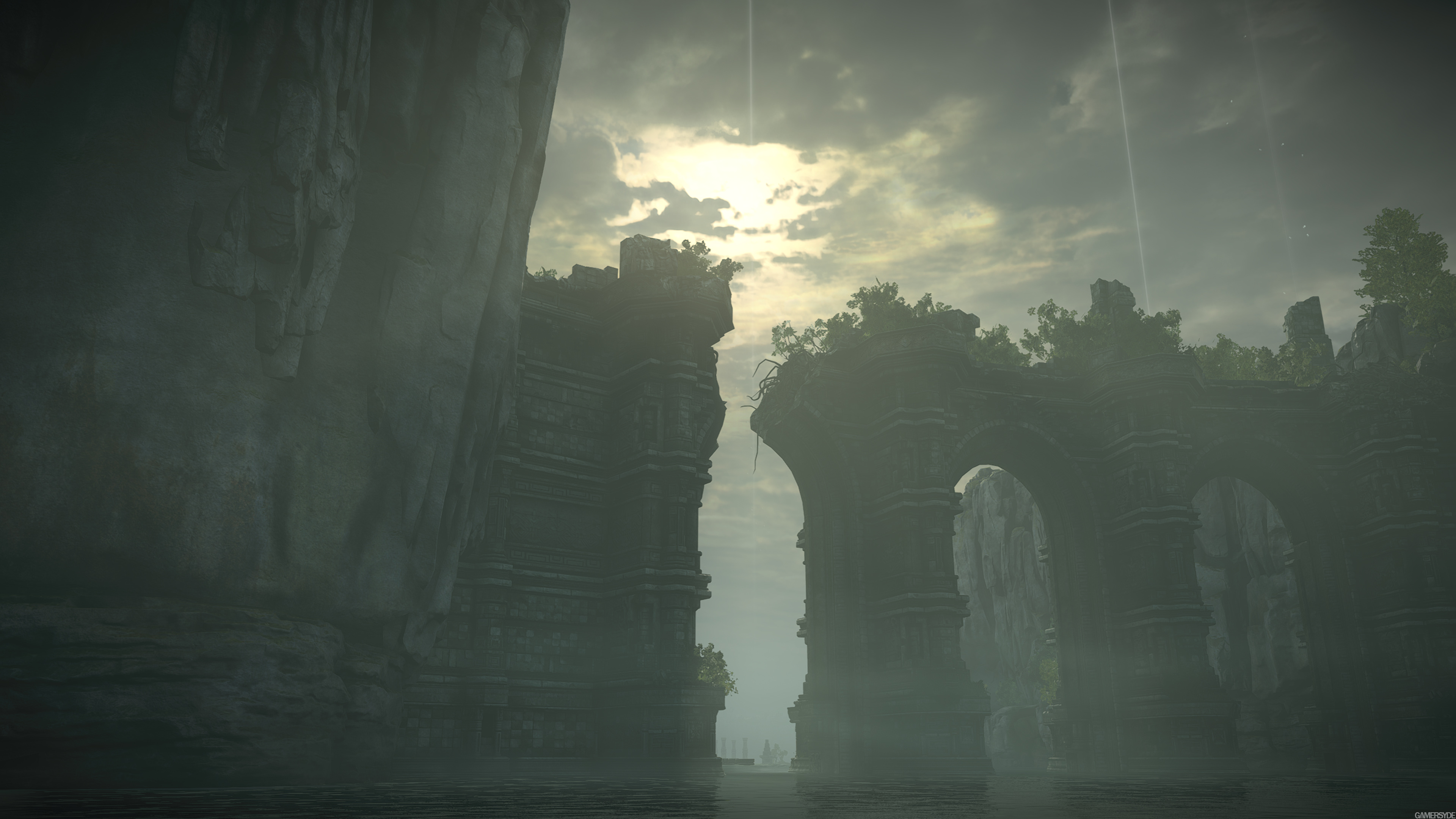
The original game is much more monotonous. So, according to the location, it can be closer or further to the original game.
Anyway, since we repeat the same thing over and over, it's very probable that i won't continue the discussion.
Last edited:
Also, note that the remake has more atmosphere variations :

The original game is much more monotonous. So, according to the location, it can be closer or further to the original game.
I’ve noticed this as well which has made me question those that think the aesthetic was destroyed.
I'll have to agree with OCASM on this one. Not 100% because of the dichotomy "I would like it to be more atmospheric and surreal, but the rocks are not realistic enough", so to speak, but yes, I can understand why a gamer/fan of the original game may feel disappointed with the visual style of this remake or the impossibility to tweak it in the game's settings.
The game looks great, in my opinion, and some assets are incredible, but there's something in the lighting in some pics that makes me go :-/
Also, I agree with the characters being less... solid and more like plastic dolls. The facial expressions are very dull and the bodies look like phong-shaded plain colors, instead of the washed-out grainy textures (duh) of the original. I think that even though at a higher fidelity and resolution, that looks could have been preserved.
I repeat, that's not to say the game is nor looks bad, but I can feel how someone could expect a more specific look, and I find pretty stupid that we reached this point in the conversation (even though it was interesting ).
).
The game looks great, in my opinion, and some assets are incredible, but there's something in the lighting in some pics that makes me go :-/
Also, I agree with the characters being less... solid and more like plastic dolls. The facial expressions are very dull and the bodies look like phong-shaded plain colors, instead of the washed-out grainy textures (duh) of the original. I think that even though at a higher fidelity and resolution, that looks could have been preserved.
I repeat, that's not to say the game is nor looks bad, but I can feel how someone could expect a more specific look, and I find pretty stupid that we reached this point in the conversation (even though it was interesting
I think the mechanics are different. The original has a weight to the characters, it seems, like LAIR's dragon. This makes it 'ungamey'. The new one is more gamey but less realistic as a result, and so plays more responsively. It sounds like Ueda's original vision has been rejected in favour of something more palatable to the current audience. Or BP didn't really notice it was a necessary part of the experience.Thats why I asked, because the PS3 is able to provide smoother/more fluid results, but we still dont know what Shifty was asking or comparing, the original Ps2 game to the Ps4, or for a Ps3 to Ps4 comparison.
They're video games. The visual aesthetics matter. Obviously not to everybody though.I’m interested in the feel after all these posts. I don’t think the feel of the game requires over exposure to capture the beautiful experience.
Movies? Perhaps visuals encompass most of the aesthetic. Games? You have to engage with them.
Just looking at the preview frame on the video you posted, the two screens look different for sure but I’m not sure they not don’t capture the feel of the game.
EDIT: I think you’re stuck on is it exactly like the original vs. does it capture the feel of the original. The washed out look from the original could be improved while keeping or increasing the mood of the original.
There's no contradiction. What I said is that the game has both a realistic core and some surrealist elements. It's not one or the other.In my opinion, you make constant contradictions. You can't say that the remake look completely artificial and that it has lost all sense of surrealism at the same time.
Which picture looks less artificial ? :


Is this picture less artificial than the STOC remake ?:

1) It is obvious that the remake has a more realistic look than the original game.
2) It is obvious that the CG trailer has a more realistic look than than the PS2/PS3 version of SOTC.
3) It is obvious that the CG trailer has similar details than the SOTC remake and so the same sens of realism according to your own criterias.
And unless you speak about some specific rocks, they tend to not have the flat look seen in the PS2 version in the real world :

So closer to the SOTC remake... something that certainly inspired BP seeing how similar they are.
Another example :

Also, note that the remake has more atmosphere variations :

The original game is much more monotonous. So, according to the location, it can be closer or further to the original game.
Anyway, since we repeat the same thing over and over, it's very probable that i won't continue the discussion.
As for your comparison, having to use the worst possible screenshot from the original game, running on an emulator with post-processing effects disabled, just says it all, doesn't it?
Then again you completely ignored my point: higher fidelity != higher realism. The world in the original was created with a geography as realistic as the PS2 would allow. Now look at the remake, it's far more detailed but it looks artificial. Compare it to the picture of the real cliff you posted. Naturally repeating pattern vs randomness. Not to mention the awful plastic shine everywhere. PBR my ass. TLG's CGI environments don't suffer from this. They also sport much higher lighting and shadowing quality.
In terms of "atmosphere" variation, if you mean environment variation then the original is superior. Not only does it have several different biomes spread all over the land, it doesn't limit them by forcing a monochromatic look everywhere:
This remake won't age well. It's neither technologically ground-breaking nor artistically memorable. It's existence is a mistake.
Similar threads
- Replies
- 25
- Views
- 3K
- Replies
- 2
- Views
- 2K
- Replies
- 21
- Views
- 10K
- Replies
- 14
- Views
- 4K


