LAIR Thread - * Rules: post #469

Status
Not open for further replies.
442559234_c372164580.jpg
Seattle in spring. What a lovely sight!

You too, Lair. Congrats to Factor 5. Hope the gameplay is able to match the graphical fidelity; or get close.
 
Maybe we should compare it to these shots.
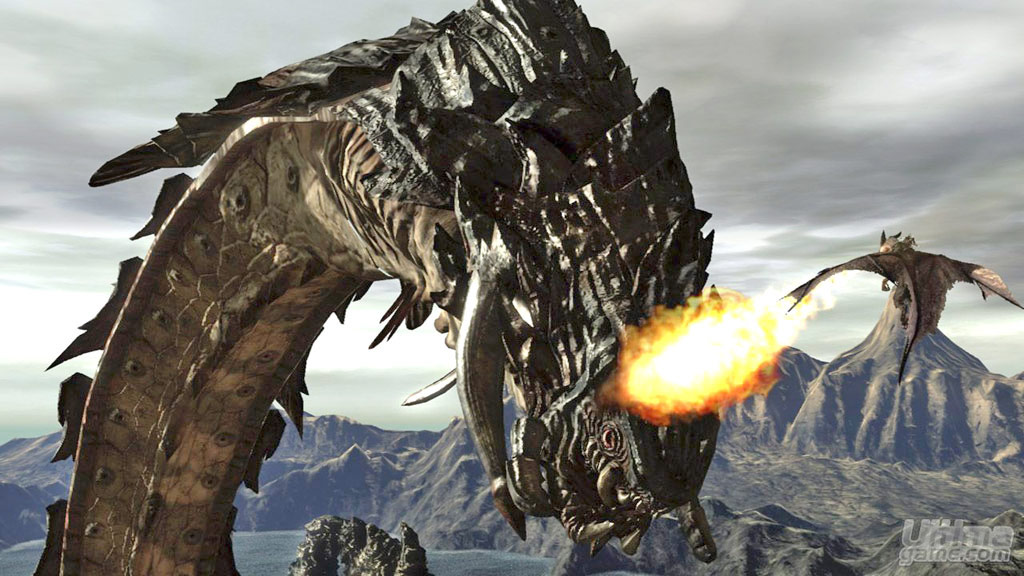
lairfev2.jpg


lairfev4.jpg

The one on top looks much better, total improvement I say.
Oh wait...

So yeah, spider wasp vs sea worm, what is the verdict? Upgrade or downgrade?

Seriously though, I am more impressed by the worm shots because they show something that I don't see in other games, not that the little spidey and its background aren't "beautiful".
 
The screenshot by itself doesn't really mean much as Volcanic logic dictates any developer can come up with better models if it dedicates most of the resources to one model only. How is this an improvement by itself?

And again, maybe spiderwasp was developed earlier than the rest. Does it make a downgrade?

It is like comparing apples to grapes. ;)
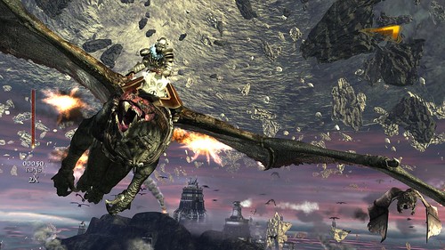
Well of course I presumed Factor 5 were going to be consistent - I feel they are a consistent team, would be a bit jarring to go from the quality of pic1, to pic2 would it not? Plus there is a dragon in each picture, and the diffferences remain striking.
 
So any news on the demo? I'm really hoping it'll be long enough to actually give a good taste of the gameplay, which is the most worrying factor in this game. I heard somewhere they wanted to have it out before the mayhem of E3... so that would make it come out tomorrow? :oops: That would be sweet.
 
Nice ! Looks like they put quite a bit of effort into story telling. The scores flow very well with the game too. Visual seems to have improved. The only thing left is game play now.
 
Last edited by a moderator:
I really thought that was art for a while (as in hand drawn). I had to look at the hi-res screenshot for a while to tell it actually was gameplay. Weird, I think it's the clouds in particular, and the color on the dragon's nose.
 
Its the first time I've seen one of the evil dragons up close with such detail. I think the point of this screenshot was to highlight that they have fixed this concern that some people had earlier in the development process.
 
It is quite beautiful especially the scenery but I wish they would clean up your characters face a bit. I know you probably see it very little during the whole game but it just looks so out of place.
 
Status
Not open for further replies.
Back
Top