LAIR Thread - * Rules: post #469

Status
Not open for further replies.
The water and sense of scale are VERY impressive.

Don't get me wrong it's a good looking game but the whole 1080P thing really set the game back visually. Hopefully F5 targets 720P in their next game..
 
The problem is that the water looks good and everything else is crap, which means that the problem isn't with the capture equipment.

They didn't have screen-captures for the water. All the screenshots are bad I don't know if they are captured directly from the video.
 
Actually, I think that it has improved in some key areas like lighting, surface shader refinement, scenery detail and such.
From ugly to mediocre, mind you, but still an improvement. The upscaling really washes out the details though, I wonder if it's worth it...
 
Actually, I think that it has improved in some key areas like lighting, surface shader refinement, scenery detail and such.
From ugly to mediocre, mind you, but still an improvement. The upscaling really washes out the details though, I wonder if it's worth it...

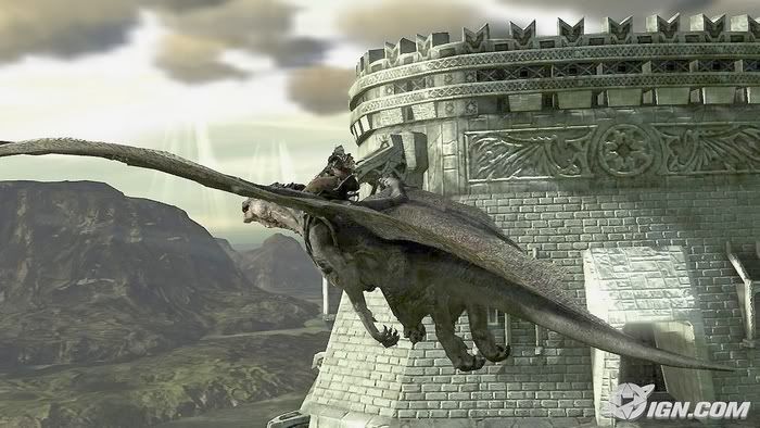
Lighting looks good, perhaps a little too saturated, the scale is awesome, the detail (from the air) is good, but the textures on the main dragon seem a little bit too reduced. Also, IMHO, the art isn't implemented very well.

Hopefully they can pull things together before release. ;)
 
Lighting looks good, perhaps a little too saturated, the scale is awesome, the detail (from the air) is good, but the textures on the main dragon seem a little bit too reduced. Also, IMHO, the art isn't implemented very well.

Hopefully they can pull things together before release. ;)

I agree. Just doesn't feel like a pretty game, even though there are certainly outstanding things about it. IMO scale (esp. no popin progressive LOD on env.) is fantastic, water is nice, dragon models are nice. Lighting seems pretty good.

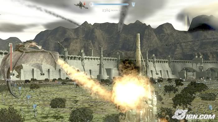
FYI, Factor 5: Dragons do not spit 3 shade yellow sprites. They breather fire. Please give me something that looks fire and not those Doom 3 sprites that everyone seems to be so happy recycling in their games. Impfire ftw
 
IGN's video streams stuttered.

If the frame rate on the game is good, graphics may be okay depending on the kind of game this is.

If you can fly and land anywhere -- you're not on rails -- so this is kind of a GTA kind of game, maybe you can't expect the most detail?

Especially if you're moving around and there has to be a lot of units which has to come into the field of view at any given time?

Someone was bragging how Dirt looked better than Motorstorm. But in Dirt, you only have one car on screen at a time, don't you?
 
* reopened

OK, this thread has been labelled as sentivite again, i.e. this one will be heavily policed.

  • Reconsider what you're posting in here before hitting the Post button.
  • Be specific in your criticism. E.g.: "The texturing seems low-res to me", etc. Flames like "looks like PS2 game" will not be tolerated.
  • Try to flesh-out your opinions. One-liners only lead to misunderstandings.
 
Read the rukes but seriously those flames and explosion deserved the criticism they get. The flames and explosions can clip with the ground plane, destroying the illusion and reveal its true nature, texture on a plane. Some of those explosion didn't even billboard correctly in the second video. Can't they use volumetrics effects like those clouds in the Warhawk video, supposedly Cell can help with that.

I was going to comment the lighting and textures but I think its obvious, so I'll leave it at that.

Anyway, I am liking the dynamics of everything that are going on in the levels. In term of scales and detail, this game seems to be the largest yet. I haven't read the IGN preview, only watched the videos, it would be cool if you have a base of your own, where you can recruit different type of units/recover and go back and conquer. It'll be something like Herzog Zwei. That'll be awsome if some one can make something like that with the scale of Lair. Will make a good multiplayer too.
 
FYI, Factor 5: Dragons do not spit 3 shade yellow sprites. They breather fire. Please give me something that looks fire and not those Doom 3 sprites that everyone seems to be so happy recycling in their games. Impfire ftw

In the videos I just watched, the balls of fire that the dragons use as a "long distance weapon" looked a lot more like fire than they did previously. Are you referring to the old ones or the ones in these new videos?
 
:cry:

There seems to be alot of negativity here surrounding a game which, from what I can tell from the IGN videos and screenshots, has been improved drastically in the art department from since it was last shown..

The terrain looks great IMO (especially in the night video) and seems to have a good sense of dense detail from the visible distance (& it doesn't look like generic perlin noise generated terrain (even though it probably/possibly is) )..
The water looks great although the explosions of the ship in the water battle video didn't do much for me.. They were a little to "cheap" and i'm sure could have been done better (would a wooden ship reeeeally "explode" when hit with a fire ball..?)
The buildings and troops look worlds better than in the previous videos with alot more detail in the troops from what I'm sooooo bloody glad that the overdone yellow glow which saturated the old videos is gone..
I think the combat maybe needs to be a bit more intuitive (since it looks a bit clunky) and the camera probably needs some work to provide a better view of whats going on in places (sometimes during the video when the player performs certain actions, the camera seems to go mad and makes it very difficult to see/understand what the heck is going on..) but other than that it seems to have alot of potential in the gameplay department..

The biggest plus for me was the sounds! I absolutely LOVED the roaring bursts coming from the spew of flames from the dragon's mouth and I thought the ambient sounds/music couple with the beat of the dragons wings really help to make you feel like your in the thick of an epic battle and flying a mighty beast..

But then again...

What do I know.. I'm just a programmer.. [shrug] :???:
 
With Laa-Yosh on this. Looks better. There's more content (not so absolutely barren) and its far better lit. There's still bizarre choices, with textures that just look totally out of place. Fire is improved on the original sprites, but so far short of the E3 movie. They should never have shown that! There was also some serious framerate droppage in the dragon-fights-a-few-fellas-on-a-grassy-field vid.
 
Sure beats me how people can tell so much out from pictures and videos of the quality of a bootlegged movie.

It looks like the ones IGN took with camera back at the last TGS and there's obviously something wrong with the compression as we can only see the very sharp contrasts, where the fine details are washed out (would be weird if Factor 5 had programmed a filter to do this).
Sure the fire looks flat but so does the water in all the areas where the bloom effects aren't there to create contrast.

The videos are only good for gameplay and animations. Reminds me of IGN and Gamespot's captures from Gears of War.

When that is said, the voice acting seems bad/flat, I hope it's due to the videos and not the actual game.
 
I guess this is what they deserve for accepting money from IGN. Definitely not the game's most flattering moment.

I guess the bright side is we get to see parts of the game we have never seen before. The water reacting to the explosions looked cool. And the number of stuff flying around in the last video was quite cool. I did not even realize it was raining in that 3 video - rain does good job of fraking up image compression I'm surprised F5 even let them use that one.
 
Quite dark screenshots from IGN. I made them brighter and sharpened them slightly just to be able to see the scenery detail (objects, geometry, billboard trees?) better.

Original screenshots from IGN.
http://media.ps3.ign.com/media/761/761161/img_4465131.html
http://media.ps3.ign.com/media/761/761161/img_4465129.html

( http://i176.photobucket.com/albums/w193/NebulasPhotoPocket/lair-clearSs.jpg )
lair-clearSsSMALL2.jpg

( http://i176.photobucket.com/albums/w193/NebulasPhotoPocket/lair-ClearSs2.jpg )
lair-ClearSs2SMALL.jpg
 
According to IGN is an Alpha Build, so probably it will get better. Anyway the videos just look awesome, i love the water effects and the dragon movements.
 
According to IGN is an Alpha Build, so probably it will get better. Anyway the videos just look awesome, i love the water effects and the dragon movements.

I don't think it'll get much better in two months. There's no way all of the wrongs could be fixed in that short amount of time.
 
Status
Not open for further replies.
Back
Top