Install the app
How to install the app on iOS
Follow along with the video below to see how to install our site as a web app on your home screen.
Note: This feature may not be available in some browsers.
You are using an out of date browser. It may not display this or other websites correctly.
You should upgrade or use an alternative browser.
You should upgrade or use an alternative browser.
Horizon: Zero Dawn - Graphics de-Gushing
- Thread starter Clukos
- Start date
good to know!Also, I can confirm that what I posted above isn't true for every area, moved to a different area and no more yellowish tones during daytime
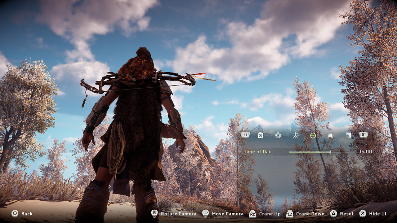
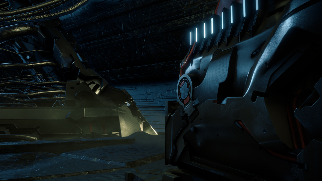
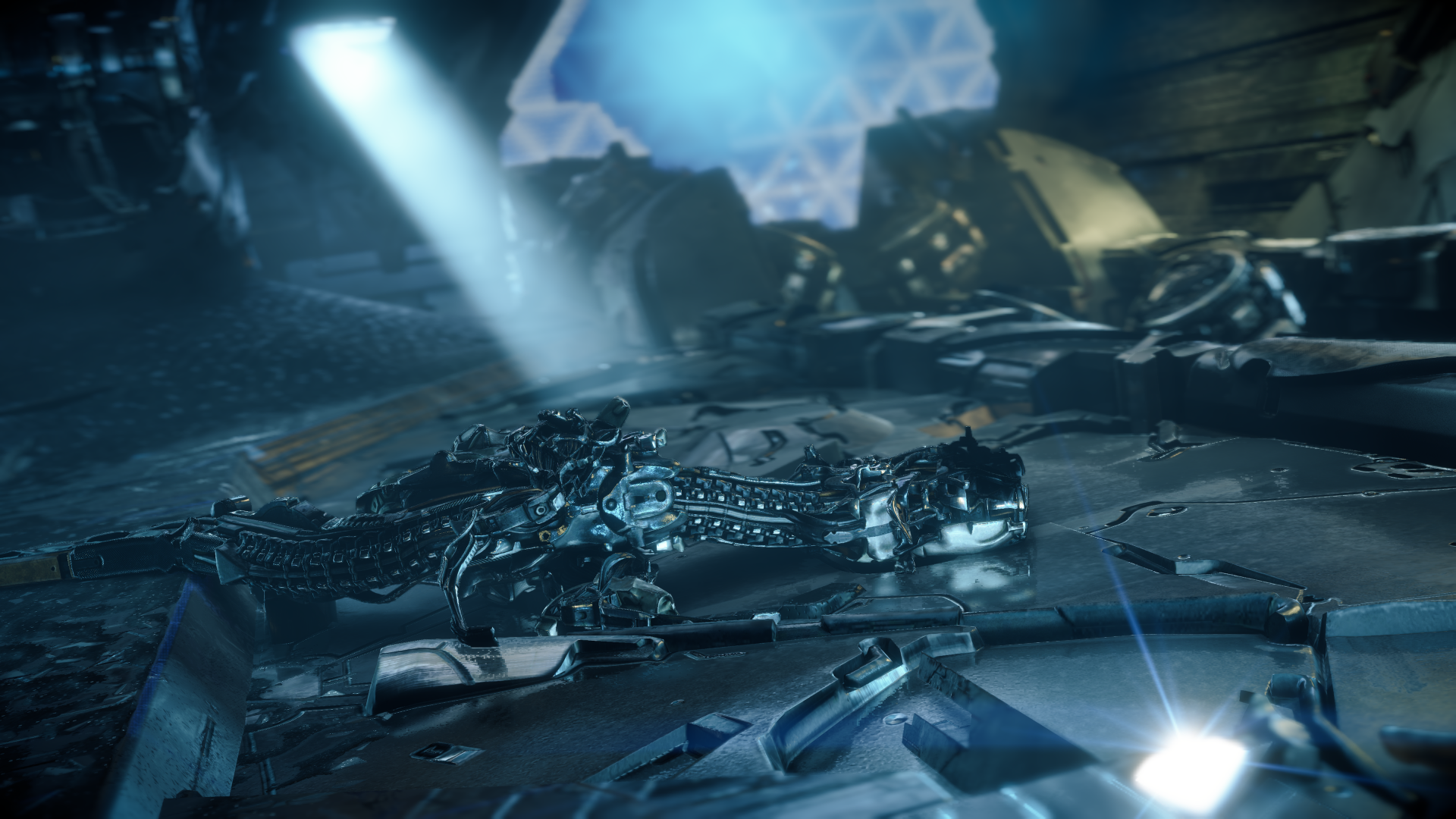
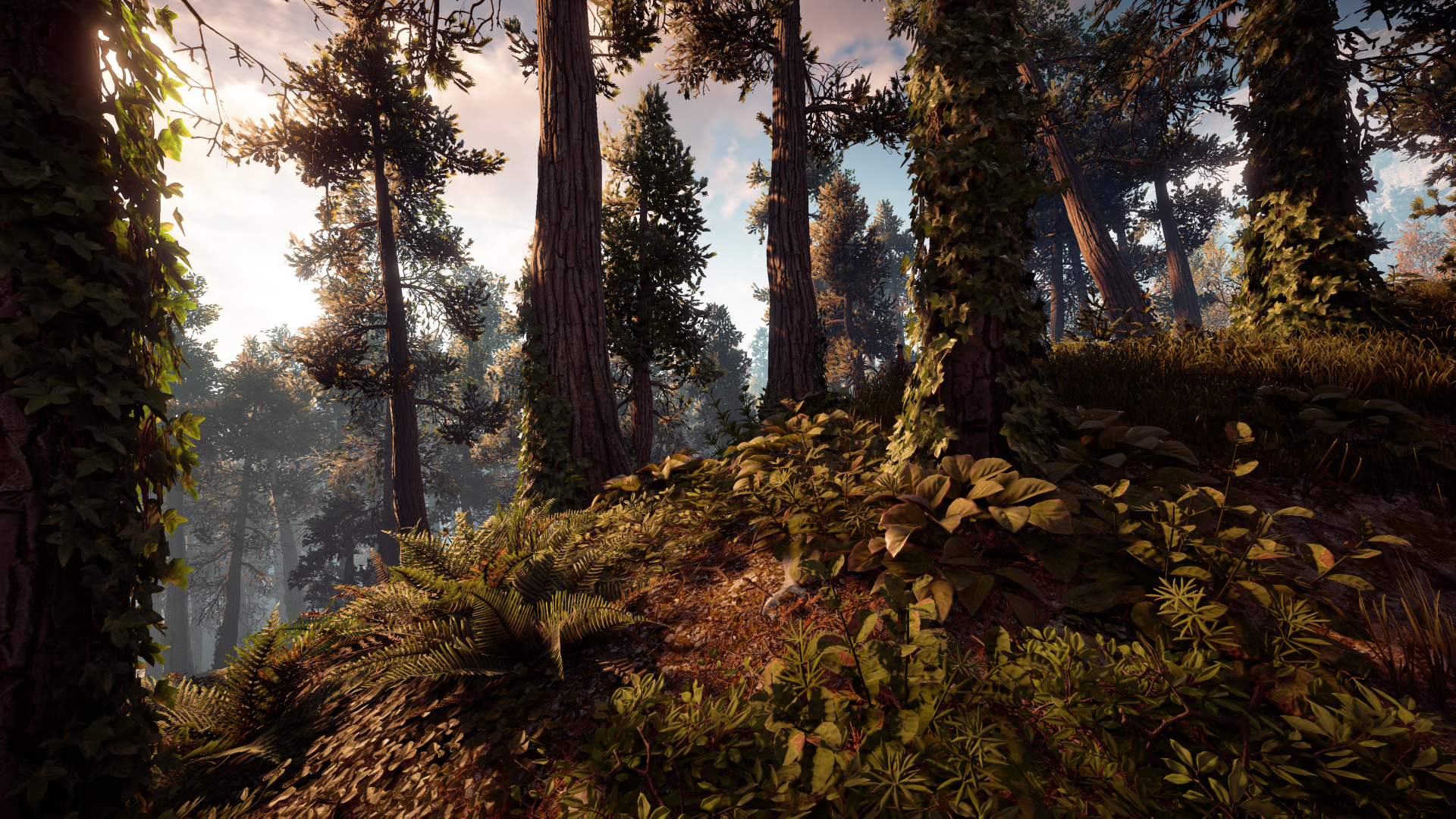
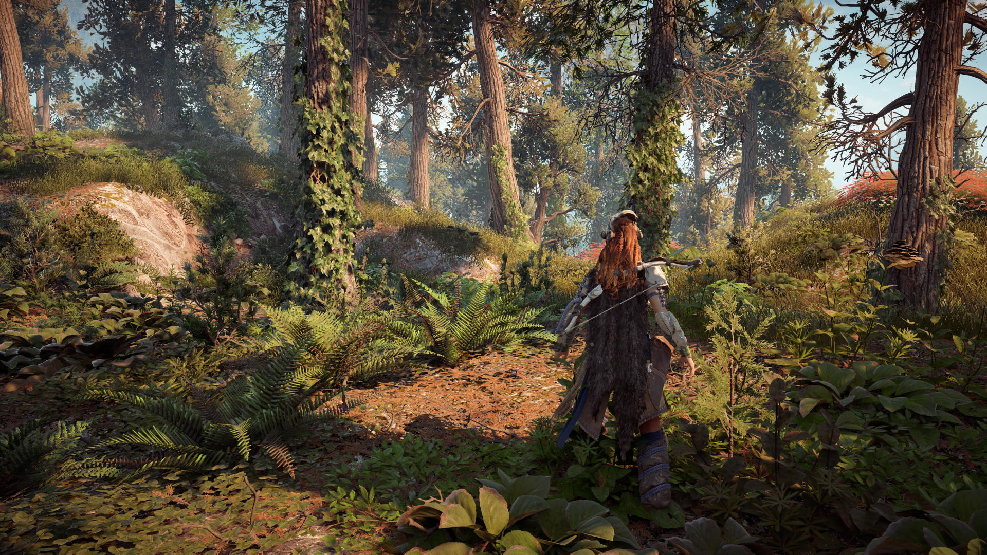
The game looks very good and it is graphically definitely one of the most impressive open world games. On the consoles there is in my opinion currently no competition which can keep pace with this. Especially on the standard PlayStation 4.
But there also things which are not well implemented:
-water often does not fit next to the environment and in generel it has a moderate quality
-SSRs could also be better.
-high grass in which the player can hide looks great and are able to move if one goes through. Unfortunately this is not the case for other things like normal grass, flowers, bushes etc.
-indirect lighting varies too little and appears flat.
-in places where people live the NPCs often look the same. Partially there are people on a bench next to each other where two of them look the same.
Other open world games also have some of these problems. All of the best open world games have their strengths and weaknesses.
Last edited:
Water looks good in screens, but the movement and "physics" are pretty basic, and no interaction with the character.
Someone on neogaf posted comparison pictures between performance mode and resolution mode, i think i saw better reflections in performance mode, i should check myself to verify.
foliage interaction is a letdown, again in uncharted 4 it reacts to main character and allies AI, but not ennemies. They could have done that at least for Alloy. Maybe in a future update, or there is no more room for improvement.
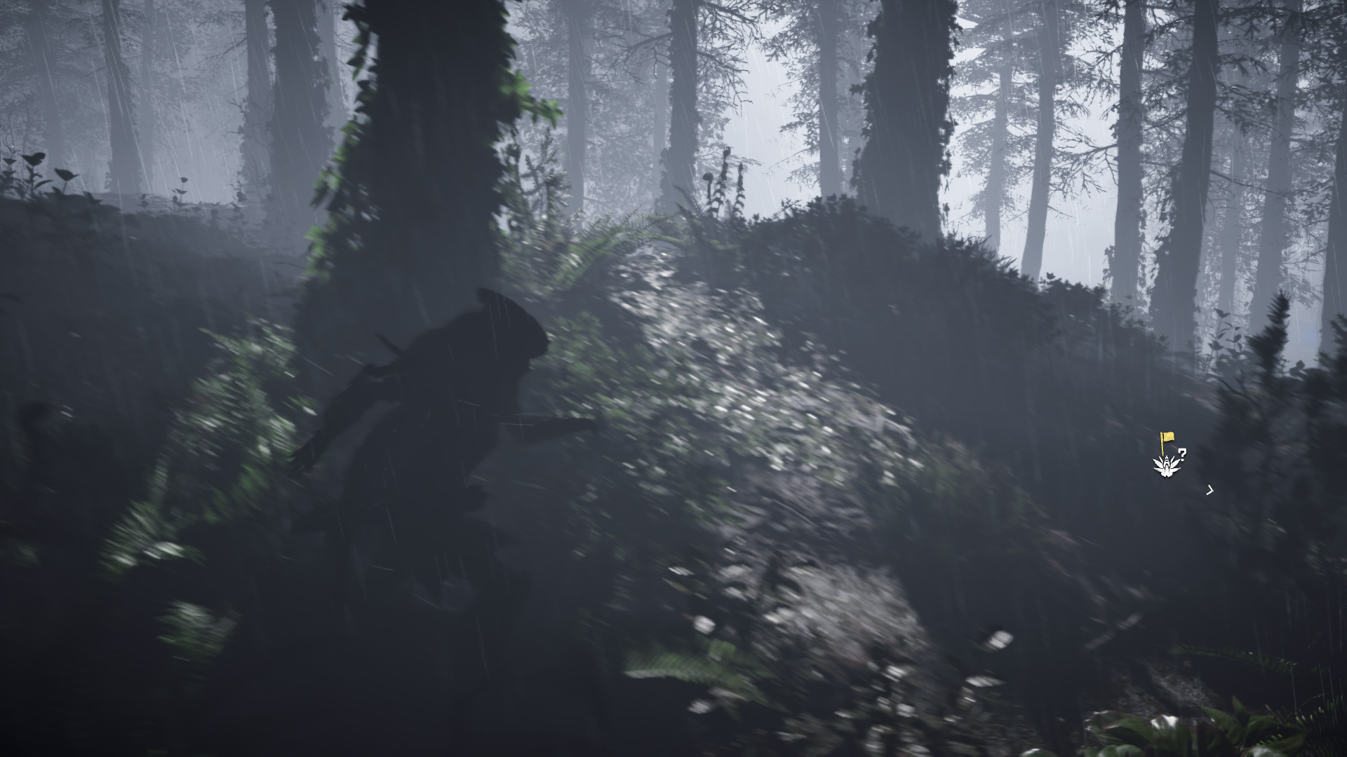
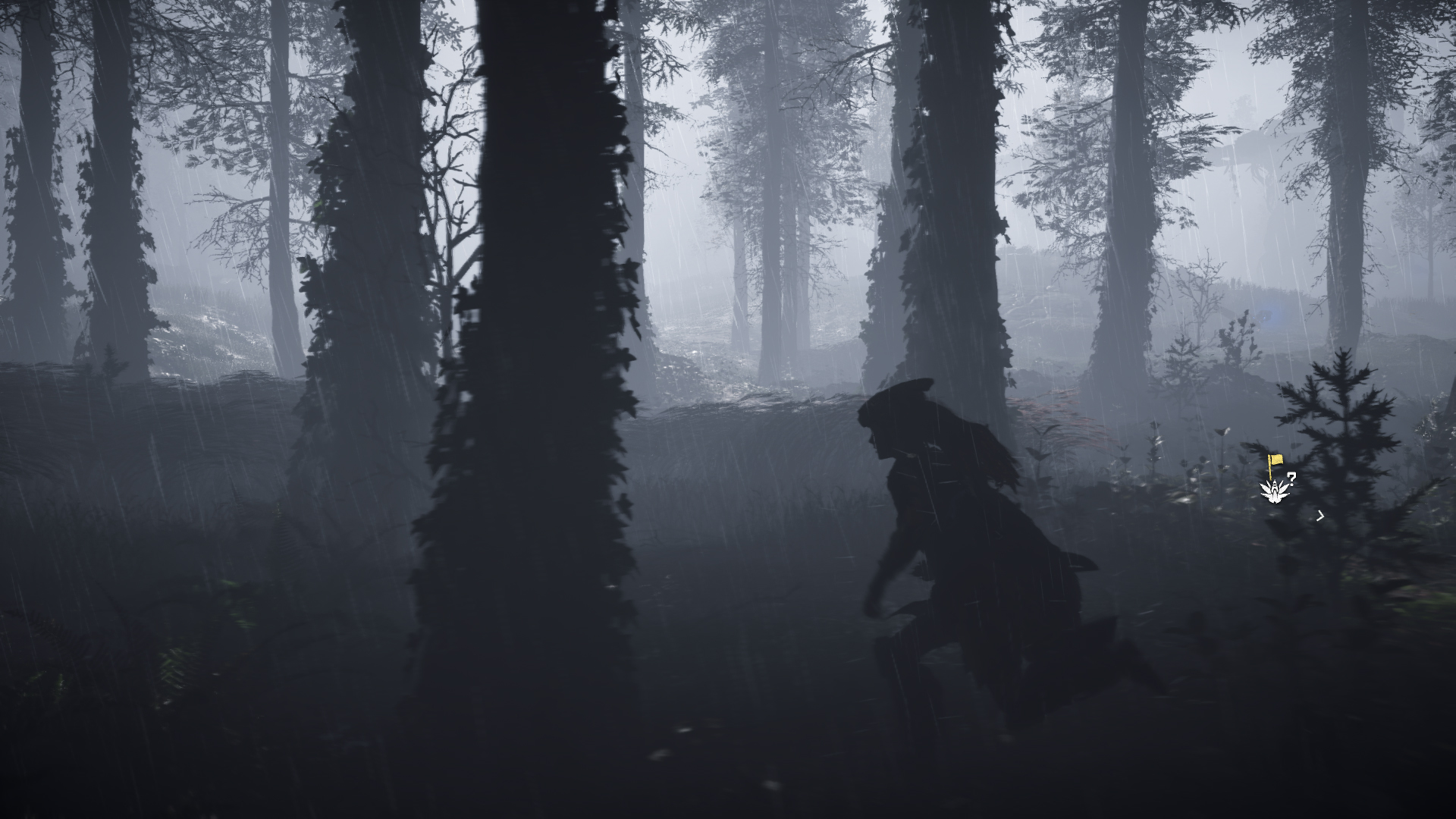
i like how shadows spread accros the fog
And yes, reflections are more detailed in performance mode
http://i.imgur.com/xgYai7a.jpg
http://i.imgur.com/NLEIYMa.jpg
And yes, reflections are more detailed in performance mode
http://i.imgur.com/xgYai7a.jpg
http://i.imgur.com/NLEIYMa.jpg
https://imgur.com/hqxfsR2
This gif is incredible. FX and particle are incredible.
Edit: Like machine animation
This gif is incredible. FX and particle are incredible.
Edit: Like machine animation
Last edited:
https://clips-media-assets.twitch.tv/24665816464-offset-1755.5829999999999-16-854x480.mp4
Very funny bug home run
Very funny bug home run
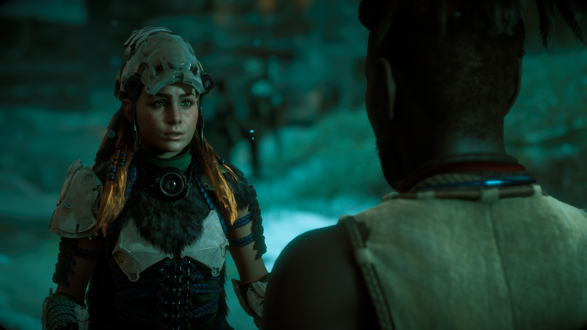
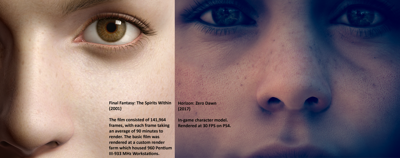
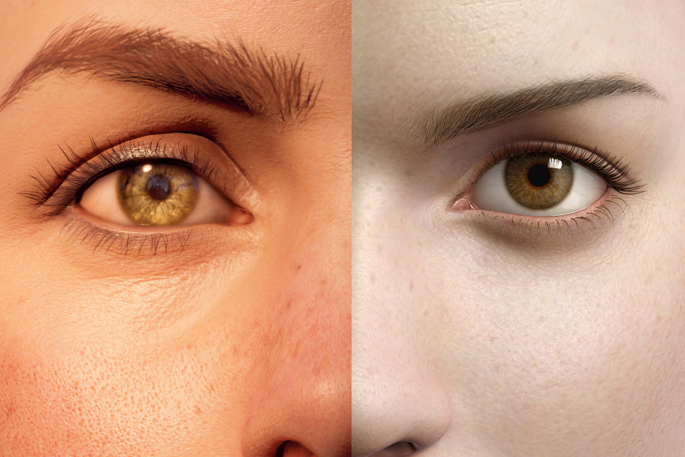
We're not really quite there yet regarding some details on the face like eyebrows and eyelashes. The eye looks more convincing on Aki's model and have better reflection. Getting really close though, next-gen we should see spirits within level of character fidelity. The hair might be impossible still

Some ultrawide goodness, this is def the best looking open world game that I've played so far

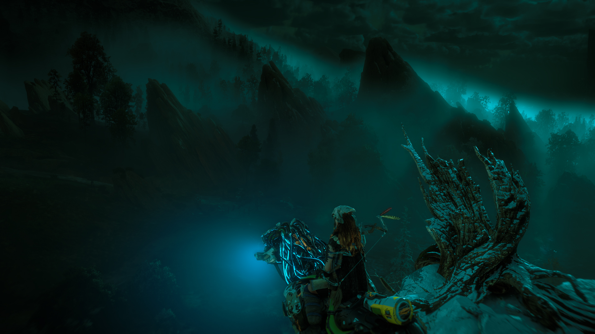
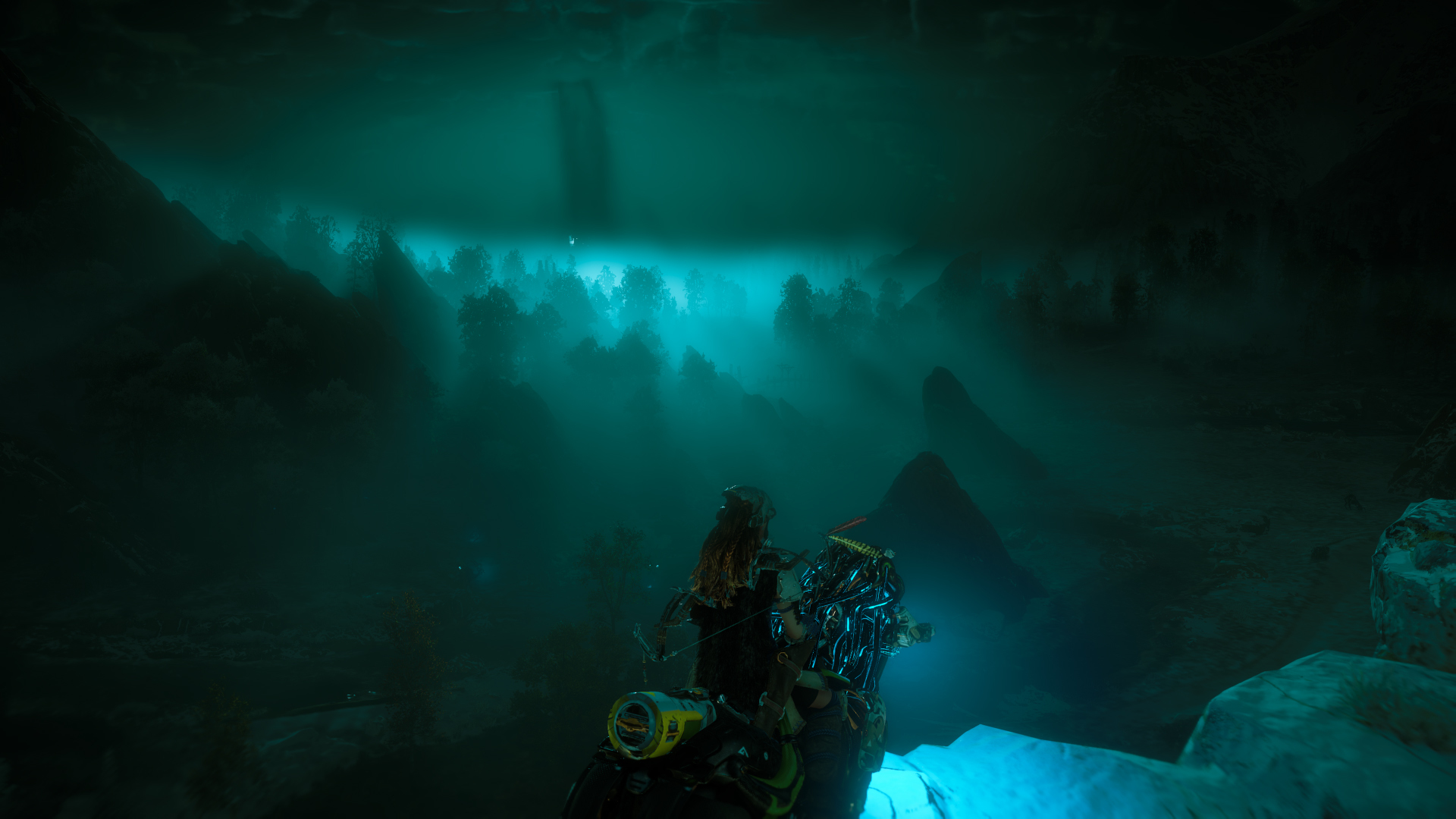
Volumetrig fog always looks nice

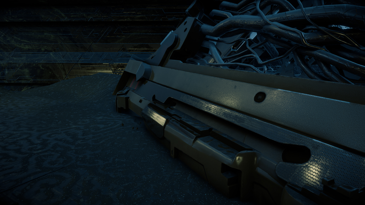
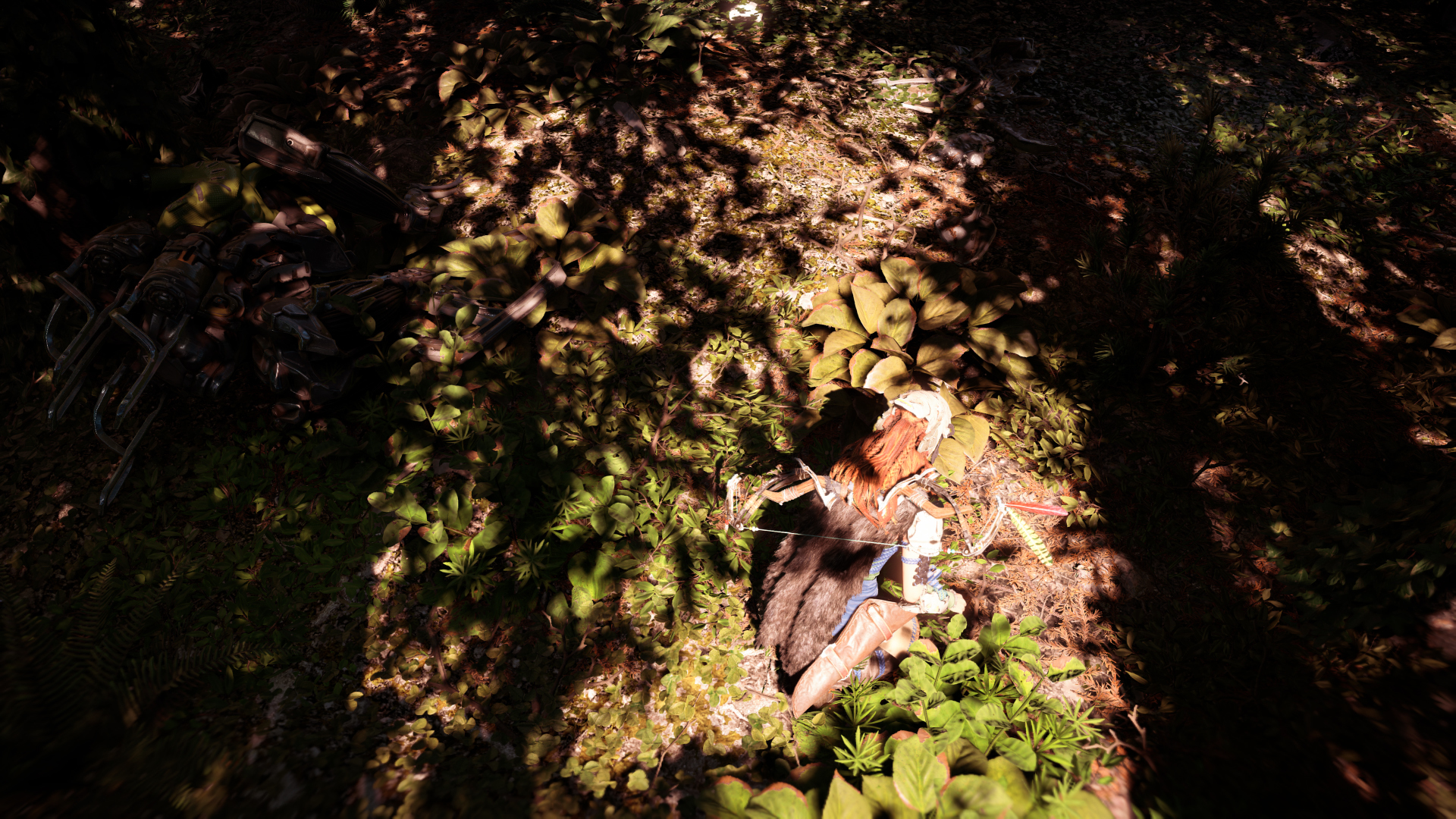
The game is also correctly using specular occlusion (aka most things that shouldn't be shiny, aren't):


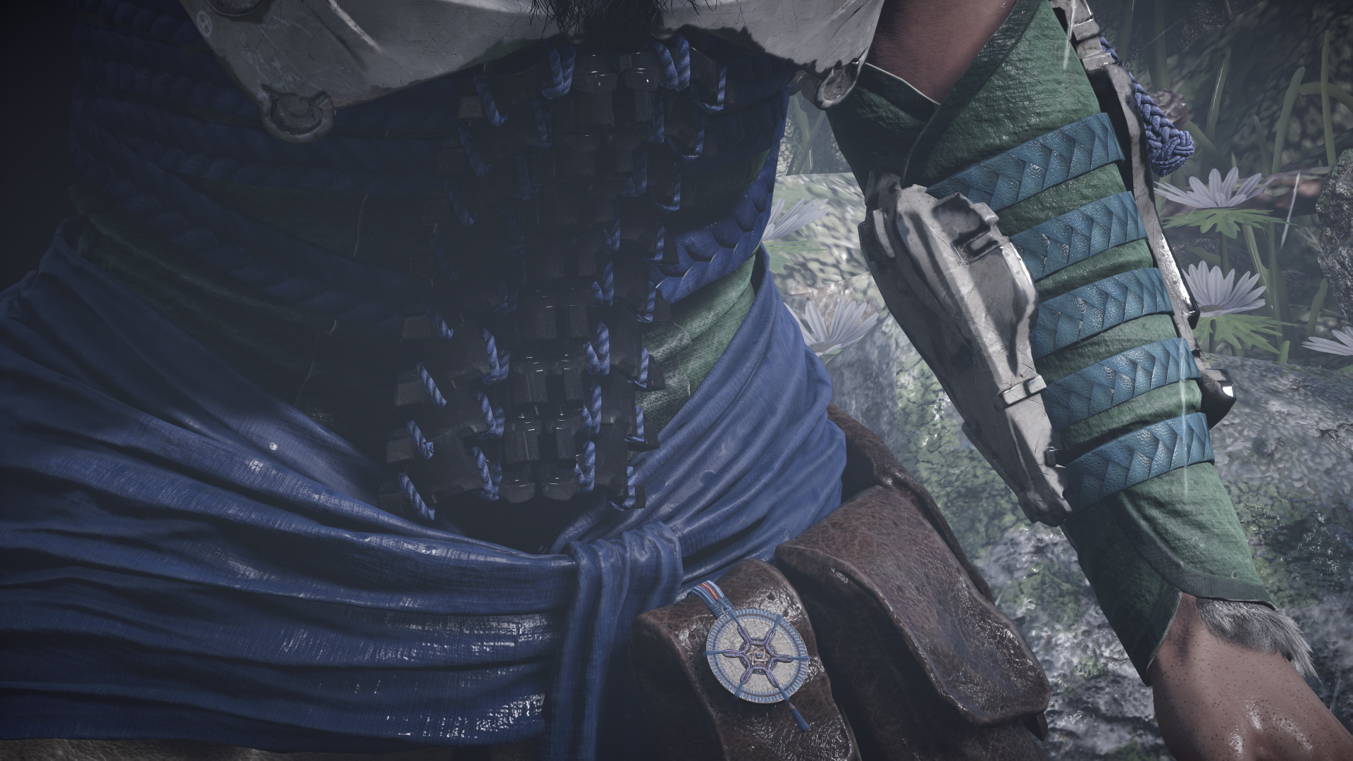

Of course the caveat here is that there must be a shadow for this to work properly and not everything casts a shadow. But it improves the overall look of the game significantly.

Volumetrig fog always looks nice

The game is also correctly using specular occlusion (aka most things that shouldn't be shiny, aren't):


Of course the caveat here is that there must be a shadow for this to work properly and not everything casts a shadow. But it improves the overall look of the game significantly.
D
Deleted member 11852
Guest
So many awesome visuals in this game. About 30 a second by my reckoning.
The game is really getting Jurassic Park like, had some intense battle with a trio of Belloback which reminded me of the Suchomimus. It showed me what it feels like to be hunted by those giant theropod dinosaurs for the first time and boy I haven't even met Thunderjaw yet. Really love the design of those machines it's right up in my ally.
Similar threads
- Replies
- 1
- Views
- 1K
- Replies
- 55
- Views
- 13K

