Uncharted : Drake's Fortune*

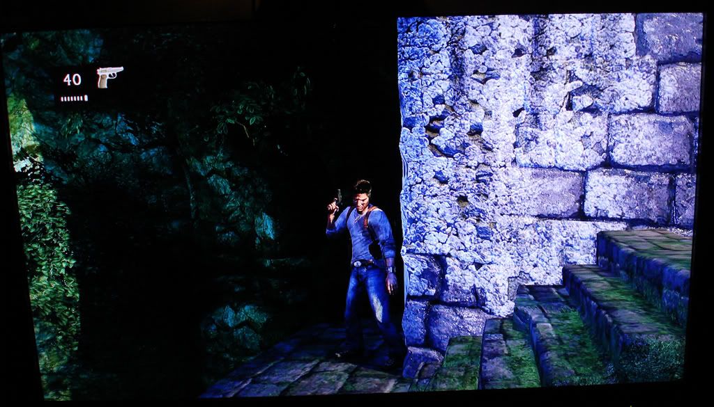
I know the quality of this pic is bad...but still nice to look at.
DSC02506.jpg

In all honesty, i dont get what you see in this picture. The lighting looks fake (wall has a very wierd colour), the ground\stairs is low rez bump mapped, the background looks... black and low rez..

Other shots looks much better, somehow it reminds me abit of FCI:p in terms of artstyle, with the "muddy\clay" skin look.

I think he said what he liked about it, he think it looks nice :)

Maybe you should take one of the good looking pictures and make a positive comment about those instead. God knows there are lots and they are completely free from the PR treatment and photomode extras we have seen plenty of here.
 
In all honesty, i dont get what you see in this picture. The lighting looks fake (wall has a very wierd colour), the ground\stairs is low rez bump mapped, the background looks... black and low rez..

Other shots looks much better, somehow it reminds me abit of FCI:p in terms of artstyle, with the "muddy\clay" skin look.
uncharted wasnt aiming for a realistic approach hence the more saturated lighting. the only thing thats abit flat was the stairs but that can be easily overlooked by the beautiful textures just about everywhere else.
 
In all honesty, i dont get what you see in this picture. The lighting looks fake (wall has a very wierd colour), the ground\stairs is low rez bump mapped, the background looks... black and low rez..

Other shots looks much better, somehow it reminds me abit of FCI:p in terms of artstyle, with the "muddy\clay" skin look.

It was just a picture posted, i posted all the ones I found. I like the wall...the guy said his camera settings are weird making the lighting look strange..way to go to jump on my back. SO, in all honesty I don't know why you felt the need to tell me why I shouldn't like it.

Maybe you should quote a picture you think is good. "the background looks black" lol. I just thought the barnacled wall was cool :/ I said it wasn't the best quality pic.
 
Last edited by a moderator:
In all honesty, i dont get what you see in this picture. The lighting looks fake (wall has a very wierd colour), the ground\stairs is low rez bump mapped, the background looks... black and low rez..

I don't know how you can see resolution of those textures (including normal maps) but lighting on the wall looks fake because of the lack of shadows casted from stairs, giving it a copy-paste look.

Drake's lighting is pretty good though.
 
i really like how the lighting, shadows, great contrast and wet surface of the rock giving off such an organic and natural look in this pic.

Either the camera or the TV settings but that ss almost glows, I mean look at the grass and leafes, they are like strong neon lights! :eek:

I wonder though about some screenshots where I saw shadows being cast in opposite direction even though there was only one dominant light source, hmm.
 
Uncharted has that typical thing so common for next gen titles these days ... you really have to see it on the game. The textures are so high quality that any kind of image quality loss from digital cameras, compression, and so on, is going to take away from them significantly. And so much of the scenery (all the green stuff) is constantly swaying in the wind, with all of them (at least higher than grass) casting shadows over just about everything else (if you look up against a tree, you can see the shadows of the second layer of leaves fall on the first layer of leaves, so to speak), and that's what makes this game look so amazing.
 
Unfortunately, I never got those from the TR games either. I might enjoy the clever mechanics of a setup, but the actual puzzle-solving was pretty much "keep climbing/jumping in the only direction you can climb/jump, and try to find right levers to pull and sprockets to place," etc.

Maybe there'll be one or two things where the puzzle itself is fun and engaging, but I find myself more frustrated by them, where I'm always just looking around for "the thing to manipulate" and "guessing at what point I have to backtrack" or "finding the thing they're hiding behind scenery."

Having hints is ALWAYS a good idea, as random wander-guessing is just added boring time. Uncharted's two-stage hinting system seems to be a good compromise; after all, you certainly don't HAVE to use them, but it's nice to to be able to simply hit a button and look in the first "clue" direction, or check your diary if you want the broad puzzle/trap/location overview.
That's where online coop would be interesting, in getting past these puzzles quicker.

Or make multiplayer puzzles show up in online coop mode.

For instance, in HS, you had to get on top of a tower and throw a discus towards the opposite tower to ring a gong and release some gate.

For an online coop mode, maybe have a second player able to release a gate for the other player to get through and then once he gets through, he'd have to trip a switch on the other side to get the other player through and so on.
 
Since you've played chapter 4, is there any more gameplay after the point demo ends?

The demo is very early in the game, I think it's chapter 2. I'd say the demo gives a pretty good feel of how the game plays. Later on in the game there are puzzles, I don't think they are too easy if you turn the hints off. also melee combat is a lot more important in the game than some people think. melee combat is context sensitive...I pulled off a flying drop kick kill, which was pretty cool.
 
The demo is very early in the game, I think it's chapter 2. I'd say the demo gives a pretty good feel of how the game plays. Later on in the game there are puzzles, I don't think they are too easy if you turn the hints off. also melee combat is a lot more important in the game than some people think. melee combat is context sensitive...I pulled off a flying drop kick kill, which was pretty cool.

No the demo is Chapter 4, he wants to know if chapter 4 is longer than the demo.
 
Maybe you should take one of the good looking pictures and make a positive comment about those instead. God knows there are lots and they are completely free from the PR treatment and photomode extras we have seen plenty of here.

*Snip trollage*
I also think that screenshots are doing this game no favour, since they hide lots of the detail the game has to offer (texture wise). Some of it which is only visible in movement, like the shimmering of wet stones' textures etc.
 
Last edited by a moderator:
I think he said what he liked about it, he think it looks nice :)

Maybe you should take one of the good looking pictures and make a positive comment about those instead.

I have commented positively on how good uncharted looks, in this thread and in others, i just found it funny how deepbrown thought that picture looked good, as its the one that looks the most "fake" of all of the shots around.

*trim follow up*
 
My other regret is that when Drake starts moving, he moves forward before his animation starts, and the movement doesn't really come 100% from pushing himself forward with his foot. That brakes the illusion of the animation a little.

Yeah, that's my only problem with the animation in general. It seems as he's floatting a lot in between animation. It's not very bad, it just breaks the illusion like you said.
 
Back
Top