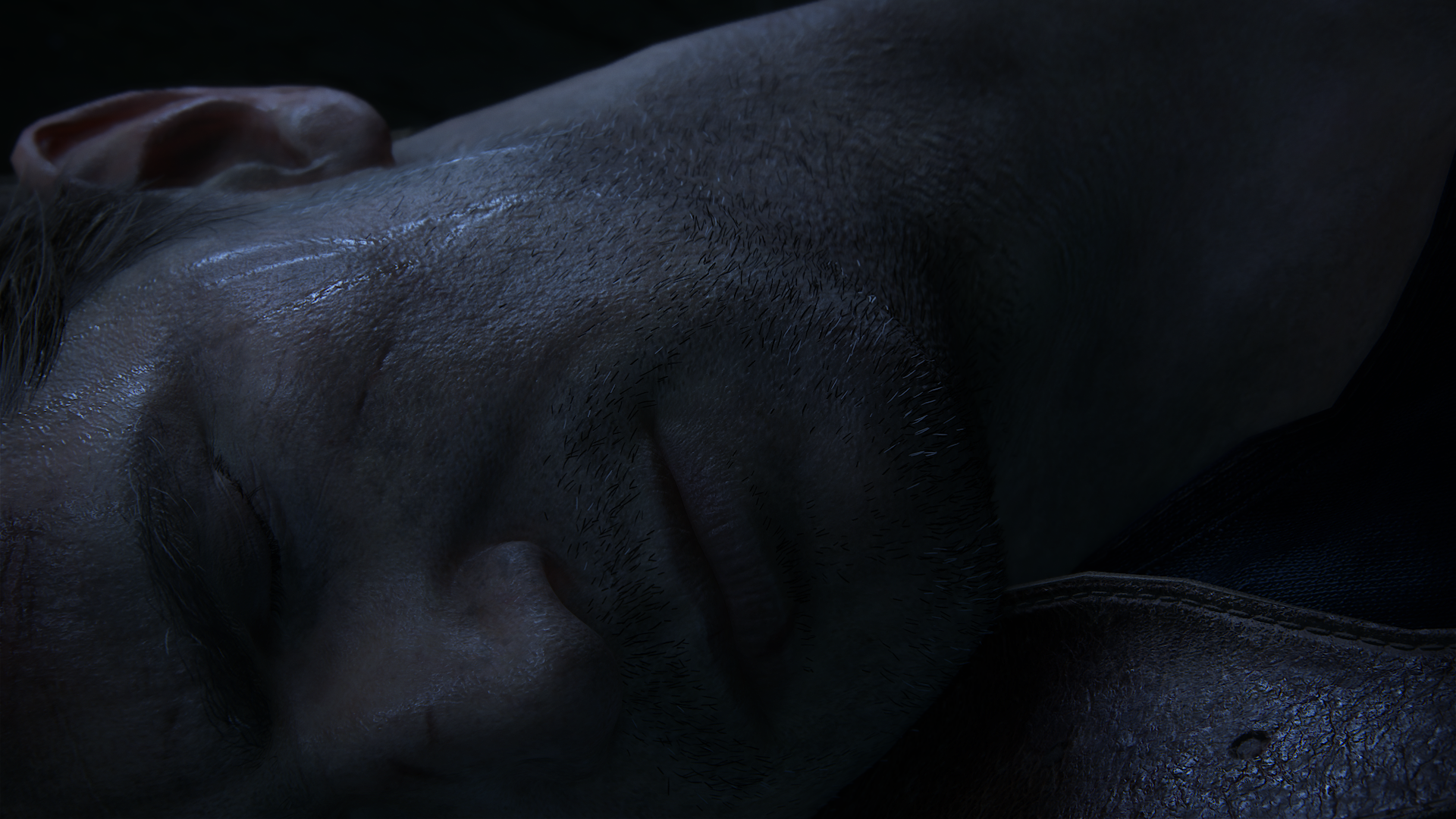
What's the current state of the art for paper holding? I expect QB would do well in this area.So now instead of "best water" threads, can we have "best paper holding" threads?
You are using an out of date browser. It may not display this or other websites correctly.
You should upgrade or use an alternative browser.
You should upgrade or use an alternative browser.
UC4: Best looking gameplay? *SPOILS*
- Thread starter RenegadeRocks
- Start date
-
- Tags
- uncharted 4
- Status
- Not open for further replies.
Regarding the lighting, Let's not forget that even with a supposed 'universal GI model', games will need to have what some here call 'hacks' simply because of how certain scenes are set up for dramatic effect.
Like in movies, after all. You get all sorts of lighting 'hacks' that have nothing to do with how it is in everyday life, and that's good otherwise we'd be seeing some really flat lighting in movies too.
Like in movies, after all. You get all sorts of lighting 'hacks' that have nothing to do with how it is in everyday life, and that's good otherwise we'd be seeing some really flat lighting in movies too.
Last edited:
It's just funny to see certain techniques being called hacks. There's certainly a lot to be improved in games, but still...
Second play through looking at all the little details is just the best, just noticed that (don't open that Shifty, not yet  chapter 13 spoilers)
It's all these details, that 99.9% of the people who play the game won't notice that impress me the most in Uncharted 4.
In chapter 13, when the lightning strikes, the surrounding geometry cast dynamic shadows, the palm tree also gets a bright green hue and casts a shadow on itself so only the directly lit part of the tree is actually bright green, the smoke on the background casts a shadow on itself as well as you can see here:

All in all, one of the most impressive use of storm and lightning I've ever seen in a game

All in all, one of the most impressive use of storm and lightning I've ever seen in a game
It's all these details, that 99.9% of the people who play the game won't notice that impress me the most in Uncharted 4.
Last edited:
'Available light' photography has technical limits as well as artistic. In the realtime space, invisible light bouncers and sources would be possible to achieve Hollywood lighting, I guess. But importantly, whatever light system Hollywood is using, it's the same core rendering engine in effect every single time, with the same occlusion and shadowing responses regardless of surface. That why Hollywood always looks good, until they composite confictingly lit elements such as a bad blue-screening where the scenery lighting doesn't match the character lighting. And then it's pretty jarring. We all know the 'uncanny valley' of the photoshopped photo and something eerie about the guy who doesn't look right, but we're not sure why (his shadow's in a different direction on closer inspection).Although there are movies that are shot with natural lighting, one example being The Revenant.
People should'nt be seeing the term hack as a negative. If I'm implying it's a negative, I apologise. The only thing that matters is what's on screen. If it takes an amazing engine, or a trillion man hours of hacking every single frame, doesn't matter. The only reason 'hacks' (custom spot solutions if you prefer) are an issue is because they don't provide a common quality standard where a complete lighting model does.It's just funny to see certain techniques being called hacks. There's certainly a lot to be improved in games, but still...
People should'nt be seeing the term hack as a negative. If I'm implying it's a negative, I apologise. The only thing that matters is what's on screen. If it takes an amazing engine, or a trillion man hours of hacking every single frame, doesn't matter. The only reason 'hacks' (custom spot solutions if you prefer) are an issue is because they don't provide a common quality standard where a complete lighting model does.
Yep i totally get what you are saying, and i agree to an extend, although i still believe the "right" solution lies somewhere in between, use a more robust lighting solution while also using "hacks" to get some very cool looking effects on screen. Like how Uncharted 4 does self shadowing and self occlusion on smoke (China Lake weapon grenades are a good way to test that) but it's not volumetric, and it looks good in motion but breaks if you use photomode. Volumetric smoke with self shadowing and self occlusion must be really hard to achieve on a Ps4 so they use something in between that's most certainly a "hack" but it does the job
D
Deleted member 11852
Guest
I wouldn't say they fact everyone does this means they're not 'hacks'. Maybe there's a more PR friendly term, but per-event solutions are typically refered to as hacks in the sodtware development space. If I create a software system for solving a problem, and then I find some outlier cases which my system can't solve and I chuck in some specific code to solve thost cases, I'd certainly call those hacks.
I think the phrase you are looking for is unique bespoke code. Certainly that's what we call it on the farm and I've heard people use it in interviews as well. Or maybe those interviewees have heard I don't hire any software engineers who tell me about their "hacks".
You hire software engineers and not 'coders' or 'code monkeys'.  I expect your industry has call for far more sensible language.
Chapter 13 is
In regards to the "downgraded" model from E3 2014, i don't see it (other than tessellation maybe)

definitely a showcase of how ND think natural lighting works and i think the work done for TLOU must have helped a lot here, PBR is also really good.


Must take some work to get a bunch of wet rocks looking good


Must take some work to get a bunch of wet rocks looking good
In regards to the "downgraded" model from E3 2014, i don't see it (other than tessellation maybe)

Last edited:
I am talking about this model:I don't get this part, what downgrade are you talking about?


Upon viewing the first difference i see is his leather strap is not tessellated like Clukos said. The eye shader seems more advanced to me also. His facial structure also changed to make him look more cartoon-ish imo.

But the most notable difference that i could tell they did not use the e3 2014 model is the arm hair present in Drake.

It was present in the teaser and present in this model:

There is no arm hair present in the final version realtime or cutscene.

I also noticed that the 2014 teaser goes a step above and adds more hair strands on his sideburns for example.

There are some more differences i will detail later when i get more screenshots.
It looks ridiculously amazing, but imo not as good as this. I mean, just ignore that it was even running at 60fps. The final game at 30fps does not compare to this.In regards to the "downgraded" model from E3 2014, i don't see it (other than tessellation maybe)


Like i said it's still the most impressive realtime character model i've seen. It would be awesome if they do decide to patch this game for the ps neo if they would enable the e3 2014 model back with the extra shaders, better motion blur/aa!
Last edited:
The most glaring "hack" of their engine, to me, is how diferently their dynamic objects lighting is from the statics. Like shifty, I was spoiled of supposed "surprise" destruction a few times because of this. QB comes up again as a good point of reference. It also bakes GI, but into a voxel volume, instead of lightmaps, which allows them to light both dynamics and satics the exact same way (and they also use artist placed "hollywood" fill lights when convenient). The downside is they have about a hundred times less highfrequency detail compared to U4, and as much as I feel amazed by the novel rendering solutions in QB -which I consider much more ambitious and cutting edge from a purely real-time-rendering-technology POV- I can't deny U4s results on screen look better prety much all of the time.
I have to raise the question again, regarding AO, i'm certain it's not a -common- screen space solution but i think it could be some sort of volume AO (whether it is voxel ao, not sure). Was looking at this gif from cryteks own SVOTI (voxel based gi/ao)

And then look at these images


I usually notice good AO implementations (playing on PC has me spoiled on that with the various nvidia techniques), this is HBAO+ Ultra on AC syndicate (look at the trees): https://farm1.staticflickr.com/730/22732666677_279b6d3005_o.jpg and grass here: https://farm6.staticflickr.com/5743/22517935623_90a6856979_o.jpg
Now, i'm not comparing these two games on visual quality, just the AO. Curious to see what they were using for U4 as i think it looks fantastic in most cases, anybody know what they were using for TLOU last gen? Might be looking too much into this (and it could be a 'hack'). Point is, i really like the AO in Uncharted 4

And then look at these images


I usually notice good AO implementations (playing on PC has me spoiled on that with the various nvidia techniques), this is HBAO+ Ultra on AC syndicate (look at the trees): https://farm1.staticflickr.com/730/22732666677_279b6d3005_o.jpg and grass here: https://farm6.staticflickr.com/5743/22517935623_90a6856979_o.jpg
Now, i'm not comparing these two games on visual quality, just the AO. Curious to see what they were using for U4 as i think it looks fantastic in most cases, anybody know what they were using for TLOU last gen? Might be looking too much into this (and it could be a 'hack'). Point is, i really like the AO in Uncharted 4
Last edited:
Battlefront, Endor, two different maps; walker mode (pictures from me).
It is very hard to take some no HUD-screens without hurting my normal 10:1 K/D.
 STAR WARS Battlefront (1) by X-RAY-89, auf Flickr
 STAR WARS Battlefront (2) by X-RAY-89, auf Flickr
 STAR WARS Battlefront (3) by X-RAY-89, auf Flickr
 STAR WARS Battlefront (4) by X-RAY-89, auf Flickr
 STAR WARS Battlefront (5) by X-RAY-89, auf Flickr
It is very hard to take some no HUD-screens without hurting my normal 10:1 K/D.
 STAR WARS Battlefront (1) by X-RAY-89, auf Flickr
 STAR WARS Battlefront (2) by X-RAY-89, auf Flickr
 STAR WARS Battlefront (3) by X-RAY-89, auf Flickr
 STAR WARS Battlefront (4) by X-RAY-89, auf Flickr
 STAR WARS Battlefront (5) by X-RAY-89, auf Flickr
U4's SSAO is one of the simplest and cheapest this gen, but at least its very discreet, maybe even completely turned off in some scenes (that infamous paper holding scene) and it's contribution is mostly a very small crease shadow on mostly already dark parts of objects. Most of the AO you see in there is actually just from their static lightmaps baked offline. They are aparently using the same solution from last of us, with two color terms, one for general ambient and one for dominant indirect light. Characters and other dynamics can shadow those lightmaps through spherical proxies, much like UE4 now started supporting.I have to raise the question again, regarding AO, i'm certain it's not a -common- screen space solution but i think it could be some sort of volume AO (whether it is voxel ao, not sure). Was looking at this gif from cryteks own SVOTI (voxel based gi/ao)

And then look at these images


I usually notice good AO implementations (playing on PC has me spoiled on that with the various nvidia techniques), this is HBAO+ Ultra on AC syndicate (look at the trees): https://farm1.staticflickr.com/730/22732666677_279b6d3005_o.jpg and grass here: https://farm6.staticflickr.com/5743/22517935623_90a6856979_o.jpg
Now, i'm not comparing these two games on visual quality, just the AO. Curious to see what they were using for U4 as i think it looks fantastic in most cases, anybody know what they were using for TLOU last gen? Might be looking too much into this (and it could be a 'hack'). Point is, i really like the AO in Uncharted 4
maybe even completely turned off in some scenes
Yeah i think that makes sense, i haven't seen the typical disappearing AO at the edges of the screen or around the character silhouette, that's a dead giveaway of screen space AO, and why it's very hard to get looking right in a TPS.
- Status
- Not open for further replies.
Similar threads
- Replies
- 24
- Views
- 2K
- Replies
- 90
- Views
- 17K
- Replies
- 16
- Views
- 4K


