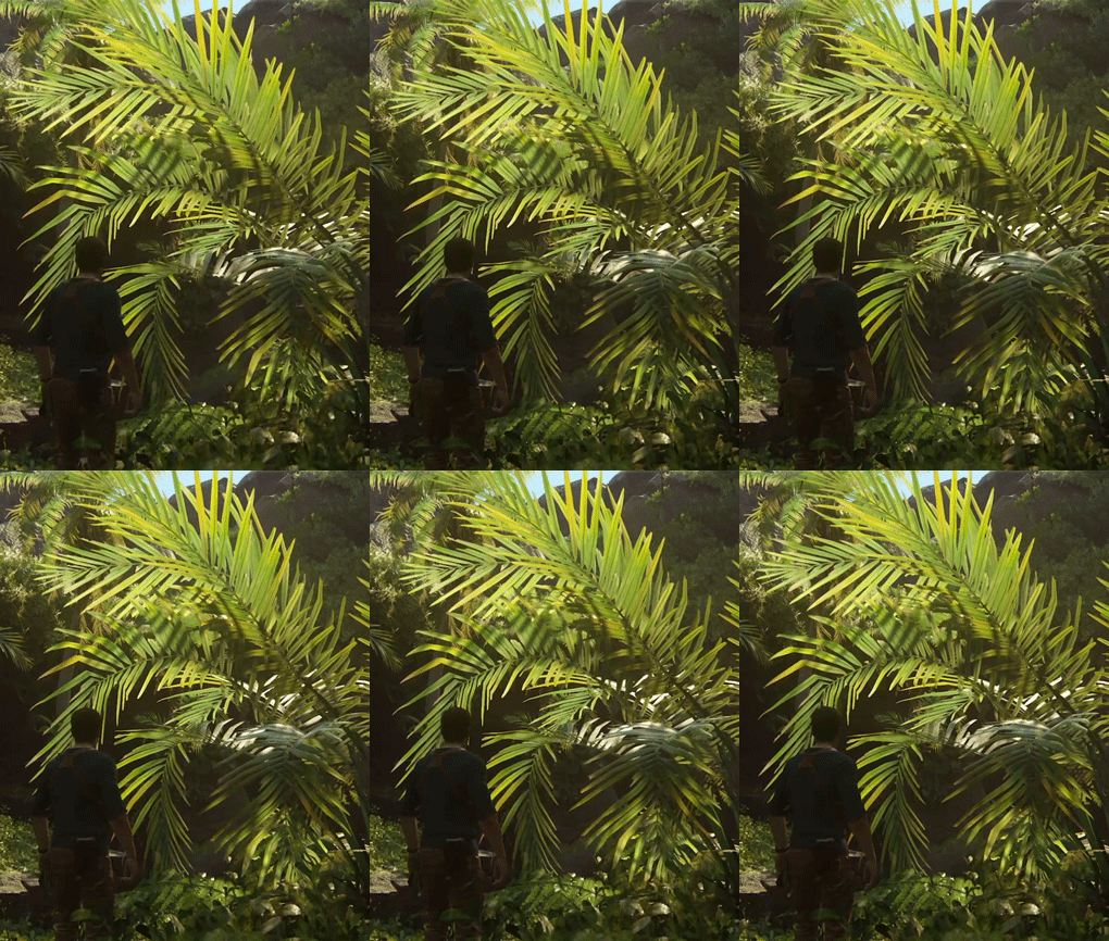
UC4: Best looking gameplay? *SPOILS*

Status
Not open for further replies.
Not all. Some games favour dynamic, computed solutions, like LBP2 and TTC. These provide a completely unified lighting model with no hacks, so look the same in all cases. At their best they don't look as good as the best choreographed solutions like UC4's, but at their worst they don't look any worse than their best whereas a choreographed solution can miss out on a specific case and be remarkably inconsistent. Again, the paper holding is pretty gobsmacking for UC4. It's a common enough occurence, they should have faked a contact shadow solution. There are too many elements (in the first four chapters) of glowing objects because the dynamic solutions can't match the quality of the baked. It's like a cartoon where the parts that are going to move are drawn completely differently (and simply) from the beautifully painted backdrops - you can see the ledge is going to crumble as the character walks on it because it's flatly drawn rather than painted and sticks out like a sore thumb.
But you know why happens that?. Because in U4 you see the game from all perspectives. From a hand in first plane to an aereal vista of a jeep in the sabana. They engine isn´t corseted to its most beautiful dress, it isn´t afraid of showing you everything naked ;)
Dont sure i made myself understood...
 
I must agree with Shifty somewhat. I'm only at chapter 7 at the moment and I've yet to experience anything truly jaw dropping in this game.
To my eyes it does look better than majority of today's games, maybe even best at the moment, but not that much better what I get the impression from some.
I do like the game, very much. I like the exploring and combat, the story seems quite good. It's just that reading these threads and reviews praising it to heavens... I have yet only had those moments of "oh, that looks quite nice" instead of moments of true awe.
I also remember that cutscene opening of chapter 4, with the hands and piece of paper. That's when I had my OMG! moment... OMG! That looks like from a PS2 game!
That's the only very bad example that I've encountered thus far though.
I wouldn't give it 8 but maybe 9- . If the later chapters really are much better then good, but the opening has not been quite up to the (admittedly very high) expectations. Close, but not quite.
 
It's worth adding that I played the game with a veiw to posting impressions here, so had my graphics-nerd eyes in. The paper thing still would have bugged, as too the strange sense with the 'cheap-TV' cutscenes, but otherwise I'd have not paid much attention. The incredulous and fearless/reckless feats of gymnastics generated more reaction than graphics!

I'll also repeat that the IQ is frickin' amazing. Good enough IMO for realtime graphics to be used in TV animations. Although that's on a 720p TV.
 
I must agree with Shifty somewhat. I'm only at chapter 7 at the moment and I've yet to experience anything truly jaw dropping in this game.
To my eyes it does look better than majority of today's games, maybe even best at the moment, but not that much better what I get the impression from some.
I do like the game, very much. I like the exploring and combat, the story seems quite good. It's just that reading these threads and reviews praising it to heavens... I have yet only had those moments of "oh, that looks quite nice" instead of moments of true awe.
I also remember that cutscene opening of chapter 4, with the hands and piece of paper. That's when I had my OMG! moment... OMG! That looks like from a PS2 game!
That's the only very bad example that I've encountered thus far though.
I wouldn't give it 8 but maybe 9- . If the later chapters really are much better then good, but the opening has not been quite up to the (admittedly very high) expectations. Close, but not quite.
Until chapter 12 and 13 (above all) -I am still in chapter 14- the most prominent wow graphics tech is the LOD and AA along lighting. After that when the jungle kicks in all starts 4 cylinders...
 
Well, their LODing must indeed be very well made, because its very hard to spot the swaps. They really nailed it with vegetation. What a relief, I thought devs would keep making games that only look good within 10 metres around the camera forever.
 
I'll also repeat that the IQ is frickin' amazing. Good enough IMO for realtime graphics to be used in TV animations. Although that's on a 720p TV.

I'd love to know how the hell they achieved this. I still find it incredible that some of the screenshots being posted here aren't in some way enhanced over the actual gameplay (e.g. photomode adding additional AA or even Supersampling). What's your take on it Shifty, is the gameplay just as clean as the best of these screenshots? If so, this is some kind of miracle AA implementation.
 
Yes, gameplay is crazy clean. I've seen some aliasing when looking for it on high contrast edges, but otherwise it just can't be seen. Ocassional noticeable temporal artefacts are present though - a bit of 'fuzz' around a shape or a slight trail on a moving hand, say. the latter just looks a bit motion blur though so doesn't even distract.
 
I can see Shifty's point about consistency and artistic driven quality.

Is a very good explanation, why in later levels, the game looks much better: just a different environment artist maybe, with a better eye for realism.

Just out of curiosity Shifty, giving this game an 8. What game has a higher score for you, just as a reference.
 
I'd love to know how the hell they achieved this. I still find it incredible that some of the screenshots being posted here aren't in some way enhanced over the actual gameplay (e.g. photomode adding additional AA or even Supersampling). What's your take on it Shifty, is the gameplay just as clean as the best of these screenshots? If so, this is some kind of miracle AA implementation.
It is. Naughty dog already confirmed this.

We don't do anything special in photo mode outside of making sure everything is visible when you move the camera around

http://www.engadget.com/2016/05/05/uncharted-4-photo-mode-screenshot-gallery/
 
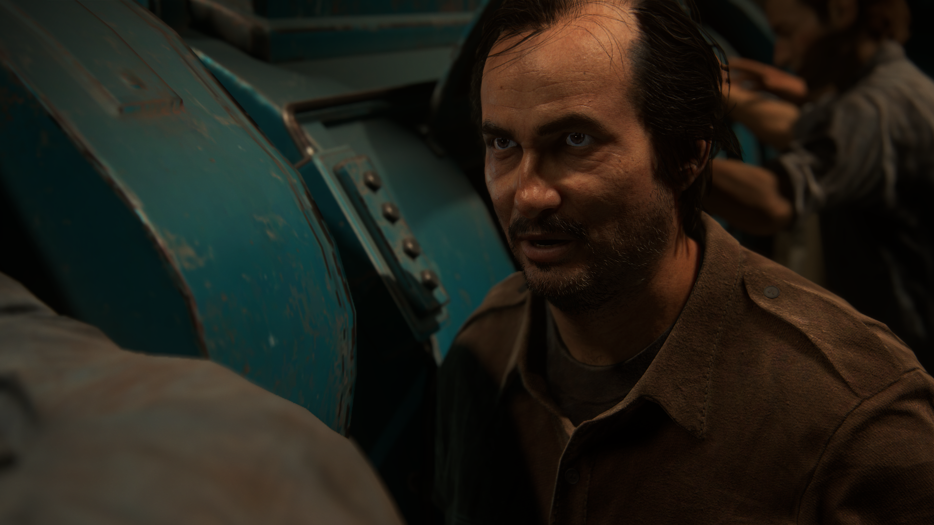
Yeah that's what i got from it as well, it reminds me of concept art some times! And i'm sure that AA allowed ND to use some very detailed assets without worrying about aliasing (like the thin strands of hair on the characters) even in random guys like this one:

26968964366_f3ea46fd81_o.png


I'm sure the game would be full of shimmering if it wasn't for that AA :yep2:
 
I have the same feeling as Shifty in that a lot of U4's good looks have a lot to thank to area specific hacks.

These aren't "hacks", this is how games are often built now - with shaders frequently embedded in the environmental data. Sucker Punch did this for Infamous Secon Son / First Light and explained why they couldn't patch the main game to benefit from the improved tech. And we've seen many cases in other games where certain areas have exhibited performance issues and just those areas are patched - the marshes near Velen in Witcher 3 and the Cortaga Factory in Fallout 4 being good examples.

This makes so much more sense than writing a single uber lighting engine that works with all variations of different environments under all circumstances.
 
Last edited by a moderator:
The most impressive realtime character model currently. In some shots it really looks like a cg model. Really sucks that the character model got downgraded which is a major shame, but most impressive is that it is still the best looking, downgraded or not.

I don't get this part, what downgrade are you talking about?

We're getting real close to spirits within character models.

UC4's assets - as well as many others in other games - are already quite far beyond FF TSW. After all, there's been more than a decade of advancement in tools and techniques, enabling artists to better realize their goals.
 
These aren't "hacks", this is how games are often built now.
I wouldn't say the fact everyone does this means they're not 'hacks'. Maybe there's a more PR friendly term, but per-event solutions are typically refered to as hacks in the software development space. If I create a software system for solving a problem, and then I find some outlier cases which my system can't solve and I chuck in some specific code to solve thost cases, I'd certainly call those hacks.

I'm not saying it's a bad solution, and it's the only solution we have until we have a super robust general GI solver. However, it has issues. eg. Lots of gorgeous water pics for UC4, but in the first scene when Nate's chucked into the water, we have him intersecting a flat water surface with no geometric detail or splashes or anything. If there was a single, accurate water simulation engine, that wouldn't be the case. However, such a solution is probably technically impossibly, or economically unfeasible, at the moment, so we have per-scene water solutions and inconsistent quality as a result.
 
Last edited:
What game has a higher score for you, just as a reference.
I'd give CON on PS2 10/10. It didn't let me down in any area of the graphics for the period and the hardware. IQ, framerate, lighting, quality, artistry, particles. Just kept looking at it and thinking "wow" and even now when I see it, I think, "that sure was a good looking game." LBP2 probably also a 9/10 because the lighting on that was so 'real' and solid adn the art style so vibrant. IQ let it down as the post AA failed with the lots of fine detail and contrast images. Edge crawl on the interface was a definite weak point.
 
Status
Not open for further replies.
Back
Top