UC4: Best looking gameplay? *SPOILS*

Status
Not open for further replies.
Dynamic LOD like that would be awesome, like streaming polygons rather than textures in a way maybe? :p

Anyone notice the TAA artifacts while playing? I noticed them sometimes while driving the car you could see a "ghost" of the wheel in front of where the actual wheel was lol.

The only other time I've seen it is while playing with the photo mode. If you toggle between showing characters and not showing characters they also leave a residual mark for a second or two which is kind of cool. I tried it with Elena on the couch and it was as if she left marks on the chair from sitting in them.... well not really, but just some lines where her arms were and where the laptop was in the frame :D
 
The rope leaves ghosts almost every time you swing in front of a wall. Thats where I saw it the most.
 
Dynamic LOD like that would be awesome, like streaming polygons rather than textures in a way maybe? :p
I'm not sure I understand that analogy. But, we also don't really have to draw theoretical analogies, because this stuff already exists in practice.

A common example is cascaded shadow maps. You have a small high-red shadow map to deal with shadows close to the camera, then a bigger shadow map for medium-distance stuff, etc.
Similar stuff has been done with positive lighting data, for instance The Tomorrow Children uses cascades for its voxel information, so lighting far away doesn't have to use the same spatial resolution as lighting near the camera.

Screen-space lighting techniques are an example of this, the amount of lighting calculation devoted to something is based on how many pixels it covers. Very little computation is used for small far-away stuff, lots of computation is used for up-close stuff.
 
Finally finished the game last night, I feel that the pacing in retrospect was very well thought out as was the level design, both IMO were very good. The production values overall were top drawer as are the graphics.

I sort of have mixed feelings about the animation, overall it works well enough but for me anyway I'm not as impressed with ND's character animation in 2016 as I was with when the original UC came out for PS3. Maybe its nostalgia or my mind playing tricks but while its clearly better its not as much of an improvement overall as I was hoping for. Although some smaller details with character interaction with level are very impressive.

BTW the flames on the torches were very very good, I was genuinely surprised at how good that looked.

I'm looking forward to what ND does next. I'm trying to think of other IPs in gaming or even movies which have managed to produce sequels of similar quality over multiple films. When you consider what ND has done here with this IP over all 4 games its very impressive. For me prior to this game UC2 was probably my favorite but I like all 4 games a lot and right now I'd probably rate 4 slightly higher than 2. If ND decided to do a mini series or movie I'd probably be willing to invest in the project bc they really know how to balance the character development, story and action very well.
 
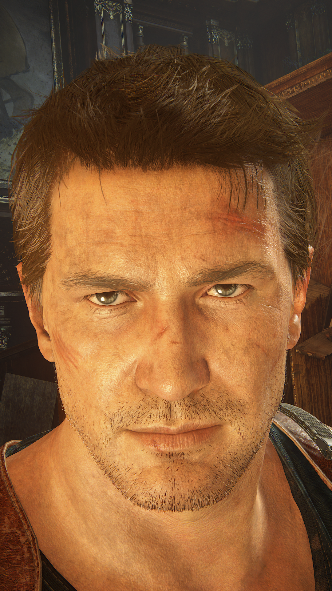
Closeup screenshot from the gameplay model of Nate
uncharted4_athiefsendk7s6m.png


And of course this is the highest lod available during gameplay, i don't think it's always that detailed (that would be a complete waste)

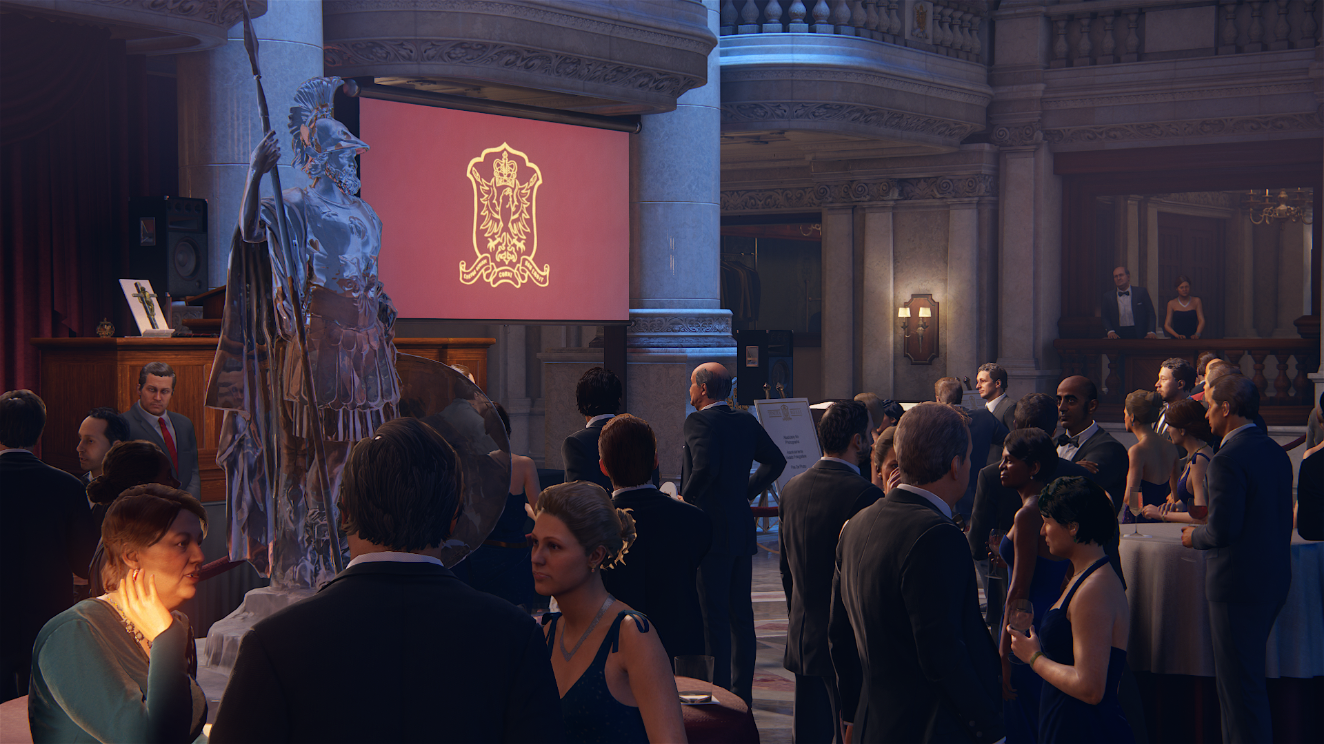
Edit: 2 more moved the camera a bit
http://abload.de/img/uncharted4_athiefsendpjs9y.png
http://abload.de/img/uncharted4_athiefsendxdss4.png

The last one with photomode -100 sharpness
http://abload.de/img/uncharted4_athiefsendcxs0i.png
 
Last edited:
Don't know if this sounds ridiculous, but even surprising to me... I think the most impressive animation was the dog on the bed lol. The way its mouth and tongue was morphing was totally realistic... super impressive stuff.

Here's a video of the part I'm talking about:
(starts at 1:36)

I made one close up of Nate's face while playing, not photo mode, just happened to get a close up of his face by accident and click the screen button :p

27052187745_5298977190_o_d.png


His eyelids (including his eyelashes...) are casting a shadow on his eyes lmao :D

I'm pretty sure this is always his face model detailed, at least when up close, and most of the time the camera is near him anyway. Maybe it changes slightly moving the camera from the back to the front possibly.

The weakest thing in gameplay is definitely the lighting, his nostrils do not look particularly naturally shaded here, neither does his ear or the anterior or posterior of his neck.

But that is expected I think. Definitely the most difficult part of the face to get right when you don't have uber-lighting running as is available in cutscenes. The model detail is spectacular even still though. It's definitely the same one as in cutscenes just with less sophisticated animations/lighting.

If you notice the characters talking while in gameplay also, they do move their mouths but not nearly as well as in cutscenes of course. Still looks pretty damn good though :)

26492708374_18d507a0e3_o_d.png


27098105445_d9a1da023a_o_d.png


26492707274_f1aee1f88e_o_d.png


Last thing for fun, love transparent geometry that performs some refraction, my favourite effect since way back when with Metal Gear Solid 2 and Halo: Combat Evolved Stealth Camouflage :)
 
Last edited:
The amount of attention to detail doesnt stop on the graphics. The sound also gets proper attention. Remember when little drake was listening to the nun and father? if the camera is in such a way that the wall is between you and the sound coming, the sound is partly blocked. Turn the camera angle a little bit and if there is nothing blocking the sound, it becomes clear again.

Other details is the jeep's hook line physics, how Drake switches the hook between his hands, how the hook line reacts with objects, Drake's cheeks when he bites an apple, how he holds the apple while eating, how light reacts under water in the very first intro of the game etc

Everything was extremely polished and received great work
 
From chapter 12 to the epilogue almost every areas have being really 'wow' in their own ways. The size of some of those areas and the far away details are impressive. Some parts are very reminiscent of TLOU (scenery and even gameplay somehow).

That epilogue was awesome. The level of details (and consistency) throughout the whole location is obscene.
 
That's just obscene and obsessive detailing with the rock physics lol. It does look great when you slide on it too :)

I guess we should be used to that with Naughty Dog but even still they get me...
 
That really is some impressive attention to details! I never seem to notice these kind of details while playing the game, I guess I'm just too immersed in the game most of the time :) Makes me want to replay some levels.
 

Better than Uncharted 4 but Battlefront? Lets see. Therefore, it has a higher resolution than both.

Like I said Motion Blur and DoF are among the best. The AA is also great.
 
I made one close up of Nate's face while playing, not photo mode, just happened to get a close up of his face by accident and click the screen button :p

27052187745_5298977190_o_d.png


His eyelids (including his eyelashes...) are casting a shadow on his eyes lmao
But accompanied with really flat lighting. for me, everything that's not Drake in that shot looks great, but he looks almost like a bugged lighting system where the subtle shading has switched off. Except as I understand it, that's the Uncharted lighting system in effect. To be fair, that's the look of almost all games AFAIK because that fine occlusion isn't possible yet, but in UC4 it contrasts so heavily with the rest of the lighting that it stands out.
 
Status
Not open for further replies.
Back
Top