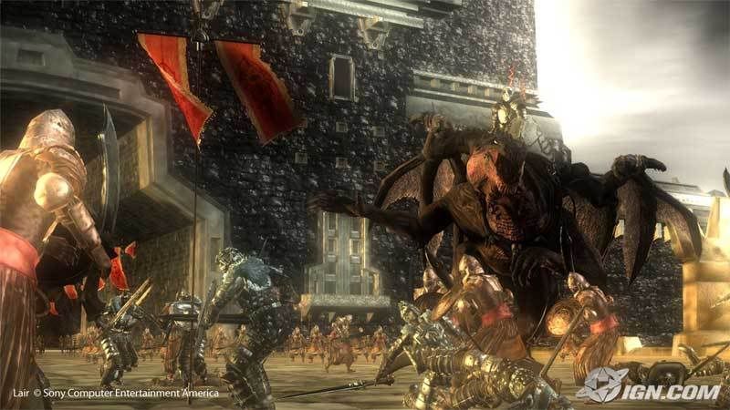
NEW Lair Screens Plus Interview!

For reference, the original screens:

oh come on, like i said its definately no e3 2006 trailer (im not spining that shit), but its definately better than what we saw before. theres no doubting that. that fact that this game is far from finished is even more reason to add to my orginal comments of being old build material.
 
Based on these screen shots, it's a hella different than that of original screen shots...Well, hopefully they can crank up the quality. I guess looking at quality jump in Froza 2, i guess it's possible....
 
I dunno...the original LAIR screenshots for starters.

Compared to what game. Sorry I'll make it a point to make obvious qualifications in the future.

This looks near the top of the next gen heap to me. I have no problem putting it up there with MGS4, FF13, Gears, Resistance, etc.
 
Compared to 2005 shots, this is definitely one step back.. But, hey, we got the HUD now :)

Btw, there are still a lot of time before release.. Given than it is now at 35% completion, I guess they can crank up the quality meanwhile. This becomes likes a classic progression in all next-gen titles. First they look impressive, then they look awful, then they settle somewhere close to initial target but at the very end of development cycle.

Is Lair a launch title or Q1 07?
 
they did say new screens will be released on the coming weeks to show off new effects. so i suppose what we saw here today are not representative at all. anyway i hav high hope in the final form and will look drastically better if everything mentioned in the interview is true.
 
The screenshots themselves are not mind blowing or anything. But the stuff they talk about in the interview is pretty damn cool!

The 1080p native rendering. Making full use of the sixaxis controler to control the regins of the dragon. The fact that the fire in the game is completly dynamic etc.
 
I am impressed, as always, by the F5 guys. However, I am disappointed as well. These definitely look worse than the "promised" gameplay in the E3 trailers. Actually, I've to agree some textures do look bad, especially the dragon wings. They should improve that as those will be close to the camera all the time.
Otherwise, it's really nice to have 1080p native. But the F5 guys were always good for eyecandy.
 
Just whatched a gameplay video. I'm impressed with the visuals. They need tweaking to look "prettier", but technically I'd say the game is one of the best I've seen.
 
this game is for christmas 2007 i believe. probably fine tuning and upping the gfx to the max is something done later on in development cycle
 
For reference, the original screens:
ss01.jpg
and the new ones
lair.jpg

yes youre right they are a huge difference from the original
 
this game is for christmas 2007 i believe. probably fine tuning and upping the gfx to the max is something done later on in development cycle

Even so, the game looks amazing. I can imagine it will look more imposing when seen in proper 1080p.

Has anyone noticed the sea in that movie? I mean, it doesn't just glitter nicely - it has realistic waves and everything!
 
WTF are people talking about? This game looks horrible. The lighting is awful, the textures are awful... Almost every single nextgen game we've seen so far is better than this.
 
WTF are people talking about? This game looks horrible. The lighting is awful, the textures are awful... Almost every single nextgen game we've seen so far is better than this.

I agree with you, the game looks disappointing for a Factor 5 game.:???:
 
I agree with you, the game looks disappointing for a Factor 5 game.:???:

Surely you and Laa-Yosh haven't seen the showfloor movie? You must really, really very much like this game to look disappointing if you can't see the quality of this even through the relatively low quality of that off-screen material. The waves, the reflections, the shadows (moving realtime with the waves!), the HDR effects, global illumination simulation, the translucency on the dragon (which, when it happens at say 1:25, makes the detail on the dragon a tad more visible), and the detailed animation of the dragon's wings, all stand out to me (not to mention the enormous area and the amount of things going on, the way the dragon flames light up the surroundings, etc.
 
Surely you and Laa-Yosh haven't seen the showfloor movie? You must really, really very much like this game to look disappointing if you can't see the quality of this even through the relatively low quality of that off-screen material. The waves, the reflections, the shadows (moving realtime with the waves!), the HDR effects, global illumination simulation, the translucency on the dragon (which, when it happens at say 1:25, makes the detail on the dragon a tad more visible), and the detailed animation of the dragon's wings, all stand out to me (not to mention the enormous area and the amount of things going on, the way the dragon flames light up the surroundings, etc.

Erm i missed that video...
 
Back
Top