Large plasmas tend to be cheaper and with better picture quality than equivalent LED screens. Last time I checked. I paid £999 for my Panny 50" GT50 in January, which was a crazy price considering it was the best screen of 2012 and anything equivalent in size or picture quality (from Samsung for example) would have cost a lot more.
Install the app
How to install the app on iOS
Follow along with the video below to see how to install our site as a web app on your home screen.
Note: This feature may not be available in some browsers.
You are using an out of date browser. It may not display this or other websites correctly.
You should upgrade or use an alternative browser.
You should upgrade or use an alternative browser.
Effects of next gen consoles on you to buy a new HDTV?
- Thread starter Cyan
- Start date
Well, I finally calibrated my TV. I wanted to use the utilities in the link provided by djskribbles.
You were right, djskribbles, the TV wasn't calibrated from the get go. The image quality is pretty good by factory design, but in order to get the best out of the TV calibration might be necessary.
I don't know how to describe the difference between a calibrated TV and a non calibrated one.
Had I to say something it is the UNIFORMITY of everything you see on the screen.
You can discern the background details as well as the close-up details, nothing of the original image -colours, and stuff- is lost in blacks or whites and it looks close the professional picture you can see on documentaries and stuff like that -I think now that professional documentaries are "calibrated" by default before being broadcasted-.
Unfortunately my graphics card doesn't support Miracast so I should have to use an HDMI cable or something and it would be a bit of hassle 'cos there isn't much space to spare in the study desktop where I have the TV.
Thus I decided to use some online tools I found here and calibrate the TV using the TV or the Xbox 360 via DLNA -Play To with Windows 8.1-:
You were right, djskribbles, the TV wasn't calibrated from the get go. The image quality is pretty good by factory design, but in order to get the best out of the TV calibration might be necessary.
I don't know how to describe the difference between a calibrated TV and a non calibrated one.
Had I to say something it is the UNIFORMITY of everything you see on the screen.
You can discern the background details as well as the close-up details, nothing of the original image -colours, and stuff- is lost in blacks or whites and it looks close the professional picture you can see on documentaries and stuff like that -I think now that professional documentaries are "calibrated" by default before being broadcasted-.
Unfortunately my graphics card doesn't support Miracast
so I should have to use an HDMI cable or something and it would be a bit of hassle 'cos there isn't much space to spare in the study desktop where I have the TV.Thus I decided to use some online tools I found here and calibrate the TV using the TV or the Xbox 360 via DLNA -Play To with Windows 8.1-:
http://www.makeuseof.com/tag/5-online-tools-calibrate-monitor/ (more concretely I utilised the fourth tool) :smile2:
The TV loaded the images to calibrate it but in order to change the values of the TV I had to press the Home button, which sent me out of the Network -DLNA- input source, making it impossible to calibrate properly.
Using the Xbox 360 via DLNA connected to the TV was the perfect solution since it didn't flip to the original TV screen when pressing Home on the TV remote and the images appeared full screen, which helped enormously to discern the little details.
Calibration explained below.
Finally, I decided to publish the values of my calibration here. This calibration has been made by a newbie like me, it's my first semi-decent calibration, so take that into account. I will probably make some extra calibration with the things I missed, so...
As I said before, the difference -at least to me- between a calibrated and a non calibrated image is how uniform the picture of the TV looks!
It seems totally smooth, and the uniformity of everything looks gorgeous.
These are the settings for my TV -Philips 32PFL4508H-.
(I will list the most important settings, the rest are unchanged or Defaulted in the picture style)
These settings have been scratched for much better ones, where a more in-depth knowledge played an important role.
Enjoy!
As I said before, the difference -at least to me- between a calibrated and a non calibrated image is how uniform the picture of the TV looks!
It seems totally smooth, and the uniformity of everything looks gorgeous.
These are the settings for my TV -Philips 32PFL4508H-.
(I will list the most important settings, the rest are unchanged or Defaulted in the picture style)
These settings have been scratched for much better ones, where a more in-depth knowledge played an important role.
Picture Style
: Photo.
Backlight Contrast: 50.
Colour: 57
Sharpness: 7 -or less (something between 0 and 7), your choice-,
Dynamic Contrast: Off.
Dynamic Backlight: Best Picture.
Colour Enhancement: Minimum
Advanced--
Gamma: 0.
Tint : Cool.
Video Contrast: 22.
Brightness: 100.
Backlight Contrast: 50.
Colour: 57
Sharpness: 7 -or less (something between 0 and 7), your choice-,
Dynamic Contrast: Off.
Dynamic Backlight: Best Picture.
Colour Enhancement: Minimum
Advanced--
Gamma: 0.
Tint : Cool.
Video Contrast: 22.
Brightness: 100.
Enjoy!
Last edited by a moderator:
Yes, I do, it was the way where the Gradient looked perfect to me --for a LED anyways. Video Contrast is at 22 -Contrast at 50-, that's the key.Are you sure you have brightness at 100% ?
most lcd's are incredibly bright
The image looks slightly muted in fact -quite a bit-, not bright at all.
With the additional knowledge acquired and after trying all the variables I have missed before I have completed the calibration.Are you sure you have brightness at 100% ?
most lcd's are incredibly bright
My previous settings were very uniform, very likable. Only the image was slightly muted, because of the almost non-existent contrast, which I used to compensate for the brightness
As my first try it wasn't bad at all. It's only that the night looked like the day.
This time around I began with my favourite setting, Personal, and started working from there. The results are something amazing to my eyes at least. I know this is subjective, but I objectively got the blacks and whites right, which is a great thing to begin with. The colouring, etc etc.
I am going to list most of the settings for the sake of it but a lot of them were defaulted already with Personal picture style. I would like to express my most sincere gratitude to djskribbles for helping me with this, I wouldn't have made it without your advice.
The television is the Philips 32PFL4508H.
Modified, I calibrated my TV much better nowadays. (.....)
(Compare to my previous settings, there are important differences, but both look uniform in their own right, this setting looks more crisp overall though, because of the leasons learnt)
I've gotta try the utilities djskribbles recommended some day, but it won't be any time soon. I spent like two hours calibrating the TV and know I just want to enjoy as much content as possible.
My feedback to Philips; thanks for the colours/detail level of this TV and keep making brilliant TVs!
Last edited by a moderator:
djskribbles
Legend
Brightness sets the black level... it has little affect over the overall brightness. Gamma, Contrast and the Backlight (on an LCD) has more control over the overall brightness. The actual Brightness control should be set properly with an appropriate test pattern, whereas the Backlight and (to lesser extents) Gamma and Contrast can be somewhat set to personal preference or based lighting conditions.
Your most recent settings for your 'eye ball calibration' are better than your previous ones. Generally you want to turn off any automatic or dynamic 'enhancement' crap. The Dynamic backlight probably helps a lot with the black levels though, so you might want to set that to preference. Generally the Warm color temperature presets are the closest to D65, but many people prefer a 'cooler' picture.
Is your room fairly bright or do you just like a really bright picture? I'd imagine that the Backlight at 100 and Contrast at 90 would be extremely bright for an LCD.
:smile2:
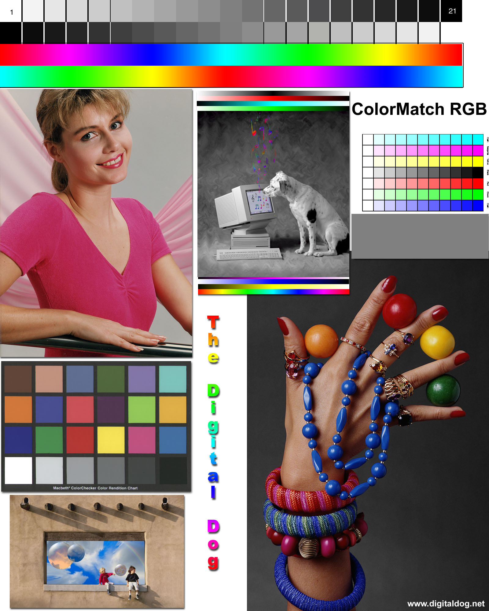
Following your advice I decided to use the test images again.
Thus I realised that the colour bands image (the one shown above in a previous post) was wrong after all I had done after calibrating the colours -which was my first step-, everything was fine -blacks, whites, gradient, sharpness, etc-.
The rightmost steps in the colour bands didn't appear for blue and red -4 or 5 steps were missing-.
I decreased the Backlight Brightness to 70. And most importantly, I also decreased the Video Contrast from 90 to 67.
Having Video Contrast at 90 was what caused that the colour bands of the rightmost rectangles appeared incorrectly -they didn't appear, to be precise-.
With Video Contrast at 67 -and below- every single step is visible for every colour! I left it at 57, where I found my ideal compromise for Video Contrast and colour quality, where the rightmost steps follow a very logical pattern, chromatically wise.
Aside from that, I increased the Sharpness from 0 to 4.
In addition, I switched the Tint from Cool to Warm, following your advice. Since I had calibrated the TV already, all these steps took me less than 5 minutes, yay.
Thanks for your feedback, djskribbles! :smile2: It was fundamental for my last try. Now I completed the calibration. I am not touching the TV in a long while.
Take care of yourself and be well. Now it is time for some testing and enjoying the calibrated TV before I run off to bed.
p.s. I am going to modify my previous post to include the changes.
Well, I re-checked the settings after reading your post and I changed some things accordingly.Brightness sets the black level... it has little affect over the overall brightness. Gamma, Contrast and the Backlight (on an LCD) has more control over the overall brightness. The actual Brightness control should be set properly with an appropriate test pattern, whereas the Backlight and (to lesser extents) Gamma and Contrast can be somewhat set to personal preference or based lighting conditions.
Your most recent settings for your 'eye ball calibration' are better than your previous ones. Generally you want to turn off any automatic or dynamic 'enhancement' crap. The Dynamic backlight probably helps a lot with the black levels though, so you might want to set that to preference. Generally the Warm color temperature presets are the closest to D65, but many people prefer a 'cooler' picture.
Is your room fairly bright or do you just like a really bright picture? I'd imagine that the Backlight at 100 and Contrast at 90 would be extremely bright for an LCD.
Following your advice I decided to use the test images again.
Thus I realised that the colour bands image (the one shown above in a previous post) was wrong after all I had done after calibrating the colours -which was my first step-, everything was fine -blacks, whites, gradient, sharpness, etc-.
The rightmost steps in the colour bands didn't appear for blue and red -4 or 5 steps were missing-.
I decreased the Backlight Brightness to 70. And most importantly, I also decreased the Video Contrast from 90 to 67.
Having Video Contrast at 90 was what caused that the colour bands of the rightmost rectangles appeared incorrectly -they didn't appear, to be precise-.
With Video Contrast at 67 -and below- every single step is visible for every colour! I left it at 57, where I found my ideal compromise for Video Contrast and colour quality, where the rightmost steps follow a very logical pattern, chromatically wise.
Aside from that, I increased the Sharpness from 0 to 4.
In addition, I switched the Tint from Cool to Warm, following your advice. Since I had calibrated the TV already, all these steps took me less than 5 minutes, yay.
Thanks for your feedback, djskribbles! :smile2: It was fundamental for my last try. Now I completed the calibration. I am not touching the TV in a long while.
Take care of yourself and be well. Now it is time for some testing and enjoying the calibrated TV before I run off to bed.
p.s. I am going to modify my previous post to include the changes.
I have been using the TV with the new settings for a few hours and I've gotta say that it is working! For someone as fiddly as me, this is an achievement.Brightness sets the black level... it has little affect over the overall brightness. Gamma, Contrast and the Backlight (on an LCD) has more control over the overall brightness. The actual Brightness control should be set properly with an appropriate test pattern, whereas the Backlight and (to lesser extents) Gamma and Contrast can be somewhat set to personal preference or based lighting conditions.
Your most recent settings for your 'eye ball calibration' are better than your previous ones. Generally you want to turn off any automatic or dynamic 'enhancement' crap. The Dynamic backlight probably helps a lot with the black levels though, so you might want to set that to preference. Generally the Warm color temperature presets are the closest to D65, but many people prefer a 'cooler' picture.
Is your room fairly bright or do you just like a really bright picture? I'd imagine that the Backlight at 100 and Contrast at 90 would be extremely bright for an LCD.
I have a hard time finding something that appeals to me because when something does I begin to compare it to other options and possibilities. It is in my nature, and I particularly don't like that about myself.
But just seeing the image quality right now, I feel like I am better off not changing it for my own good. It doesn't strain my eyes after hour using it, it looks gorgeous without the *radioactive* look of the TV -default Brightness too high for a LED-, the colouring is really nice, and I still keep the old values for comparison.
The previous preset looks also solid, but the image is subdued in comparison because of the very little contrast. Even so, it looked like one of those old cinema screensin some ways. It is kinda fun to see my first attempt at a somewhat decent calibration.
In regards to what you mention and Dynamic Backlight; the settings are Off, Standard, Best Power, Best Picture. The differences between them are minimal. Off looks brighter, but just very slightly, Standard looks slightly darker, so does Best Power, and then Best Picture. -I didn't choose Best Picture, it was like that by default and I had calibrated the TV with it enabled, with the expected results, so I didn't change it around.
Dynamic Contrast for instance, is an entirely different matter. It is better to set it to Off, because Minimum, Medium -both Minimum and Medium aren't bad- and Maximum -this one is the worst, it totally breaks all the contrast balance- just modify the video contrast and some of the rectangles in the colour bands test don't show up.
The image I get is very uniform, very consistent and solid. The coloured areas look beautiful, the darker parts of the image are discernable and the whitest too. I am really happy with the results.
In the future I gotta try AVS forums, but I can't be happier nowadays.
The amount of colour and stuff like that can be set based off your own preferences, but with that Brightness, Contrast, and Video Contrast settings the picture looks very clear, differentiated, and the different areas of the image are quite clear.
Additionally, it's not a "weird" TV, which is a boon. I mean, it is easy to calibrate -controls are a bit clumsy and slow though- without much hassle.
One of the best examples regarding how a well calibrated TV should look could be this image. I mean, the image itself is not about calibration, but it the TV has a natural good contrast, calibrating it would allow you to discern every single area of colour, whites, blacks, etc, like in the picture below.

I think that screenshot is meant for comparison purposes. I had a typical LCD TV before and I noticed from the get go -it took me like 10 seconds- that there were more coloured areas on my current TV, everything that was shown on the screen was more noticeable and easy to discern from the other colours/darkest areas, more clear areas, etc etc.If that first shot is true, that has to be the worst tv ever, ive never seen a lcd look that bad
I didn't have that feeling before. Since I am not TV savvy I didn't know how to call that. Then I realised it had to do with what they call Contrast. I had read reviews of my previous TV saying that the colours were a bit off, although it wasn't a bad TV according to them.
Since I didn't mind the reviews except for informative purposes, I have been a very happy user ever since -2007-.
Then when I purchased this new TV and I tried my old games the difference was obvious to me from second one, as I said. Yes, the TV is larger and it's full HD and so on, but for me the most obvious difference was noticing and realising there were some areas of colour that didn't exist for me before.
Like say, the lamps on the masonry walls while playing Red Dead Redemption. They were there before, but now they actually had a different colour compared to the wall.
In my previous TV those lamps were emitting a halo of light but they looked the same colour as the walls, and that wasn't right.
That and also realising for the first time that the number telling the amount of years someone has been a gold user in Xbox Live is half white -top- and half golden-coloured -bottom-.
It looked all white to me before. And I had calibrated my TV the lazy way -using someone else's calibration in AVS forums, just like DrJay24 said-.
Perhaps it is not like the image, but yes, there is a pretty important difference. It serves as a great example about how fine colours and contrast are essential to image quality.
One nice image I used to complete the last steps of calibration by testing the Gamma settings was this.
Another one is this one -which I had on my TV for about 20 minutes, lol-, but only because it's Laura Jackson, whom I consider the most beautiful woman ever in the history of humanity!
Believe it or not, I have similar traits in some ways, especially in my 20s -I am in my 30s now-, only that I am a male, but I see her and I feel like I can look at her for hours and hours.
This last image wasn't meant for calibration purposes, but as I said, I did that because of a personal initiative. That's it.
I just wanted to swiftly mention that a TV with nice colouring, great contrast and some calibration can make a big difference, and I am going to provide a couple of examples of this.
- I played a Formula 1 game on Xbox Live yesterday's night with a childhood friend and he has a 42" TV, mine is 32" TV -although I always liked to play at close distances- because of the lack of space in my desktop study, so it is the right size for me.
At some point I told him that the brakes of my F1 car were cool, that they hadn't reach the right temperature. He asked what I was talking about.
When the temperature of the brakes is right, they are coloured green, and when they are cool, they look blue.
The game displays a 2D F1 car from a top view. And the brakes are represented as four straight -and tight- lines next to the tyres and in between the tyres and the body of the car.
I told him more than once where he could check the brakes' temperature, yet he couldn't see them. I could easily see both the colour -green, blue, or white- and the lines perfectly.
- While playing Skyrim I entered a cave called Rimerock Burrow, which is a very small cave.
There is a sound mound in the cave whose sand has dune-like ripples and when I was inside the cave I began to test the black and white levels of a RGB setting I was trying, out of curiosity and I decided to switch between picture styles in order to compare.
With my current calibration I could see the ripples even if they are shaded, but with the other default settings, where they looked nice in their own right, I could only see a black shadow there and nothing below.
Do you like your new tv ? its hard to tell as youve only made 50 posts about it.....
It's not without its flaws but thankfully they aren't related to picture quality.
Talking of which, I screwed it all up because I have been playing around with the Xbox 360 RGB settings, sound and stuff.
I started from scratch and I believe now that maybe I overcomplicated things.
I made a little discovery where I don't need an excessive use of testing tools or changing settings around.
The picture style Natural was my first ever choice when I purchased the TV because of the initial looks -the lighting seemed very natural, more in line with real life I thought then-, and since I started from scratch with the calibration once again, I set the TV at Natural and surprisingly I didn't need to tweak it much.
My only tweak was to decrease Sharpness to 4. The default setting for Sharpness using Natural picture is 12, which is way too much.
I thought it looked great with Sharpness at 4, so my next change was to set Dynamic Contrast to Off -for the colour bands test- and the last step was setting Video Contrast (found within the Advanced section) to 87.
That was it! Whites test: Passed! Colour bands test (Contrast): Passed! Blacks level test: Passed!
Colour me surprised. No other changes were made.
So for an easy almost factory design average calibration the settings are:
Picture Style: Natural.
Sharpness: 4.
Dynamic Contrast: Off.
Video Contrast: 87.
Done.
I just don't understand this. How many peple on here have your tv, that you need to post the settings over and over? Should i get this TV??
I just publish the settings because I think those findings are interesting and this thread might be helpful in the future for those who have the same TV so they don't have to go over the process of finding a sweet spot for them via calibration. This is meant for those people who are lazy with these things and if they find this thread in a search engine then it's nice -I am not going to talk about calibration anymore, til I try the utilities djskribbles shared here, but even then it might take a long while before I do.I just don't understand this. How many peple on here have your tv, that you need to post the settings over and over? Should i get this TV??
As for the TV, if I were you I wouldn't go with this TV but a better one from a superior Philips series --or a TV with similar features from another brand that you fancy, say Bravia, LG, Samsung. Mine is from the Philips 4500 series.
If you were interested in a Philips TV I'd go with the 5000 series and up, practically everything from this year 2013 onwards.
My TV is just too small for a living room -it's only 32", which is perfect for my room because of the limited space in my desktop study- although it's also available in 40", 42" and 50" screen sizes with exactly the same specifications.
I'v never been very impressed with the build quality of whatever i bought from Philips. Panasonic and Sony stuff is built like a tank.
My plasma will last me for years and by then i'll happily move to oled/4k. Good times!
My plasma will last me for years and by then i'll happily move to oled/4k. Good times!
In the US, Philips doesn't have a great following. It's usually seen as a budget TV. I've got a 6 year old Sharp 32" LCD & it has the same image as a budget TV. I might go with a 50" Vizio or Samsung LED next go round. Not top of the line or even the middle, but slightly better than Sharp or Philips.
Tommy McClain
Tommy McClain
Similar threads
- Replies
- 42
- Views
- 3K
- Replies
- 51
- Views
- 3K
- Replies
- 8
- Views
- 1K
- Replies
- 16
- Views
- 851
- Replies
- 22
- Views
- 1K