Is Crysis max'd out the benchmark for Xbox3 and PS4?

Status
Not open for further replies.
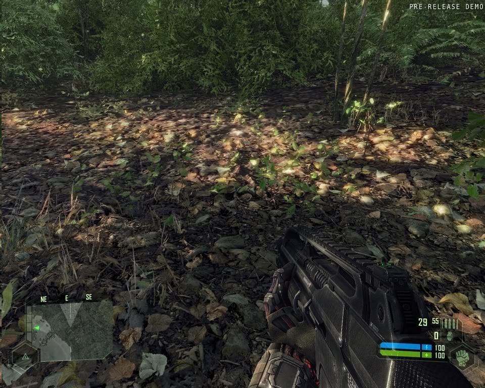
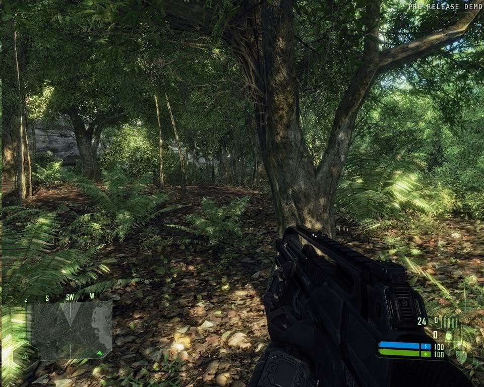
Betanumerical: still doesn't look as good as the foliage shadowing in the top screenshot of the image I posted. The leaves are too opaque.

Edit: posted before Nebula replied. Yes, that looks better. I see no "pre-release demo" text so I assume it is not in the demo.

I have seen video from some Game conventions where they filmed the screen and the light through leaf was visible and enabled. That would make a blade block lighting for the other blade.
 
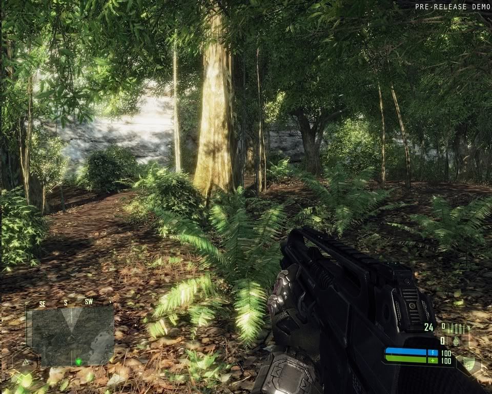
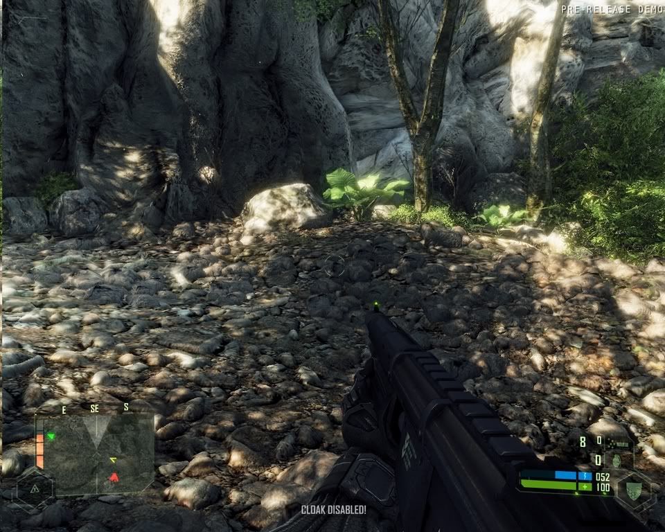
most of us who have played the game agree that the second pic is FAR from the best jungle point of view crysis has to offer, even if it may be missing some of the advanced effects seen in the first pic. I'm hoping peoplessi didn't actually play the demo, or else it would scream of bias.

I'll be the first to admit it doesn't look as good as any FGF or tech demo we've seen long ago, but it still looks fantastic! so many areas far more than that second picture.
 
Of what kind of bias does it scream? Are you saying there is a specific place in the demo map where you can see the effects show in the top screenshot?

I think Crysis looks awesome, but it doesn't look as good as it did in the pre-demo videos.
 
Of what kind of bias does it scream? Are you saying there is a specific place in the demo map where you can see the effects show in the top screenshot?

I think Crysis looks awesome, but it doesn't look as good as it did in the pre-demo videos.

I'm not sayign that at all! I even admitted in my first scentance that it's missing certain advanced effects.

I'm sayign these two sets of screenshots are a poor choice. The first pic is one of the best of the early footage, while the second pic is some of the less interesting you can find in the demo. It's not a fair comparison, and anyone who's explored the demo would know that. That's all I'm saying. :)

I agree with you that it doesn't look as good as the early test videos. Either they're from an FGF, or they had to scale back significantly to make it playable on upcomming hardware. As yo usaid, it still looks incredible!
So basically you are saying that your earlier post is irrelevant? :LOL:
 
Its not that different. (Please not this is not my screenshot).

http://st30.startlogic.com/~jilanoco/CrysisDX10HIREZ.jpg

Different scenes, one is a darker has object motion-blur (DX10 only) and the light shining through the blades. The modded game makes it more alike but still to much shine? A very similar look to teh first image can be obtained by tweaking the settings in teh editor and displaying the image at such small size. But the ss used for the comparision (second image is so bad). I myself play the game with different setting and IMO looks much better.

I like it when it looks 'vivid' hehe!
CrysisIm1.jpg

CrysisIm2.jpg

CrysisIm3.jpg

CrysisIm4.jpg
 
the dev shot is definetly way superior alright. higher poly foliages, much more viberant lighting, contact shadows on the leaves, more subtle object translucency, more depth in the terrain all sums up to make the 2nd pic few generations apart. the 1st looked like cg rendering, the 2nd has all the typical directx rendering remnant.
 
73fkfw4.jpg

i dont remember seeing this kind of quality in any of the recent footages. you can tweak it to death in the editor but they're still miles away from the original shot. btw, i hope you enjoy the 7-8fps in the editor while you're doin it Nebula.
 
Now we're talking, thanks Nebula. :)

Cheers!

the dev shot is definetly way superior alright. higher poly foliages, much more viberant lighting, contact shadows on the leaves, more subtle object translucency, more depth in the terrain all sums up to make the 2nd pic few generations apart. the 1st looked like cg rendering, the 2nd has all the typical directx rendering remnant.

I dont see higher poly foliage compared to what is displayed ingame in v.high. But I do agree that the second picture is of lower settings, taken in a place where the 'sun color multiplier' is set to lowest point (~0) which makes it dull and detail less since the lighting is almost gone. But in the editor there are many settings for the maps and filters so it would be interesting to see how alike teh same scene is in the final!

The first image in fullsize.
http://www.crysis-online.com/Media/Screenshots/Screenshots/Jungle-Action-01.jpg
 
you can tweak it to death in the editor but they're still miles away from the original shot.

haha, are you aware that the changes I done in the editor is minimal and has no perfomance hit? Also I hope you are aware of how blurry images due to motion-blur ingame makes them look much better than no motion-blur at all. Use KZ2 as an example, ingame images without motion-blur vs those with, people say CG for those with and hmm for those without.

btw, i hope you enjoy the 7-8fps in the editor while you're doin it Nebula

you mean at 1200p res? Otherwise my 8800GTX takes it at 720p 30fps -/+. Hell even my other PC with a fumy Opteron 165 and my previous 7900GT runs it at 10-12 fps in the editor with all bars and tabs closed! :eek:

And here is a video where you can see how it comes really close to the first image, where some said that is what is to be expected in 4-5 years. The video is not mine but neverthless shows that it has the posibility to be a benchmark for the next batch of consoles (aswell as my ss above). Of course a benchmark where the game runs with high amounts of AA, AF and resolution aswell as perhaps teh added features to come for PC version!

http://www.gametrailers.com/player/usermovies/127682.html
 
Last edited by a moderator:
They are still missing the shadowing on the leaves.

You've completely missed the point.

Your first post on this subject implied that Crysis doesn't look anything like the press/dev shot. All I'm saying is that the shot you're comparing to does not represent the best Crysis has to offer. I'm not saying Crysis looks like the press/dev shot.
 
You've completely missed the point.

Your first post on this subject implied that Crysis doesn't look anything like the press/dev shot. All I'm saying is that the shot you're comparing to does not represent the best Crysis has to offer. I'm not saying Crysis looks like the press/dev shot.

Fine, it was a simple misunderstanding. We are both in agreement then.
 
CrysisDX10HIREZ.jpg


*THIS* is what I want as a benchmark for next gen (ps4/xbox3). Make that your minimum and I'll be happy a little panda. Now add a large scale with lots of optional paths and we're talking!

Take out the HUD, text and gun. Get a free roaming camera through the part of the jungle and put it in a loop at a store like Best Buy. People would certainly stop to look. Hell you could even throw a discovery HD logo on it!
 
Last edited by a moderator:
Only if you don't plan to study more than 4 vegetal varieties and 3 animal species...

Haha, there arestill things to find and 'study'! :LOL:

Big/round/thin leave plants
mushrooms
grass
tomato bush
thin/palm/roundleaf/cliff/beach/tall/jungle/groundfern/greenfern leaf bush.
Coral rocks, birds, crabs, fish, frogs, insects, turtle, (white shark not implemented for demo).
 
CrysisDX10HIREZ.jpg


*THIS* is what I want as a benchmark for next gen (ps4/xbox3). Make that your minimum and I'll be happy a little panda. Now add a large scale with lots of optional paths and we're talking!

Take out the HUD, text and gun. Get a free roaming camera through the part of the jungle and put it in a loop at a store like Best Buy. People would certainly stop to look. Hell you could even throw a discovery HD logo on it!


I really do understand what you're saying. You like those graphics a lot. you see how Xbox2,PS3 is not upto that standard. I see that too. those graphics ARE nice, and I could see anyone wanting that to be the standard for Xbox3,PS4 games. I suppose if more AA was added and that was running at 60fps, that's what I would expect from an average developer. with that said, Xbox3,PS4 should still be well beyond that, even with first-gen/launch games on the next-gen consoles.
 
CrysisDX10HIREZ.jpg


*THIS* is what I want as a benchmark for next gen (ps4/xbox3). Make that your minimum and I'll be happy a little panda. Now add a large scale with lots of optional paths and we're talking!!

And this will be butt ugly by the time ps4\xbox 3 comes out.....
 
This graphics will surely be outdated when the next gen consoles arrive.. We dont even have to wait for next gen consoles. PC graphics cards will evolve way above what we have today in a matter of years.

These visuals look incredibly real but believe it or not, they will become outdated.
 
[modhat]I'll just remind people what this thread is about - is Crysis a target for the next-gen consoles? Just posting screenshots and saying 'wow it looks lovely!' is inappropriate for the console forum as Crysis is a PC game. If you are posting screenshots or videos, it should be to show how Crysis is or is not going to be managed on next-gen consoles, and not just to showcase the game. I'm going to have a zero tolerance policy on this from now on. If posts aren't relating Crysis to next-gen consoles, they'll get chopped, and if I have to keep removing content from the same people, I'll start to suspect they're only here to pimp the game and not actually discuss the topic.[/modhat]
 
Status
Not open for further replies.
Back
Top