Inuhanyou
Veteran
I feel bad for Oliver but I really want his video asap..True true. I am not trying to “debunk” it or anything. Everything will be clear when we get DF vid.
I feel bad for Oliver but I really want his video asap..True true. I am not trying to “debunk” it or anything. Everything will be clear when we get DF vid.
These are images are primarily of directly lit bright surfaces - that is not where VRS even applies so the comparison is not even showing the area of difference in general.Here is an intresting video
(8) Dead Space Remake - Patch 1.03 - PS5 - Graphical Issues Fixed? - YouTube
I have to say i am confused as this doesn't look anything as bad as the images we saw before.
View attachment 8256
View attachment 8255
View attachment 8254
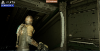
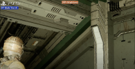
hmmm this is from PS5 version after VRS fix.
 www.dsogaming.com
Especially interesting since they're using an Nvidia GPU. Previously, it seems like AMD users were the only ones getting truly sizeable improvements using ReBAR.Dead Space Remake gets a 25% free performance boost with Resizable BAR

Dead Space Remake gets a 25% free performance boost with Resizable BAR
We can now confirm that Resizable BAR can increase performance by up to 25% in EA Motive's latest horror game, Dead Space Remake.www.dsogaming.com
Yeah so this is pretty much confirmed why some people didn't notice any issues at all. Seems like without cranking brightness to 100% is basically very hard to spot any VRS issues.“got the update, i turned up the brightness and looked up at the ceiling and darker areas...
definitely improved, a lot less blurry and jaggy. need a digital foundry to do a video asap!”
Yeah we need DF vid asap because this sounds bizarre
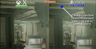
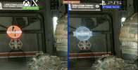
If it was overreaction people would not have spotted it prior to John mentioning it and pointing it out on console and PC both with an option to disable it on PC in particular. Just because some people don't think it's a big deal doesn't mean it's not something worth looking into. Same with horizon performance mode.
It would be nice if people simply allowed devs to take critisism instead of trying to downplay it as if it's nothing
People notice different things in different ways my friend. As long as the game is improved for all users that should be all that matters no?
Some people notice fps drops and framepacing others don't. But it's still something that devs should be improving
I honestly cant see any difference between the twoThis could be it as probably person who made video was unaware what for to look at.
Here is a whole screenshot without zoom with lot of dark places.
View attachment 8257View attachment 8258
And one zoomed with shadowed surfaces.
What kind of config is that? A 9900K with a 4090?Especially interesting since they're using an Nvidia GPU. Previously, it seems like AMD users were the only ones getting truly sizeable improvements using ReBAR.
So if the pitch black place that should not be visible suddenly shows issues when changing brightness is this an issue or not?
They were. People were complaining before they were pointed out by John who brightened the footage to show the actual problem clearlyNot an issue at all. In fact those optimizations are very welcome. By all means please shade near pitch black areas at 1/4 resolution. I thought the initial complaints were based on people just playing the game though and the zoomed in shots with brightness cranked to the heavens came after.
