There's a reasonable chance the alert link isn't aware of the things per page add-on, so the links will have pagination setup incorrectly versus your customised user preference. If that's what's happening I've got no quick route to fixing it unfortunately.
Install the app
How to install the app on iOS
Follow along with the video below to see how to install our site as a web app on your home screen.
Note: This feature may not be available in some browsers.
You are using an out of date browser. It may not display this or other websites correctly.
You should upgrade or use an alternative browser.
You should upgrade or use an alternative browser.
XenForo 2 Problems and Feature Requests
- Thread starter Rys
- Start date
D
Deleted member 2197
Guest
No problem as it does not always happen. The issue does seem reproduceable when I tried again on @neckthrough's Ada alert.
Edit: Last time it did get the page correctly though behavior is similar to what @BRiT mentioned regarding expanding and incorrect location.
Edit: Last time it did get the page correctly though behavior is similar to what @BRiT mentioned regarding expanding and incorrect location.
yes please, can you also check it looks good with the dark themecan easily change the colour (red?) and/or make the bar thicker or a different style, to help it stand out. Would that help?
I can easily change the colour (red?) and/or make the bar thicker or a different style, to help it stand out. Would that help?
On previous themes, wasn't there a DOT or STAR or BALL at the front of the thread title that indicated it had NEW posts? Maybe some sort of Prefix thing?
Watched thread. The most recent posting it happened with was @neckthrough post in the Ada thread.
Can you copy/paste the link from the Alert? I don't have any thread level alerts to look at.
The Alerts I see from person X quoted you or reacted to a post uses the exact post syntax, which is valid regardless of number of posts per page settings.
Code:
https://forum.beyond3d.com/posts/####/
D
Deleted member 2197
Guest
Here is the alert from the post.Can you copy/paste the link from the Alert? I don't have any thread level alerts to look at.
The Alerts I see from person X quoted you or reacted to a post uses the exact post syntax, which is valid regardless of number of posts per page settings.
Code:https://forum.beyond3d.com/posts/####/
Paste as plain text (*) added:
* https://forum.beyond3d.com/posts/2254905/ *
Normal paste:

NVidia Ada Speculation, Rumours and Discussion
I've been seeing people bring up the issue of stock piling up, but is that actually the case or are we just comparing it against the situation of the last 2 years or so? The inventory norm prior was actually stock readily available on shelves (real or virtual) even if products were on sale...
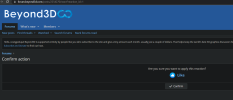
any idea why i sometimes got like confirmation and sometimes like simply works like on the old forum?
View attachment 6559
What are you running to customize the forum and show things as blue? The dark theme is based around orange. The theme that's based around blue is light and uses white. Whatever you're running custom must be causing your issues. Can't help you when you're running your own customized thing.
Here is the alert from the post.
Paste as plain text (*) added:
* https://forum.beyond3d.com/posts/2254905/ *
Normal paste:

NVidia Ada Speculation, Rumours and Discussion
I've been seeing people bring up the issue of stock piling up, but is that actually the case or are we just comparing it against the situation of the last 2 years or so? The inventory norm prior was actually stock readily available on shelves (real or virtual) even if products were on sale...forum.beyond3d.com
That's for that. That link should be directly to the post and as such should not be affected by number of posts per page. So now I'm not sure why it would load that thread on the wrong page, let alone being two pages away.
Its just dark mode via "dark reader" extension that only changes css colorsWhat are you running to customize the forum and show things as blue? The dark theme is based around orange. The theme that's based around blue is light and uses white. Whatever you're running custom must be causing your issues. Can't help you when you're running your own customized thing.
Edit : forgot to mention that it also randomly happened on chrome on Android
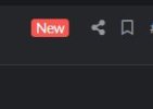
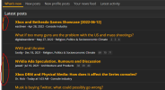
Threads with new posts have a line at the sideOn previous themes, wasn't there a DOT or STAR or BALL at the front of the thread title that indicated it had NEW posts? Maybe some sort of Prefix thing?
I have never seen a reaction confirmation in years of using XF2 on desktop and mobile.any idea why i sometimes got like confirmation and sometimes like simply works like on the old forum?
Threads with new posts have a line at the side
View attachment 6561
I have never seen a reaction confirmation in years of using XF2 on desktop and mobile.
Yeah, for me and you this is obvious enough along with the font emphasis/bolding.
For others maybe they want something right at the thread name like a little ball, star, icon? Maybe I'm confusing my forums but i thought XF1 B3D had that.
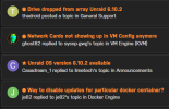
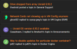
EDIT: I was probably confusing it with a different forum (unraid) that has that style, unread and then read:
Jawed
Legend
Previous B3D forum had emphasis/bold for thread titles in the alert list with waiting-to-be-accessed posts. Additionally, the alerts dropdown list only showed those few thread titles, instead of replicating the full list of entries that show in the page.
For what it's worth, I think the line down the left border of the box is fine. It's just weird that the alerts page displays thread titles differently from the new posts page.
For what it's worth, I think the line down the left border of the box is fine. It's just weird that the alerts page displays thread titles differently from the new posts page.
If you're going to the dedicated alerts page by clicking on the bell icon first then alerts, that will mark your alerts as read and this would show all alert links as read.For what it's worth, I think the line down the left border of the box is fine. It's just weird that the alerts page displays thread titles differently from the new posts page.
Jawed
Legend
I interpret your post to mean that by keeping the alerts page open and issuing a page refresh, that the newly alerting thread titles will show as bold. Is that correct?If you're going to the dedicated alerts page by clicking on the bell icon first then alerts, that will mark your alerts as read and this would show all alert links as read.
Well, I've just tried the experiment (using Beyond3D default scheme, not the dark version) and thread titles are still not showing as bold for new alerts.
Silent_Buddha
Legend
Yeah I think it's a styling issue. My alerts page on my forums shows thread title as bold.I interpret your post to mean that by keeping the alerts page open and issuing a page refresh, that the newly alerting thread titles will show as bold. Is that correct?
Well, I've just tried the experiment (using Beyond3D default scheme, not the dark version) and thread titles are still not showing as bold for new alerts.
There is an ever so slight difference on alerts that are unread. The Orange line at the front and the orange dot at the end along with slightly different background color. The styling doesn't have it as bolded. It needs something more or more difference between the theme colors.
You can see this on the alert page by marking some rows as unread by clicking the empty circle at the end: https://forum.beyond3d.com/account/alerts
You can see this on the alert page by marking some rows as unread by clicking the empty circle at the end: https://forum.beyond3d.com/account/alerts
Sounds like you had BB-code toggled by default, it disables all the formating buttonsThe emoji button doesnt seem to work
edit : I need to click on the BB code button first [ ]
Similar threads
- Replies
- 25
- Views
- 3K
- Locked
- Replies
- 10
- Views
- 1K
- Replies
- 9
- Views
- 924

