XenForo 2 Problems and Feature Requests

I never took "liking" of a post to mean agreement, as I always view it as thanks for the contribution. I haven't seen reasonable people using "post likes" in a positive way, I have only ever seen them dragged up by absolute assholes to try and twist and imply meaning behind them while they go on toxic tirades. Fortunately for the health of the community, they are long gone.

Perhaps "Helpful" may fit in along the lines of "good idea" / "interesting". The graphic I used elsewhere was a life preserver -- View attachment 6859

Possible ratings differentiation which might be useful here (but then again may run entirely counter to the intent of keeping the meta out of the forums and preventing all the petty bickering and posturing):

  • Like
  • Haha / LOL / Funny
  • Agree
  • Helpful
  • Wow / Surprise
  • Sad / Aww

Same here. I often "like" posts that I actually disagree with, but found them to bring valid points, and/or information I did not know. I'm ok with the word "like" and thumbs up iconography though. Its the modern standard. "helpful" seems more fitting to a more trouble-shooting based forum.
 
On another note, would it be possible to have the page count show up at the top of a thread's page as well as the bottom? I miss that.

Sorry if thats been talked about before...
 
Possible ratings differentiation which might be useful here (but then again may run entirely counter to the intent of keeping the meta out of the forums and preventing all the petty bickering and posturing): Like, Haha / LOL / Funny, Agree, Helpful, Wow / Surprise, Sad / Aww

I know some folks may have overlooked them, but there are already specific options for Like, Love, Haha, Wow, Sad, and Angry. They pop-up when you mouse-over the Like icon.
 
I know some folks may have overlooked them, but there are already specific options for Like, Love, Haha, Wow, Sad, and Angry. They pop-up when you mouse-over the Like icon.
Yup. They're nice positive reactions.

I was going over the reactions used elsewhere. I don't see even the neutral ones being used properly here and certainly know the negative ones would be abused.
  • Disagree (Red X)
  • Kill It with Fire (Flame)
  • Forehead Slap (Picard)
  • ORLY? (The owl)
  • Taters (Potatoes but looks like Nads)
  • I Call BullShit (Steaming Pile)
  • Smite (Sword)
  • WTF!? (Surprised Face)
 
I never took "liking" of a post to mean agreement, as I always view it as thanks for the contribution. I haven't seen reasonable people using "post likes" in a positive way, I have only ever seen them dragged up by absolute assholes to try and twist and imply meaning behind them while they go on toxic tirades. Fortunately for the health of the community, they are long gone.

Perhaps "Helpful" may fit in along the lines of "good idea" / "interesting". The graphic I used elsewhere was a life preserver -- View attachment 6859

Possible ratings differentiation which might be useful here (but then again may run entirely counter to the intent of keeping the meta out of the forums and preventing all the petty bickering and posturing):

  • Like
  • Haha / LOL / Funny
  • Agree
  • Helpful
  • Wow / Surprise
  • Sad / Aww
I use “like” both as agreement (it saves on forum clutter to agree rather than reply) and thanks/interesting, depending on the post.

I like Ars’ article comment categories, where “interesting” is distinct from “agree.” That’s where I’m coming from. Your expanded categories look good. I’d consider agree and helpful as sub-categories of like, so I’d transmogrify like to one of the two and add the other, but that may misinterpret previously given likes. That last part makes this whole exercise more effort than it’s probably worth.

To be clear, I “liked” your post in that I appreciated the thoughtful contribution more than I fully agreed with the need for so many synonyms for haha. ;) I’m not fully sold on the life preserver for my purposes, but it would make a cool “this answers my question” emoji for the Beginner’s Zone or Purchasing Help.
On another note, would it be possible to have the page count show up at the top of a thread's page as well as the bottom? I miss that.

Sorry if thats been talked about before...
I was going to ask for this, too, until I accidentally rotated my phone and saw the page counts in landscape mode. The forum omits them in portrait mode (below a minimum horizontal res?), which is fine if I didn’t occasionally want to back up a page to refresh my memory without having to scroll all the way to the bottom. iOS also has a shortcut just to the top of a page, another reason to keep page counts always visible up top.

———

BTW, clicking a thread title from Watched Threads or What’s New occasionally takes me to the OP rather than the first unread post. I don’t know if that behavior depends on whether I’m Watching a thread or not or how recently I’ve read it, but it seems random.
 
We do run the risk of overthinking this, and I'd recommend stopping for a moment to think about what these things even do and why we use them. Because from a coding perspective, I'm not seeing a need for an icon but a matrix. What if you both value a contribution and agree with it? You need to have both reactions available, or a combined reaction. So now how many permutations and combinations of reaction are there? A funny, thoughtful post you disagree with? A sad, shocking, well argued post that you largely agree with but there's parts that are completely confusing and at odds with the rest of the argument? How far do you want to go down the rabbit hole? Will we need users to spend 2 minutes on every post selecting their judgement?

Presently I think 'like' works simply so contributors get feedback their content is valued, for an unspecified reason. As we aren't sorting posts by likes or merit, and there is no other value in counting reactions - they don't unlock privileges or anything - I see no particular need to develop the system. If the system is developed without a particular objective to the enhancements, there'll be an arbitrary line drawn as to what level of feedback we want. I don't have a problem with that, but it will be arbitrary and not logically selected if there's no problem directly being solved.

So the question is "what is the purpose of reactions and how can that be best optimised?" When we have an answer to that question, we'll have an idea what work does or doesn't need doing. ;)
 
It’s clear we need sentence by sentence reactions and an algorithm to summarize overall sentiment and our devation from the mean, culminating in a numerical cynicism rating beneath a user’s name so we know who we’re dealing with before we reply. As a bonus it would render a sarcasm tag unnecessary. ;)
 
We do run the risk of overthinking this, and I'd recommend stopping for a moment to think about what these things even do and why we use them. Because from a coding perspective, I'm not seeing a need for an icon but a matrix. What if you both value a contribution and agree with it? You need to have both reactions available, or a combined reaction. So now how many permutations and combinations of reaction are there? A funny, thoughtful post you disagree with? A sad, shocking, well argued post that you largely agree with but there's parts that are completely confusing and at odds with the rest of the argument? How far do you want to go down the rabbit hole? Will we need users to spend 2 minutes on every post selecting their judgement?

Presently I think 'like' works simply so contributors get feedback their content is valued, for an unspecified reason. As we aren't sorting posts by likes or merit, and there is no other value in counting reactions - they don't unlock privileges or anything - I see no particular need to develop the system. If the system is developed without a particular objective to the enhancements, there'll be an arbitrary line drawn as to what level of feedback we want. I don't have a problem with that, but it will be arbitrary and not logically selected if there's no problem directly being solved.

So the question is "what is the purpose of reactions and how can that be best optimised?" When we have an answer to that question, we'll have an idea what work does or doesn't need doing. ;)
I think breaking into categories like 'agree, interesting, insightful, useful' etc creates a better feedback loop than just 'like'. When a person writes something, they aren't given a lot of feedback on the structure of their posts, their messaging, communication, etc. So when the feedback comes back as interesting, agree, insightful but they aimed for something else, that tells the poster that perhaps what they wrote and what people read are not aligned. This misalignment may lead to revectoring of the messaging that the poster had in mind initially but fell off track.

Secondly, others may aim to post for certain types of feedback. for instance, there are those that provide hard documentation or facts, those could be highlighted as useful. Then there are those that take facts and provide insight around them, and people tag as insightful. I think giving posters a chance to aim for the type of posts and feedback that they want would help as well, it would certainly give some feedback to people who don't understand the topics. So if you read something about memory management, and you don't understand the topic, but 400 people agreed and found that post 'useful', then that could say a lot about the quality of the post itself even if the reader themselves were not able to evaluate it directly.
 
Go to here https://forum.beyond3d.com/threads/...for-religious-and-political-discussion.30611/ and press user control panel on the post.

Result in

This site can’t be reachedThe webpage at https://www.beyond3d.com/forum/usercp.php might be temporarily down or it may have moved permanently to a new web address.
ERR_HTTP2_PROTOCOL_ERROR

OH. You mean the link inside the post???

Yeah, that post is entirely out of date. So best I can do is remove it entirely and attempt to post a pointer to directions on how to join.
 
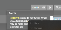
Not sure if it's really Xenforo problem per se, but I think the recent Chromium bug (or change?) which causes some links to be "misaligned" is affecting this forum too, happened on our forum aswell (though in different place)
When on forum front page, clicking on my alert bell, the first alerts second row part of the link isn't right clickable, the dot marks about where I right clicked on the link (don't mind the overexposure, happens sometimes when taking screenshots from Edge with HDR in use in Windows)
1664189722508.png
 
How about light and dark mode that follows OS settings, so we don't manually have to go to settings and change it between them depending on time of day? :yes:

CSS media query can be used easily for this:

Code:
@media (prefers-colour-scheme: dark) {}

:root {
   color-scheme: light dark;
}
 
The only issue I have with dark in iOS is highlighting is black, so invisible on the dark background.
 
Sounds like Apple bug, have you reported it?

Isn't that only in the editor or when replying though?
Well, now I can’t get it to happen when either replying or editing on an iPad. Typical. Let me try to recreate it.

Edit: My problem is likely an outdated version of Safari, not the forums themselves.
 
Last edited:
I use the Beyond3D forums just for games and technical stuff. Therefore, I'd like to make a feature reguest:

- Ignore this forum
- Ignore this thread

As an example: I'd like to ignore the General Discussion forum so that its content do not show up on the latest posts list.

Thanks.
 
Last edited:
Back
Top