You are using an out of date browser. It may not display this or other websites correctly.
You should upgrade or use an alternative browser.
You should upgrade or use an alternative browser.
Uncharted 4: A Thief's End [PS4]
- Thread starter Strange
- Start date
- Status
- Not open for further replies.
Love the SSS on their faces now which is making the skin look so natural, one of the most noticeable change from PSX 2014 demo. The volumetric light shaft is also sorely missing from PSX 2014, you can actually tell without even looking at the light shaft, scenes with volumetric lighting tend to have that hazy look to it which is well demonstrated in the subsequent showings. The Bokeh DOF is also very beautifully added since along with object motion blur. I can 100% guarantee the graphics in the jungle level for the retail version would be much improved.
100% guarantee or my money back? 
I think it's more about artstyle and the general impact each game have on a person. It's not about the number of shaders, polygons or "next gen" techniques where I am pretty sure UC4 would win (well except maybe against battlefront though).Trolls gonna troll. It is the best looking PS4 games with The Order 1886 and Star Wars Battlefront...
Basically here it's realistic / gritty games VS cartoony / colorful ones. Many people in some cases will find the former games more impressive even if those are objectively less pushing the hardware than the latter.
My refund policy is 7 days.100% guarantee or my money back?
Would you be so kindly to take a screenshot to prove it?I'll say it again. The PSX 2014 demo had volumetric lightshafts already, it just wasn't all too evident. Not that it matters, but just for the sake of factual correctness.
I think it's more about artstyle and the general impact each game have on a person. It's not about the number of shaders, polygons or "next gen" techniques where I am pretty sure UC4 would win (well except maybe against battlefront though).
Basically here it's realistic / gritty games VS cartoony / colorful ones. Many people in some cases will find the former games more impressive even if those are objectively less pushing the hardware than the latter.
After it is debatable. I only have a PS4 but it is impossible to do a top 10 of the best looking console games without Ryse and Quantum Break...
Something that i expect to make a major difference in the final version of the game in the jungle map other than improved lighting is the inclusion of AO for small geometry, it was absent in the PSX demo as you can see here:

And it is present in the beta which runs at twice the framerate:


And it is present in the beta which runs at twice the framerate:

PeanutButterOnPickles
Newcomer
I personally believe Uncharted 4 is a good looking title, but I also don't believe it is above and beyond a few other game titles with the narrative shared by some posters from what I have seen for myself from Uncharted 4 so far : )I think it's more about artstyle and the general impact each game have on a person. It's not about the number of shaders, polygons or "next gen" techniques where I am pretty sure UC4 would win (well except maybe against battlefront though).
Basically here it's realistic / gritty games VS cartoony / colorful ones. Many people in some cases will find the former games more impressive even if those are objectively less pushing the hardware than the latter.

Another gameplay capture from E3. I'm still seeing basic geometric assets for environment props, a static 2d skybox and overall unconvincing shading (though a little stylized) compared to a couple games that I have seen for myself (Crysis 3, AK and Advanced Warfare).
PeanutButterOnPickles
Newcomer
In my opinion (I'm just being honest), from what I've seen for myself, I personally believe Portal 2's assets outputs a more realistic convincing visual than Uncharted 4 in gameplay comparisons.Sigh, let go of the last gen guys.
I can take some other names, but Portal 2?
Come on let's stop being silly here. This isn't a comparison thread, first of all, and it's most definitely not a silly bizzarro comparison thread.
The game looks gorgeous and people are excited by it. And some might see things that aren't actually there. Good for them! Get over it.
Come on let's stop being silly here. This isn't a comparison thread, first of all, and it's most definitely not a silly bizzarro comparison thread.
The game looks gorgeous and people are excited by it. And some might see things that aren't actually there. Good for them! Get over it.
I'm not sure what the point is in comparing screenshots. Screenshot is not going to be something Uncharted will ever excel in, because it's not that type of game. You see, the developers have focused a lot of the finite resources available to them not to create a photo-realistic game that looks great in still captures, but one that feels alive when in motion. This is where the whole dynamic objects come into play, the openness of the environment - in other words, the entire world built around the story that is interactive on a broad level and central to the core mechanics of the game itself. That costs performance, and more importantly, it also costs time to create assets for such a huge world. I know Crysis is open world, but its a very different game at its core level with different requirements (and different goals).
L. Scofield
Veteran
This thread took a funny turn, how long till modded Skyrim starts showing up
A totally irrelevant gif

I am sure nothing has changed since E3, some of you have checked out your logic card trying to promote your agendas
Just some simple math for you
I will be sure to update that gif when the final game hits.
- PSX -> E3 = Approx 180 days
- E3 -> Release date = Approx 270 days
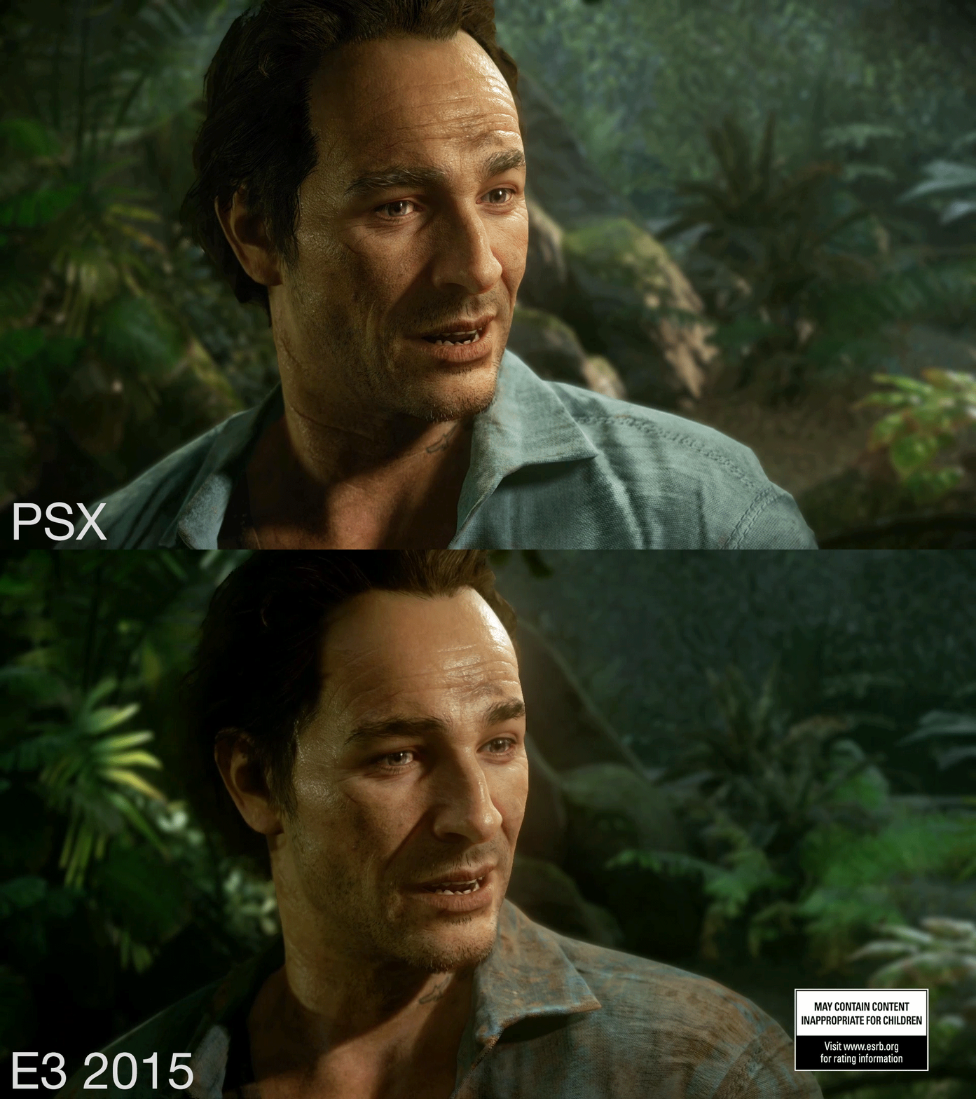
So you finally followed the advice I gave you and posted a proper comparison. Couldn't you just do that from the beginning instead of throwing a tantrum?
The differences I see are:
-Higher resolution shadow for the main light.
-More hair on the guy.
-Softer SSS that washes away the fine skin details.
-Shirt dirt.

Interesting...the PSX trailer version of Drake's hair seems improved almost to the E3 2014 promo version of Drake.
Here is another comparison between the Gameplay reveal vs the game awards trailer

The sss on the skin looks very convincing now.
Or maybe the lighting conditions in each of those shots is just different. Huh...
And now with concrete evidence in the thread directly contradicting the hypothesis of both L. Scofield and VFX_Veteran(that in fact, nothing has changed since PSX [a year ago], and scene by scene lighting variations are to blame for improved visual fidelity), both are never to be seen again until the next bullet point for complaining shows up, repeating the same process.
I love the internet.
So much salt, lol. It's a discussion forum man. If you wanted a circlejerk why not just open a blog lol.
And no matter how you want to spin it this:

Is impressive that it's running real-time on a Ps4, which is by no means a tech powerhouse. Getting something like that to run on "budget hardware" takes a lot of time and a lot of work. Something has to be said about the people who fight with limited resources everyday to produce something visually pleasing, instead of just saying "they'll have to buy better hardware to play what i am going to code".
Two high detail guys on a simple scenery with nothing going on. What's impressive about that? Do we even have numbers on the polycount of these characters?
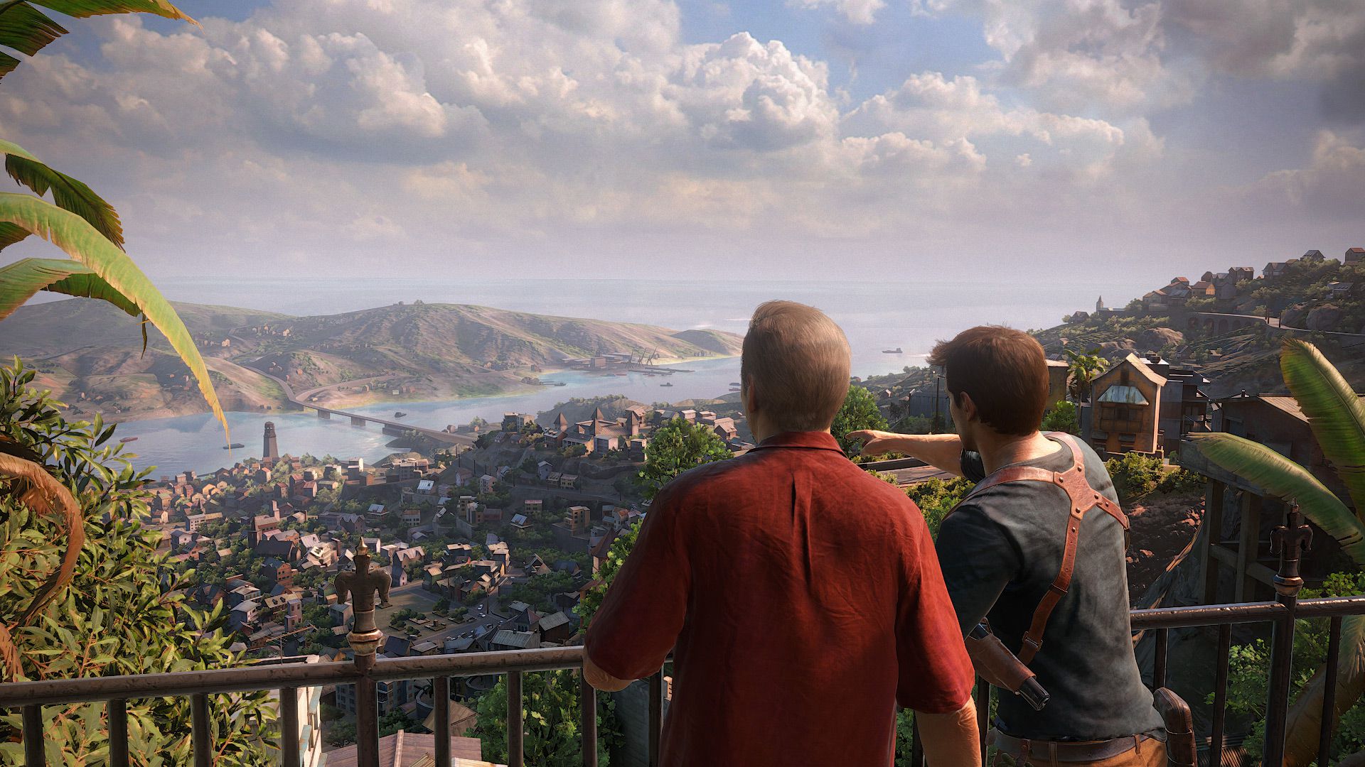
The only thing unrealistic about Uncharted 4 could be the color palette. Everything else is pretty much going for a realistic style, characters, setting, materials, etc...I'm not sure what the point is in comparing screenshots. Screenshot is not going to be something Uncharted will ever excel in, because it's not that type of game. You see, the developers have focused a lot of the finite resources available to them not to create a photo-realistic game that looks great in still captures, but one that feels alive when in motion. This is where the whole dynamic objects come into play, the openness of the environment - in other words, the entire world built around the story that is interactive on a broad level and central to the core mechanics of the game itself. That costs performance, and more importantly, it also costs time to create assets for such a huge world. I know Crysis is open world, but its a very different game at its core level with different requirements (and different goals).
RenegadeRocks
Legend
The only thing unrealistic about Uncharted 4 could be the color palette. Everything else is pretty much going for a realistic style, characters, setting, materials, etc...
Totally disagree there. ALmost every shape is unrealistic. Just the shaders and lighting are realistic, everything else, including animations, expressions, silhouttes, shapes of things, colours, are all unrealistic.
L. Scofield
Veteran
So motion and facial capture are now unrealistic? Every object in the videos has the same proportions they would have in the real world, from basic props all the way to major buildings and that includes the characters.Totally disagree there. ALmost every shape is unrealistic. Just the shaders and lighting are realistic, everything else, including animations, expressions, silhouttes, shapes of things, colours, are all unrealistic.
How is this guy unrealistic?

PeanutButterOnPickles
Newcomer
Yeah, the movement of objects is pretty cool from what I've seen :>I'm not sure what the point is in comparing screenshots. Screenshot is not going to be something Uncharted will ever excel in, because it's not that type of game. You see, the developers have focused a lot of the finite resources available to them not to create a photo-realistic game that looks great in still captures, but one that feels alive when in motion. This is where the whole dynamic objects come into play, the openness of the environment - in other words, the entire world built around the story that is interactive on a broad level and central to the core mechanics of the game itself. That costs performance, and more importantly, it also costs time to create assets for such a huge world. I know Crysis is open world, but its a very different game at its core level with different requirements (and different goals).
Anyway, I'll stay clear from derailing this thread, just wanted to share my honest opinion. See you guys.
-Peanutbutteronpickles
D
Deleted member 11852
Guest
These features should be highlighted on the box!-More hair on the guy.
-Shirt dirt.
- Status
- Not open for further replies.
Similar threads
- Replies
- 25
- Views
- 2K
- Replies
- 0
- Views
- 604
- Replies
- 37
- Views
- 2K
- Replies
- 22
- Views
- 2K
D


