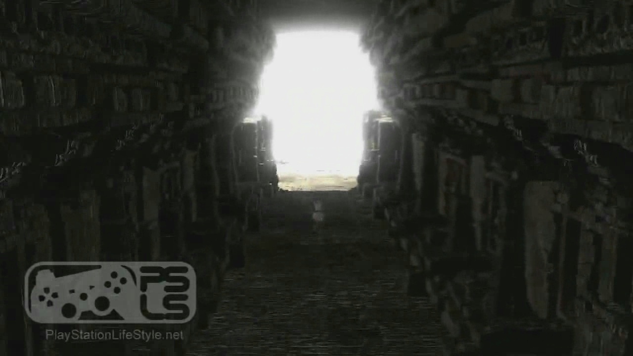
The Last Guardian (Trico, Ico 3, Shadow of the Colossus sequel, etc.) [PS4]

The world and the creature belong to the same plane of existence.The boy belongs to another.It's a patern in Ueda's work.Some acidental merge of two worlds on some kind of spiritual/imaginary plane.Most of the drama/curse comes from that.

The feeling of being out of place.

QFT

I can see how some people look at it from a purely graphical point of view and find it almost contradictory. But I don't understand calling it "wrong", the whole point of it is to look contradictory.

Perhaps we (gamers) do too much "looking at it from a purely graphical point of view". But that's another story entirely ;)
 
There are zillions of ways to make the boy both stand out from his enviroment in all the spiritual and emotional sense that the creator wants - and still keep the artistic style consistent. Also, the PS3 is a lot more capable than this - it's basicaly a simple color texture, not even any cartoon shader or such.
Right now the difference is distracting in the wrong way, taking the viewer out of the game. Particularly with all the realistic wind effects on the kid's clothing...

This makes me think that the result is not what's intended, it's more about the game being a work in progress. We'll see once it's completed.
 
There are zillions of ways to make the boy both stand out from his enviroment in all the spiritual and emotional sense that the creator wants

Then i really like this one.And the whole in motion is really perfect.It's certainly not meant to be apreciated on static screenshot.
 
There are zillions of ways to make the boy both stand out from his enviroment in all the spiritual and emotional sense that the creator wants - and still keep the artistic style consistent. Also, the PS3 is a lot more capable than this - it's basicaly a simple color texture, not even any cartoon shader or such.
Right now the difference is distracting in the wrong way, taking the viewer out of the game. Particularly with all the realistic wind effects on the kid's clothing...

This makes me think that the result is not what's intended, it's more about the game being a work in progress. We'll see once it's completed.

So all of this (that is based purely on your opinion) make you think that this is not their intent?

I guess we'll have to wait and see.
 
In my opinion Ueda makes games that feel like they come from the imagination or dreams of a child. The player is thrown into a world that doesn't make much sense, doesn't quite know why they are there and often times revolves around relationships with odd things. If each game is a dream then this brings the "nightmare" and "wonder" aspect into full effect, it's why sometimes the game is dark and at others you are left in wonderment of what you are seeing. The fact that these games typically have a main character who isn't very old and plays along the lines of innocents really stands out for me.

Ueda has captured the childlike imagination and put it into a video game, these are the stories I imagine 7-8yr old boys make up while sitting in thier room thinking, as they play with their toys. Then an adult gets ahold of those stories and rewrites them to add an emotional bond and make them more cohesive.

Ico and SOTC are not just games, they tend to be an experience when being played. I have no doubt that even with the visual disparity between the main character and the surroundings that it will deliver the same exceptional experience.
 
In my opinion Ueda makes games that feel like they come from the imagination or dreams of a child.

Weird ! That's the impression I have too. I keep thinking about my childhood and from my son's point of view when I watch the video.
 
comparison

TLG1.jpg

TLG2.jpg

http://upsilandre.free.fr/images/TLG3.jpg
http://upsilandre.free.fr/images/TLG4.jpg

http://upsilandre.free.fr/images/TLG5.jpg
http://upsilandre.free.fr/images/TLG6.jpg
http://upsilandre.free.fr/images/TLG7.jpg
http://upsilandre.free.fr/images/TLG8.jpg
 
Last edited by a moderator:
Very nice comparison Quaz, the lighting seems improved dramatically, volumetric HDR? Also spotted the use of parallax mapping, self shadows and better feathers. Anything on the rendering res so far?
 
Apart from some brighness/gamma problems, that game has pretty much the best lighting I have seen by a long shot. Animations and models are too, awesome mind you.
 
I'm confused a little. Have you guys watched the HD trailer? Where is Nebula?

What? I am here, bu I dont know why you're asking for me! :smile:

I think the boy kinda looks good in the scene if that is what you are where asking. But nothing special in the looks vs the animal IMO. Very well done and realistic looking animal, reminds me of that PS3 techdemo released on PSN. Though lighting is offscreen thus cant really be judged. Even ugly games look good/fantastic in offscreen and good looking games amazing. To bad thats reality. But yeah in those offscreens it rivals H3's lighting.

Offscreen
Not offscreen
 
Last edited by a moderator:
There are zillions of ways to make the boy both stand out from his enviroment in all the spiritual and emotional sense that the creator wants - and still keep the artistic style consistent.

The artistic style is consistent - with Team Ico's previous works, in which graphical decisions were made to promote the story and the emotion being created in the player.

But you mean graphically consistent. Why does the artistic style have to be graphically consistent? Apart from simply to fit in with the crowd?

If you're making Gran Turismo or Gears of War then graphical consistency is important, but all videogames don't have to follow the same path by default. They are videogames, after all.
 
You guys are basicaly biased because it's a game from Ueda. Yes, his previous works are masterpieces but it doesn't put everything he does above criticism. And a lot of his previous decisions were probably dictated by technology and limitations.

But as it's clearly not a discussion based on arguments, I'll quit now.

They've actually made some very convincing arguments. You have to justify why all decisions in video game design should be made on a graphical level rather than an artistic, story, or even emotional reason. Once you have justified that, then you can legitimately disregard their arguments. So far you haven't done that.
 
What? I am here, bu I dont know why you're asking for me! :smile:

I think the boy kinda looks good in the scene if that is what you are where asking. But nothing special in the looks vs the animal IMO. Very well done and realistic looking animal, reminds me of that PS3 techdemo released on PSN. Though lighting is offscreen thus cant really be judged. Even ugly games look good/fantastic in offscreen and good looking games amazing. To bad thats reality. But yeah in those offscreens it rivals H3's lighting.

Offscreen
Not offscreen

Those screenshots...the on-screen one looks better :/

We've seen a direct feed video of The Last Guardian trailer haven't we?
 
You guys are basicaly biased because it's a game from Ueda. Yes, his previous works are masterpieces but it doesn't put everything he does above criticism. And a lot of his previous decisions were probably dictated by technology and limitations.

But as it's clearly not a discussion based on arguments, I'll quit now.

The part of your post in bold is nothing short of contemptible, even risible, especially as you seem to actually work in some field of "art". As I see it, there is no discussion based on arguments, because there is no argument here other than someone trying to portray their subjectivity using objective statements as "Doesn't make it any less wrong". There is nothing wrong about it! It may not be to your liking, but there are many forms and genres of art that are not to a lot of people's liking. Art can only be wrong if it's technically inept. What you are seeing here is far from being technically inept.

Yes, it's an early version, yes the boy could change, yes the boy could be as detailed as the animal, etc. etc. etc. We'll see when it's finished, and then you can be as presumptuous as you want all over again when the boy has all the same wrongness you say he has now.
 
Those screenshots...the on-screen one looks better :/

We've seen a direct feed video of The Last Guardian trailer haven't we?

Ahh then you then you will dislike the lighting strenght on previous shots a page back.
 
Back
Top