Install the app
How to install the app on iOS
Follow along with the video below to see how to install our site as a web app on your home screen.
Note: This feature may not be available in some browsers.
You are using an out of date browser. It may not display this or other websites correctly.
You should upgrade or use an alternative browser.
You should upgrade or use an alternative browser.
Screenshots of Ridunkulous Quality and Size! Part Deux [2023+]
- Thread starter Shortbread
- Start date
Beautiful shots, Jupiter!
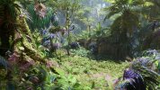
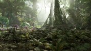
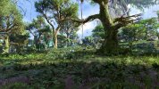
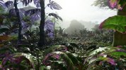
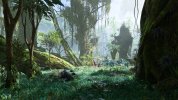
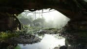
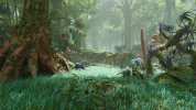
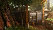
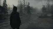
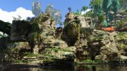
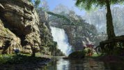
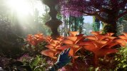
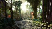
Avatar is very photogenic. Other than in Alan Wake 2 it's easy to find good scenes for screenshots. The game also looks extremely impressive. While Alan Wake 2 looks really good and is even superior in terms of lighting it doesn't evoke those "wow" moments as often as Avatar. Alan Wake 2 just has more typical environments. The environment of Avatar is also very interactive. There are many different plants that react to you.
In addition everyone can take unique pictures ub Avatar due to the large size of the game and different time of day and weather conditions. Whereas the pictures from Alan Wake 2 are more similar. That's why I don't think it makes so much sense to post cutscene pictures. Anyone can post them. It looks the same for everyone.
I am still in the first of the 3 or 4 areas. However, my next Avatar pictures will only be uploaded when pictures from another games have been posted in the meantime. The thread should not be spammed with my Avatar pictures.
I have many more pictures. It's difficult to decide which one to upload.








Last edited:
Silent_Buddha
Legend
Wow, those screens make Pandora look like both a last gen game and a current gen game.
A+ : the foliage looks great and I love the foliage density.
D- : that is some hilariously low poly asset quality in the game. Wow that is some incredibly low poly geometry.
The good lighting just makes that low poly geometry look so bad despite their attempts to hide it with clever texture tricks.
Regards,
SB
I'd say geometry wise it looks to be about a match or slightly better than Forbidden West, which IMO was the game with the highest perceived level of geometry.Wow, those screens make Pandora look like both a last gen game and a current gen game.
A+ : the foliage looks great and I love the foliage density.
D- : that is some hilariously low poly asset quality in the game. Wow that is some incredibly low poly geometry.
The good lighting just makes that low poly geometry look so bad despite their attempts to hide it with clever texture tricks.
Regards,
SB
Wow, those screens make Pandora look like both a last gen game and a current gen game.
A+ : the foliage looks great and I love the foliage density.
D- : that is some hilariously low poly asset quality in the game. Wow that is some incredibly low poly geometry.
The good lighting just makes that low poly geometry look so bad despite their attempts to hide it with clever texture tricks.
Regards,
SB
Low poly asset quality? Have you seen the DF technical breakdown video? This game uses insane amounts of geometry! There's nothing "last gen" there whatsoever.
davis.anthony
Veteran
Low poly asset quality? Have you seen the DF technical breakdown video? This game uses insane amounts of geometry! There's nothing "last gen" there whatsoever.
But there are still a lot of visible poly edges on assets, so while it's geometry is high, it's still not enough for the type of game that it is.
Here's hoping mesh shaders start to gain traction over the next few years.
Low poly asset quality? Have you seen the DF technical breakdown video? This game uses insane amounts of geometry! There's nothing "last gen" there whatsoever.
I wouldn't necessarily use the word low poly, but there are lots of angular edges where more rounded surfaces should be. I often see high-frequency assets/textures (especially, in photogrammetry based assets) used to mask low geometry surfaces and/or objects in certain games (such as large scale top-down MMORPGs) to preserve geometry rendering time and/or performance budgets overall. That's why consoles often have slightly lower LODs or models in game, but have matching (or close to matching) texture work when compared to PC.
Incredebily low poly geometry in Avatar? Isn't that statement a bit exaggerated? Even Alan Wake 2 has angular trees (see my last image of this post which is called: "comparison picture"). Fully 3d or tessellated trees are rare exceptions. I can hardly think of a game with better assets than Avatar. Avatar is a next gen game through and through. Take a look at a typical last hen game, or better, post pictures here. Then you will realize that Avatar is far superior. There are only single assets in Avatar that look bad. Once I saw a small hollow tree trunk that was really too angular and poor looking. But that was it. All the other assets are either very high quality or in the worst case only okay.Wow, those screens make Pandora look like both a last gen game and a current gen game.
A+ : the foliage looks great and I love the foliage density.
D- : that is some hilariously low poly asset quality in the game. Wow that is some incredibly low poly geometry.
The good lighting just makes that low poly geometry look so bad despite their attempts to hide it with clever texture tricks.
Regards,
SB
I'd like to see comparisons between Nanite ARK 2 and Avatar and what looks more impressive in the end. Can someone please upload pictures of ARK 2.
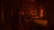
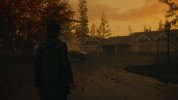
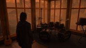
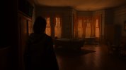
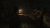
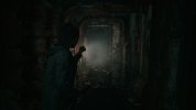
Alan Wake 2 - round 3
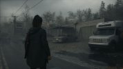
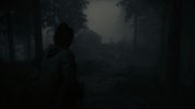
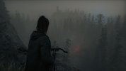


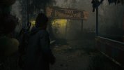

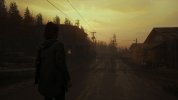
__
Comparison picture
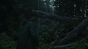
Last edited:
davis.anthony
Veteran
@davis.anthony
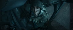
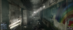
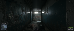
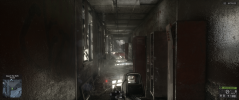
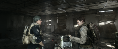
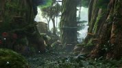
The Battlefield 4 section also looked very good and high-resolution in the first presentation. However, I didn't find the game quite as impressive in the end.Avatar Frontiers of Pandora - Round 3
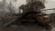
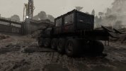



Last edited:
davis.anthony
Veteran
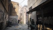
Robocop - I wish there was a way to remove the fizzle as it can be quite serve and distracting at times, as can the texture pop-in.
Add that to the engine.ini
r.Lumen.Reflections.Temporal=0 : Mitigates the noise in Lumen reflections, particularly when using DLSS.
r.Lumen.ScreenProbeGather.Temporal.MaxFramesAccumulated=32 : Decreases the noise (or boiling) in Lumen Global Illumination.
I used it and it reduces some RT flicker. Video about how to do that:
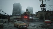
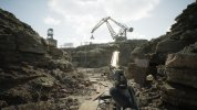
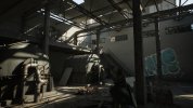
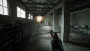
More of Robocop Rouge City
Max. settings, UHD DLSS Quality, filters like CA etc. are activated.
Every screenshot is from one section of the game. I initially wanted to include another one but that didn't work for me. The game varies greatly in terms of graphics. Here, of course, are mainly the beautiful parts.
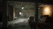
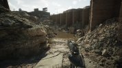
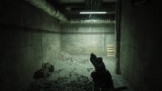
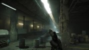
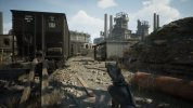
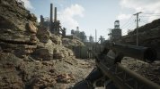
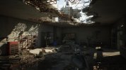
Last edited:
davis.anthony
Veteran
It is very good looking and is only spoilt by a few rough spots in it's IQ.
Callisto Protocol
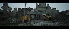
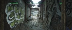
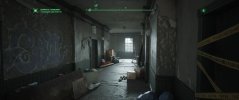
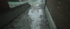
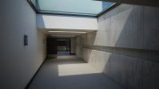
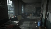
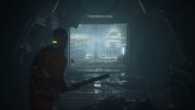
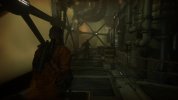
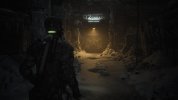
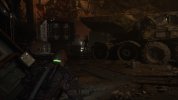
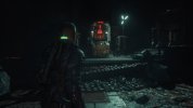
A few screenshots I took today in my second playthrough. In Callisto Protoco I have a high reject rate of images because pf the strong motion blur. It looks fantastic in motion but in pictures it's just too blurred. Also, some scenes don't come across as well in pictures as they do in the game in motion.
The game has it's weaknesses but what I like is that it focuses on the essentials and that's fun, at least for me. RoboCop was good (7.5/10) but most side missions didn't have to be. If there would be an NG+ in RoboCop I'd skip the side missions. I also have a few more pictures of RoboCop.
An extra note: I think Callisto Protocol is one of the more brutal games of my violent game collection.

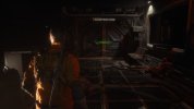





Last edited:
Callisto Protocol
A few screenshots I took today. In Callisto Protoco I have a high reject rate of images because the motion blur is too strong. It looks fantastic in motion but in pictures it's just too blurred. Also, some scenes don't come across as well in pictures as they do in the game in motion.
The game has its weaknesses but what I like is that it focuses on the essentials and that's fun, at least for me. RoboCop was good (7.5/10) but most side missions didn't have to be. If there would be an NG+ in RoboCop I'd skip the side missions. I also have a few more pictures of RoboCop.
An extra note: I think Callisto Protocol is one of the more brutal games of my violent game collection.
View attachment 10405
View attachment 10412
View attachment 10406
View attachment 10407
View attachment 10414
View attachment 10413
View attachment 10408
View attachment 10409
View attachment 10410
View attachment 10411
This was definitely something I would have picked up if they hadn't screwed up the PC version so badly (I know it was greatly improved, but I was tainted by first impressions), it gives me serious Doom 3 vibes.
Similar threads
- Replies
- 1
- Views
- 4K
- Replies
- 4
- Views
- 2K
- Replies
- 42
- Views
- 16K

