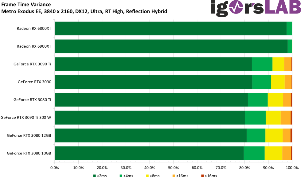
Can someone explain what's going on in this graph?:
"Sometimes it’s really good to evaluate everything, because the details of the variances reveal more subtleties than you might think. Just this metric is really a must and I can only advise every tester to make this effort as well."
Yes, I cherry-picked that graph, but it makes my point.
Overall it's a really nice article, super-impressive work.
There are some data points, affecting AMD and NVidia, where theoretically faster cards are showing worse results than slower cards. Those seem to me to be outliers that should be rejected. He says these outliers are reproducible, so shouldn't be rejected.
It's really tricky stuff doing consistent testing and we already know the dangers of using canned-benchmarks for performance evaluation. But Igor's definitely on another level here.
I just want to point out that while the Suprim X cooler on the 3090 Ti is a 4-slot cooler versus 3-slot coolers on AMD, the difference in cooling capability at "390W" as shown on these pages:
MSI GeForce RTX 3090 Ti Suprim X Review - Cooler Performance Comparison | TechPowerUp
MSI Radeon RX 6900 XT Gaming X Trio Review - Cooler Performance Comparison | TechPowerUp
isn't massive, though, only about 3 celcius. In theory more cooler efficiency = lower power consumption, since GPUs increase their power consumption with temperature. But I don't think it's making the test too unbalanced.

