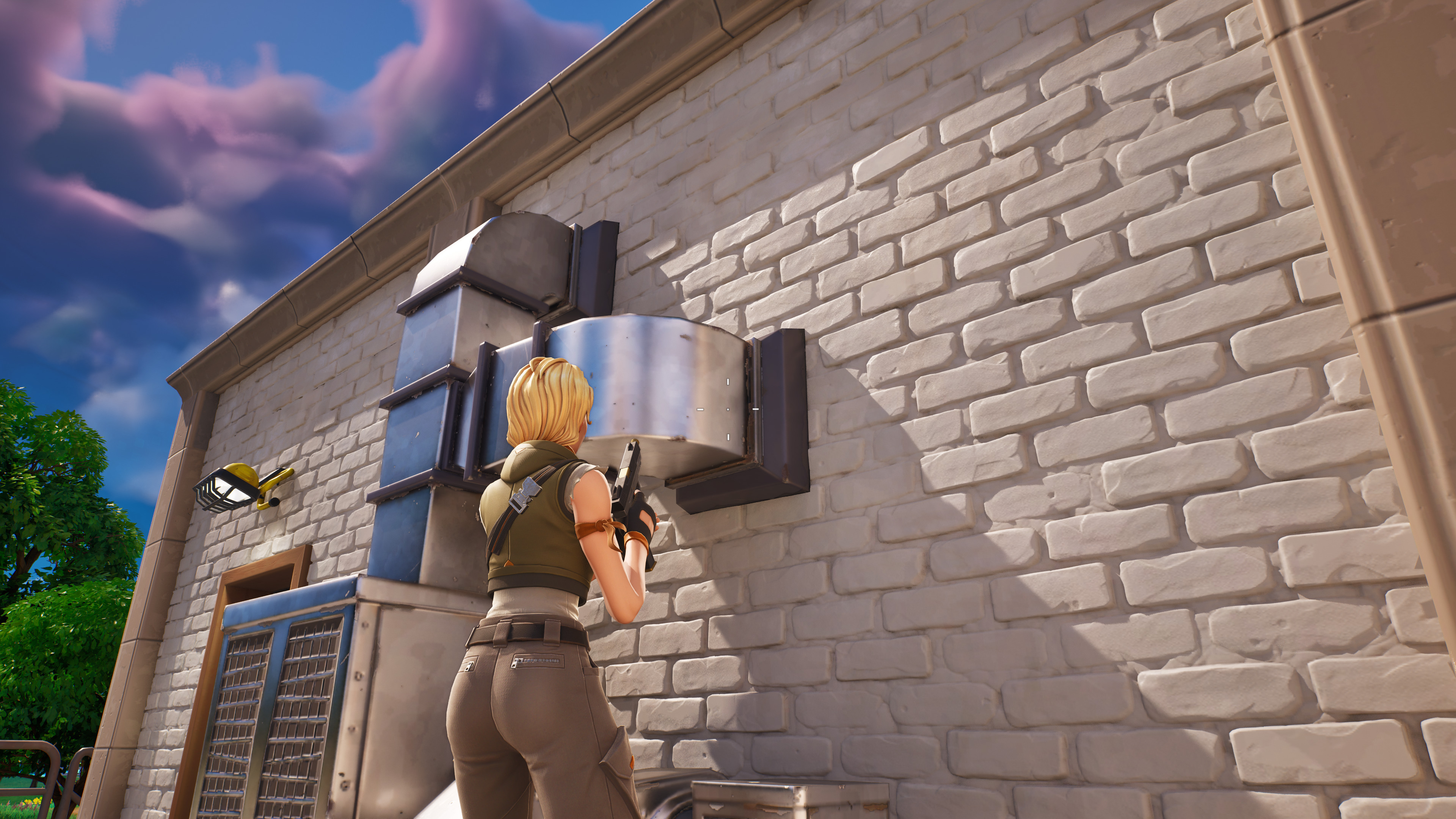
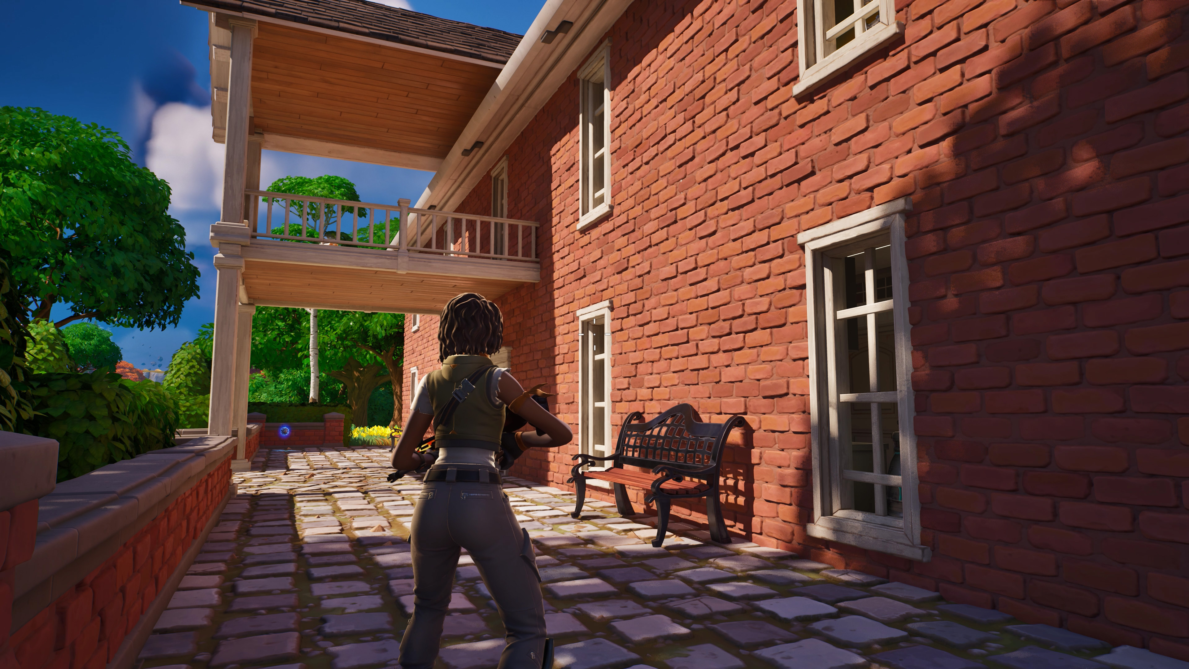
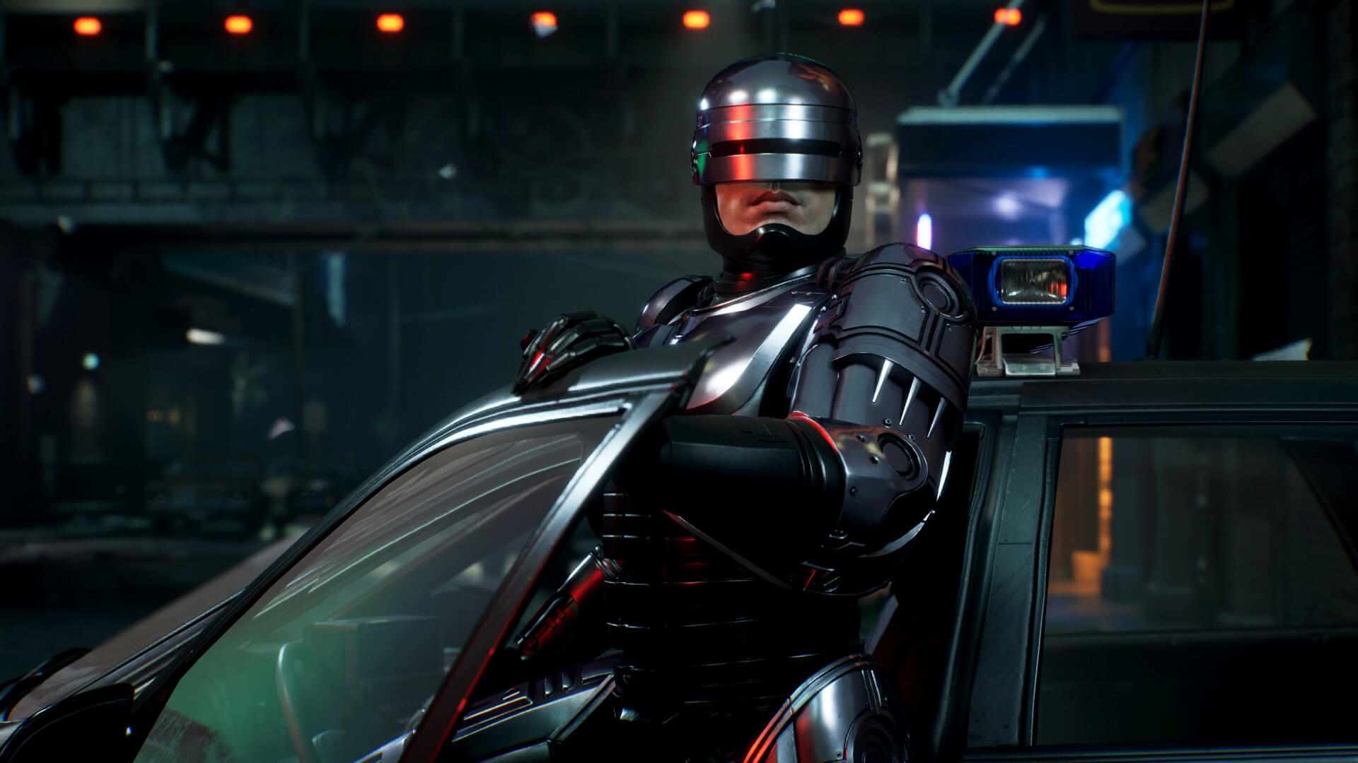
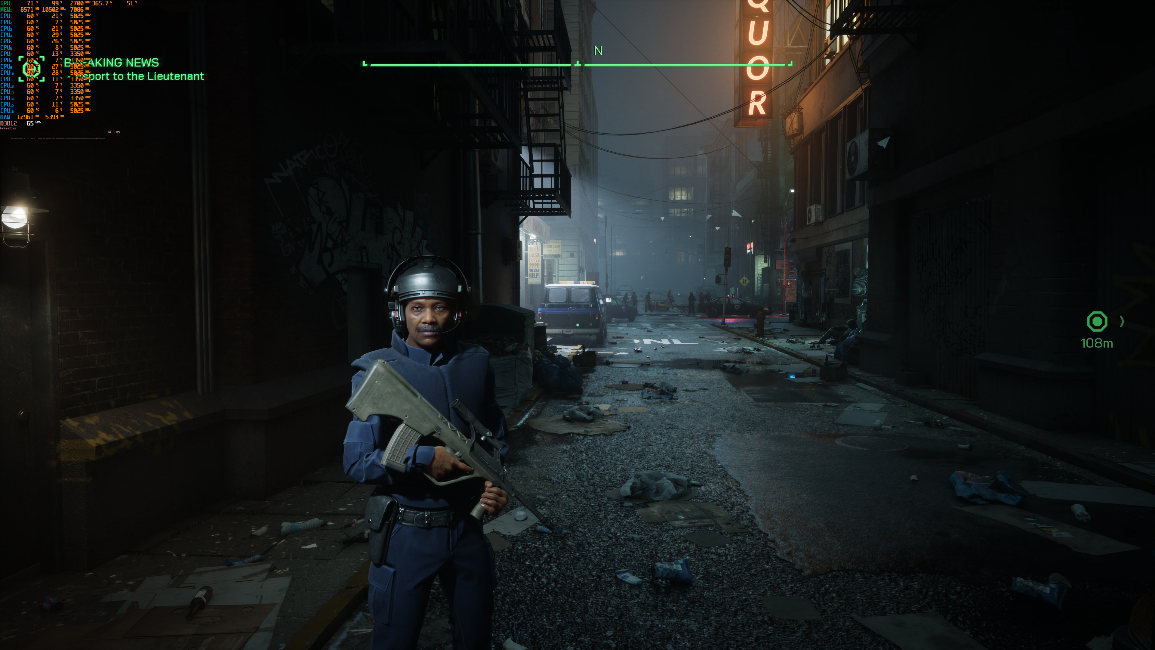
I think the PT ports like Portal and Quake are very obvious examples of this. They are technically interesting, but I wouldn't even go so far as to say they look "better" than the originals. You need good materials and good geometry to make PT really shine as well.In other words for me, RT lighting up texture tricks instead of actual geometry just accentuates how low poly everything is in older games and for me actually makes it look worse because now it's much harder to ignore the low poly nature of older games.
I personally wouldn't put Cyberpunk into the same category since it still has a lot more detail than those old games. It's just that the other stuff is looking nice now so the lack of clutter and micro-detail stands out more.
I also don't want to say Ark is like a shining example of doing everything right or anything... it's clearly still somewhere in the mirky land below AA but above indy (which the original game definitely was). There are issues, and obvious ones. But I think it's worth calling out as it kind of came out of nowhere and I'm pleasantly surprised about how good it looks vs. some of the other initial crop of UE5 stuff, all things considered.Yes, there are times when I wish the lighting were a bit better when it interacts with the high geometry in Ark, similar to how I feel with Cyberpunk 2077, except wishing the geometry was better.

