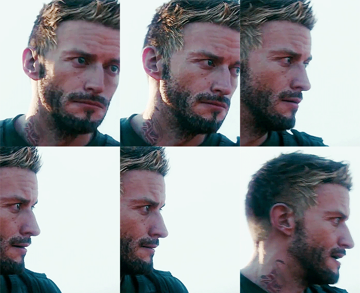
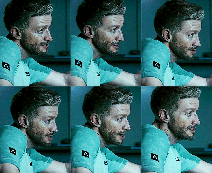
One of the few times I hope Misterxmedia makes an article.
http://i.imgur.com/SAcd3Mp.jpg
http://i.imgur.com/SAcd3Mp.jpg
Follow along with the video below to see how to install our site as a web app on your home screen.
Note: This feature may not be available in some browsers.
Saw that the other day and to be honest, you could achieve that look by moving a couple lights here and there and colour/contrast correct.One of the few times I hope Misterxmedia makes an article.
http://i.imgur.com/SAcd3Mp.jpg
Saw that the other day and to be honest, you could achieve that look by moving a couple lights here and there and colour/contrast correct.
Because they're not me? DOH!So then why didn't they?


Wouldn't say they hated it. I found it very distracting in Drakes Fortune.I wonder why Naughty Dog hates motion blur. It would look much better with it.
I thought you(!) hate blur? Or what do your 100 posts about blur in The Order thread mean???I wonder why Naughty Dog hates motion blur. It would look much better with it.
I like motion blur, not smearing vaseline on the screen.I thought you(!) hate blur? Or what do your 100 posts about blur in The Order thread mean???
Now I am confused...
Mitchell hair style was bad, it was fine for me to play him until he removed his helmet lol

What is that? Can you elaborate?My biggest issue is that they haven't fixed the bullet impact issue that the game has always had. Really hope they can do something about that before launch.
One of the few times I hope Misterxmedia makes an article.
http://i.imgur.com/SAcd3Mp.jpg
What is that? Can you elaborate?
They don't need to be in the same place. You can tell that the lighting is severely downgraded and the character model isn't nearly as good as it was before. Also far less foliage.About what? These shots are clearly not from the same point in the game ... the effects might be downgraded but you could never tell from these shots in isolation.
