Install the app
How to install the app on iOS
Follow along with the video below to see how to install our site as a web app on your home screen.
Note: This feature may not be available in some browsers.
You are using an out of date browser. It may not display this or other websites correctly.
You should upgrade or use an alternative browser.
You should upgrade or use an alternative browser.
Quantum Break: Graphics Tech
- Thread starter VFX_Veteran
- Start date
Yikes. This is primarily why I still give the nod to The Order for most visually impressive modern title - the consistency.26 png captures from chapter 4 on high settings on PC with upscaling turned off (native 1080p) and AF forced to x16 through nvidia driver
http://abload.de/img/quantumbreak5_2_20161vtkb1.png
http://abload.de/img/quantumbreak5_2_20161imj95.png
There are are no doubt an ample selection of stunning setpieces in QB and the environment reconstruction with the time effects makes the comparison between the games somewhat unfair as QB's engine is likely 'doing more', but IME you just don't see glaring standouts like the two shots above. You can take a random shot in The Order of any chapter at any time and have it look at the least exceptional if not debatable that it's pre-rendered, whereas QB seems to be far more hit or miss.
Metal_Spirit
Regular
Must agree with you Dave.
On those two pictures the low geometry, textures and the papers and folders as a texture on the floor, without any volume, stand out!
Regardless of this, there are stunning locations and details on QB. Game is way above average looking, and the light quality... i find it amazing!
Its a console game... with console limitations. So I prefer to point out the good things, instead of the bad ones, although both should get attention.
I think the most glaring issues with the game visually are all the low resolution buffers and aggressive lod. Volumetric light sources look like fog most of the time, like this:
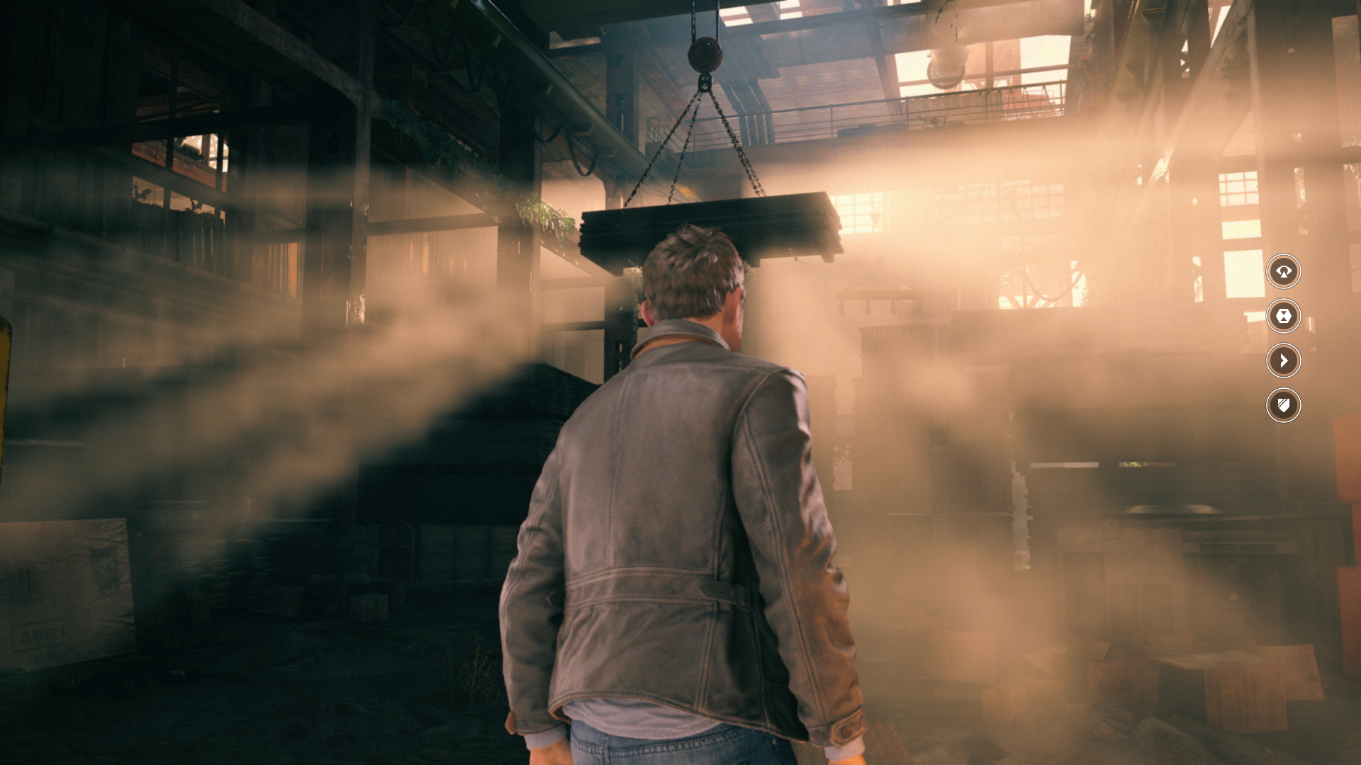
And this

But it's undeniably a beautiful game in motion, when everything clicks it looks really good. It's just that it's very inconsistent, i think my personal highlights from the game are the big set pieces with the time machine and the time of day changing rapidly, and the time stutter parts of the game which have lots of animated/warping geometry and great sound effects. I too think The Order looks better overall, simply because it doesn't show its weaknesses so easily. Plus material shading is on a different level and that's not a knock on Quantum Break, nothing so far reached the heights The Order did, especially when it comes to realistic materials.
Few of my screenshots from The Order to better illustrate my point
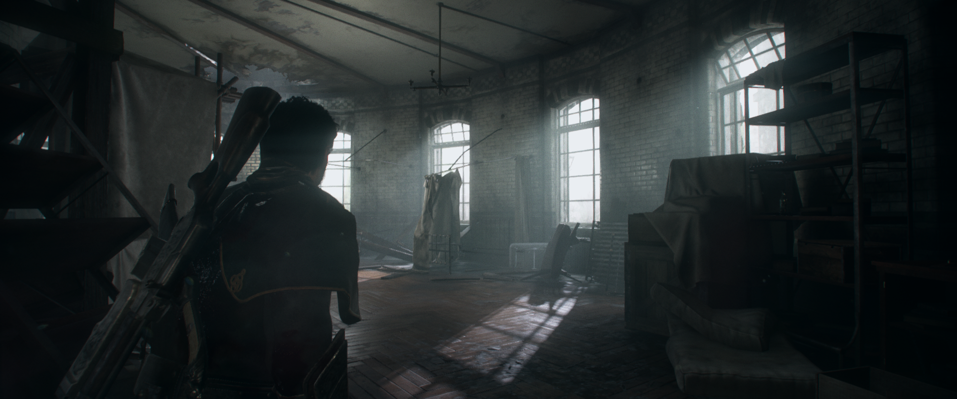
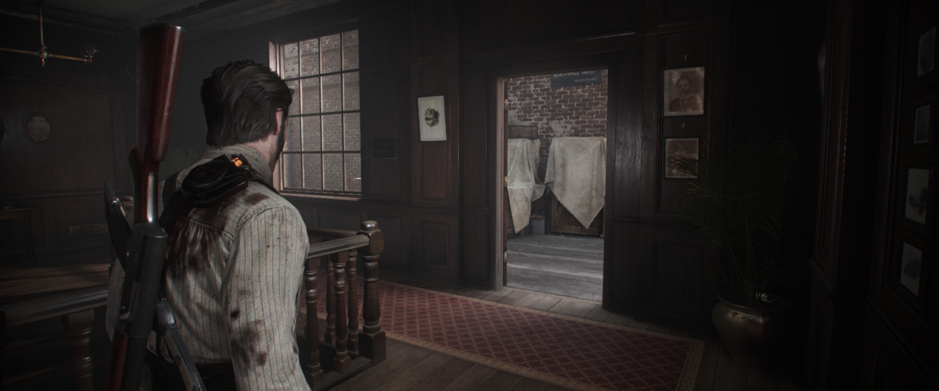
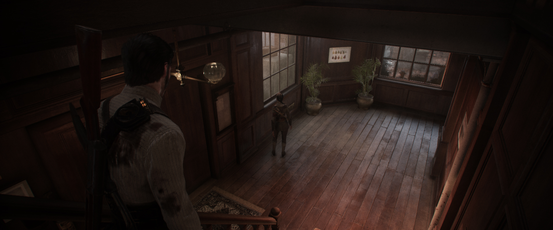

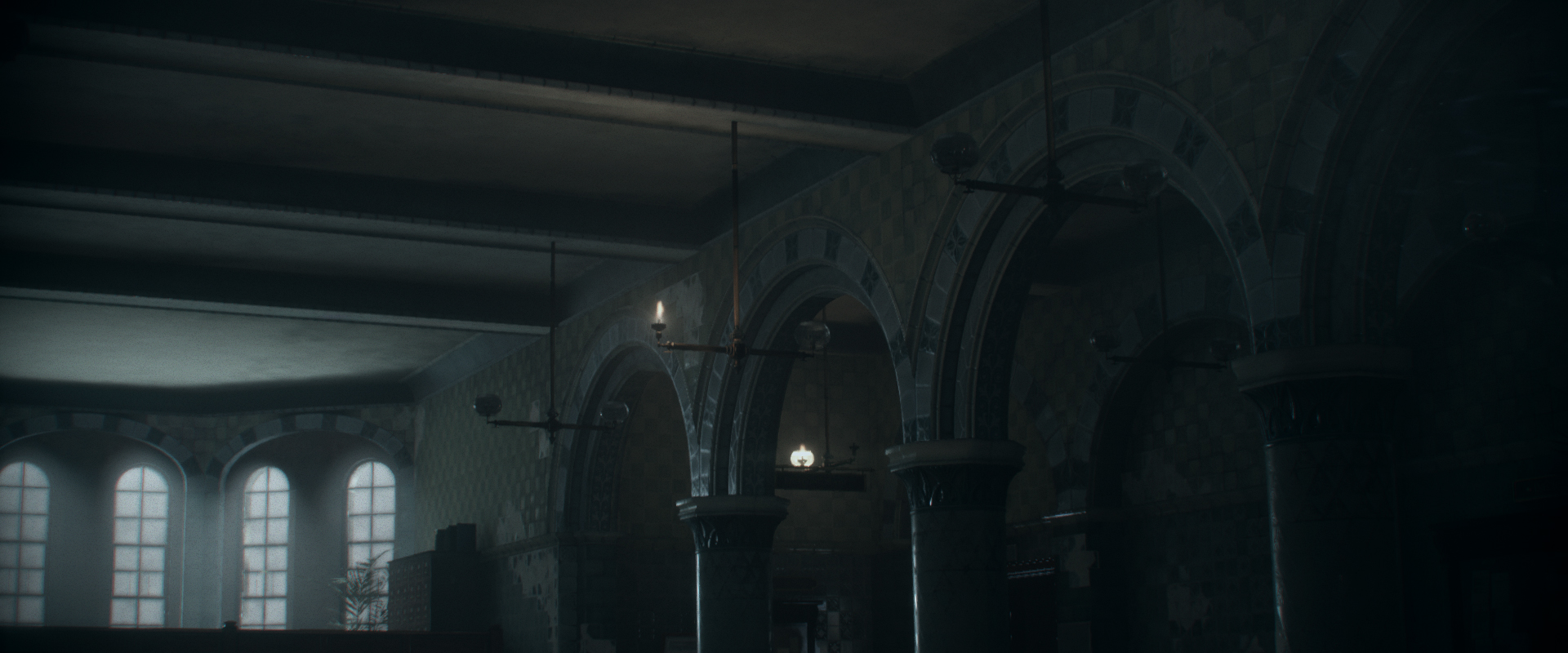
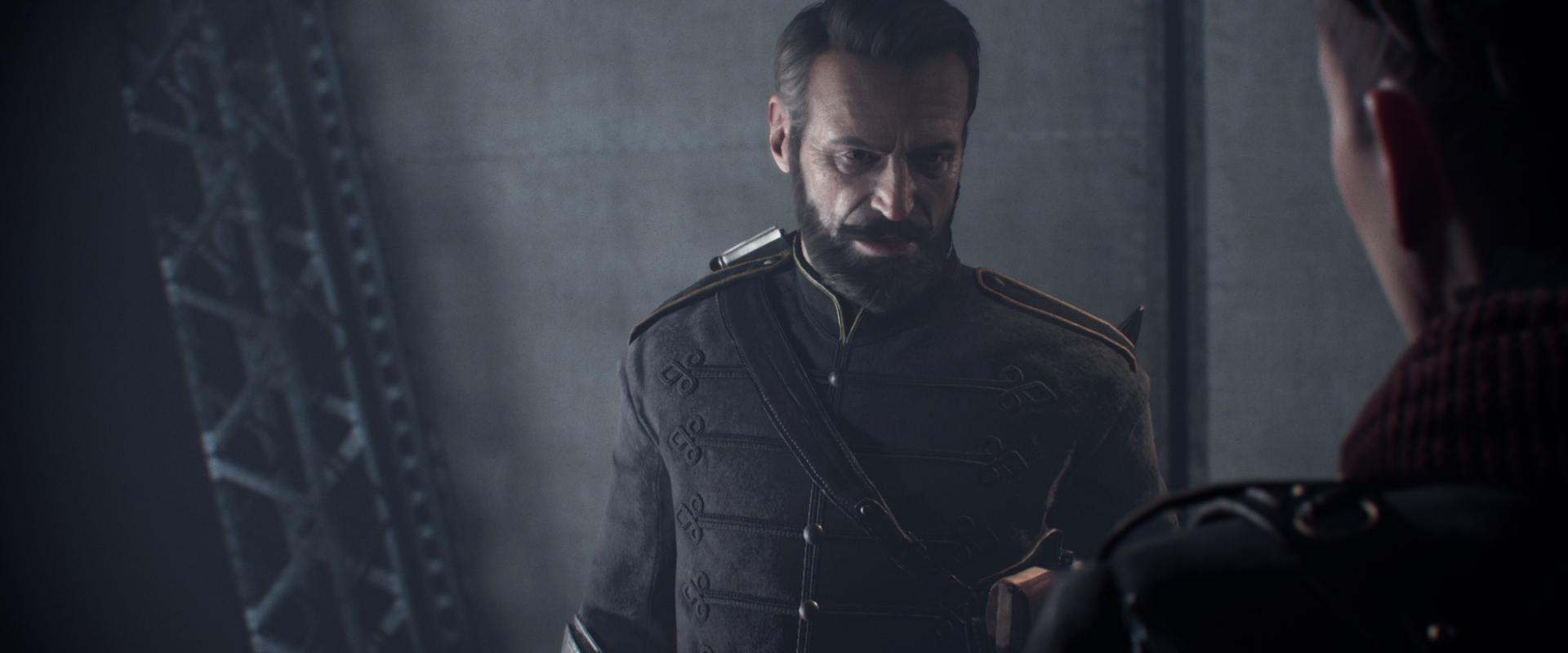
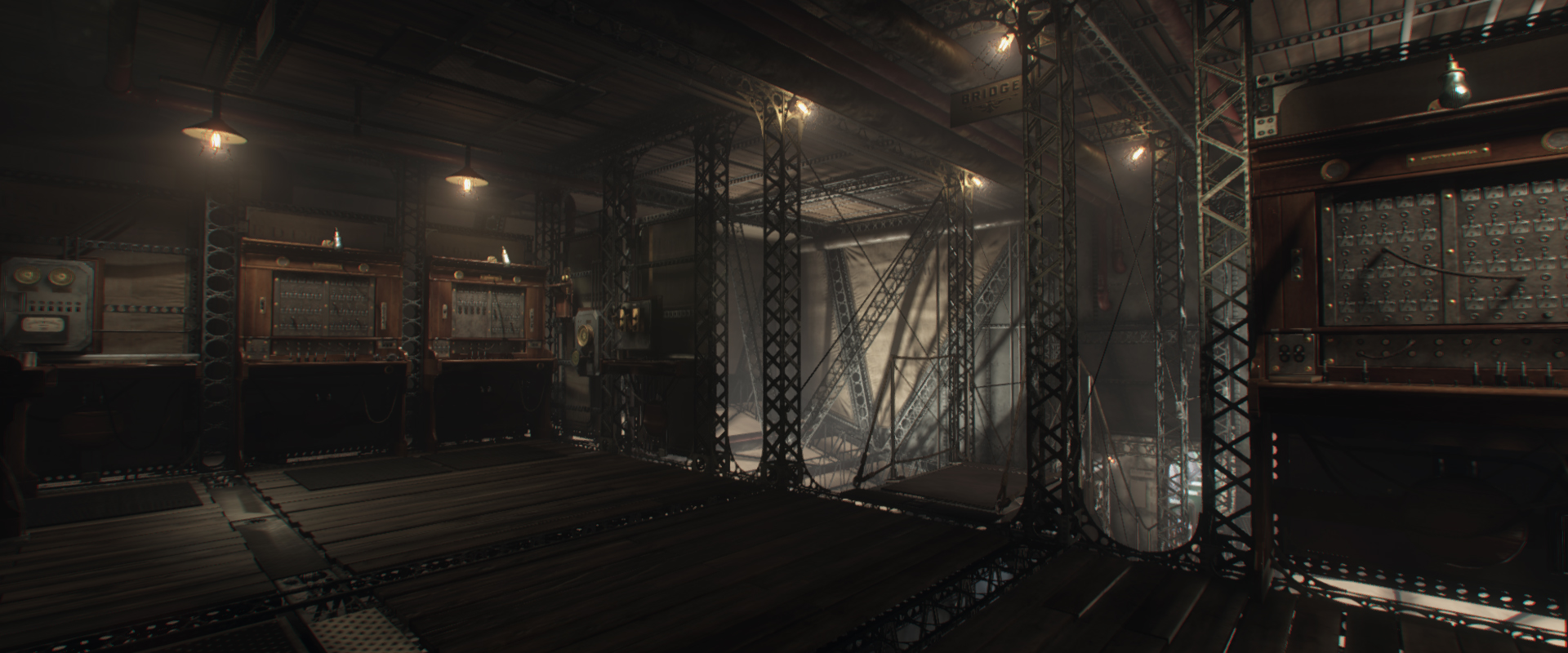
More here: https://www.flickr.com/photos/128836441@N08/albums/72157650510207659
But i do think there are a few areas Quantum Break is better than The Order. For example, facial animation in cutscenes which is extremely well done, and The Order is nowhere near as chaotic as Quantum Break can get with all the warping geometry and stuck in a loop objects on screen. The Order has an advandage on running everything in real-time though, in QB there's quite a few cutscenes that are pre-rendered (12gb folder full of videos in the PC version, and that's not including the TV show). You can usually call these out by the increased IQ.

And this

But it's undeniably a beautiful game in motion, when everything clicks it looks really good. It's just that it's very inconsistent, i think my personal highlights from the game are the big set pieces with the time machine and the time of day changing rapidly, and the time stutter parts of the game which have lots of animated/warping geometry and great sound effects. I too think The Order looks better overall, simply because it doesn't show its weaknesses so easily. Plus material shading is on a different level and that's not a knock on Quantum Break, nothing so far reached the heights The Order did, especially when it comes to realistic materials.
Few of my screenshots from The Order to better illustrate my point


More here: https://www.flickr.com/photos/128836441@N08/albums/72157650510207659
But i do think there are a few areas Quantum Break is better than The Order. For example, facial animation in cutscenes which is extremely well done, and The Order is nowhere near as chaotic as Quantum Break can get with all the warping geometry and stuck in a loop objects on screen. The Order has an advandage on running everything in real-time though, in QB there's quite a few cutscenes that are pre-rendered (12gb folder full of videos in the PC version, and that's not including the TV show). You can usually call these out by the increased IQ.
Last edited:
I don't mind the upscaling so long as it's optional. I'll take prettier pixels (with good AA) over more pixels any day. Hell my current monitor only does 1600x900 (lost my good monitorhttp://abload.de/img/quantumbreak5_1_2016430j4p.png
I think the reconstruction technique fits the style and asset quality of the game more, as you up the resolution more things become obvious, while they are cleverly hidden with the normal reconstruction technique.
How do you lose a monitor? A good one too!
VFX_Veteran
Regular
While playing QB today, I noticed something that I never did before -- which makes QB even more impressive graphically!
The PBR materials in this game are pretty good but what the dev team has done is incorporate actual reflections on materials that are NOT completely mirror. As an example, you walk up to a shiny surface that clearly has some diffuse on it like a shiny table. The table has what I would call a "clear coat" layer where it will have a high roughness but still reflecting. Shooting a box on this table, for example, will yield the true reflection of that box on the table wherever the box moved after shooting it. So it's not just a capsule AO affect like The Order with no color information. It's another big step up to trying to simulate reflections on a rough surface.
I can imagine having that on along with the stellar GI implementation would make for a very power hungry game.
Isn't that just the screen-space specular?While playing QB today, I noticed something that I never did before -- which makes QB even more impressive graphically!
The PBR materials in this game are pretty good but what the dev team has done is incorporate actual reflections on materials that are NOT completely mirror. As an example, you walk up to a shiny surface that clearly has some diffuse on it like a shiny table. The table has what I would call a "clear coat" layer where it will have a high roughness but still reflecting. Shooting a box on this table, for example, will yield the true reflection of that box on the table wherever the box moved after shooting it. So it's not just a capsule AO affect like The Order with no color information. It's another big step up to trying to simulate reflections on a rough surface.
I can imagine having that on along with the stellar GI implementation would make for a very power hungry game.
As far as how it compares to The Order's capsule-based occlusion, it contains more information but also lacks the stability.
Last edited:
Isn't that just the screen-space specular?
As far as how it compares to The Order's capsule-based occlusion, it contains more information but also lacks the stability.
It's screen space yeah, made this couple days ago
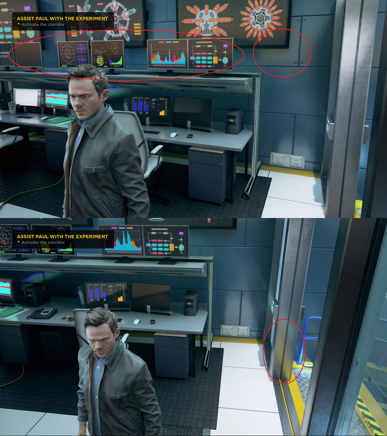
And it seems to be a hack not some complex calculation, seems like the rendering engine thinks the orange parts of the screen would bounce light against the monitors there (which wouldn't happen realistically), see how the orange hue disappears when the orange parts in the tv screen are out of screen space. So technically, it's an "error" but can look good in quite a few places, can look weird in others (like the screen i posted).
Edit: It's the same as the screen "bouncing" light exactly behind it in the screenshot above, which is impossible.
Last edited:
VFX_Veteran
Regular
Isn't that just the screen-space specular?
Yes, it is.. but it's use is quite conservative in games these days. Only being noticed on perfect mirror surfaces most of the time. QB seems to use it liberally and as an extra term for the final BRDF color.
VFX_Veteran
Regular
It's screen space yeah, made this couple days ago
And it seems to be a hack not some complex calculation, seems like the rendering engine thinks the orange parts of the screen would bounce light against the monitors there (which wouldn't happen realistically), see how the orange hue disappears when the orange parts in the tv screen are out of screen space. So technically, it's an "error" but can look good in quite a few places, can look weird in others (like the screen i posted).
Edit: It's the same as the screen "bouncing" light exactly behind it in the screenshot above, which is impossible.
Why are we all suddenly complaining about screenspace computations when that's all the hardware is good enough for at this point? Where are the world space calculation games at? The fact that they at least have SOMETHING resembling reflections as opposed to nothing at all is an achievement in my book.
When you are talking about hardware are you specifically talking about Xbox One? There might be a connection there, but it's definitely on Remedy to decide if they want to use something more stable or something less stable and have inconsistent results, with things looking good in some places and bad in others. QB is using screen space info for almost everything, i bet you Remedy know what the problems are right now and their next title won't be as reliant on screenspace techniques as QB was.
VFX_Veteran
Regular
When you are talking about hardware are you specifically talking about Xbox One? There might be a connection there, but it's definitely on Remedy to decide if they want to use something more stable or something less stable and have inconsistent results, with things looking good in some places and bad in others. QB is using screen space info for almost everything, i bet you Remedy know what the problems are right now and their next title won't be as reliant on screenspace techniques as QB was.
But you aren't giving me an example of a game that doesn't use screenspace techniques? How is Remedy getting points taken away for something that everyone in the industry uses? The only world space AO is in RoTR for the PC and that drains the graphics card. I've never seen a world space reflections technique in a game either. Volume ray-marching for volume lights only in Lords of the Fallen. Volume smoke with ray-marched world space computations? Batman:AK with NvidiaFX patch. Again on the PC. Name a console game that uses world space for AO, reflections, volume lighting, etc..?
There are ways of increasimg the stability and hidjng some of the artifacts of Screen Sapce effects, at the cost of making them less pronounced. QB consistently favoured good looks on non-problem scenarios in detriment of stability in harder situations, in all the SS effects implementations they used.
Not really. That's one of the reasons I'm not generally fond of it.Yes, it is.. but it's use is quite conservative in games these days.
There are plenty of counterexamples though, and have been for years (i.e. KZSF).Only being noticed on perfect mirror surfaces most of the time.
Sampling color in screen-space specular is typical.QB seems to use it liberally and as an extra term for the final BRDF color.
Not sudden. I've been complaining about screen-space reflections since they started to catch on.Why are we all suddenly complaining about screenspace computations
Older games, implementations that sacrifice completeness for stability (like Order 1886 capsules), games which have fairly generalized volume irradiance representations (this isn't yet very typical, but upcoming cases like Tomorrow Children do a huge amount of stuff in world space).Where are the world space calculation games at?
Sort of. Especially in games that have reasonably free vertical camera control, I think SSR often looks worse than classical sketchier methods with less-complete reflections. Yes, it looks subtly more accurate when it works, but it's also actively distracting when it doesn't, and in many cases you're getting obvious artifacts on-screen constantly.The fact that they at least have SOMETHING resembling reflections as opposed to nothing at all is an achievement in my book.
This doesn't simply not look right, it actively jumps out with wrongness:

Even in implementations where the cubemaps match power with expected SSR, you get weird smudge bubbles dangling around objects.
Last edited:
VFX_Veteran
Regular
There are plenty of counterexamples though, and have been for years (i.e. KZSF).
I have KZSF and do notice SSR. Perhaps on materials, but definitely not common in most games.
Sampling color in screen-space specular is typical.
Of course, but not on every object that has specular.
Not sudden. I've been complaining about screen-space reflections since they started to catch on.
Everything is mostly done in screenspace. That's the limitation a dev has to deal with the hardware we have today. I still don't see why downplaying it strictly for QB isn't being bias. Also, I'd love for games to implement world space calculations on everything, unfortunately we aren't there yet.
Older games, implementations that sacrifice completeness for stability (like Order 1886 capsules), games which have fairly generalized volume irradiance representations (this isn't yet very typical, but upcoming cases like Tomorrow Children do a huge amount of stuff in world space).
Fair enough. I prefer actual color though.
Sort of. Especially in games that have reasonably free vertical camera control, I think SSR often looks worse than classical sketchier methods with less-complete reflections. Yes, it looks subtly more accurate when it works, but it's also actively distracting when it doesn't, and in many cases you're getting obvious artifacts on-screen constantly.
This doesn't simply not look right, it actively jumps out with wrongness:

Even in implementations where the cubemaps match power with expected SSR, you get weird smudge bubbles dangling around objects.
Yeap. I still consider not having any reflection as "more" wrong. You simply can't remove reflections on a material and then call it PBR. Indirect is just as important to the look of a scene as direct lighting IMO.
Furthermore, not adding contact shadows for occlusion (which is very prevalent in almost every game) and only sampling static GI spheres and adding that as an ambient term to the BRDF is nowhere near considered "physically-based" -- IMO of course.
Last edited:
The problem isn't necessarily the screenspace techniques (which i do have a problem with) but that Quantum Break is using so much screen space info that it looks completely out of place most of the time, one example being the screen space specular I posted in a video previously.
Edit: This
That just looks wrong.
Although to be fair there are instances where this is a non-issue in some chapters. Especially when you don't have high contrast areas, Chap 3 looks fine most of the time for example.
Edit: This
That just looks wrong.
Although to be fair there are instances where this is a non-issue in some chapters. Especially when you don't have high contrast areas, Chap 3 looks fine most of the time for example.
Last edited:
VFX_Veteran
Regular
There are ways of increasimg the stability and hidjng some of the artifacts of Screen Sapce effects, at the cost of making them less pronounced. QB consistently favoured good looks on non-problem scenarios in detriment of stability in harder situations, in all the SS effects implementations they used.
So? Why should it be a "negative" with regards to the graphics tech used? Should we all just go back to light maps lighting?
Similar threads
- Replies
- 28
- Views
- 3K
- Replies
- 26
- Views
- 2K
- Replies
- 156
- Views
- 10K
- Replies
- 37
- Views
- 3K
