You are using an out of date browser. It may not display this or other websites correctly.
You should upgrade or use an alternative browser.
You should upgrade or use an alternative browser.
Gears of War 4 [XO, XPA]
- Thread starter Clukos
- Start date
Not sure how I feel about the graphics in the new video, it's a bit inconsistent really, the lack of object density and iffy textures perhaps. The final cutscene did look impressive tho, I hope they improve the lighting in gameplay a bit more.
As for robots in Gears, no thanks, I prefer more creature related enemies, you know big ugly, scary looking creatures, otherwise it just looks too similar to the new cod.
As for robots in Gears, no thanks, I prefer more creature related enemies, you know big ugly, scary looking creatures, otherwise it just looks too similar to the new cod.
Damn, have you been pushy with your stylized vs. photorealism agenda lately. Do you think if you bitch about it enough times people will start agreeing with you until the whole industry is steered into the direction you'd like it to?The bullshots for the first Gears of War looked better than this game. I wish they could push through the stylism and focus on photorealism. If their primary render target for Scorpio is 4K, I don't think this will happen.
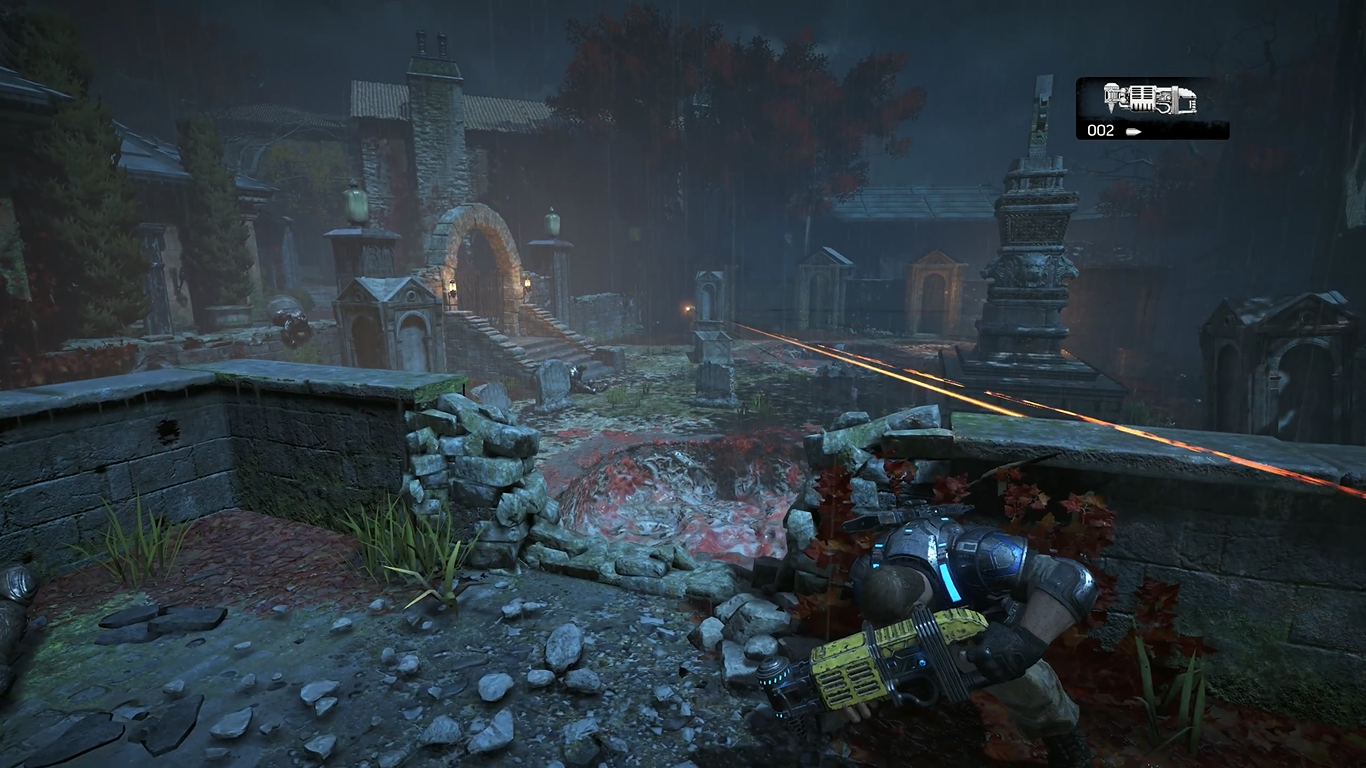
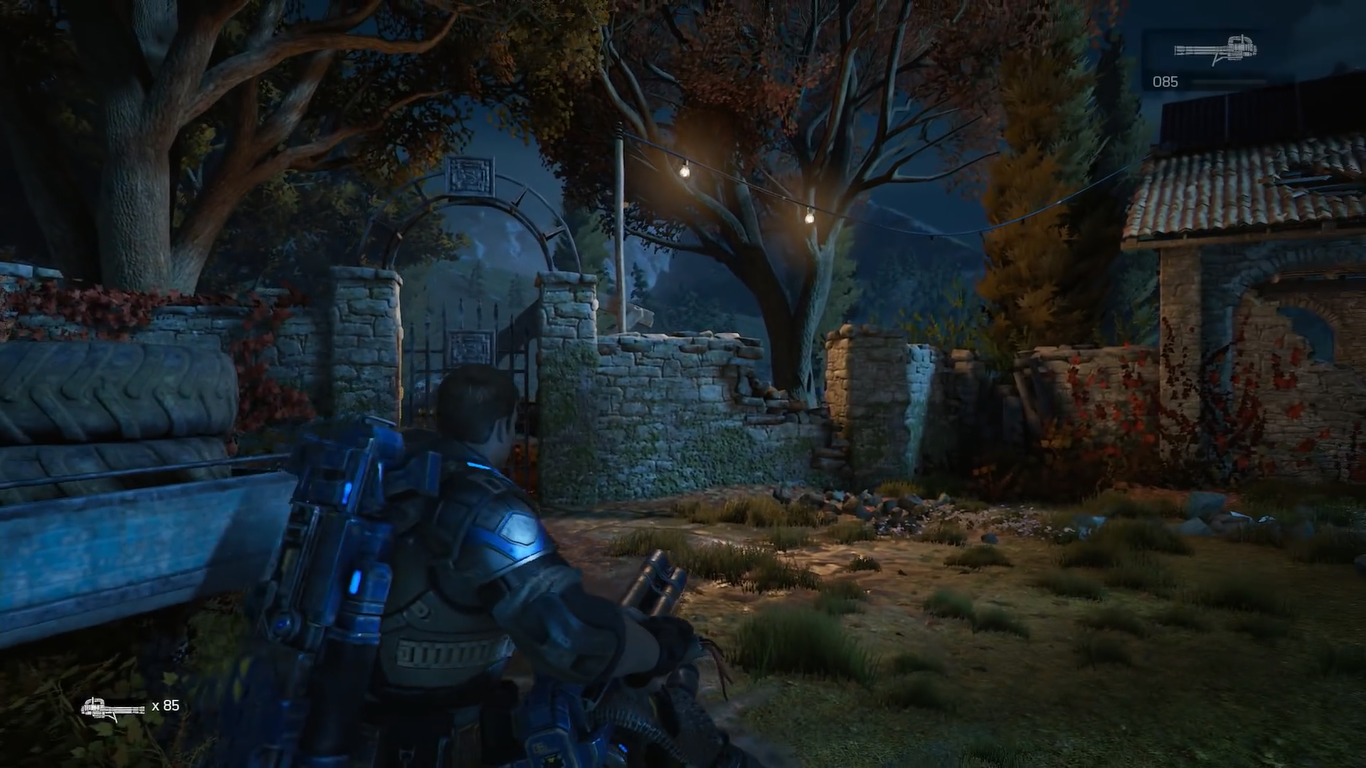
Gear of War 4 : 2016 VS 2015
Excellent image quality, otherwise, for the moment, the game isn't especially impressive. Compared to the best looking games on the market, it has flat lighting, inexistent physics, average animations and inconsistent texture quality.
Why is the color palette so limited? It's worse than some NES games. They probably do it on purpose but It's really not appealing.
Silent_Buddha
Legend
"Inexistent physics"? I'm guessing he means non-existent.
Are people watching a video other than the one linked? There's plenty of physics simulations in that. I see ragdoll physics and particle physics. There even appears to be some rudimentary cloth physics on the loincloths that some of the enemies wear.
Sure, it's not in your face waving its physics in your face. There's no billowing cloaks that would get any combat soldier killed if they ever actually wore one into combat. There's no box stacking going on. Corpses aren't flying around as if they weighed all of 10 pounds (~4.5 kg) to make sure people notice their physics implementations, etc. So, I guess a more apt description is that there isn't any excessive or unnecessary physics going on.
Regards,
SB
Some great looking gifs (I dunno, was there some B3D policy against gifs? Anyways I spoiler tag them)


Textures and lighting, weather effects look so good.jpeg.
Coming in less than two months but, a long two months
I guess there will be PC crussbuy? Well my plan is for BF1 to show off my new rig but, hey.


Textures and lighting, weather effects look so good.jpeg.
Coming in less than two months but, a long two months
I guess there will be PC crussbuy? Well my plan is for BF1 to show off my new rig but, hey.
the most colorful gears of war ever!
Sigfried1977
Legend
Of that comparison, the 2015 level looks better (atmosphere and graphics wise). But, the 2016 level has been confirmed to be an old build so it could have changed by now.
Remember that you are also supposed to play the damned thing. Clive Barker's Jericho levels of darkness may be oppressively atmospheric, but playing such a game is also an eye-straining ordeal.
RenegadeRocks
Legend
Wish they would give us Gear 2 and 3 on pc.
Sent from my SM-N920G using Tapatalk
Sent from my SM-N920G using Tapatalk
"Inexistent physics"? I'm guessing he means non-existent.
Yeah, i meant non-existent lol.
9min5 : when the monster jump on some of the cars, they don't even move... at least for the moment.
There is not hit detection : 2min40
Corpses aren't flying around as if they weighed all of 10 pounds (~4.5 kg) to make sure people notice their physics implementations, etc. So, I guess a more apt description is that there isn't any excessive or unnecessary physics going on.
I'm not sure about that : 6min59
Last edited:
Yeah, that 4k video is an OLD build. If you watch the latest gameplays, Old Marcus and Introducing DeeBees. The former has an ugly, grey tint whilst the latter has a saturated blue tint and all the newest gameplays have bushes of grass as the most common foilage and 4k have these strands of grass that look like placeholders.
4k

DeeBees footage

Far better ambient occlusion in the newer videos as well.
4k

DeeBees footage

Far better ambient occlusion in the newer videos as well.
Similar threads
- Replies
- 21
- Views
- 2K
- Locked
- Replies
- 27
- Views
- 3K
- Replies
- 1
- Views
- 4K
- Replies
- 15
- Views
- 2K
- Replies
- 90
- Views
- 17K
