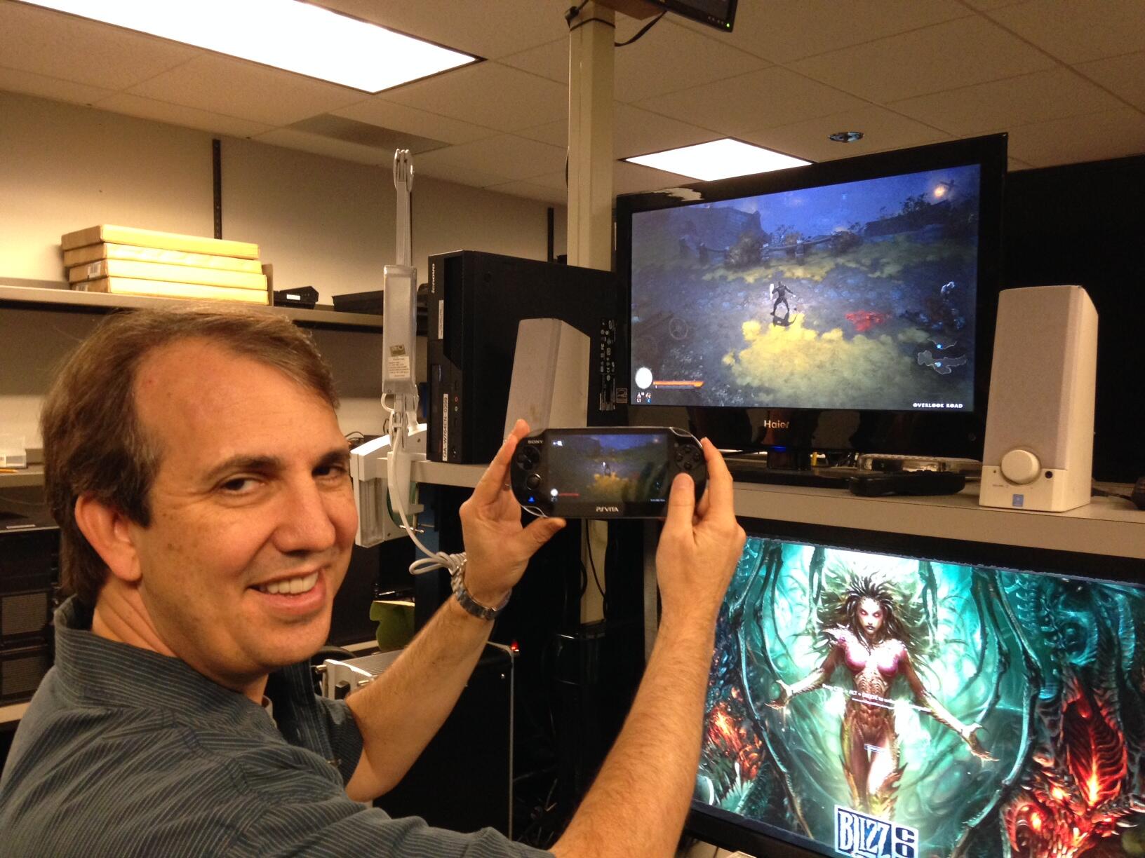
Diablo 3 - Gamepad Edition

Not that I know of. It's a full retail game.

As an update to my post Cyan quoted, in multiplayer we quit the game and restarted at that point with Monster Level 3, I think, and it became a lot more challenging and enjoyable. But it's still pretty broken regards stats and skills IMO, and one can easily overpower the game unless it's on stupidly-hard mode, at which point one can barely move without dying.

My Monk couldn't manage any difficulty beyond Normal to begin with, but I have a Normal monk who's unstoppable, just wading through the monsters. Completely OP (even when the game laughably tries up up the difficulty by dumping 30+ mobs on screen). He needs a greater challenge, but that was impossibly frustrating when starting a game at that mode. It just doesn't scale well (I'm only playing as an occasional time-passer to get a rare drop for the Staff of Herding. I have all three items but one is on a Hardcore character and I need to farm it again).

Also, the game can't cope with the graphics, and with three players, the Witch Doctor's bat skill wasn't getting drawn sometimes. Made it a bit tricky.
 
I am also having difficulty issues with the game, like i said earlier, my Demon hunter pretty much felt OP throughout the game on normal. Then I starteda gain on hard+Monsterlevel 2 and things got better with a just the right bit of challenege in online co op, but now somehow in act2, i seem to have hit a wall with this character. While everyone around me , being similar levels, are monster ass to heaven, my Demon Hunter is squeamish little rat who just can't take it ! It doesn't feel normal at all. Don't know whichw ay to go from here :???:
 
This PS4 feature is actually pretty cool :

What's more, new social features not found on PC will be included on PS4 version.

The most prominent of which is a new Adventure Kills system, which Berger described as "by far the most fun." Through this new system, when a player is killed by a monster, there is chance that the monster will level up and jump into a friend's game.

The first player's friend will be prompted with a message saying "Matthew's bane is stalking you," at which time the monster--described as elite and with special abilities--will appear on his screen. If the second player defeats the monster, the first player will receive a message saying their death has been avenged and the second player will receive loot.

That sounds fun :D

@Billy Idol: player mail solves our problem of not being able to get into one game :

The other two new social systems are Player Mail (players can mail items to other players), and Player Gifts. Here, when a Legendary item drops, a second item will also drop with a friend's name on it. This item, of appropriate rarity and tailored made for any character the friend wants, will be delivered to the friend.

These arw facebook game-like ideas but I am getting excited again ! This sounds like fun stuff !
 
BY1YZiLCcAAFGtO.jpg:large
 
Isn't simpler to re-design the HUD and make it minimal so that it will work well regardless of the dimension of the screen rather than make 2 HUDs, on for PS4 and one for PS Vita?
 
They're a PC dev. Making for small screens is new to them. Making a HUD for a console proved a little taxing for them - eg four play local coop and a common effect to all players results in 8 green icons appearing around the screen. Its very messy and clearly a hodge-podge from their PC design philosophy. I expect the same UI for PS4 (which'll be less obtrusive at 1080p), and something cobbled together for remote play on small screens. If the small screen interface is good, they may learn something about future console game design optimisations .;)
 
In all fairness a lot of devs need to learn how to design UI/HUD in a decent way or even better learn how to not use HUD at all.

P.S.
If I was a dev I would be a UI/HUD designer because it's an area where there is a lot of room for improvement ;)
 
Last edited by a moderator:
You can't really play a game like diablo without seeing your health or resource level though.
 
In general I can say that informing the player can can always done "organically" in a coherent and believable way by using animations, visual & audio cues or in consoles case even haptic feedback.
HUD is not a necessity, it's a habit that dev have, a "bad" habit IMO.
Though if a dev doesn't want to be so "extreme"/ forward thinking and remove HUD then it can at least make it stylish an minimal.
Blizzard is surely not forced to use a HUD that is so intrusive.
 
Last edited by a moderator:
It's a full retail game like Shifty said. I've played through the PS3 version which was OK. The fact that you can import your PS3 data into the PS4 version has made me far more interested in re-buying it.

For some reason, I thought they have gone F2P.

I'll most likely wait a while to see if the game will make it into PS+ ;-)
 
In general I can say that informing the player can can always done "organically" in a coherent and believable way by using animations, visual & audio cues or in consoles case even haptic feedback.
Many of us turn off rumble. And in D3, there are plenty of times when I can't see my character under all the special effects. A subtle animation showing I'm getting hurt wouldn't be good enough. I don't have issue with the use of a UI in this game, which is an arcade action game, a button masher, and hardly an immersive, character led, realistic title. The traditional health and energy bars have their use. It's the other icons, and particular there presentation, that I find jarring in this game.
 
Back
Top