You are using an out of date browser. It may not display this or other websites correctly.
You should upgrade or use an alternative browser.
You should upgrade or use an alternative browser.
Case Design of PS3
- Thread starter Arty
- Start date
Oh please! Since when did aesthetics become unimportant? I guess you just LOVE soviet industrial design then? I bet your home is brown and grey with square boxes and bolts and rivets everywhere, no?Bobbler said:Frankly, the consoles could a brown bag of parts for all I care
A console is a small thing, but it will nevertheless help it's sales and overall image tremendously if it looks good.
You shouldn't stack electronic devices.jvd said:Squeak i've already said the rounded top or i guess the curved top . The ps3 will be under other things like my reciever , dvd player , gamecube and xbox 360 .
Especially temperatures sensitives devices like consoles.
And about the thread subject, I'd say that the PS3 desgin is not offensive. It doesn't look great, but it doesn't look bad, so nothing to say or complain about it.
I hope they sell the the black model, though, the one with the gloss finish, it looks way better than the horrible grey one.
And the only good thing about the batarang is that it seems that they're using a new system for the analog sticks. Since there's no way to include, in the new pad, the big, and awfully imprecise, system made of potentiometers + motion sensors. Well, maybe they're using smaller motion sensors...
But that would mean that for another complete generation, the Dual Shock will be useless in FPS and TPS...
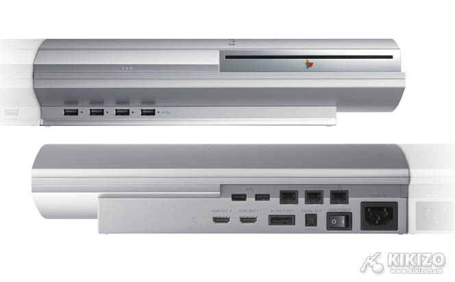
I think the PS3's design is pretty nice. It looks better camera shots than it does in the promo's, the pastic used is shiny and reflective and looks really nice. Also, I like the slot loading, and the metal accents as well (the trim of metal that lines the face of the unit), it looks especially nice on the black unit.
Overall its in line with what I expect of a next-gen console design. I just hope it isn't too big, if its around the size of the X360 it'll look nice. If its as big as Xbox1... :/
Overall its in line with what I expect of a next-gen console design. I just hope it isn't too big, if its around the size of the X360 it'll look nice. If its as big as Xbox1... :/
Again how would you have done it differently/better?jvd said:err the ps3 is a generic design . Its a piece of plastic in a rectangle with a curved top. Don't see whats impressive about it .
There are limitations to what you can do in a certain pricerange and with existing molding equipment you know.
And you would scare many people of by doing something completely insane, like a Gaudi inspired design for example.
MechanizedDeath
Regular
I'll wait for feedback on that controller before passing judgement. Looks mean nothing for functionality and ergonomics. If it's comfy as hell and works great, I don't want them to change a thing, no matter how odd it looks. The Mako pad for the N64 is still my favorite pad ever. Just so incredibly comfortable, assymetry just makes the most sense. This thing looks ugly as all hell, right?

But held in my hands, this thing was heaven wrapped in plastic. Short-throw analog stick, and a better-placed trigger. Looks mean nothing. I want someone to hold this controller first before it gets binned. PEACE.

But held in my hands, this thing was heaven wrapped in plastic. Short-throw analog stick, and a better-placed trigger. Looks mean nothing. I want someone to hold this controller first before it gets binned. PEACE.


See, the console looks a lot better than people give it credit for. I think that its the best design of next-gen consoles, its got a very sleek look to it regardless of whether its in the horizontal or vertical position. With PS2 I only liked it in the vertical postition, this is a step up from that design IMO.
jvd said:err the ps3 is a generic design . Its a piece of plastic in a rectangle with a curved top. Don't see whats impressive about it .
As opposed to a white piece of plastic in a rectangle with a concave top?
Watch your posts . This conversation is about the ps3 . If you want to talk about the other boxes design make a thread about it .onanie said:jvd said:err the ps3 is a generic design . Its a piece of plastic in a rectangle with a curved top. Don't see whats impressive about it .
As opposed to a white piece of plastic in a rectangle with a concave top?
On certain angles I think it's a very sexy looking machine. On others, not so great. I like the angles in the pictures above, though.
Certainly the controller is very ugly at this point, but is that really what a controller is about? I think i'd take comfort over cosmetics any day of the week.
Certainly the controller is very ugly at this point, but is that really what a controller is about? I think i'd take comfort over cosmetics any day of the week.
It still looks hot for a console.version said:
Nicked said:version said:
I think it's a fair question, is the PS3 design more generic to all other designs in your opinion?jvd said:Watch your posts . This conversation is about the ps3 . If you want to talk about the other boxes design make a thread about it .onanie said:jvd said:err the ps3 is a generic design . Its a piece of plastic in a rectangle with a curved top. Don't see whats impressive about it .
As opposed to a white piece of plastic in a rectangle with a concave top?
Anyway, I like the PS3 design. I think it's one of the first consoles that looks really great or average depending on the angles. It just oozes Sony.
I've heard that it isn't too large just about the same size as the PS2 which is great in my book. It's too bad it seems we will only be getting the silver one, I personally think the black one is perfect. (The white one looks better too..)
For some reason the ps3 looks alot better standing up to me than laying down. I don't why by it just looks awkward horizontal. It also looks like it takes alot of real estate horizontal.
Personally Im a little disapointed in the console designs this coming gen. I think the ps3 is the weakest case Sony has made yet and MS has also failed to create the knockout design they needed after the ugly Xbox.
But then again I hardly look at my XBox when Im playing it.
Still looks like MS redesigned the Dell Optiplex

And Sony took a page out of Panasonic's book

Personally Im a little disapointed in the console designs this coming gen. I think the ps3 is the weakest case Sony has made yet and MS has also failed to create the knockout design they needed after the ugly Xbox.
But then again I hardly look at my XBox when Im playing it.
Still looks like MS redesigned the Dell Optiplex

And Sony took a page out of Panasonic's book

EpicZero said:I think it's a fair question, is the PS3 design more generic to all other designs in your opinion?jvd said:Watch your posts . This conversation is about the ps3 . If you want to talk about the other boxes design make a thread about it .onanie said:jvd said:err the ps3 is a generic design . Its a piece of plastic in a rectangle with a curved top. Don't see whats impressive about it .
As opposed to a white piece of plastic in a rectangle with a concave top?
Anyway, I like the PS3 design. I think it's one of the first consoles that looks really great or average depending on the angles. It just oozes Sony.
I've heard that it isn't too large just about the same size as the PS2 which is great in my book. It's too bad it seems we will only be getting the silver one, I personally think the black one is perfect. (The white one looks better too..)
If its about the size of the PS2 it will look fantastic. Size had a lot to too with how good or bad a console can look. PS3's design is hot for a smaller console (PS2 size), but will probably look too bloated if it were Xbox1 size.
For some reason the ps3 looks alot better standing up to me than laying down. I don't why by it just looks awkward horizontal. It also looks like it takes alot of real estate horizontal.
It actually looks good horizontally as well, the shots above aren't indicative of how it looks in that postition. Check this one out, best screen I could find of the PS3 in the pure horizontal postion...

Similar threads
- Replies
- 223
- Views
- 20K
- Replies
- 21
- Views
- 2K
- Replies
- 14
- Views
- 3K
- Replies
- 21
- Views
- 9K


