Windows 11 [2021]

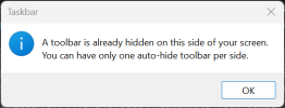
1676982843599.png

just came back from hospital and my computer shown that to me. what does that even supposed to mean ROFL.

one "per side"?

since when did windows able to use multiple taskbar on multiple sides?
heck, since when did windows 11 allows the taskbar to be moved to the sides?

oh and i didnt have "auto hide taskbar" enabled.

EDIT:
uh.. actually, what the heck is a toolbar? the error popup window title = taskbar. but the paragraphs says toolbar
 
I installed Windows 11 on my new PC and I hate it more than I thought I would. It is really annoying compared to Windows 10 which already wasn't great. I saw a Linus Tech Tips video recently where they ran Windows 98. The network adapter properties have buttons to release and renew DHCP leases. Reminded me how much better the UI used to be.
 
I installed Windows 11 on my new PC and I hate it more than I thought I would. It is really annoying compared to Windows 10 which already wasn't great. I saw a Linus Tech Tips video recently where they ran Windows 98. The network adapter properties have buttons to release and renew DHCP leases. Reminded me how much better the UI used to be.
Honestly WinXP (and maybe Win7) were peak Windows for me. Win10 is mostly ok except for (1) the dumbing down of the Control Panel and (2) the constant armtwisting to get you to log in using a MS account. X-(
 
Windows 8 and 8.1 was amazing.

Desktop stuff are in classic control panel, tablet stuff are in UWP.

Lots of amazing UX to be used in a tablet.

Then windows 10 kinda try to facilitate both desktop and tablet. Okay...

Then windows 11 completely destroyed the tablet experience and crippled the desktop experience
 
The problem is the Microsoft Store apps still aren't so hot and even tablet users are mostly on the desktop I think. So you want the desktop to be pretty usable on tablets / touchscreen convertibles / whatever. That's what 10 was going for along with backpedaling on the incredibly stupid "force desktop users to the Start Screen" backlash.

Windows 10 has "tablet mode" so people who prefer 7 can be happy along with tablet people.

I think Windows 11 is an attempt to make it friendly for both desktop and tablets without the need for a tablet mode but yeah pretty awful. And seemingly to make MacOS users feel at home with the taskbar changes? I feel like I haven't seen them dupe MacOS UI concepts in such a shallow way before.
 
Last edited:
I think Windows 11 is an attempt to make it friendly for both desktop and tablets without the need for a tablet mode but yeah pretty awful. And seemingly to make MacOS users feel at home with the taskbar changes? I feel like I haven't seen them dupe MacOS UI concepts in such a shallow way before.

i wish journalists managed to make them speak out their reasonings. lots lots and lots of baffling design change.

the most obvious one is the heavily downgraded taskbar. its bad for desktop AND tablet. it has no better function at all AFAIK. it is a 100% total downgrade. for example the decision to remove the ability to pin taskbar to left/right side.

why? what does it even supposed to improve by removing that option?
it obviously makes tablet use annoying. as taskbar on bottom means its FAR AWAY from left or right thumbs.
for desktop... the benefit of removing the taskbar position is....

uh..
ah...
huh?

also zero benefit.
 
Windows 8 7 and 8.1 7.1 was amazing.
FIFY
Win8 was diabolically awful in many of the ways that Win11 is awful.

why? what does it even supposed to improve by removing that option?
Because it makes it more like a Mac and the clear intent of most of the fucked up terrible GUI stuff is to be more like Mac.
Most of it makes some sense on old-school 4:3 iMac or portrait-mode phone but absolutely nonsense in a world of ultrawides/2 or 3* 16*9 setups being the norm on desktop.
 
FIFY
Win8 was diabolically awful in many of the ways that Win11 is awful.


Because it makes it more like a Mac and the clear intent of most of the fucked up terrible GUI stuff is to be more like Mac.
Most of it makes some sense on old-school 4:3 iMac or portrait-mode phone but absolutely nonsense in a world of ultrawides/2 or 3* 16*9 setups being the norm on desktop.
These are personal opinions, please respect others'
I am on the same bandwagon actually, I really hated win 7 & 10 , really loved 8/8.1. And for some reason I also like win 11 (despite its obvious ui downgrades ) more than 10; 10 used to break many things I was using. And then break some more with updates. Tens of times the windows button was completely unresponsive in win 10..
That was a trully awful experience for me
 
I still find some good software, especially through people sharing things on github, but more often I find software that looks slick, but is slow and convoluted to use. I'd honestly prefer my software looked plain and retro if it meant it was fast, responsive and easier to use.
 
^^^ Yeah, it's the smartphone UI that killed the usability of a lot of software plus the obsession to connect to a cloud account for everything
 
When I turned my computer on a few days after building it a screen came up asking me to "finish setting up Windows", which I knew meant signing into my Microsoft account. The options were "ask again in 3 days" or continue. I chose Continue thinking I could then tell it to fuck off forever. Turns out once you click continue there is no way to go back. At that point you simply have to sign in with a Microsoft account. I had to hard reboot my computer with the power button to make it go away.

I'm not even super opposed to using a Microsoft account. I think it makes a lot of sense for many people. I just didn't want to fool with it at the time.

Also I have Windows Pro. I can kind of understand Microsoft pushing this for Windows Home, but on Pro it should not be like this. Most businesses I know of have their own local domains anyway, running in a super expensive Windows Server environment.
 
Last edited:
FWIW, if you're joined to a domain, it doesn't ask. In fact, part of the Pro license asking you for a login is actually to log in with your own company's domain creds so it can auto-join over the internet.
 
You can disable the network adapter or disconnect the network to get past the Windows account login during setup. Shift-F10 to devmgmt, or whatever.
 
Last edited:
FWIW, if you're joined to a domain, it doesn't ask. In fact, part of the Pro license asking you for a login is actually to log in with your own company's domain creds so it can auto-join over the internet.
I always install Windows and set up a local admin account before joining a system to a domain. Otherwise I would have to be on site with the customer when I install Windows, updates, and other software. Or I could set up a VPN to their network but that's a pain in the ass. I have to unplug the network cable and make sure to not connect to WiFi when I do the initial setup. This started with Windows 10. Windows Pro should not be like this. They could make it clear that you should use a Microsoft account or a domain account, but it should not be impossible to use a local account without disconnecting from the Internet.

BTW these are small companies with local domains. The larger companies with public domains don't have this problem.
 
Windows 12 expected next year ... perhaps with AI enhanced functionality.
Other companies like AMD are also producing hardware to make the new software emerge, and Microsoft is integrating artificial intelligence (AI) into Windows 12 to enhance its capabilities. It has been claimed that Intel has discussed Windows 12 compatibility with its next-generation CPUs internally. The tweet has been deleted, however rumored is that Meteor Lake will support Windows 12 and have 20 PCIe Gen5 lanes. Intel was approached to comment on the leak, but the corporation declined. Microsoft also remained silent when asked about rumors that Intel would soon begin supporting Windows 12.
 
Or you could use the free DISM toolkit and an unattend.xml file to roll an image that doesn't do any of that, and has a preset admin account and password created.

Perfect for small and large businesses alike :)

I may look into this. I used to have a deployment server but I stopped using it because it wasn't really saving me time. I typically only install a couple PCs a week.
 
Windows 8 and 8.1 was amazing.

Desktop stuff are in classic control panel, tablet stuff are in UWP.

Lots of amazing UX to be used in a tablet.

Then windows 10 kinda try to facilitate both desktop and tablet. Okay...

Then windows 11 completely destroyed the tablet experience and crippled the desktop experience

Absolutely agree. For the last 3 OSes, Windows 8 and 8.1 were by far the best, I even like it every so slightly better than 7. Windows 10 was "OK" but it took a lot of steps backwards from 8/8.1, IMO.

And Windows 11, ugh. Windows 11 is the first time I've been FORCED to replace the Windows UI since Windows 3.x because the UI is so goddamn awful. Windows explorer while it looks nicer is functionally (in terms of performance and reliability) an absolutely massive step backwards. Like what's up with that abomination that masquerades as an integrated search field?

Edge has also continued to get worse and worse ever since they moved to Chromium. Prior to the move to Chromium I was able to have hundreds of tabs with no issues. Now I start to run into issues with half as many tabs as I used to have open on the non-Chromium Edge. Chromium is just a piece of garbage, IMO.

There was even a handy < and > on the tab bar for the non-Chromium Edge when you had more tabs than your window could display so you could scroll through them. Now? If you open too many tabs for the tab bar to display, your only option to close tabs to get to the ones you just opened. Who's the idiot that thought that was a smart idea?

I don't get this fetish that the new Microsoft under Nadella has of trying to make Windows as non-functional and non-Gates/Ballmer Microsoft as they can. If I wanted that I'd have already moved to MacOS (mostly kidding all of you that love MacOS. :p). Windows under Gates and Ballmer may not have been sexy but it was functional and incredibly efficient (in terms of getting work done) for a GUI based OS if you customized it to your needs. And now they are hell bent on removing customizability as making it as non-functional as they can. AAAAUUUUGGGGHHHHH!

Regards,
SB
 
Damn, a lot of people don't like Windows 11 huh?

I love it and think it's the best Windows has been in a long time. Mind you I've been in the Windows Insider Program for forever, so I've had a long adjustment period.

The biggest thing I hate about Windows 11, is that there's no "never combine" for apps on the taskbar.. but that's coming in the near future.

I've also switched from Chrome to Edge (have for a long time now) and Edge is just much better to me. Edge before chromium was so silky smooth though.. there's no denying that. It was a lot smoother and responsive than the new chromium version is now. Unfortunately it just lacked the features and support that people wanted from it.. and just had a negative reception to it overall because of the whole UWP thing.
 
Back
Top