Uncharted 4: A Thief's End [PS4]

Status
Not open for further replies.
What do you prefer: 3 games with 720p cutscenes or 1 game (like TLOUR) with 1080p cutscenes?
That's nonsense. Shame on you. :yep2:

Because re-doing cutscenes at 1080p, if possible, would take additional space, time and money (there are a lot of cutscenes in those 3 games).
Let's take these one at a time.
1. Re-doing the cutscenes at 1080p. I say just use the 1080p renders created for the PS3 games. Problem solved.
2. Take additional space. Use H.265 like I suggested. Problem solved.
3. Time and money. It would require time to encode but that's not a certainly not a lot of time or money relative to the cost of porting three whole games.

My work here is done. :yep2:
 
I don't want to think "man that looks ass compared to the gameplay" when playing through one of my fav trilogies! Make it an optional download if it doesn't fit in the disc.
 
Because re-doing cutscenes at 1080p, if possible, would take additional space, time and money (there are a lot of cutscenes in those 3 games).
ND already have an offline render path for their engine. Shouldn't be any trouble to render the same cutscenes out to 1080p. (DSoup suggests they already were 1080p?)
 
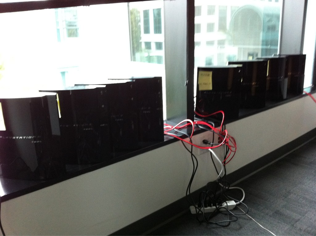
ND already have an offline render path for their engine.

91aafwh0bxm.jpg


:D

[this was used for U3 cinematics]
 
I know that people do not agree, but even after watching extended gameplay in high quality on Gamersyde I still don't like the graphics in Uncharted 4. Material shaders look kinda last gen, everything is too cartoonish. Reflections in water look just terrible. Gameplay will be great I think, but graphics wise I think it will not be any kind of new standard setter. Only environment destructibility and face animation may be really impressive.
 
Last gen material shaders? :oops: I'd like to see some examples.


@ 32 minute mark, i don't think any last gen game used shaders like that (let alone, current gen!)...
 
There's a point to be made that, so far, uncharted's presentation might be full of stand out stuff, but is still a little "uneven" in many places. It lacks that level of consistency and groundedness of all materials and lighting that some games have managed to achieve up to this point in the past years. It can look beautifull and kind of odd at the same time, depending on what you are paying attention to.
 
The only thing that it lacks is extensive use of PP effects. Which is most probably intentional because they want a clean look for the game. And about consistency i believe it's the opposite, it's one of the most visually consistent games we've seen so far visually, nothing really stands out as a sore thumb, even if you go into detail frame by frame analysis. The only thing i'd like to see improved before release is the SSR solution (just clean it up a little) and the water splash.
 
Last edited:
The only thing that it lacks is extensive use of PP effects. Which is most probably intentional because they want a clean look for the game. And about consistency i believe it's the opposite, it's one of the most visually consistent games we've seen so far visually, nothing really stands out as a sore thumb, even if you go into detail frame by frame analysis. The only thing i'd like to see improved before release is the SSR solution (just clean it up a little) and the water splash.

It's consistenty High-res, definetly, but the lighting is a bit odd in many places compared to the more recent games that excelled in that department. Some materials look a bit too sturated agaist other stuff around them, and in other instances, some materials seem too desturated, or not glossy enough. I'm not talking about the things you notice when looking at pixels, but rather, that image consistency that you notice when looking from afar, or with a squinty eye... Some graphic enthusiasts just don't get this stuff.
 
They focused a lot on physics, destruction and sandbox-ish gameplay this time even though the rest is still high res and all, it obviously wont have nearly enough resources to spend on each individual assets or the amount of post processing effects a game like The Order has. For pure balls to the walls pixel quality I think QD's new game or God of War 4 would be the next candidates as these games tend to focus on visuals 90% of time. But for overall technical achievement UC4 and Horizon are definitely in the top spot currently.
 
is it possible that those are ND's art direction? maybe they chase 'tintin' rather than 'battlefield'

... deliberately over/under saturate stuff to control the player's attention... etc
 
is it possible that those are ND's art direction? maybe they chase 'tintin' rather than 'battlefield'

... deliberately over/under saturate stuff to control the player's attention... etc
I am sure stylized visuals could be the culprit. Drake and Sully up close look incredibly detailed. Probably the most detailed characters I ve seen in a game. Once they are far from the camera, the not so realistic stylized color scheme is more apparent than the model details and hence they look kinda "cartoonish". In direct contrast MGS V uses less geometry and detail on models but since everything is using physical based rendering to some people the visuals might look more impressive.
 
I say it's probably the color that's just over-saturated, because the models at greyscale look absolutely stunning.
Look at this screenshot I took from the above video at 25m2s:

7YeQGfT.png
 
The Order 1886 and Uncharted are on opposite side of a scope for visual style. Uncharted is a little cartoony and they paint the texture by hand. Ready at Dawn scanned materials and everything is rework by artist but it is not the same process at all...
 
Last edited:
The Order 1886 and Uncharted are on opposite side of a scope for visual style. Uncharted is a little cartoony and they paint the texture. Ready at Dawn scanned materials and everything is rework by artist but it is not the same process at all...

Lead shading artist is the same for both The Order and Uncharted https://www.artstation.com/artist/yibingjiang

It comes down to stylistic difference, and from what we've seen ND are focusing on revealing gameplay rather than potentially cool looking shots graphically (moonlight, wet shaders, like the reveal).

And according to her this is what Uncharted 4 character models can look like under different lighting:
yibing-jiang-10386864-10205033407769930-985465084251523592-n.jpg

yibing-jiang-frank-tzeng-drake-head-lighting-test.jpg

Real-time rendered in game. This is not CGI or pre-render, which means all the shading features for skin, hair, eyes need to be written in code.

Using Disney Diffuse model, GGX Brdf model and Screen Space Subsurface.

Hair is using Kajiaya-kay Brdf model.

She worked for both Disney, Pixar and Dreamworks before doing The Order and Uncharted 4. Cartoony or not this looks bloody amazing to me and a cut above anything we've seen on consoles (or PCs) so far.
 
Last edited:
I'm not talking about cartoonishness. Uncharted 3 was even more cartoony, and I think some environments on that game achieved better lighting and material consistency than what's been shown on UC4 demos. They are new to this level of fidelity, and to all the diferent stuff their new engine is doing. Some stuff ends up looking out of place.
 
Status
Not open for further replies.
Back
Top