Uncharted 4: A Thief's End [PS4]

Status
Not open for further replies.
I don't go with the 'adaptive tessellation' argument, and some of the improvement is temporal AA I'd say, but the chair is interesting in that it does appear to exhibit a gradual LOD transition. That may be an illusion of the changing brightness, which might be a weird illumination accumulation from the AA?

A more obvious mistake is claiming Nate's pupils dilate where they actually contract. If he gets that wrong, it doesn't bode so well for any of his other observations. :p
 
Confusing tessellation with AA. Yes, he's clueless. He's just spreading crap that will live on for years, just like LoT.


Wrong. Watch the video at 16:37, he rambles about the objects in the scene being affected by adaptive tessellation. It's specially obvious when he uses the chair as an example.
Wrong. He - incorrectly, I think - talks about how the chair is affected by tessellation. And says that the effect, added to the AA, makes it look smooth or whatever he says. He just started talking about tessellation while on his AA analysis and then just gets very confused about what he's trying to say. He is very well aware that AA and tessellation are not the same thing. Doh.
 
Like Digital Foundry? That's ok, at least it's a different kind of crap, so people won't believe DF blindly.
Actually yes. DF should stick to counting pixels and measuring framerates.

Wrong. He - incorrectly, I think - talks about how the chair is affected by tessellation. And says that the effect, added to the AA, makes it look smooth or whatever he says. He just started talking about tessellation while on his AA analysis and then just gets very confused about what he's trying to say. He is very well aware that AA and tessellation are not the same thing. Doh.

I'm quoting now:

"But more importantly, you can see all of the objects appear in far more detail and the jagged roughness of the scene as they are then adaptively tessellated on the silohuette to add more detail but this looks like it's adding quite a lot of detail in the scene so it looks to be a dynamic solution...

The best place to notice it though is if you look at the chair you can see it kind of expand, like it's blowing up and look at the corner edge, you can see the edge becoming less jagged and more rounded. This is their adaptive tessellation solution or whatever they're doing. The bullets on the table also highlight this along with the compass and like I said, the gun. You can see this throughout the scene. Obviously in addition to the AA kicking in and the DOF kicking in as well."


He makes it quite clear that he's not intentionally confusing AA with tessellation, he truly believes the surfaces are being tessellated.
 
He makes it quite clear that he's not intentionally confusing AA with tessellation, he truly believes the surfaces are being tessellated.
This guy likes to use big words but clearly has no clue about what he's talking about. Calling temporal AA "adaptive tessellation".
Yes, tessellation is arguable. What's not arguable is that he is definitely not confusing AA with tessellation, as you originally said. That's all.

He might over-interpret things, but he does know what those 'things' are. They just don't seem to be there sometimes.

He does agree with me with regards to the nice looking fire and smoke in some scenes, which seem to be some very pretty animated textures slapped on a 2D plane.
 
Yes, tessellation is arguable. What's not arguable is that he is definitely not confusing AA with tessellation, as you originally said. That's all.

He might over-interpret things, but he does know what those 'things' are. They just don't seem to be there sometimes.

He does agree with me with the exceptionally looking fire and smoke in some scenes, which seem to be some very pretty animated textures slapped on a 2D plane.
He is confusing the effects of temporal AA with those of tessellation.
 
They seem to have changed some things since the PSX demo, same scene in the new trailer, although the new trailer is compressed and some texture detail is lost in that compression

PSX
1_1ljp3o.png


E3 Trailer
2_18fonc.png
 
I went back and studied that footage from 16:37 on and two things I noticed:

1) It does clearly show some dynamic tessellation happening, but why the edge of the chair and not the entire curve that makes up the top of the chair? It still looks polygonal.

2) While the bullets, gun, ash tray, etc.. cast shadows because of the light source, there is no ambient occlusion on any of those objects. Blantantly obvious with the books being in shadow of the lamp. This destroys realism for me and most games do it. I'm unsure why games can't have AO on every object enabled (i.e. Batman AK seems to be the only game I noticed that does this). Period.

Perhaps someone from the game industry can enlighten me.
 
They seem to have changed some things since the PSX demo, same scene in the new trailer, although the new trailer is compressed and some texture detail is lost in that compression

PSX
1_1ljp3o.png


E3 Trailer
2_18fonc.png


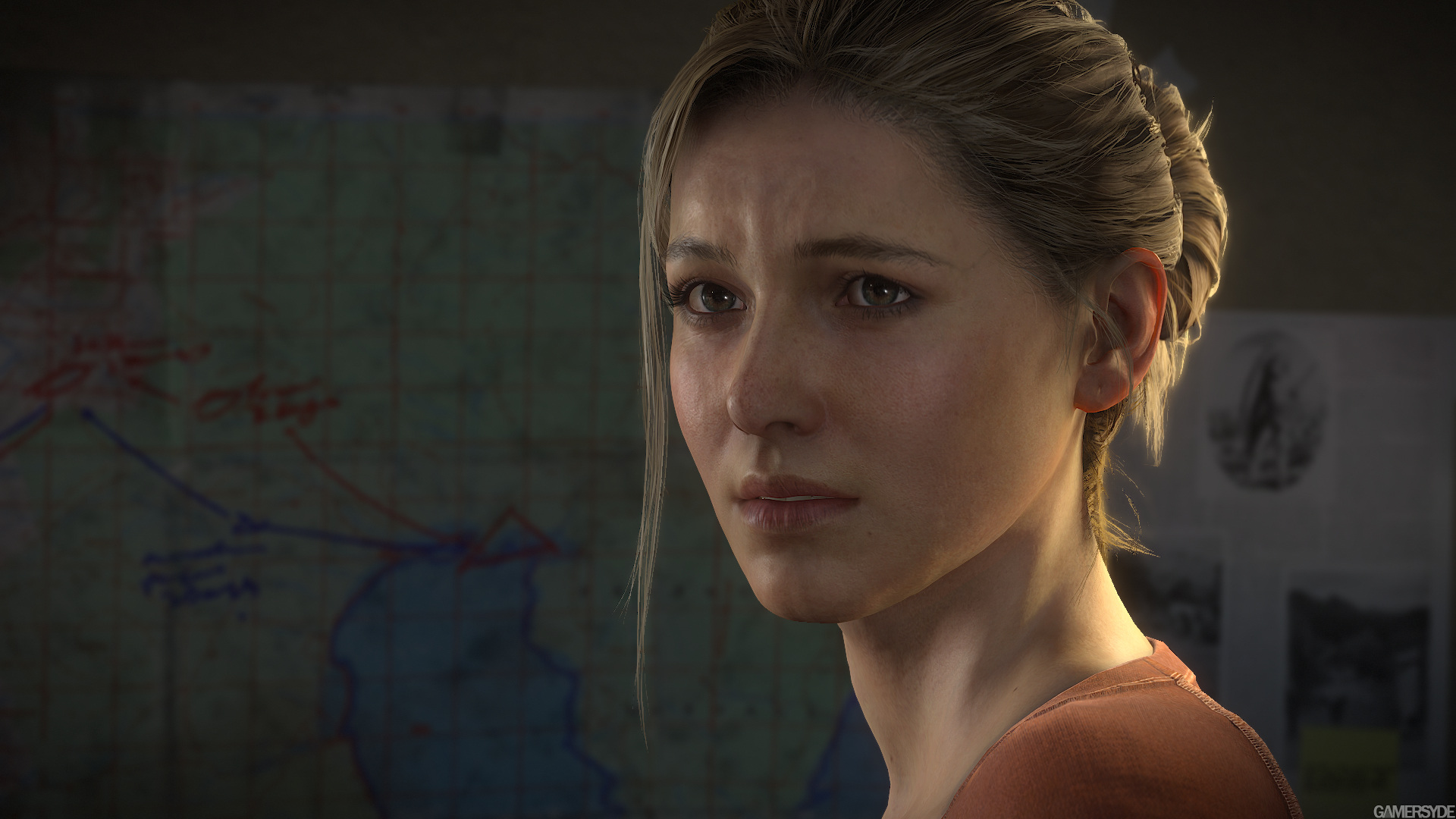
E3 demo has SSS on the skin. Notice how the light penetrates the surface and spreads out the shadowing (i.e. the shadows gradually fall off to the skin color instead of a sharp transition). This also makes the self-shadowing of the bumps on the skin more illuminated -- the result is a blurry but much more realistic skin tone. Shirt also has a mud layer with a bit more desaturation
 
That's not what you said.
He never said that.
Ambiguous language. Scofield's point is that the vid highlights an edge, shows it gradually getting smoother, and calls that tessellation where it's (probably) the temporal AA working. Perhaps more accurate if Scofield said "confused temporal AA with "adaptive tessellation" rather than "Calling...". No point arguing over it anyway!
 
Another interesting thing is the use of SSS specifically in the ears, here's in slow mo

UnsteadyEnragedBlesbok.gif

It can look quite goofy at times though, example

2015_07_uncharted_4_eenqny.png

In other cases it looks really nice, like here

image_uncharted_4_a_thief_s_end-28644-2995_0006.jpg
 
Another interesting thing is the use of SSS specifically in the ears, here's in slow mo

It can look quite goofy at times though, example

2015_07_uncharted_4_eenqny.png

In other cases it looks really nice, like here

image_uncharted_4_a_thief_s_end-28644-2995_0006.jpg

Here is a perfect example of cutscene shaders vs. gameplay shaders and how they are misinterpreted as being equal. They clearly can't afford the better approximation to SSS in gameplay, but use it very well in cinematics. I noticed this in The Order. Galahad's skin shader is terrible in gameplay exhibiting this glow effect that just doesn't look right. I'm pretty sure they use a backlighting trick of reversing the normals using a masked map to control how much backlighting gets to the ears and nose. But in cinematics, it looks much much better. I'd rather remove the in-gameplay SSS because it just looks so out of place.. but that's me.
 
Last edited:
E3 demo has SSS on the skin. Notice how the light penetrates the surface and spreads out the shadowing (i.e. the shadows gradually fall off to the skin color instead of a sharp transition). This also makes the self-shadowing of the bumps on the skin more illuminated -- the result is a blurry but much more realistic skin tone. Shirt also has a mud layer with a bit more desaturation

I think SSS was there before - it'd be really strange if ND didn't have it implemented in such an important scene, the very first showing of the game. However it's definitely been fine tuned for the E3 trailer. Other changes are shader effects like better looking sweat on his temple/cheekbone area on the left side, and dirt on the clothing.
 
Here is a perfect example of cutscene shaders vs. gameplay shaders and how they are misinterpreted as being equal. They clearly can't afford the better approximation to SSS in gameplay, but use it very well in cinematics. I noticed this in The Order. Galahad's skin shader is terrible in gameplay exhibiting this glow effect that just doesn't look right. I'm pretty sure they use a backlighting trick of reversing the normals using a masked map to control how much backlighting gets to the ears and nose. But in cinematics, it looks much much better. I'd rather remove the in-gameplay SSS because it just looks so out of place.. but that's me.

I don't think that's what in-game SSS will look like come release, they have time to polish that if they want or completely remove it.
 
What makes you think it'll be more complex? There is literally *NO* game that has a very good solution while in gameplay.

Well it was completely missing in the PSX demo and from now till release there's a similar window for improvement.

Also, there's definitely something going on other than Temporal AA

PerfectRightIaerismetalmark.gif


And it's happening to more objects than the chair.
 
Also notice Sam's shoulders have more polys now than the PSX demo, silhouette tessellation?
Or it was wrinkled in the PSX demo.

Well it was completely missing in the PSX demo and from now till release there's a similar window for improvement.

Also, there's definitely something going on other than Temporal AA

PerfectRightIaerismetalmark.gif


And it's happening to more objects than the chair.
At first I thought it was eye adaptation but it actually looks like a light being turned on slowly, hence the appearing specular highlights. Could be shader LOD as well.
 
Status
Not open for further replies.
Back
Top