New Heavenly Sword Info (screens included)

Status
Not open for further replies.
Lol, that's funny coming from someone who claims to see no difference between this latest batch of screens and previous ones, other than 'colour saturation'

The difference is there, check any message board in the world where these have been posted, you'll see many many people saying the exact same thing. What happened?

Pretending there is no difference pretty much destroys your credibility imo.
Maybe you should frame the differences then to enlighten poor ignorants like me. :)

"check any message board in the world where these have been posted"
I bet that you aren't one of a kind but that doesn't make your claim true, while looking at polygon edges and texture resolutions I can't claim to see any difference as those were quite obvious in the original trailer too.

"Pretending there is no difference pretty much destroys your credibility imo."
With the few posts I have made it hasn't been possible for me to build up any credibility yet; whilst your posting history... speaks for itself?
 
How about this?

PDVD_001high1resizedORiginal.jpg

PDVD_001high1resizedENhanced.jpg

PDVD_003high3ORiginalENhanced.jpg

pdvd003high3originalenhzb6.jpg

pdvd006bg7.jpg
 
Still the E3 05 and the lastest screens/videos are far apart in IQ. Not the same place but both are battles and one of them is enhanced with colors and extra "HDr", fast work only. There is IQ difference in lightning, enemy detail, DoF vs draw distance? such things as motion blur for moving objects. As for the hair I thin kyour'e right!

E3 05,
[IM]http://i176.photobucket.com/albums/w193/NebulasPhotoPocket/IGNHSpic02.jpg[/IMG]
CES 07,
[IM]http://i176.photobucket.com/albums/w193/NebulasPhotoPocket/PDVD_003high3ORiginalENhanced2a.jpg[/IMG]
CES 07,Enemy detail/geometry,
[IM]http://i176.photobucket.com/albums/w193/NebulasPhotoPocket/PDVD_002.jpg[/IMG]

Please elaborate because I seem to sense sarcasm.

"DoF vs draw distance?"
There is depth of field but the draw distance is also a lot longer than in the E3 '05 video but it can't be seen in the picture you chose.

"colors and extra "HDr"
On the note about colors I agree, but "extra" HDR lighting? If I'm not mistaken you mean HDR at a higher bit rate? Anyway I'm no developer so I could be wrong about this but HDR is the colour space and what it does is making details in bright and dark areas more noticable.
To me it doesn't seem like the details are more washed out in dark and bright areas in the new pictures/videos (where there isn't DoF, which I hope will be used to lesser extend in the final build).

I hope you weren't using sarcasm as only very few people are clever enough to pull off that kind of humour. :)
 
It's like that in-game filter for Gears of War. :p

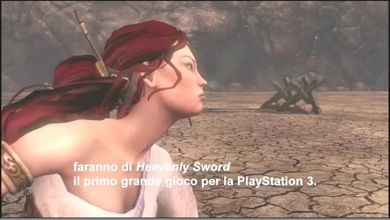
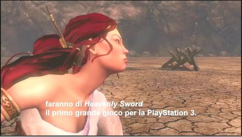
I'd like to say I'm impressed with the skin shading and the body's shadowing, but I don't know if that's because of the screengrabs or if I'm imagining things based off of the cinematic render. :???: It looks great!
 
Please elaborate because I seem to sense sarcasm.

"DoF vs draw distance?"
There is depth of field but the draw distance is also a lot longer than in the E3 '05 video but it can't be seen in the picture you chose.

"colors and extra "HDr"
On the note about colors I agree, but "extra" HDR lighting? If I'm not mistaken you mean HDR at a higher bit rate? Anyway I'm no developer so I could be wrong about this but HDR is the colour space and what it does is making details in bright and dark areas more noticable.
To me it doesn't seem like the details are more washed out in dark and bright areas in the new pictures/videos (where there isn't DoF, which I hope will be used to lesser extend in the final build).

I hope you weren't using sarcasm as only very few people are clever enough to pull off that kind of humour. :)

You misunderstood it, no problem!
The second shot the one with extra "HDr" is retusched by me. I added the extra "HDr" and changed the colors to make the color and lightning more like the E3 05 screenshot. This so that one could ignore color differences and instead focus on the other detail.
DoF vs draw distance should have been more like "DoF to cover up lower detail objects/landscape at distance?". Still it looks good now even though not as detailed as the E3 05 video!;)
 
It's like that in-game filter for Gears of War. :p

I'd like to say I'm impressed with the skin shading and the body's shadowing, but I don't know if that's because of the screengrabs or if I'm imagining things based off of the cinematic render. :???: It looks great!

I once saw a post about one of the devs having said that all polygons cast dynamic shadows on polygon surfaces.

Dunno if it's true though.
 
You misunderstood it, no problem!
The second shot the one with extra "HDr" is retusched by me. I added the extra "HDr" and changed the colors to make the color and lightning more like the E3 05 screenshot. This so that one could ignore color differences and instead focus on the other detail.
DoF vs draw distance should have been more like "DoF to cover up lower detail objects/landscape at distance?". Still it looks good now even though not as detailed as the E3 05 video!;)

I know that you altered the images, got eyes and proud of it. :)

But how can you be so sure that the objects blurred by the DoF are less detailed? I mean the textures in MGS4 aren't less detailed though many people scream low res when the fine details are hidden by the DoF and can only be sensed in IGN's 1GB HD videos.

I just do not see any difference in the close up (as in not smeared by DoF) environment and character models.

Would someone please frame the most obvious differences? It should put an end to this debate.

Yes thats why I put a ? at the end --> Becouse my experience is that when it used close it is to cover less detail in either objects/landscape geometry/textures. But it may just be for giving a special effect and no covering but then why so close then to the players FOV, makes you think, yes?;)

DoF vs draw distance should have been more like "DoF to cover up lower detail objects/landscape at distance?".
 
The other thing that stood out to me, is the outdoor scene seems downgraded quite a bit. I've been waiting for a long time to see what the outdoor scenes look like in comparison to the debut trailer, as to me it was the most ambitious part if the original trailer.

http://images.playsyde.com/gallery/public/5094/644_0025.jpg

Seems quite a big drop from:
http://ps3media.ign.com/ps3/image/article/614/614802/heavenly-sword-20060117011357672.jpg
http://ps3media.ign.com/ps3/image/article/614/614802/heavenly-sword-20060117011353953.jpg
http://ps3media.ign.com/ps3/image/article/614/614802/heavenly-sword-20060117011356578.jpg

Also her hair looks so much better in these old shots.

Now I know it's a WIP, so I'm just commenting on it's current state, I'm sure it will progress nicely as it nears completion.


What your seeing is the 'model' effect, the E3-2005 was polished. Whereas this footage is just straight from the game, it hasn't had a full polish yet. So lighting and shadows aren't just right yet. Its the same as taking a photo of a super-model whose just woke up and grabbing a coffee versus a photo-shoot with proper lighting...

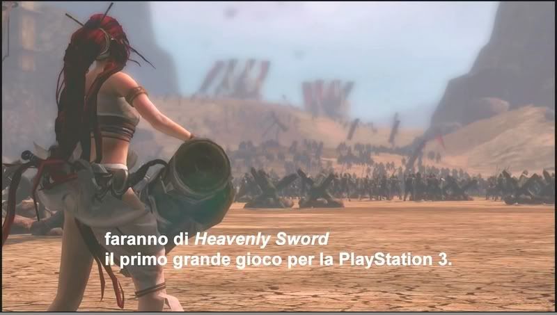
As for differences?? Well the new army screenshot is meant to be dof'ed like that its an opening shot. whereas the E3-2005 shots you've shown are closer, so you can see the peeps better. A similar camera would produce a similar result with the new stuff...

There really isn't any major downgrade... its fundementally the same renderer just improved and made PS3 friendly. And better shaders, lots of better shaders now.
 
Yes thats why I put a ? at the end --> Becouse my experience is that when it used close it is to cover less detail in either objects/landscape geometry/textures. But it may just be for giving a special effect and no covering but then why so close then to the players FOV, makes you think, yes?;)

Maybe I should be less proud of having eyes. :oops:
 
What your seeing is the 'model' effect, the E3-2005 was polished. Whereas this footage is just straight from the game, it hasn't had a full polish yet. So lighting and shadows aren't just right yet. Its the same as taking a photo of a super-model whose just woke up and grabbing a coffee versus a photo-shoot with proper lighting...

As for differences?? Well the new army screenshot is meant to be dof'ed like that its an opening shot. whereas the E3-2005 shots you've shown are closer, so you can see the peeps better. A similar camera would produce a similar result with the new stuff...

There really isn't any major downgrade... its fundementally the same renderer just improved and made PS3 friendly. And better shaders, lots of better shaders now.

And on that note, "shush you haters" :p
 
Yes thats why I put a ? at the end --> Becouse my experience is that when it used close it is to cover less detail in either objects/landscape geometry/textures. But it may just be for giving a special effect and no covering but then why so close then to the players FOV, makes you think, yes?;)

For example in the desert scene... The look were trying to achieve is a smokey hot day with dust etc. So we want things in the distance to be soft... I won't deny it also handily covers a multitude of sins out there ;-)

And while some here might not like lots of dof and bloom, its a part of the signature look of the game, its meant to be a bit dreamy and ethereal. And orange, that's a signature thing as well...

You know a kind of heat-haze effect with the DoF (unless I missed that it has a haze effect) would make it look fantastic!
 
What your seeing is the 'model' effect, the E3-2005 was polished. Whereas this footage is just straight from the game, it hasn't had a full polish yet. So lighting and shadows aren't just right yet. Its the same as taking a photo of a super-model whose just woke up and grabbing a coffee versus a photo-shoot with proper lighting...

As for differences?? Well the new army screenshot is meant to be dof'ed like that its an opening shot. whereas the E3-2005 shots you've shown are closer, so you can see the peeps better. A similar camera would produce a similar result with the new stuff...

There really isn't any major downgrade... its fundementally the same renderer just improved and made PS3 friendly. And better shaders, lots of better shaders now.

Cool, thx for the reply Dean. Lookin forward to some official media...soon I hope ;)
 
Status
Not open for further replies.
Back
Top