New Heavenly Sword Info (screens included)

Status
Not open for further replies.
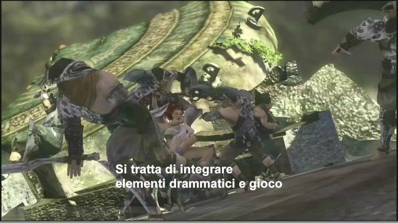
Hmmph. Looks meh when it's in high res and you can see all the blurry textures. I like the draw distance, but I wish there wasn't so much haze/dof. I also hate how they are trying to sell realistic cutscenes in between levels as revolutionary, when they were done easily with CG previously.

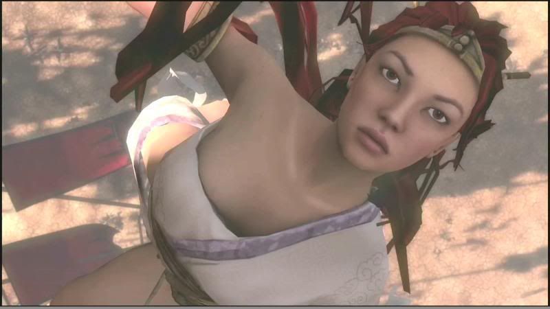
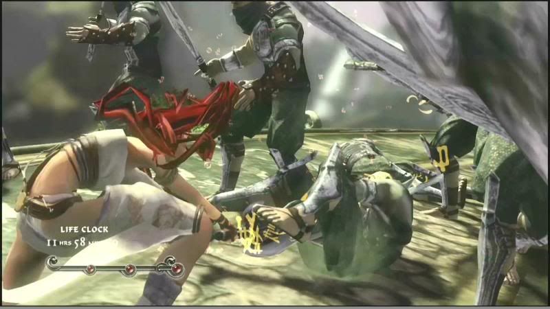
This are direct screengrabs from the HS 1080p mp4 demo from the link that the moderator StefanS posted above. The grabs are blurrier than the real game but ignore it and focus instead on such things as the shadows, polygons and hair, background detail. I still think there is overabuse of DoF though...
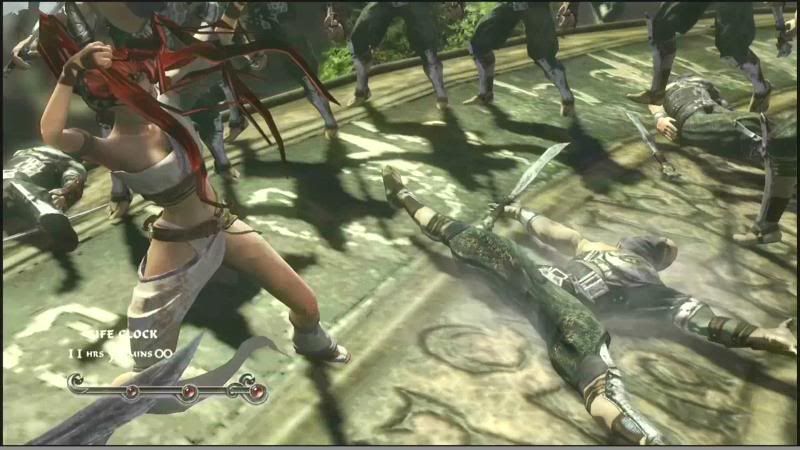
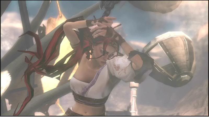
PDVD_001.jpg

PDVD_004.jpg

PDVD_002.jpg
 
Forgot to say that I also think they should fix better resolution on the bumpmaps on the floor and better polygon count on that girl. Textures are maybe already good? Didnt know that the screenies where blurrier than the video.
 
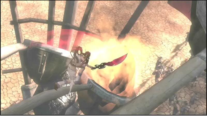
This are some more direct screengrabs from the HS 1080p mp4 demo from the link that the moderator StefanS posted in the previous page, enjoy.

PDVD_006.jpg

PDVD_000.jpg

PDVD_005.jpg
 
Are you shure that thoes pictures not are false? Because they dont even look close to the Heavenly Sword I have seen.

I captured them myself with PowerDVD v7.1 Ultra. They are from the latest video from the link that moderator StefanS posted on the previous page. Look at the image links (goes like this http://i176.photobucket.com/albums/w193/NebulasPhotoPocket/PDVD_000.jpg).

The video is the 1080p mp4 HD video, 173MB video size. I think it still looks good dont you, I mean it's still beta right?
 
The video is washed out and blurry ruining the quality despite that it is supposed to be 1080p
 
I could post you a screenshot of my desktop with the player running, file information and more. Here are links to the 1080p size screengrabs (forum only allows 800x600/800x450 widescreen screenshots to be viewed).

Enjoy.
http://i176.photobucket.com/albums/w193/NebulasPhotoPocket/1080resHS2.jpg
http://i176.photobucket.com/albums/w193/NebulasPhotoPocket/1080resHS1.jpg

Shoot I forgot that free edition of Photobucket only allows images to be a maximum of 1024x768 so it downscaled them. :cry:
 
The other thing that stood out to me, is the outdoor scene seems downgraded quite a bit. I've been waiting for a long time to see what the outdoor scenes look like in comparison to the debut trailer, as to me it was the most ambitious part if the original trailer.

http://images.playsyde.com/gallery/public/5094/644_0025.jpg

Seems quite a big drop from:
http://ps3media.ign.com/ps3/image/article/614/614802/heavenly-sword-20060117011357672.jpg
http://ps3media.ign.com/ps3/image/article/614/614802/heavenly-sword-20060117011353953.jpg
http://ps3media.ign.com/ps3/image/article/614/614802/heavenly-sword-20060117011356578.jpg

Also her hair looks so much better in these old shots.

Now I know it's a WIP, so I'm just commenting on it's current state, I'm sure it will progress nicely as it nears completion.
 
The other thing that stood out to me, is the outdoor scene seems downgraded quite a bit. I've been waiting for a long time to see what the outdoor scenes look like in comparison to the debut trailer, as to me it was the most ambitious part if the original trailer.


Seems quite a big drop from:

Also her hair looks so much better in these old shots.

Now I know it's a WIP, so I'm just commenting on it's current state, I'm sure it will progress nicely as it nears completion.

Are you seriously comparing those two?

One is from a crappy washed out video (from a completely different angle, before the fight even starts) and the others are from E3 05 with pristine shots (where the fight is mid way through).

I'm, honestly, not sure how you can tell anything from those comparisons. The only definitive difference I can see is the motion blur in the ign shots that likely won't be there in the real game...

I'm mainly comparing the scope. While the early shots show highly detailed enemies as far as the eye can see, the latest ones have DOF spread everywhere and look much more like the approach used with N3.
 
I'm mainly comparing the scope. While the early shots show highly detailed enemies as far as the eye can see, the latest ones have DOF spread everywhere and look much more like the approach used with N3.

You think that might have something to do with the crappy washed out video screen grab being of an few second intro-cutscene before the battle...? I can't imagine the color and clarity of the screenshot are helping anything either.

I'm not sure you're comparison really makes much sense.

I also don't really understand the hair comment (even more mystifying then the rest of the post).
 
Status
Not open for further replies.
Back
Top