Gripe against Paint3D, Microsoft breaking windows standards in their new software.

Mendel

Mr. Upgrade
Veteran
So I just loaded Paint 3d to print out something (not doing any image manipulation on this pc usually) and was immediately super frustrated at not having a top menu visible. No problem, this has happened before that the top menu is not visible by default. So I just press F10 and... nothing happens! Yea... No top menu at all!
I think this might be an issue with their latest office products too. I´ll just have to try hard to avoid using them if I can.

Yes yes, There might be some icon near top left or top right where I can access the print command and maybe even the about screen to check the software version but it is no substitute for a real top menu. Even if there is some way to access all functions I would ever need, I don´t care. I want it to be intuitive. I want it to act like a Windows application is supposed to act. I don´t want to learn a new way to use simple things like word and paint. Not interested. I´ll rather download open source replacements like any sane person would do.

They are trying to do some kind of new UI and make it some kind of new experience I guess but I want none of that. It is not behaving as I expect it to behave. In fact, this is unfamiliar enough that I do not even consider this a Windows application. These new Microsoft products seem to be about as foreign to me as using a Macos or Linux. It just does not work like I am used to using Windows software.

At least GIMP and Open Office have standard top menus and they are visible by default (though I may have old versions of them) so I can very intuitively check all the functions they have. File menu, edit menu, tools menu, help and about right where I expect them to be but Microsoft has decided to hide these basic tools on their first party software. So this forces me to use free software that would work just as well or better on Linux than on Windows.

So where is the benefit in using Windows at all then anymore? I guess just being able to play some games but... I´m mostly playing Factorio now and that is on Linux and Macos as well! So at the office then? Maybe some compatibility issues may be there still (though probably mostly easy to overcome) but the benefit is certainly not software familiarity to users anymore.

Well... I can´t be arsed to install a new OS right now to be honest but if and when I do need to make a clean install... it sure won´t be Windows even though it´s been like 10 years since I last used Linux.

Yeah... there. Came back here after some years to vent some steam since it seems all the other pc forums I visited back over the years have died but at least this place is still going strong :)

edit: and just now I realize there is no top menu in Chrome either. At least there is one in Firefox still... Sheesh. Did the Windows application top menu piss on some software development directors cereals or what is going on?
 
Why do you think the top menu is a current Windows Application standard? Perhaps the standard changed years ago, as evident by your mention of Chrome not having it either.
 
Did you download the Creators Update? Dunno about previous versions but Print3D has a top menu and a button at the top left with options to Print, Export as PNG, JPG etc... I highlighted it with a blue circle.

Capture2.png


after clicking on it this menu appears

Capture4.png
 
Why do you think the top menu is a current Windows Application standard? Perhaps the standard changed years ago, as evident by your mention of Chrome not having it either.

I dont know if the standard have change, just menu bar are called or placed differently for take less space on screen.. On chrome you cick on the 3dots on the top right of the bar who call the menu.. on Firefox,
You have the same things as in chrome ( click on the 3 horizontal bar icon on the top right corner )

But the old "menu bar" is still there. you need to enable it, right click on the top bar and ´check, menu bar..
 
Last edited:
edit: and just now I realize there is no top menu in Chrome either. At least there is one in Firefox still... Sheesh. Did the Windows application top menu piss on some software development directors cereals or what is going on?

Chrome was one of the first to start this trend and other's have been following it. It pisses me off to no end still. One of the reasons (among many) I still hate using Chrome when I use it.

Don't even get me started on how much I hate Chrome also starting the trend of no title bar that Microsoft copied for Edge (I hate you for doing this MS).

Regards,
SB
Actually, that is a problem with most Store apps in Windows 10. The interface is bland-looking, and all of them look about the same. There are good apps, like Torrenx and a few others, but it looks so phone oriented, it lacks soul and personality. As for Paint3D, I guess the op knows the buttons I mentioned, judging from his post saying there is something at the top or top-left corner to print his work and so on, but even so it looks better than most store apps.

It is a trend. Typical MS, they have been outsmarted in the last decade, but they always had immense potential. WhatsApp for instance, if you were a Messenger user back in 2000, you would know that there is nothing Messenger would need to learn from WhatsApp. If when smartphones started to gain popularity MS used Messenger with the interface the app had back in 2000, save for a few tweaks, it'd be one of the most popular apps. They had phones and notebooks with a similar touch screen interface but Ballmer couldn't see much 3cm away from his body.
 
I dont know if the standard have change, just menu bar are called or placed differently for take less space on screen.. On chrome you cick on the 3dots on the top right of the bar who call the menu.. on Firefox,
You have the same things as in chrome ( click on the 3 horizontal bar icon on the top right corner )

But the old "menu bar" is still there. you need to enable it, right click on the top bar and ´check, menu bar..

Try pressing F10 on Firefox (with menu bar disabled.) Works!
Try pressing F10 on Chrome or paint 3d. Nothing happens <- Fury!
What standard shortcuts might they disable next? Maybe ctrl-c and ctrl-v? :)
 
You keep using the word "standard", which standard(s) are you refering to?
 
General keyboard-only commands

...

F10: Activates menu bar options

https://support.microsoft.com/en-us/help/126449/keyboard-shortcuts-for-windows

Regardless I still think he is still being a bit dramatic. 3rd party Windows apps have always decided which keyboard commands & GUI designs they want to support. That's the great thing about Windows apps: they're not cookie cutter or beholden to Microsoft's design. With that said I love Chrome & it's simplistic design. Bring on more!

Tommy McClain
 
I still don't see it listed as part of a "standard".
 
Heck, once upon a time the ALT key was the default key to bring up program menus that were hidden. Still works in IE11. No go in Edge. Or Chrome. Or...bleh. I'm a sad panda now.

Regards,
SB
 
You keep using the word "standard", which standard(s) are you refering to?

I would refer to the Common User Access guidelines, which included many things we take for granted. Even things like using tab to cycle through input fields.

https://en.wikipedia.org/wiki/IBM_Common_User_Access
It was developed by IBM and first published in 1987 as part of their Systems Application Architecture. Used originally in the MVS/ESA, VM/CMS, OS/400, OS/2 and Microsoft Windows operating systems, parts of the CUA standard are now implemented in programs for other operating systems, including variants of Unix. It is also used by Java AWT and Swing.

https://en.wikipedia.org/wiki/IBM_Common_User_Access#Description

Now something pretty nerdy : the origins of alt+f4
http://toastytech.com/guis/miscc3.html
Even today there are a number of linux desktop environments where you can use alt+f7 to move a window.
 
That was my word!
Obviously you won't get a $50,000 fine from a random government if you don't obey it but it went very far. Windows 2.0, 3.1, 95, XP, most of the applications for Vista and 7 and later, desktop Java (e.g. Jedit text editor), Unix applications with the Motif toolkit then linux/unix (and Windows) applications made with GTK, Qt and other toolkits, cross-platform applications (e.g. Firefox, Virtualbox, most emulators)
 
I think by standard he meant ms programming programs
all have the file/edit/view menu as a built in custom control that a programmer can use
and no alternative type of menu
tools -- menu editor
and that only allows creation of the ("standard") menu
if you want something different you will have to program it yourself
may have changed now we have win10 with its metro interface and apps
 
But I seen a few screenshots of Windows UWP apps with File/Edit/View, as weird as it seems. Apparently Microsoft caved in and bundled a large subset of Win32 into what was formerly WinRT/Metro/Windows Phone 8 etc.


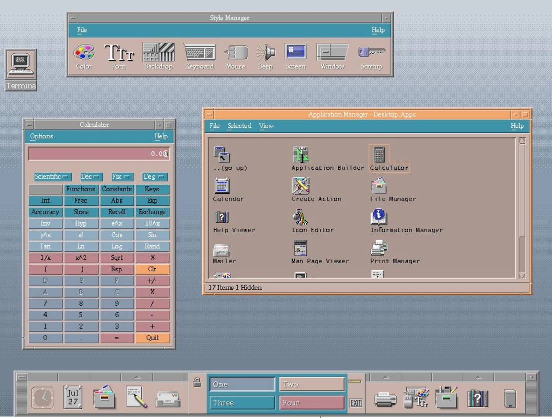
I'll give a few examples. This is what bearded people thought was ugly and bloated in early 90s (not sexist. there may have been bearded women using it). Some people did like it.
cde_desktop_image_big.jpg


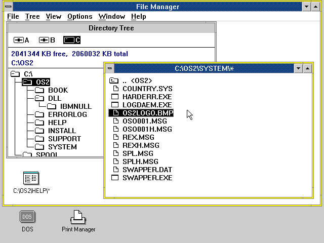
microsoft OS/2 (right)
MOS2Fileman.gif


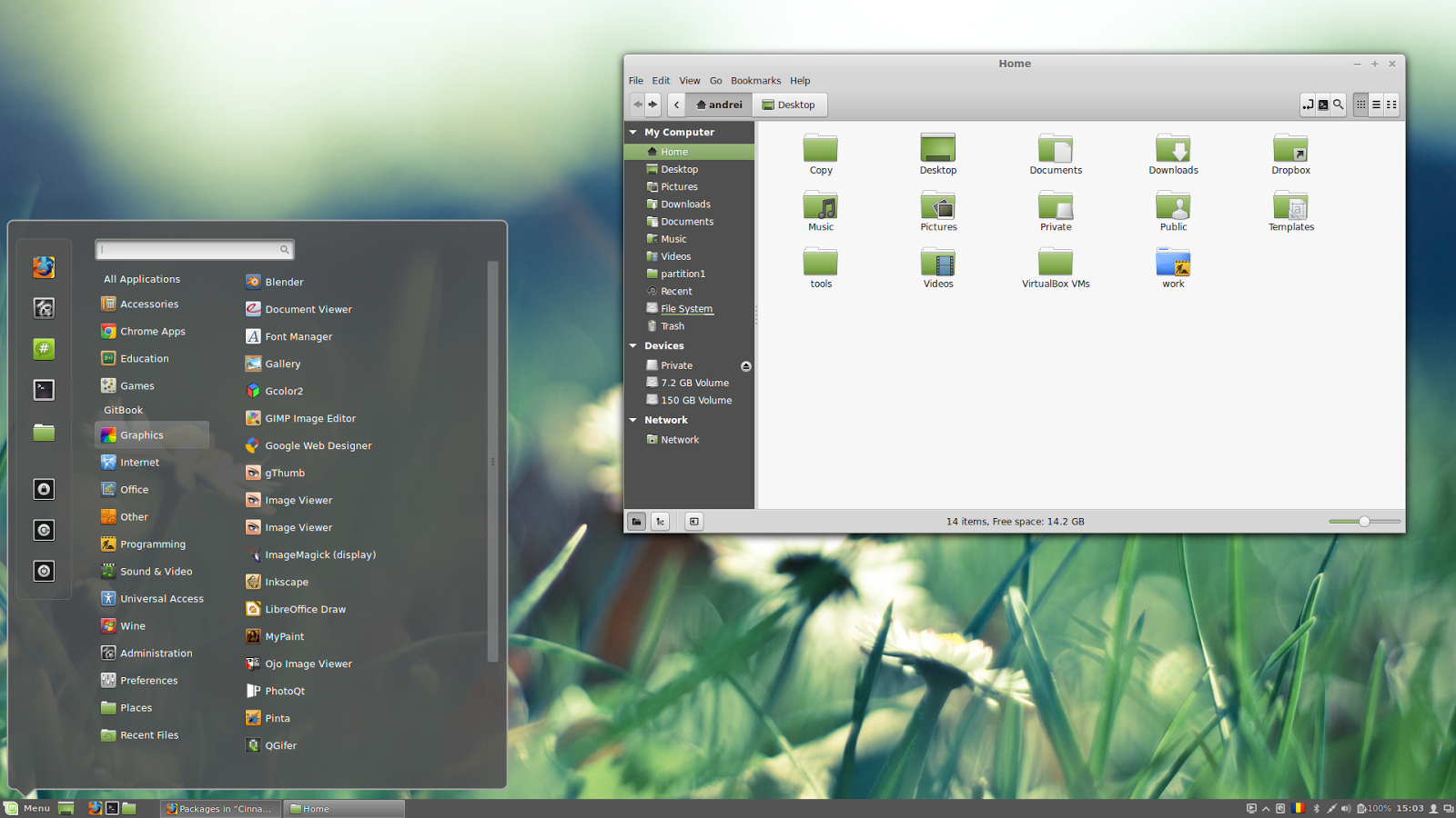
Cinnamon desktop, vintage mid 2010s (2012-2017 and counting). There's an ongoing desktops war and this is a modern one in 3D that doesn't do stupid things like Gnome 3 does ; it keeps to the standards instead. (it feels a bit dumbed down to me already. top left menu icon is removed, although right-click the title bar anywhere brings the same stuff. Also menu letters aren't highlighted unless you press alt)
cinnamon-2-4.png

/edited for slight clarity
 
Last edited:
Guidelines. Not Standards.
If they were guidelines everyone used, they became a standard. If computers are expected to work a certain way and don't, it confused uses and reduces productivity. Sadly we're at a time when software is trying its best to be minimalist designer and making lots of usability faults. eg. Links and buttons that don't differentiate themselves from labels, so you've no idea what you can and can't press. Some web pages are very pretty at a cursory glance but pretty shit when it comes to information presentation and usability. Hopefully there's a learning process in play and eventually people will remember why we studied HCI in the 90s and actually go back to making interfaces to tools first and foremost rather than gorgeous screenshots for idiot sci-fi futures.
 
If they were guidelines everyone used, they became a standard. If computers are expected to work a certain way and don't, it confused uses and reduces productivity. Sadly we're at a time when software is trying its best to be minimalist designer and making lots of usability faults. eg. Links and buttons that don't differentiate themselves from labels, so you've no idea what you can and can't press. Some web pages are very pretty at a cursory glance but pretty shit when it comes to information presentation and usability. Hopefully there's a learning process in play and eventually people will remember why we studied HCI in the 90s and actually go back to making interfaces to tools first and foremost rather than gorgeous screenshots for idiot sci-fi futures.

Yes, I really REALLY REALLY hate that Usability has taken a backseat to Minimalist Design. It makes everything so unpleasant to use in most cases. Considering how much research I do on the internet, the Minimalist Design that Chrome started has me pulling my hair out at how much more work I have to do in order to accomplish the same things I could do in IE9. Even IE11 was a step backwards in usability in order to facilitate a more minimalist UI.

It's frustrating and aggravating. I understand that minimalist designs have a place in more consumer oriented devices, especially those with limited screen space like smartphones and tablets. But this is the Windows Desktop where a very large portion of the user base is trying to use it for WORK! ARGH!!!!!

Of course, if MS didn't do these things, they'd get blasted by all those people that don't use X app. primarily for work.

Basically MS will get blasted regardless. Don't go with a minimalist design and keep a usable design that offers UI customizations for advanced features, and get blasted by neck beards. Go with a minimalist design and get blasted by people like me who are PO'd at the loss of functionality that makes doing our jobs harder.

Regards,
SB
 
Back
Top