Game Disappointments in the Graphics Realm

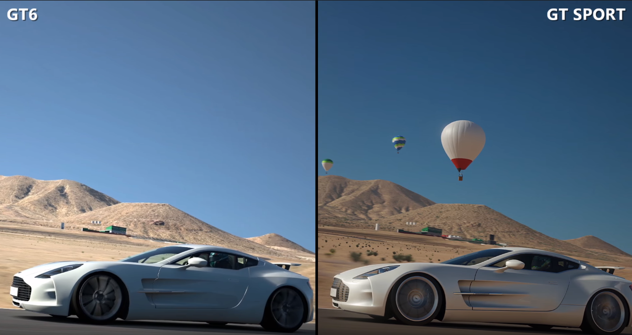
Hmm honestly I didn't think the lighting would be that much a different between GT Sport and other competing games. That's actually really surprising. I have only tried PCars and AC though, neither I expected to have as good lighting. But overall HDR effect in GT Sport is much beyond these other games.

I think FM6 looks the nicest among those 3 personally, just based on that video and compared to what I've played of AC and PCars, they feel much less polished visually overall IMO.

Whatever discipline or focus Polyphony has to natural lighting it always pays off it seems. But this time I really though they were struggling a week ago. Now with actual comparisons it doesn't seem lackluster anymore.

The GT6 to GT Sport comparison helped a lot I think for me.... I imagine it was my rose-tinted nostalgia goggles though was the problem ^^
 
I agree, Polyphony still nails the lighting better than the competition IMO. Their artists and models are also above the rest. Materials look more realistic in GTS to me. The only other game that comes close is DriveClub. That's not to say that I think GTS is leaps and bounds better than the competition, just that I think DriveClub is the closest. Other games look slightly cartoony and stylized by comparison. Much like Uncharted vs something like Battlefront. While Uncharted 4 leans more towards realism compared to previous games, it still has a stylized look to it IMO.

Sound also seems to be much improved. However what I think they still need to work on is the sound while shifting.
 
Last edited:
Indirect lighting also seems to have improved significantly since GT6

1o5rie.png
 
It's nice old school racing adornments, but a good effect for VR too I bet.
 
Definitely the best balloons in a game, but that can be achieved with simple geometry and some pretty baked light. So nothing really to write home about.

Heck, if it's far enough away from the camera you could just use a 2D image. Not saying that's what's being done here as we have no idea.

Regards,
SB
 
Yeah, it could be a photo stuck up there, but that'd be obvious if seen from different directions as the lighting would break. Although that's what they're doing with three trees at the moment. :p
 
It seems to be lit with some specular/HDR reflective stuff. I'm sure it's 3D, but probably not nearly as detailed up close lol, no point ^^
 
Very interesting comparisons between Forza 6 and GTS (from GAF again). Try to objectively decide which one is better without paying attention to the UIs like I did.

It's compressed, but still, one is better looking (and more realistic) than the other IMO. Clearly. I hope this won't spawn its own Versus thread. It just helps to put some perspective in our first mixed reactions.

vlcsnap-2016-05-30-03f5ooq.jpg

8ybo5n.jpg

vlcsnap-2016-05-30-03ldr6h.jpg

vlcsnap-2016-05-30-03b1r6b.jpg
 
The ones on the left look better to me. The ones on the right, some tree's don't appear to cast shadows. And the shadows don't really match up with the tree line.

Other than that the screenshots on the right seem to be a lot more saturated, while the ones on the seem to be a bit more like real life.

Also strange the first screenshot on the right has the sun throwing out an almost blinding glare like you'd see in real life. But in the fourth screenshot there's absolutely no effect on the viewer's eyes from the sun directly in front of them. It's hugely inconsistent.

IMO, screenshot 3 on each side are the best for their respective sides.

For the 3rd screenshot on the left side it gives a really nice impression of an overcast day and I love the attention to detail where the asphalt meets the dirt which transitions into grass. It's exactly like how I see roads when driving around.

For the 3rd screenshot on the right side, I love how it gives that nice lighting in the car from what appears to be the sun setting behind it. Except looking at shadow on the left side being cast on a tree from the one in front, the sun can't be setting. And the shadows on the right on one of the trees doesn't look right. And looking further down the track, the shadows are VERY wrong on the trees in the distance. For those trees it looks like the sun should be ahead of the driver, but the sun is obviously supposed to be behind the driver.

Both sets of shots look pretty good. The left side looks more realistic while the right side looks more "gamey." Also, the shadow problems on the right side just aren't good.

I don't play racing games anymore, so hopefully someone will enlighten me as to which is which. :)

Regards,
SB
 
I felt like right side looks more naturally lit, only except maybe the third one down didn't look so hot. But just the range of colour and brightness and how it varies between scenes.... I mean I'm guessing it's GT Sport lmao :D

Tbh the left kind of looks like GT6 lighting. Looks more "static" is the best way I can describe it, flatter maybe is a better word though.
 
The left side looks more realistic while the right side looks more "gamey." Also, the shadow problems on the right side just aren't good.
Im guessing the left is an xbone game and the right is a ps4 game, what do I win?

Though IMO I need to see proper fullscreen screenshots to accurately judge between the two
 
I'm having a very hard time trying to see that the right side is more "gamey", especially in the first two comparisons. I would describe the left ones particularly more gamey really. Lighting is a lot harsher and too high contrast. They just look flatter and duller.

I dunno based on these comparisons I'd say GT Sport wins the day. Even just looking at the foliage, it's far more realistically shaded according to the direction of the Sun as well. Nice shadows from trees onto other trees as well even. Much more natural and convincing image on all accounts as far as I can tell.
 
Very interesting comparisons between Forza 6 and GTS (from GAF again). Try to objectively decide which one is better without paying attention to the UIs like I did.

It's compressed, but still, one is better looking (and more realistic) than the other IMO. Clearly. I hope this won't spawn its own Versus thread. It just helps to put some perspective in our first mixed reactions.

vlcsnap-2016-05-30-03f5ooq.jpg

8ybo5n.jpg

vlcsnap-2016-05-30-03ldr6h.jpg

vlcsnap-2016-05-30-03b1r6b.jpg

the one on the right looks more realistic and the shades looks properly blends between various objects and the background.

the best examples i think is the blend between tree and building lines with sky. The right picture blends much better than the left one. The left ones looks like photoshop cutout.

this aspect also has been discussed a while back in FFXV thread (the blend between sky and tree/objects/mountains)

btw the picture, which is which?
 
You can easily tell the left image is Forza even without looking at UI, because shadowed objects appear as if they are lit directly (that's a problem in AC/PC too)

vlcsnap-2016-05-30-0327zuf.png


Overall i'd say i prefer the right side just because objects under shadow appear like they are... under shadow, which is something Driveclub excels at by the way.

Edit: Because i'm dumb and mixing left and right (the words) :LOL:
 
Last edited:
You can easily tell the left image is Forza even without looking at UI, because shadowed objects appear as if they are lit directly (that's a problem in AC/PC too)


Overall i'd say i prefer the right side just because objects under shadow appear like they are... under shadow, which is something Driveclub excels at by the way.

Edit: Because i'm dumb and mixing left and right (the words) :LOL:
So you knew which one was which before stating your opinion? If yes that's a pity.
 
So you knew which one was which before stating your opinion? If yes that's a pity.

I've played almost every Forza so it's easy to tell by the look of it rather the UI, they got a really unique style at Turn10, maybe it's the engine. But my point still stands, i usually prefer the lighting in GT games even if i'm not the biggest fan, that doesn't seem to change with GTS. And all my other complaints still stand, i just think it's nice to give credit where it's due too :p
 
Forza always have more of that "cg look" while gt looks more like a recording of reality.

I always got bored quicker with gt visuals though. Like... I can play the same track again and again in forza. But I need to keep changing tracks in gt.

Driveclub doesn't look boring and it looks more like a movie than reality for me.

Project cars looks boring and it looks more like gt.

I guess my brain thinks reality is boring...
 
Back
Top