Forza Horizon 4 [XO, XBSX|S, XPA]

One really boring thing was entering a festival hub, selecting a car, exiting on the hub, reentering the garage, selecting the car, applying the upgrades, exiting to the hub.

I have it on the xbox one x, funny, nice, but so dispersive that it can't click on me, plus at some point it's like I've already driven any new race.
 
There was a really fantastic blog post done by an artist (not an artist, dev with overlapping knowledge of cameras, luts, color grading) explaining why most videogames looked terrible for being too contrasty, and Forza was given as one of the examples of what videogames should look like, in terms of contrast. Wish I could find it. It was very well written. Battlefield 1 was given as an example of terrible.

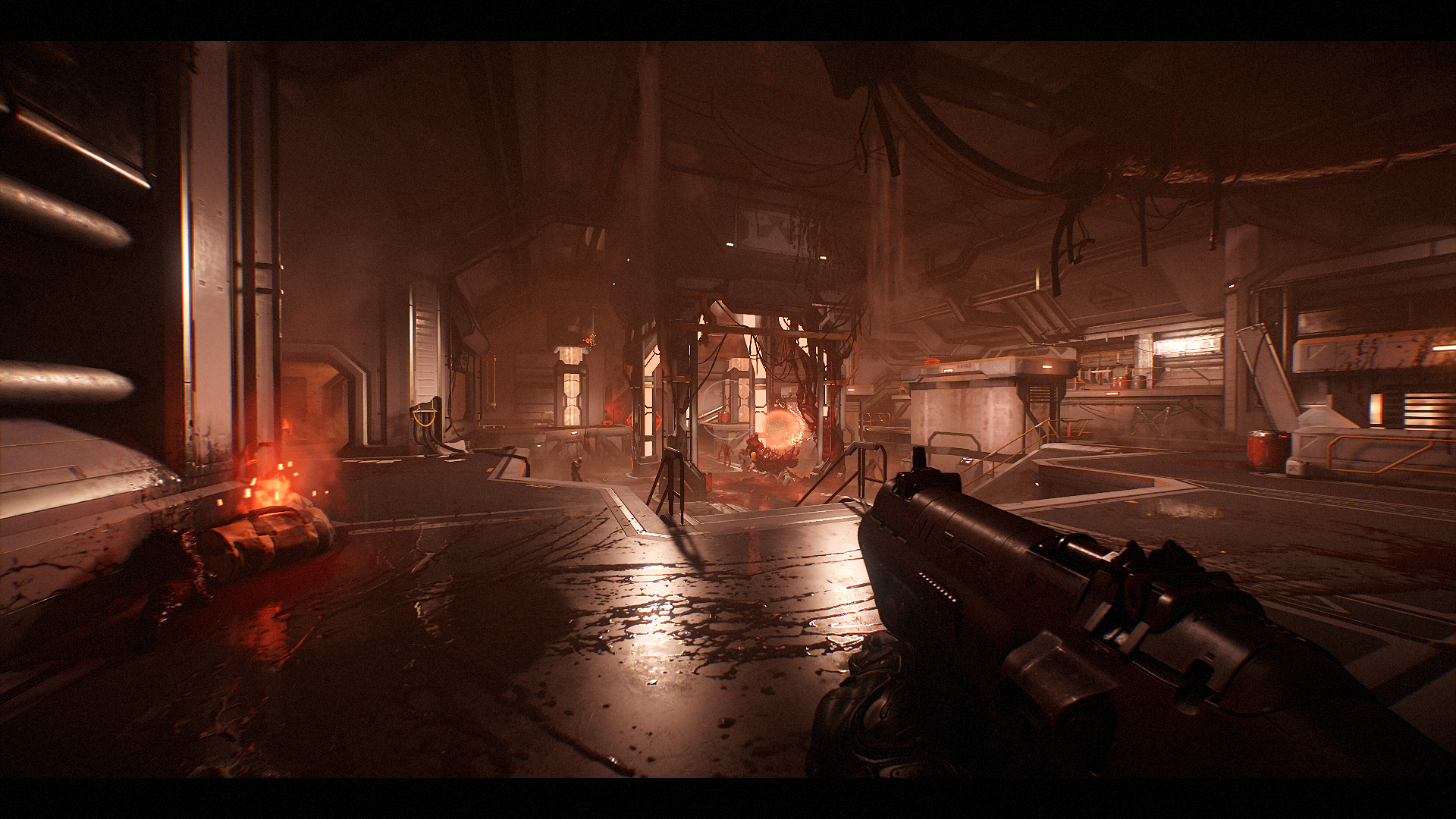
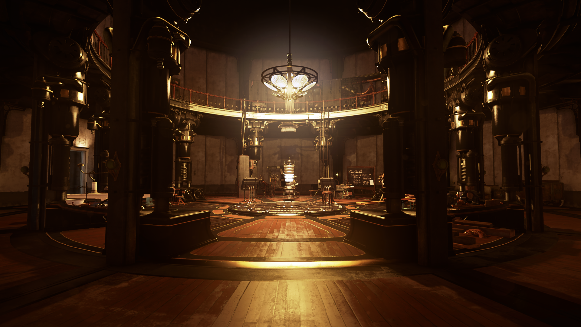
That's BS as far as I'm aware, there's definitely a point where contrast can be bad, but the pursuit of the opposite is equally as offensive imo. Contrast adds depth to a scene, but it's very hard to create a stable image with high contrast and high detail, very few games manage to do that successfully.

DOOM is one example:
28821800046_b0a88c288f_o.png


Dishonored 2 is another good one (although not as consistent):
30996640612_3212ea0e1e_o.png


Detroit: Become Human is another excellent example

But yeah, I think FH4 still lacks some TSSAA variant (probably sticking to forward + MSAA yet again), it's very obvious that the shimmering on high detail geometry from FH3 is still present in the game, and most probably why they avoid high contrast detail.
 
Last edited:
It was novel the first time (intro sequence), but it's irritating on subsequent playthroughs. I spend too much time on loading screens than getting right into the game/specific DLC.

Thats why I'm thinking of picking up a home-made SSD drive for the One X console, just to limitthekoading screen impacts of games like this.Its around $10 to $20 for the enclosure then the rest depends on what size SSD to put in it.
 
That's BS as far as I'm aware, there's definitely a point where contrast can be bad, but the pursuit of the opposite is equally as offensive imo. Contrast adds depth to a scene, but it's very hard to create a stable image with high contrast and high detail, very few games manage to do that successfully.

DOOM is one example:
28821800046_b0a88c288f_o.png


Dishonored 2 is another good one (although not as consistent):
30996640612_3212ea0e1e_o.png


Detroit: Become Human is another excellent example

But yeah, I think FH4 still lacks some TSSAA variant (probably sticking to forward + MSAA yet again), it's very obvious that the shimmering on high detail geometry from FH3 is still present in the game, and most probably why they avoid high contrast detail.

IIRC, there is a TSSAA implementation of sorts in FH3, but it's effectively off while playing normally (mostly there for photomode*). Once the camera is dead-still it's working quite noticeably (at least on PC).

A stringent threshold is probably intentional because it'd be more likely to breakdown @30fps (console target) along with all the foliage everywhere that would make it look less than presentable.

Doom does have pretty good movement speed, and the 60fps helps, but its environments are very much all about solid geometry. It's pretty easy to see TSSAA breakdown with the Hellknight hopping around or when there are transparency effects at play (holograms).


* I have to rant about the crappy controls in photomode that haven't improved much over the years. It's irritating for the camera to be blocked so easily (and limited height delta).
 
Last edited:
IIRC, there is a TSSAA implementation of sorts in FH3, but it's effectively off while playing normally (mostly there for photomode*). Once the camera is dead-still it's working quite noticeably (at least on PC).

Ha! I'll have to check that out :D

But yeah it's kinda weird, I think FH3 has excellent image quality even on the standard Xbox One, but image stability is still an issue. I think overall TSSAA would prove a better solution if implemented correctly as it'll get rid of shader/specular aliasing (which to be fair FH3 doesn't have that much of) as well as clean up some of that shimmery foliage in the distance. But 4x MSAA looks better in screenshots and stills and is sharper :)
 
mm... yeah, just checked - it's only observable while in photomode. Move the camera around and stop, and then you should see higher sampling, especially foliage & specular.

It's not used during normal gameplay.
 
Thanks. Bastards driving around in a yellow FD pulling on my heart strings
 
I played a bunch of FH3 and recently went back to FH2. Those two games are carbon copies IMO, they only changed the map. Things I hope FH4 improves on.

  • Reasons to pick the right car for the right race. Everything seems to just drive on all surfaces and there is no penalty.
  • Better controls, hoping the 60Hz helps with this.
  • Less relying on open world to impress and I hope they use the space in more interesting ways. Less field after field with roads. Better cities, more vertical space, etc.
  • Be more like FM or go big and stop straddling both worlds. I'd rather have a something with realistic physics and driving if it means sports cars are not driving through fields. If they want to be a real arcade racer, then go big like Motorstorm and others. Let me fly through the air and give me boost.
  • Do cars and tuning ever matter? It seems the AI just scales to whatever you pick.
  • Get rid of the cringy festival atmosphere and bad music.
  • Make skill count. Right now you can pick any car for any race and always win. There is no real skill to the racing, the AI just kind of lets you win.
 
Many/some would be uninterested in FH series if it was any more like FM series.

What game settings are you playing FH3 or FH2 on for it to be such a cake-walk for you? Have you tried the Blizzard Mountain region of FH3? There's definitely penalties if you try using normal vehicles without tuned setups for the snowy conditions.
 
Back
Top